
Python--Matplotlib(基本用法)
Matplotlib
Matplotlib 是Python中类似 MATLAB 的绘图工具,熟悉 MATLAB 也可以很快的上手 Matplotlib。
1. 认识Matploblib
1.1 Figure
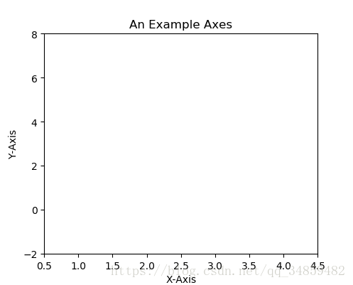
在任何绘图之前,我们需要一个Figure对象,可以理解成我们需要一张画板才能开始绘图。
import matplotlib.pyplot as plt
fig = plt.figure()
1.2 Axes
在拥有Figure对象之后,在作画前我们还需要轴,没有轴的话就没有绘图基准,所以需要添加Axes。也可以理解成为真正可以作画的纸。
fig = plt.figure()
ax = fig.add_subplot(111)
ax.set(xlim=[0.5, 4.5], ylim=[-2, 8], title='An Example Axes',
ylabel='Y-Axis', xlabel='X-Axis')
plt.show()
上的代码,在一幅图上添加了一个Axes,然后设置了这个Axes的X轴以及Y轴的取值范围(这些设置并不是强制的,后面会再谈到关于这些设置),效果如下图:
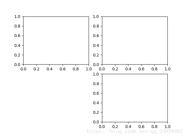
对于上面的fig.add_subplot(111)就是添加Axes的,参数的解释的在画板的第1行第1列的第一个位置生成一个Axes对象来准备作画。也可以通过fig.add_subplot(2, 2, 1)的方式生成Axes,前面两个参数确定了面板的划分,例如 2, 2会将整个面板划分成 2 * 2 的方格,第三个参数取值范围是 [1, 2*2] 表示第几个Axes。如下面的例子:
fig = plt.figure()
ax1 = fig.add_subplot(221)
ax2 = fig.add_subplot(222)
ax3 = fig.add_subplot(224)
1.3 Multiple Axes
可以发现我们上面添加 Axes 似乎有点弱鸡,所以提供了下面的方式一次性生成所有 Axes:
fig, axes = plt.subplots(nrows=2, ncols=2)
axes[0,0].set(title='Upper Left')
axes[0,1].set(title='Upper Right')
axes[1,0].set(title='Lower Left')
axes[1,1].set(title='Lower Right')
fig 还是我们熟悉的画板, axes 成了我们常用二维数组的形式访问,这在循环绘图时,额外好用。
1.4 Axes Vs .pyplot
相信不少人看过下面的代码,很简单并易懂,但是下面的作画方式只适合简单的绘图,快速的将图绘出。在处理复杂的绘图工作时,我们还是需要使用 Axes 来完成作画的。
plt.plot([1, 2, 3, 4], [10, 20, 25, 30], color='lightblue', linewidth=3)
plt.xlim(0.5, 4.5)
plt.show()
2. 基本绘图2D
2.1 线
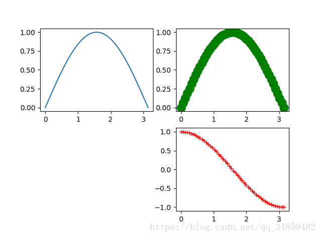
plot()函数画出一系列的点,并且用线将它们连接起来。看下例子:
x = np.linspace(0, np.pi)
y_sin = np.sin(x)
y_cos = np.cos(x)
ax1.plot(x, y_sin)
ax2.plot(x, y_sin, ‘go–’, linewidth=2, markersize=12)
ax3.plot(x, y_cos, color=‘red’, marker=‘+’, linestyle=‘dashed’)
在上面的三个Axes上作画。plot,前面两个参数为x轴、y轴数据。ax2的第三个参数是 MATLAB风格的绘图,对应ax3上的颜色,marker,线型。
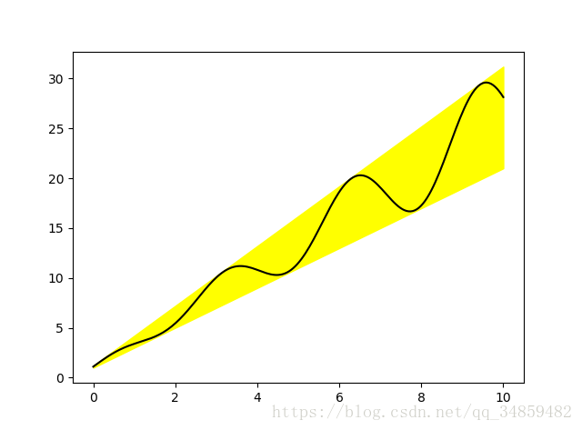
另外,我们可以通过关键字参数的方式绘图,如下例:
x = np.linspace(0, 10, 200)
data_obj = {
  'x': x,
            'y1': 2 * x + 1,
            'y2': 3 * x + 1.2,
            'mean': 0.5 * x * np.cos(2*x) + 2.5 * x + 1.1}
fig, ax = plt.subplots()
#填充两条线之间的颜色
ax.fill_between(‘x’, ‘y1’, ‘y2’, color=‘yellow’, data=data_obj)
# Plot the “centerline” with plot
ax.plot(‘x’, ‘mean’, color=‘black’, data=data_obj)
发现上面的作图,在数据部分只传入了字符串,这些字符串对一个这 data_obj 中的关键字,当以这种方式作画时,将会在传入给 data 中寻找对应关键字的数据来绘图。
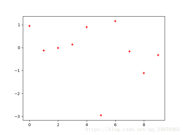
2.2 散点图
只画点,但是不用线连接起来。
x = np.arange(10)
y = np.random.randn(10)
plt.scatter(x, y, color='red', marker='+')
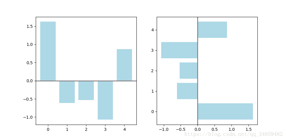
2.3 条形图
条形图分两种,一种是水平的,一种是垂直的,见下例子:
np.random.seed(1)
x = np.arange(5)
y = np.random.randn(5)
fig, axes = plt.subplots(ncols=2, figsize=plt.figaspect(1./2))
vert_bars = axes[0].bar(x, y, color=‘lightblue’, align=‘center’)
horiz_bars = axes[1].barh(x, y, color=‘lightblue’, align=‘center’)
#在水平或者垂直方向上画线
axes[0].axhline(0, color=‘gray’, linewidth=2)
axes[1].axvline(0, color=‘gray’, linewidth=2)
plt.show()
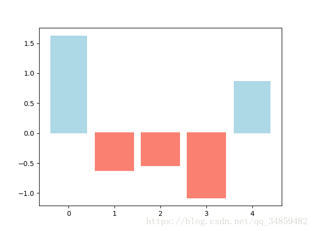
条形图还返回了一个Artists 数组,对应着每个条形,例如上图 Artists 数组的大小为5,我们可以通过这些 Artists 对条形图的样式进行更改,如下例:
fig, ax = plt.subplots()
vert_bars = ax.bar(x, y, color='lightblue', align='center')
We could have also done this with two separate calls to ax.bar and numpy boolean indexing.
for bar, height in zip(vert_bars, y):
if height < 0:
bar.set(edgecolor=‘darkred’, color=‘salmon’, linewidth=3)
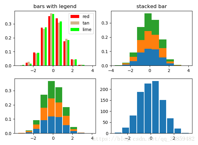
2.4 直方图
直方图用于统计数据出现的次数或者频率,有多种参数可以调整,见下例:
np.random.seed(19680801)
n_bins = 10
x = np.random.randn(1000, 3)
fig, axes = plt.subplots(nrows=2, ncols=2)
ax0, ax1, ax2, ax3 = axes.flatten()
colors = [‘red’, ‘tan’, ‘lime’]
ax0.hist(x, n_bins, density=True, histtype=‘bar’, color=colors, label=colors)
ax0.legend(prop={‘size’: 10})
ax0.set_title(‘bars with legend’)
ax1.hist(x, n_bins, density=True, histtype=‘barstacked’)
ax1.set_title(‘stacked bar’)
ax2.hist(x, histtype=‘barstacked’, rwidth=0.9)
ax3.hist(x[:, 0], rwidth=0.9)
ax3.set_title(‘different sample sizes’)
fig.tight_layout()
参数中density控制Y轴是概率还是数量,与返回的第一个的变量对应。histtype控制着直方图的样式,默认是 ‘bar’,对于多个条形时就相邻的方式呈现如子图1, ‘barstacked’ 就是叠在一起,如子图2、3。 rwidth 控制着宽度,这样可以空出一些间隙,比较图2、3. 图4是只有一条数据时。
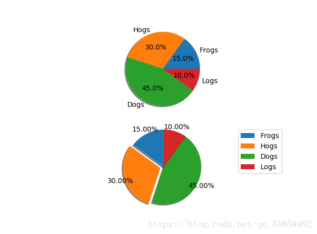
2.5 饼图
labels = 'Frogs', 'Hogs', 'Dogs', 'Logs'
sizes = [15, 30, 45, 10]
explode = (0, 0.1, 0, 0)  # only "explode" the 2nd slice (i.e. 'Hogs')
fig1, (ax1, ax2) = plt.subplots(2)
ax1.pie(sizes, labels=labels, autopct=‘%1.1f%%’, shadow=True)
ax1.axis(‘equal’)
ax2.pie(sizes, autopct=‘%1.2f%%’, shadow=True, startangle=90, explode=explode,
pctdistance=1.12)
ax2.axis(‘equal’)
ax2.legend(labels=labels, loc=‘upper right’)
饼图自动根据数据的百分比画饼.。labels是各个块的标签,如子图一。autopct=%1.1f%%表示格式化百分比精确输出,explode,突出某些块,不同的值突出的效果不一样。pctdistance=1.12百分比距离圆心的距离,默认是0.6.
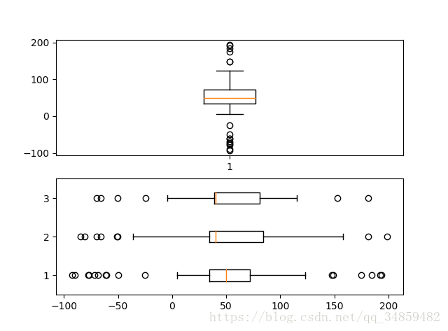
2.6 箱形图
为了专注于如何画图,省去数据的处理部分。 data 的 shape 为 (n, ), data2 的 shape 为 (n, 3)。
fig, (ax1, ax2) = plt.subplots(2)
ax1.boxplot(data)
ax2.boxplot(data2, vert=False) #控制方向
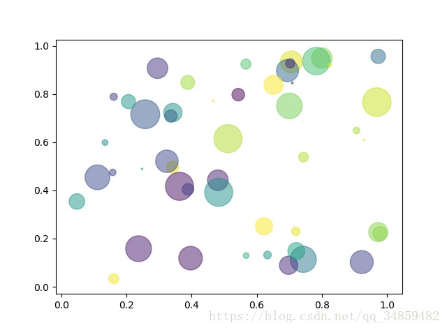
2.7 泡泡图
散点图的一种,加入了第三个值 s 可以理解成普通散点,画的是二维,泡泡图体现了Z的大小,如下例:
np.random.seed(19680801)
N = 50
x = np.random.rand(N)
y = np.random.rand(N)
colors = np.random.rand(N)
area = (30 * np.random.rand(N))**2 # 0 to 15 point radii
plt.scatter(x, y, s=area, c=colors, alpha=0.5)
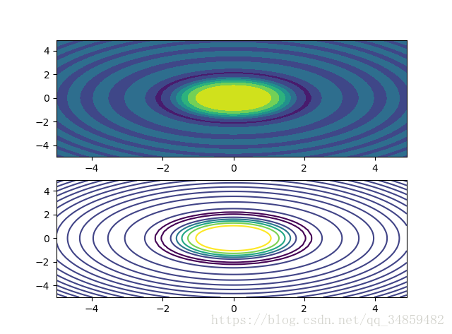
2.8 等高线(轮廓图)
有时候需要描绘边界的时候,就会用到轮廓图,机器学习用的决策边界也常用轮廓图来绘画,见下例:
fig, (ax1, ax2) = plt.subplots(2)
x = np.arange(-5, 5, 0.1)
y = np.arange(-5, 5, 0.1)
xx, yy = np.meshgrid(x, y, sparse=True)
z = np.sin(xx**2 + yy**2) / (xx**2 + yy**2)
ax1.contourf(x, y, z)
ax2.contour(x, y, z)
上面画了两个一样的轮廓图,contourf会填充轮廓线之间的颜色。数据x, y, z通常是具有相同 shape 的二维矩阵。x, y 可以为一维向量,但是必需有 z.shape = (y.n, x.n) ,这里 y.n 和 x.n 分别表示x、y的长度。Z通常表示的是距离X-Y平面的距离,传入X、Y则是控制了绘制等高线的范围。
3 布局、图例说明、边界等
3.1区间上下限
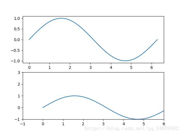
当绘画完成后,会发现X、Y轴的区间是会自动调整的,并不是跟我们传入的X、Y轴数据中的最值相同。为了调整区间我们使用下面的方式:
ax.set_xlim([xmin, xmax]) #设置X轴的区间
ax.set_ylim([ymin, ymax]) #Y轴区间
ax.axis([xmin, xmax, ymin, ymax]) #X、Y轴区间
ax.set_ylim(bottom=-10) #Y轴下限
ax.set_xlim(right=25) #X轴上限
具体效果见下例:
x = np.linspace(0, 2*np.pi)
y = np.sin(x)
fig, (ax1, ax2) = plt.subplots(2)
ax1.plot(x, y)
ax2.plot(x, y)
ax2.set_xlim([-1, 6])
ax2.set_ylim([-1, 3])
可以看出修改了区间之后影响了图片显示的效果。
3.2 图例说明
我们如果我们在一个Axes上做多次绘画,那么可能出现分不清哪条线或点所代表的意思。这个时间添加图例说明,就可以解决这个问题了,见下例:
fig, ax = plt.subplots()
ax.plot([1, 2, 3, 4], [10, 20, 25, 30], label='Philadelphia')
ax.plot([1, 2, 3, 4], [30, 23, 13, 4], label='Boston')
ax.scatter([1, 2, 3, 4], [20, 10, 30, 15], label='Point')
ax.set(ylabel='Temperature (deg C)', xlabel='Time', title='A tale of two cities')
ax.legend()
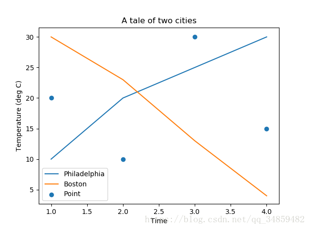
在绘图时传入 label 参数,并最后调用ax.legend()显示体力说明,对于 legend 还是传入参数,控制图例说明显示的位置:
| Location String | Location Code |
|---|---|
| ‘best’ | 0 |
| ‘upper right’ | 1 |
| ‘upper left’ | 2 |
| ‘lower left’ | 3 |
| ‘lower right’ | 4 |
| ‘right’ | 5 |
| ‘center left’ | 6 |
| ‘center right’ | 7 |
| ‘lower center’ | 8 |
| ‘upper center’ | 9 |
| ‘center’ | 10 |
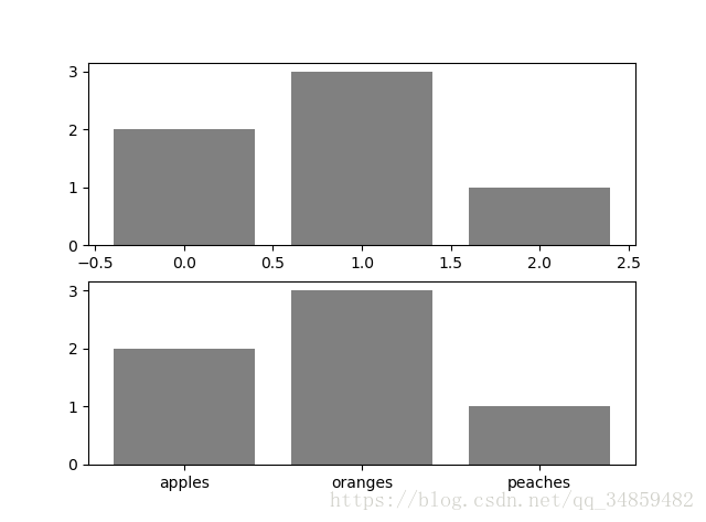
3.3 区间分段
默认情况下,绘图结束之后,Axes 会自动的控制区间的分段。见下例:
data = [('apples', 2), ('oranges', 3), ('peaches', 1)]
fruit, value = zip(*data)
fig, (ax1, ax2) = plt.subplots(2)
x = np.arange(len(fruit))
ax1.bar(x, value, align=‘center’, color=‘gray’)
ax2.bar(x, value, align=‘center’, color=‘gray’)
ax2.set(xticks=x, xticklabels=fruit)
#ax.tick_params(axis=‘y’, direction=‘inout’, length=10) #修改 ticks 的方向以及长度
上面不仅修改了X轴的区间段,并且修改了显示的信息为文本。
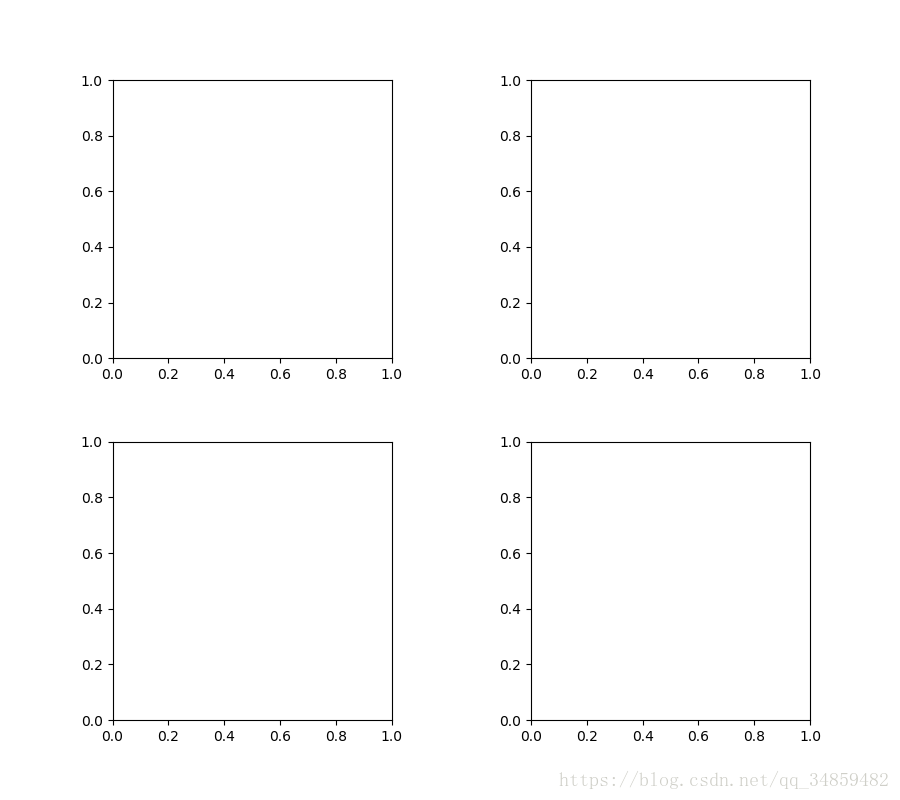
3.4 布局
当我们绘画多个子图时,就会有一些美观的问题存在,例如子图之间的间隔,子图与画板的外边间距以及子图的内边距,下面说明这个问题:
fig, axes = plt.subplots(2, 2, figsize=(9, 9))
fig.subplots_adjust(wspace=0.5, hspace=0.3,
                    left=0.125, right=0.9,
                    top=0.9,    bottom=0.1)
#fig.tight_layout() #自动调整布局,使标题之间不重叠
plt.show()
- 1
- 2
- 3
- 4
- 5
- 6
- 7
通过fig.subplots_adjust()我们修改了子图水平之间的间隔wspace=0.5,垂直方向上的间距hspace=0.3,左边距left=0.125 等等,这里数值都是百分比的。以 [0, 1] 为区间,选择left、right、bottom、top 注意 top 和 right 是 0.9 表示上、右边距为百分之10。不确定如果调整的时候,fig.tight_layout()是一个很好的选择。之前说到了内边距,内边距是子图的,也就是 Axes 对象,所以这样使用 ax.margins(x=0.1, y=0.1),当值传入一个值时,表示同时修改水平和垂直方向的内边距。
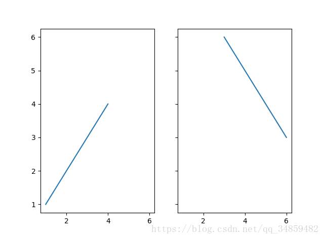
观察上面的四个子图,可以发现他们的X、Y的区间是一致的,而且这样显示并不美观,所以可以调整使他们使用一样的X、Y轴:
fig, (ax1, ax2) = plt.subplots(1, 2, sharex=True, sharey=True)
ax1.plot([1, 2, 3, 4], [1, 2, 3, 4])
ax2.plot([3, 4, 5, 6], [6, 5, 4, 3])
plt.show()
- 1
- 2
- 3
- 4
3.5 轴相关
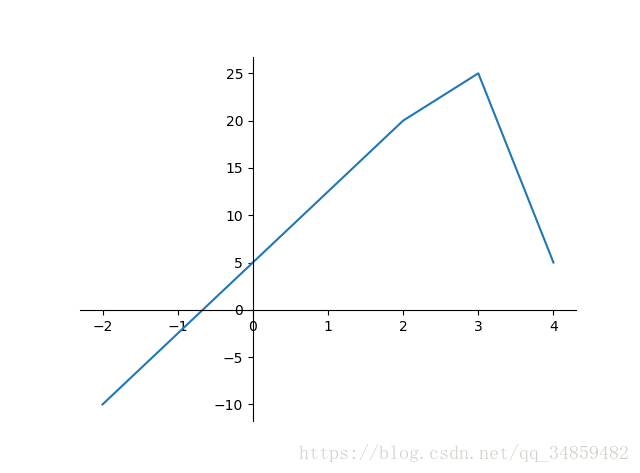
改变边界的位置,去掉四周的边框:
fig, ax = plt.subplots()
ax.plot([-2, 2, 3, 4], [-10, 20, 25, 5])
ax.spines['top'].set_visible(False)     #顶边界不可见
ax.xaxis.set_ticks_position('bottom')  # ticks 的位置为下方,分上下的。
ax.spines['right'].set_visible(False)   #右边界不可见
ax.yaxis.set_ticks_position('left')
# “outward”
# 移动左、下边界离 Axes 10 个距离
#ax.spines[‘bottom’].set_position((‘outward’, 10))
#ax.spines[‘left’].set_position((‘outward’, 10))
# “data”
# 移动左、下边界到 (0, 0) 处相交
ax.spines[‘bottom’].set_position((‘data’, 0))
ax.spines[‘left’].set_position((‘data’, 0))
# “axes”
# 移动边界,按 Axes 的百分比位置
#ax.spines[‘bottom’].set_position((‘axes’, 0.75))
#ax.spines[‘left’].set_position((‘axes’, 0.3))

 浙公网安备 33010602011771号