十一、封装组件
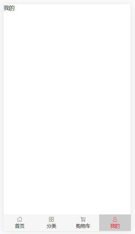
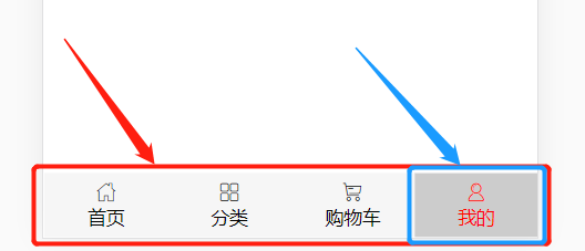
1、布局拆分
-
红色部分为最外层组件,蓝色部分为里面的item
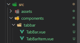
- TabBar.vue
 1 <template>
 2   <div id="tabbar">
 3     <slot></slot>
 4   </div>
 5 </template>
 6
 7 <script>
 8 export default {
 9   name: 'TabBar'
10 }
11 </script>
12
13 <style lang="scss" scoped>
14 #tabbar {
15   display: flex;
16   background-color: #f6f6f6;
17   position: fixed;
18   left: 0;
19   right: 0;
20   bottom: 0;
21 }
22 </style>
- TabBarItem.vue
 1 <template>
 2   <div
 3     class="tab-bar-item"
 4     @click="itemClick"
 5     :class="{active: isActive}"
 6     :style="activeStyle"
 7   >
 8     <slot name="item-icon"></slot>
 9     <slot name="item-text"></slot>
10   </div>
11 </template>
12
13 <script>
14 import '@/assets/images/iconfont/iconfont.css'
15
16 export default {
17   name: 'TabBarItem',
18   props: {
19     path: String,
20     activeColor: {
21       type: String,
22       default: 'red'
23     }
24   },
25   data () {
26     return {
27     }
28   },
29   computed: {
30     // 判断路由中是否有当前路由(点击item后的背景颜色,自行修改,可移除)
31     isActive () {
32       return this.$route.path.indexOf(this.path) !== -1
33     },
34     // 点击item后字体和图标的颜色,使用者按需传入颜色
35     activeStyle () {
36       return this.isActive ? { color: this.activeColor } : {}
37     }
38   },
39   methods: {
40     itemClick () {
41       this.$router.replace(this.path).catch(err => err)
42     }
43   }
44 }
45 </script>
46
47 <style lang="scss" scoped>
48 .tab-bar-item {
49   flex: 1;
50   text-align: center;
51   height: 49px;
52   &.active{
53     background: #ccc;
54   }
55   i {
56     font-style: normal;
57     display: block;
58     margin-top: 6px;
59   }
60   p {
61     margin: 0;
62     font-size: 14px;
63   }
64 }
65 </style>
2、路由规划
-
src/router/index.js路由文件
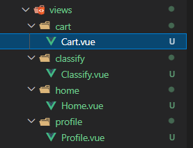
 1 import Vue from 'vue'
 2 import VueRouter from 'vue-router'
 3
 4 Vue.use(VueRouter)
 5
 6 // 解决冗余导航(自行百度)
 7 const originalPush = VueRouter.prototype.push
 8 VueRouter.prototype.push = function push (location) {
 9   return originalPush.call(this, location).catch(err => err)
10 }
11
12 // 路由懒加载方式引入
13 const Home = () => import('@/views/home/Home.vue')
14 const Classify = () => import('@/views/classify/Classify.vue')
15 const Cart = () => import('@/views/cart/Cart.vue')
16 const Profile = () => import('@/views/profile/Profile.vue')
17
18 const routes = [
19   {
20     path: '/',
21     redirect: '/home'
22   },
23   {
24     path: '/home',
25     name: 'Home',
26     component: Home
27   },
28   {
29     path: '/classify',
30     name: 'Classify',
31     component: Classify
32   },
33   {
34     path: '/cart',
35     name: 'Cart',
36     component: Cart
37   },
38   {
39     path: '/profile',
40     name: 'Profile',
41     component: Profile
42   }
43 ]
44
45 const router = new VueRouter({
46   mode: 'history',
47   base: process.env.BASE_URL,
48   routes
49 })
50
51 export default router
3、使用
-
App.vue
 1 <template>
 2   <div id="app">
 3     <router-view></router-view>
 4     <tab-bar>
 5       <tab-bar-item path="/home" activeColor="green">
 6         <i slot="item-icon" class="iconfont icon-home"></i>
 7         <p slot="item-text">首页</p>
 8       </tab-bar-item>
 9       <tab-bar-item path="/classify" activeColor="blue">
10         <i slot="item-icon" class="iconfont icon-fenlei"></i>
11         <p slot="item-text">分类</p>
12       </tab-bar-item>
13       <tab-bar-item path="/cart">
14         <i slot="item-icon" class="iconfont icon-gouwuche"></i>
15         <p slot="item-text">购物车</p>
16       </tab-bar-item>
17       <tab-bar-item path="/profile">
18         <i slot="item-icon" class="iconfont icon-iconfuzhi"></i>
19         <p slot="item-text">我的</p>
20       </tab-bar-item>
21     </tab-bar>
22   </div>
23 </template>
24
25 <script>
26 import TabBar from './components/tabbar/TabBar.vue'
27 import TabBarItem from './components/tabbar/TabBarItem'
28 import '@/assets/css/base.css'
29
30 export default {
31   name: 'App',
32   components: {
33     TabBar,
34     TabBarItem
35   }
36 }
37 </script>
38
39 <style lang="scss" scoped>
40 </style>
二、TabControl
效果图:
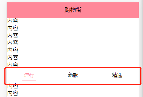
1、功能
-
组件内tab切换
-
有吸顶效果
2、代码
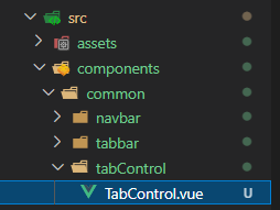
src/components/common/tabControl/TabControl.vue
common文件用来存放可在其它项目复用的组件
 1 <template>
 2   <div class="tab-control">
 3     <div
 4       v-for="(item,index) in titles"
 5       :key="item"
 6       class="tab-control-item"
 7       :class="{active: index === currentIndex}"
 8       @click="itemClick(index)"
 9     >
10       <span>{{item}}</span>
11     </div>
12   </div>
13 </template>
14
15 <script>
16 export default {
17   name: 'TabControl',
18   props: {
19     titles: {
20       type: Array,
21       default () {
22         return []
23       }
24     }
25   },
26   components: {
27   },
28   data () {
29     return {
30       currentIndex: 0
31     }
32   },
33   methods: {
34     itemClick (index) {
35       this.currentIndex = index
36       // 发送给父组件使用
37       this.$emit('tabClick', index)
38     }
39   }
40 }
41 </script>
42
43 <style lang="scss" scoped>
44 .tab-control{
45   display: flex;
46   height: 40px;
47   line-height: 40px;
48   text-align: center;
49   font-size: 14px;
50 }
51 .tab-control-item{
52   flex: 1;
53   span{
54     padding: 5px;
55   }
56   &.active{
57     color: #f89;
58     span{
59       border-bottom: 2px solid #f89;
60     }
61   }
62 }
63 </style>
3、使用
-
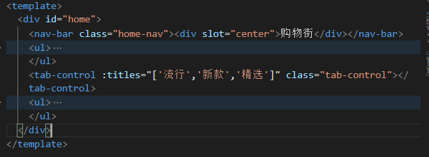
使用titles绑定传入的数据
在
tab-control标签内监听tabClick点击事件(图片内没写,@tabClick="事件函数名")
- 引入并注册
 1 import TabControl from '@/components/common/tabControl/TabControl'
 2 export default{
 3     ...
 4     components: {
 5         TabControl
 6     },
 7     methods: {
 8         tabClick (index) {
 9           switch (index) {
10             case 0:
11               console.log('pop')
12               break
13             case 1:
14               console.log('new')
15               break
16             case 2:
17               console.log('sell')
18               break
19           }
20         }
21     }
22 }
- 定位样式(参考)
1 .tab-control{
2   position: sticky;
3   top: 44px;
4   background: #fff;
5 }
三、Scroll滚动组件
使用
better-scroll封装滚动组件
1、功能
-
实现一定区域的滚动
-
包裹其它组件一起滚动
-
根据传入的
probeType决定是否实时监听滚动
2、代码
 1 <template>
 2   <div class="wrapper" ref="wrapper">
 3     <div class="content">
 4       <slot></slot>
 5     </div>
 6   </div>
 7 </template>
 8
 9 <script>
10 import BScroll from 'better-scroll'
11
12 export default {
13   name: 'Scroll',
14   props: {
15     // 从性能考虑,采用父组件传入probeType,来判断是否实时滚动
16     probeType: {
17       type: Number,
18       default: 0
19     },
20     pullUpLoad: {
21       type: Boolean,
22       default: false
23     }
24   },
25   data () {
26     return {
27       scroll: null
28     }
29   },
30   mounted () {
31     // 1、创建BScroll对象
32     this.scroll = new BScroll(this.$refs.wrapper, {
33       scrollX: false,
34       click: true,
35       probeType: this.probeType
36     })
37     // 2、监听滚动位置,发送给父组件
38     if (this.probeType === 2 || this.probeType === 3) {
39       this.scroll.on('scroll', (position) => {
40         this.$emit('scroll', position)
41       })
42     }
43     // 3、上拉加载更多
44     if (this.pullUpLoad) {
45       this.scroll.on('pullingUp', () => {
46         this.$emit('pullingUp')
47       })
48     }
49   },
50   methods: {
51     // 此函数配合BackTop组件返回顶部点击事件使用
52     backTop (x, y, time = 300) {
53       this.scroll && this.scroll.scrollTo(x, y, time)
54     },
55     // 完成加载更多
56     finishPullUp () {
57       this.scroll.finishPullUp()
58     }
59     // 防止因图片加载导致scroll高度带来的bug,需要刷新页面,使用中央事件总线并挂载到原型,在父组件调用
60     refresh () {
61       this.scroll && this.scroll.refresh()
62         }
63   }
64 }
65 </script>
66
67 <style lang="scss" scoped>
68 </style>
  1 <template>
  2     <div id="home">
  3         <nav-bar class="home-nav"><div slot="center">购物街</div></nav-bar>
  4         <scroll
  5           class="scroll-con"
  6           ref="scroll"
  7           :probe-type="3"
  8           @scroll="contentScroll"
  9           :pull-up-load="true"
 10           @pullingUp="loadMore">
 11           <!-- BScroll对象中click为true,否则点击事件无效 -->
 12           <tab-control
 13             :titles="['流行', '新款', '精选']"
 14             class="tab-control"
 15             @tabClick="tabClick"
 16           />
 17           <!-- 需要滚动的内容 -->
 18         </scroll>
 19     </div>
 20 </template>
 21
 22 <script>
 23     import NavBar from '@/components/common/navbar/NavBar'
 24     import TabControl from '@/components/common/tabControl/TabControl'
 25     import Scroll from '@/components/common/scroll/Scroll'
 26
 27     export default {
 28         components: {
 29             NavBar,
 30             TabControl,
 31             Scroll
 32         },
 33         data () {
 34             return {
 35               banners: [],
 36               goods: {
 37                 pop: { page: 0, list: [] },
 38                 new: { page: 0, list: [] },
 39                 sell: { page: 0, list: [] }
 40               },
 41               currentType: 'pop',
 42               isShowBackTop: false
 43             }
 44         },
 45         created() {
 46             // this.getHomeMultidata()
 47             // thsi.getHomeGoods('pop')
 48             // thsi.getHomeGoods('new')
 49             // thsi.getHomeGoods('sell')
 50         },
 51         mounted() {
 52               // const refresh = this.debounce(this.$refs.scroll.refresh, 100)
 53             // this.$bus.$on('itemImageLoad', () => {
 54             //   refresh()
 55             // })
 56         },
 57         methods: {
 58             /**
 59              * 事件监听相关方法
 60              */
 61             tabClick (index) {
 62               switch (index) {
 63                 case 0:
 64                   console.log('pop')
 65                   break
 66                 case 1:
 67                   console.log('new')
 68                   break
 69                 case 2:
 70                   console.log('sell')
 71                   break
 72               }
 73             }
 74             // 此函数配合BackTop返回顶部组件使用
 75             contentScroll (position) {
 76               // 判断当前位置与给定的位置关系
 77               this.isShowBackTop = (-position.y) > 1000
 78             },
 79             loadMore () {
 80               console.log('上拉加载更多')
 81               // this.getHomeGoods(this.currentType)
 82             },
 83             // scroll防抖函数(可抽离到utils.js文件中)
 84             debounce (fun, delay) {
 85               let timer = null
 86               return function (...args) {
 87                 if (timer) clearTimeout(timer)
 88                 timer = setTimeout(() => {
 89                   fun.apply(this, args)
 90                 }, delay)
 91               }
 92             }
 93             /**
 94              * 网络请求相关方法
 95              */
 96             // getHomeMultidata () {
 97             //   getHomeMultidata().then(res => {
 98             //     this.banners = res.data.banner.list
 99             //   })
100             // },
101             // getHomeGoods (type) {
102             //   const page = this.goods[type].page + 1
103             //   getHomeGoods(type, page).then(res => {
104             //     this.goods[type].list.push(...res.data.list)
105             //     this.goods[type].page += 1
106             //     this.$refs.scroll.finishPullUp()
107             //   })
108             // }
109         }
110     }
111 </script>
-
scroll滑动区域如果有图片,会产生滑动高度的bug,原因是scroll组件计算高度时没有计算图片高度,此时图片还未加载完成,导致前后高度不一致
-
采用scroll中的
refresh()
1 Vue.prototype.$bus = new Vue()
1 methods: {
2   imageLoad () {
3     this.$bus.$emit('itemImageLoad')
4   }
5 }
- 在使用scroll的组件中(Home.vue)接收
1 mounted() {
2   this.$bus.$on('itemImageLoad', () => {
3       this.$refs.scroll.refresh()
4   })
5 },
四、BackTop
1、功能
一键返回顶部按钮
2、代码
 1 <template>
 2   <div>
 3     <!-- 自行选择返回顶部图标样式,使用图片或icon图标均可 -->
 4     <div class="back-top"></div>
 5   </div>
 6 </template>
 7
 8 <script>
 9 export default {
10 }
11 </script>
12
13 <style lang="scss" scoped>
14 .back-top{
15   width: 30px;
16   height: 30px;
17   border-radius: 10px;
18   background: skyblue;
19   position: fixed;
20   right: 20px;
21   bottom: 60px;
22 }
23 </style>
 1 <template>
 2 <div id="home">
 3   <nav-bar class="home-nav"><div slot="center">购物街</div></nav-bar>
 4   <scroll class="scroll-con" ref="scroll" :probe-type="3" @scroll="contentScroll">
 5     <!-- BScroll对象中click为true,否则点击事件无效 -->
 6     <tab-control
 7                  :titles="['流行', '新款', '精选']"
 8                  class="tab-control"
 9                  @tabClick="tabClick"
10                  />
11     <!-- 需要滚动的内容 -->
12   </scroll>
13   <!-- 监听组件点击事件要加native修饰符,监听原生事件 -->
14   <back-top @click.native="backTopClick" v-show="isShowBackTop"/>
15   </div>
16 </template>
17
18 <script>
19   import NavBar from '@/components/common/navbar/NavBar'
20   import TabControl from '@/components/common/tabControl/TabControl'
21   import Scroll from '@/components/common/scroll/Scroll'
22   import BackTop from '@/components/common/backtop/BackTop'
23
24   export default {
25     components: {
26       NavBar,
27       TabControl,
28       Scroll,
29       BackTop
30     },
31     data () {
32       return {
33         banners: [],
34         goods: {
35           pop: { page: 0, list: [] },
36           new: { page: 0, list: [] },
37           sell: { page: 0, list: [] }
38         },
39         isShowBackTop: false
40       }
41     },
42     methods: {
43       tabClick (index) {
44         switch (index) {
45           case 0:
46             console.log('pop')
47             break
48           case 1:
49             console.log('new')
50             break
51           case 2:
52             console.log('sell')
53             break
54         }
55       },
56       // 此函数配合BackTop返回顶部组件使用
57       contentScroll (position) {
58         // 判断当前位置与给定的位置关系
59         this.isShowBackTop = (-position.y) > 1000
60       }
61       backTopClick () {
62         this.$refs.scroll.backTop(0, 0, 300)
63       },
64       }
65   }
66 </script>

 浙公网安备 33010602011771号