元素不确定宽高居中
对于确定宽高的元素
简单的来说
我们用margin就可以了
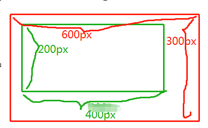
比如上图:
红色框宽高分别是600*300
绿色框宽高分别是400*200
那么,我们可以给绿色的框设置margin:50px 100px;
上下50px 左右100px
.red{
	width: 600px;
	height:300px;
	background: red;
}
.green{
	width: 400px;
	height:200px;
	margin:50px 100px;
	background: green;
}
或者使用定位:
红色框是position:relative 相对起点定位
绿色框是position:absolute 相对于定位的父元素定位
.red{
	width: 600px;
	height:300px;
	background: red;
	position: relative;
}
.green{
	width: 400px;
	height:200px;
	background: green;
	position: absolute;
	top:50px;
	left:100px;
}
另一种定位方式
.red{
	width: 600px;
	height:300px;
	background: red;
	position: relative;
}
.green{
	width: 400px;
	height:200px;
	background: green;
	position: absolute;
	top:50%;
	left:50%;
	margin-left:-200px;
	margin-top:-50px;
}
又或者这样定位
.red{
	width: 600px;
	height:300px;
	background: red;
	position: relative;
}
.green{
	width: 400px;
	height:200px;
	background: green;
	position: absolute;
	top:0;
	left:0;
	right:0;
	bottom:0;
	margin:auto;
}
当然这些全都有一个前提:宽高确定
如果不确定宽高的情况下,我们可以通过css3来定位居中
.red{
	width: 600px;
	height:300px;
	background: red;
	position: relative;
}
.green{
	background: green;
	position: absolute;
	top:50%;
	left:50%;
	transform: translate(-50%,-50%);
}
不论是宽或高还是宽高,有任意不确定,都可以这样设置居中
还有就是讲父元素设置
display:table;
子元素设置
display: table-cell;
vertical-align:middle;
text-align:center;
如下:
.red{
  display: table;
}
.green{
  width:100%;
  display: table-cell;
  vertical-align:middle;
  text-align:center;
}
还有flex的方法,父元素设置一下:
.red{
    display: flex;
    align-items: center;
    justify-content: center;
}
里面的内容就可以居中了
尔等可以试试哈
