Matplotlib学习笔记1 - 上手制作一些图表吧!
Matplotlib学习笔记1 - 上手制作一些图表吧!
Matplotlib是一个面向Python的,专注于数据可视化的模块。
快速上手
这是使用频率最高的几个模块,在接下来的程序中,都需要把它们作为基础模块
import matplotlib as mpl
import matplotlib.pyplot as plt
import numpy as np
第一个图表
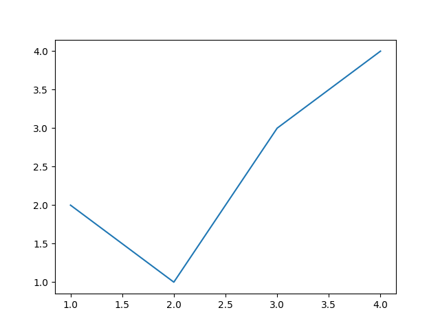
使用pyplot.plot函数,可以在坐标轴上画一条曲线。
plt.plot([1,2,3,4],[2,1,3,4])
plt.show()
让图表变得更加可读
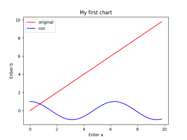
使用pyplot.xlabel与pyplot.ylabel可以给图表的x轴与y轴进行标注;使用pyplot.title给图表起一个标题。在这个例子中,分别绘制了两次曲线,分别标注为了'original'和'cos',使用pyplot.legend可以为图表增加一个图例。
# Generate some data
x=np.arange(0,10,0.2)
y=np.cos(x)


# Plot the figure
plt.plot(x,x,'r-',label='original')
plt.plot(x,y,'b-',label='cos')

# Some decoration
plt.xlabel('Enter a')
plt.ylabel('Enber b')
plt.title('My first chart')
plt.legend()

plt.show()
图表的组成部分
这是一个Matplotlib图表的组成示意图。
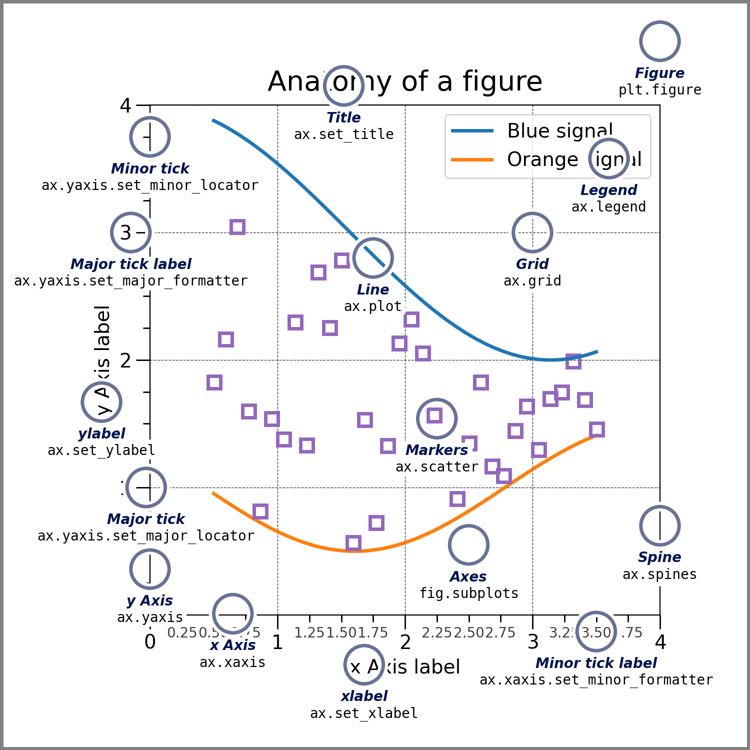
Figure: Figure囊括了整个图表(包括曲线啦~标题啦~坐标之类的),它有若干下属Axes子类
Axes:Axes是Figure的附属子类,包含了作图的区域。一般来说每个Axes会包含2个Axis类,在三维图中则含有3个。
绘制函数所支持的输入数据类型
并不是所有的数据都能顺利地被pyplot的绘制函数识别并绘成图表。一般来说函数支持numpy.array、numpy.ma.masked_array,或者可以被numpy.asarray转化(例如numpy.matrix)的数据类别。
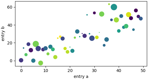
Pyplot也支持通过一个“字典”来存储并运用数据,只需要在绘制函数中给出data关键字的参数,就可以通过字典的key,将字典中的数据导入绘制函数中。在下面的例子中,我们把各种变量存在'data'字典中,并通过下标来引用在在字典中的数据。
data = {'a': np.arange(50),
        'c': np.random.randint(0, 50, 50),
        'd': np.random.randn(50)}
data['b'] = data['a'] + 10 * np.random.randn(50)
data['d'] = np.abs(data['d']) * 100

fig, ax = plt.subplots(figsize=(5, 2.7), layout='constrained')
ax.scatter('a', 'b', c='c', s='d', data=data)
ax.set_xlabel('entry a')
ax.set_ylabel('entry b')
代码风格
显式交互与隐式交互
我们有两种不同的方式(或者说是两种不同的风格,因为本质上它们没有很大的区别)来与Matplotlib交互:
- 显式交互(Explicit interface)
显式地申明Figure与Axes变量(分别对应于下例中的fig和ax),并通过它们调用函数【“面向对象” object-oriented 风格】
import matplotlib.pyplot as plt

fig = plt.figure()
ax = fig.subplots()
ax.plot([1, 2, 3, 4], [0, 0.5, 1, 0.2])
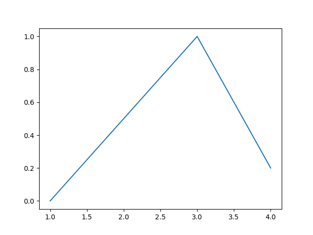
- 隐式交互(Implicit interface)
通过pyplot模块间接创建Figure和Axes,并用pyplot函数来绘图。
import matplotlib.pyplot as plt

plt.plot([1, 2, 3, 4], [0, 0.5, 1, 0.2])
要想在隐式交互中获取当前Figure,可使用gcf;获取当前Axes,可使用gca。
以上任何一种方式都会得到完全一致的结果
显式交互的好处
在处理简单任务时,隐匿交互相比之下会更快捷,只需要调用pyplot附属函数即可完成任务;而显式交互还需要为Figure和Axes分别声明变量,更加繁琐。但是显式交互也有其优势所在。
清晰的逻辑
在显式交互中,所有使用过的Figure与Axes都被保存下来了,每一个变量的作用便清晰。假如此时我们已经生成了一个2*2的图表,想要在每一个图表上都设置一个标题该怎么处理?
如果是隐式交互,我们需要遍历一遍每一个Axes。比方说下面的代码就是一个可行的思路:
for i in range(1, 5):
	plt.subplot(2,2,i) # 每一次都要说明改变的是哪一个Axes
    plt.xlabel('Boo')
在显式交互中,则可以直接对特定的Axes进行交互,比如说酱紫:
fig, axs = plt.subplots(1, 2)

# make some data here!

for i in range(4):
    axs[i].set_xlabel('Boo')
更方便地模块化处理
一些第三方模块(例如pandas)可能会提供绘制函数(data.plot() ),我们自己也可以调用通过显式交互声明的Axes更方便地写一个绘制函数。
import matplotlib.pyplot as plt

# supplied by downstream library:
class DataContainer:

    def __init__(self, x, y):
        """
        Proper docstring here!
        """
        self._x = x
        self._y = y

    def plot(self, ax=None, **kwargs):
        if ax is None:
            ax = plt.gca()
        ax.plot(self._x, self._y, **kwargs)
        ax.set_title('Plotted from DataClass!')
        return ax


# what the user usually calls:
data = DataContainer([0, 1, 2, 3], [0, 0.2, 0.5, 0.3])
data.plot()
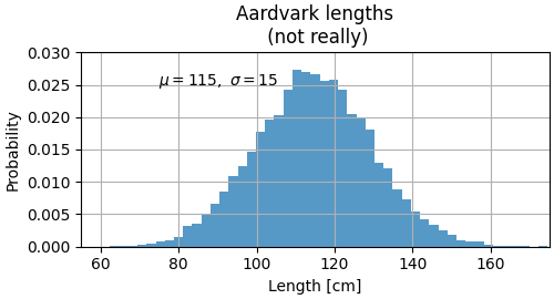
给图表添加标签
给坐标添加标签
通过set_xlabel与set_ylabel为x轴与y轴分别添加分标签;通过set_title为图标添加大标题;也可以通过text直接在图表上添加文字。
mu, sigma = 115, 15
x = mu + sigma * np.random.randn(10000)
fig, ax = plt.subplots(figsize=(5, 2.7), layout='constrained')
# the histogram of the data
n, bins, patches = ax.hist(x, 50, density=True, facecolor='C0', alpha=0.75)

ax.set_xlabel('Length [cm]')
ax.set_ylabel('Probability')
ax.set_title('Aardvark lengths\n (not really)')
ax.text(75, .025, r'$\mu=115,\ \sigma=15$')
ax.axis([55, 175, 0, 0.03])
ax.grid(True);
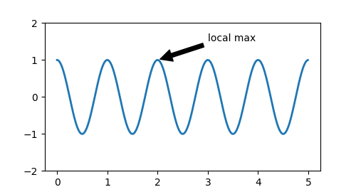
注解
我们可以添加一条由文字位置xytext,指向特定坐标xy的一条箭头,来给曲线注解。
fig, ax = plt.subplots(figsize=(5, 2.7))

t = np.arange(0.0, 5.0, 0.01)
s = np.cos(2 * np.pi * t)
line, = ax.plot(t, s, lw=2)

ax.annotate('local max', xy=(2, 1), xytext=(3, 1.5),
            arrowprops=dict(facecolor='black', shrink=0.05))

ax.set_ylim(-2, 2);

 浙公网安备 33010602011771号