CSS实现文字镂空效果炫酷背景效果
CSS实现文字镂空效果炫酷背景效果
css3中的mix-blend-mode
css3中有一个mix-blend-mode的screen混合模式,可以轻松实现镂空文字效果。背景我们可以固定定位设置一个静态图片,gif动态图,视频video,svg动画等等。
代码案例
<!DOCTYPE html>
<html >
<head>
    <meta charset="UTF-8">
    <meta http-equiv="X-UA-Compatible" content="IE=edge">
    <meta name="viewport" content="width=device-width, initial-scale=1.0">
    <title>Document</title>
</head>
<style>
    body {
        margin: 0;
        padding: 0;
    }
    .test-title {
        width: 100vw;
        height: 100vh;
        background: #ffffff; /*关键加了背景色才能混合*/
        text-align: center;
        font-size: 100px;
        font-family: 'Segoe UI', Tahoma, Geneva, Verdana, sans-serif;
        font-weight: 800;
        position: absolute;
        margin: auto;
        top: 0;
        z-index: 1;
        padding-top: 20%;
        mix-blend-mode: screen; /*关键 screen混合模式*/
    }
</style>
<body>
	<!--video视频做动态炫酷背景-->
    <video style="width: 100%;" src="./testvideo.mp4" loop autoplay muted="muted">
    </video>
    <div class="test-title">
        Hello World
        Hello World
        Hello World
    </div>
</body>
</html>
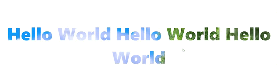
预期效果


【推荐】国内首个AI IDE,深度理解中文开发场景,立即下载体验Trae
【推荐】编程新体验,更懂你的AI,立即体验豆包MarsCode编程助手
【推荐】抖音旗下AI助手豆包,你的智能百科全书,全免费不限次数
【推荐】轻量又高性能的 SSH 工具 IShell:AI 加持,快人一步
· 无需6万激活码!GitHub神秘组织3小时极速复刻Manus,手把手教你使用OpenManus搭建本
· Manus爆火,是硬核还是营销?
· 终于写完轮子一部分:tcp代理 了,记录一下
· 别再用vector<bool>了!Google高级工程师:这可能是STL最大的设计失误
· 单元测试从入门到精通