Css3实现波浪效果3-静态波纹
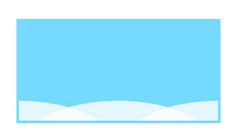
一、外框宽度等比例3个椭圆拼合
.container {
    position: absolute;
    width: 400px;
    height: 200px;
    border: 5px solid rgb(118, 218, 255);
    left: 50%;
    top: 50%;
    transform: translate(-50%, -50%);
    background-color: rgb(118, 218, 255);
    overflow: hidden;
}

.info {
    height: 100%;
    width: 100%;
    position: absolute;
    background: rgba(255, 255, 255, 0.8);
    top: 80%;
    border-radius: 55%;
    border: 0px solid red;
    left: 50%;
    transform: translate(-50%, 0);
}

.info2 {
    left: 0;
}

.info3 {
    left: 100%;

}
显示结果:
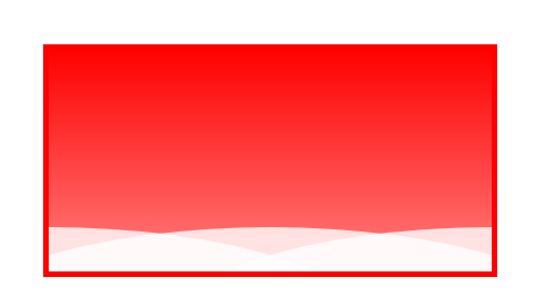
二、不等比例3个椭圆 拼合
.container {
    position: absolute;
    width: 400px;
    height: 200px;
    border: 5px solid red;
    left: 50%;
    top: 50%;
    transform: translate(-50%, -50%);
    background: linear-gradient(to bottom, rgba(255, 0, 0, 1), rgba(255, 0, 0, 0.5));
    overflow: hidden;
}

.info {
    height: 100%;
    width: 150%;
    position: absolute;
    background: rgba(255, 255, 255, 0.8);
    top: 80%;
    border-radius: 55%;
    border: 0px solid red;
    left: 50%;
    transform: translate(-50%, 0);
}

.info2 {
    left: 0px;
}

.info3 {
    left: 100%;
}
显示结果:
更多: