
HTML5实现简单圆周运动示例
一、使用JS实现圆周运动
根据指定圆心、半径,在定时器中移动固定的弧度,重绘圆圈的位置
源代码:

<!DOCTYPE html>
<html lang="en">
<head>
    <meta charset="UTF-8">
    <title>Document</title>
    <style>
    .circle{
        width:20px;
        height:20px;
        background:blue;
        border-radius:50%;
        position: absolute;
    }
    .rectangle{
        width:300px;
        height:300px;
        border:1px solid red;
        position: relative;
    }
    </style>
</head>
<body>

    <div class="rectangle">
        <div class="circle"></div>
    </div>

    <script src="../Js/jquery-1.11.3.min.js"></script>
    <script>
        (function(){
            //圆周运动js实现
            var circle=$('.circle');
            var rect=$('.rectangle');
            //获取半径和圆心
            var centerX=(rect.width()-circle.width())/2;
            var centerY=(rect.height()-circle.height())/2;
            var radius=centerX;
            //时间递进
            var times=0;
            //重绘位置
            function reset(){
                times+=1;
                var hudu=(2*Math.PI/360)*times;
                //console.info(hudu);
                var x=centerX+Math.sin(hudu)*radius;
                var y=centerY+Math.cos(hudu)*radius;

                circle.css({
                    left:x,
                    top:y
                });
                //调用自己
               requestAnimationFrame(reset);
            }
            //启动定时器
            requestAnimationFrame(reset);
        })();
    </script>
</body>
</html>
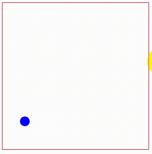
逆时针旋转效果:
二、使用CSS实现圆周运动
使用transform的rotate方法实现旋转,需要重点设置一下圆心位置
源代码:
<!DOCTYPE html>
<html lang="en">
<head>
    <meta charset="UTF-8">
    <title>Document</title>
    <style>
    @keyframes run{
        from{
          transform:rotate(0deg);
        }
        to{
           transform:rotate(360deg);
        }
    }
    .circle{
        width:20px;
        height:20px;
        background:blue;
        border-radius:50%;
        position: absolute;
        transform-origin:110px 110px;
        animation:run 5s linear infinite;
        left:40px;
        top:40px;
    }
    .rectangle{
        width:300px;
        height:300px;
        border:1px solid red;
        position: relative;
    }
    </style>
</head>
<body>
    <div class="rectangle">
        <div class="circle"></div>
    </div>
</body>
</html>
顺时针旋转效果:

更多:
分类:
HTML5示例Demo
标签:
HTML5圆周运动Demo


【推荐】国内首个AI IDE,深度理解中文开发场景,立即下载体验Trae
【推荐】编程新体验,更懂你的AI,立即体验豆包MarsCode编程助手
【推荐】抖音旗下AI助手豆包,你的智能百科全书,全免费不限次数
【推荐】轻量又高性能的 SSH 工具 IShell:AI 加持,快人一步
· AI与.NET技术实操系列:向量存储与相似性搜索在 .NET 中的实现
· 基于Microsoft.Extensions.AI核心库实现RAG应用
· Linux系列:如何用heaptrack跟踪.NET程序的非托管内存泄露
· 开发者必知的日志记录最佳实践
· SQL Server 2025 AI相关能力初探
· winform 绘制太阳,地球,月球 运作规律
· 震惊!C++程序真的从main开始吗?99%的程序员都答错了
· AI与.NET技术实操系列(五):向量存储与相似性搜索在 .NET 中的实现
· 【硬核科普】Trae如何「偷看」你的代码?零基础破解AI编程运行原理
· 超详细:普通电脑也行Windows部署deepseek R1训练数据并当服务器共享给他人