
Css3 常用布局方式 一行两列&高度自适应&垂直方向居中
一、 float+ margin 经典模式,兼容性好
原理:使用padding+margin扩大内容,使用 hidden隐藏超出部分。
注:垂直方向无法居中


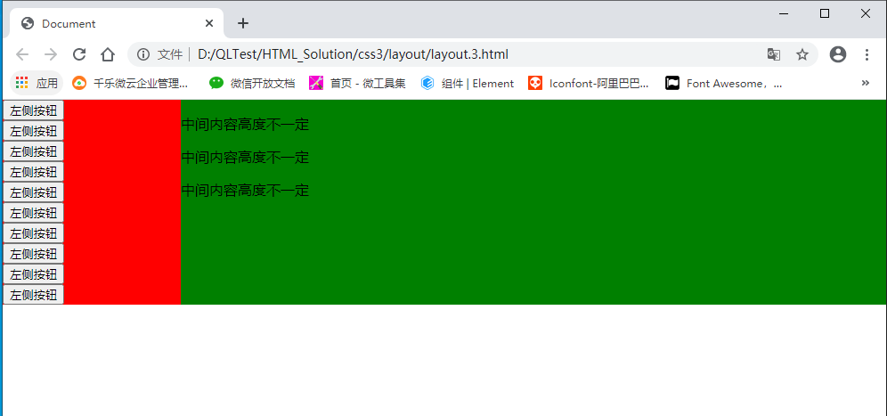
<!DOCTYPE html>
<html lang="en">

<head>
    <meta charset="UTF-8">
    <meta name="viewport" content="width=device-width, initial-scale=1.0">
    <title>Document</title>
    <style>
        html,
        body {
            padding: 0px;
            margin: 0px;
            width: 100%;
            height: 100%;
        }

        .wrap {
            /* width: 100%;
            height: 100%; */
            overflow: hidden;
        }

        .row {
            margin-bottom: -10000px;
            padding-bottom: 10000px;
            /*内外补丁是关键*/
        }

        .left {
            width: 200px;
            background: red;
            float: left;
        }

        .center {
            background: green;
            overflow: hidden;
        }

        .clear {
            clear: both;
        }

        button {
            display: block;
        }
    </style>
</head>

<body>

    <div class="wrap">
        <div class="left row">
            <button>左侧按钮</button>
            <button>左侧按钮</button>
            <button>左侧按钮</button>
            <button>左侧按钮</button>
            <button>左侧按钮</button>
            <button>左侧按钮</button>
            <button>左侧按钮</button>
            <button>左侧按钮</button>
            <button>左侧按钮</button>
            <button>左侧按钮</button>
        </div>
        <div class="center row">
            <P>中间内容高度不一定</P>
            <P>中间内容高度不一定</P>
            <P>中间内容高度不一定</P>
        </div>
        <div class="clear"></div>
    </div>

</body>

</html>
显示效果:
二、table | table class 方式
1.table 布局
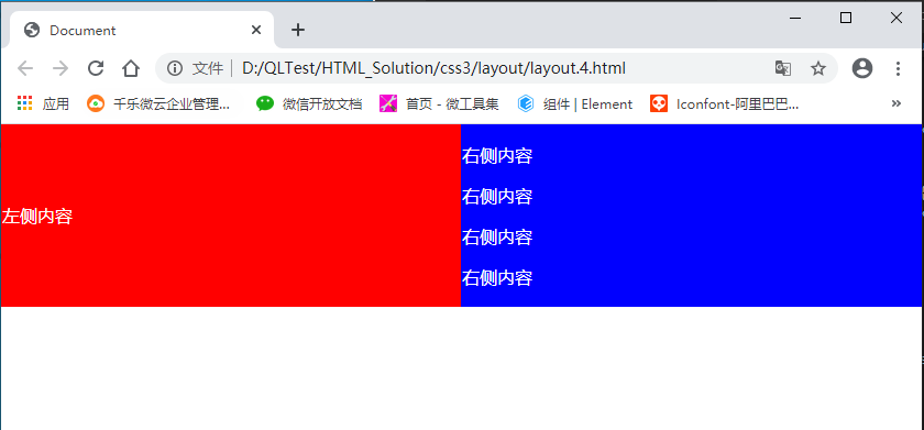
<!DOCTYPE html>
<html lang="en">

<head>
    <meta charset="UTF-8">
    <meta name="viewport" content="width=device-width, initial-scale=1.0">
    <title>Document</title>
    <style>
        html,
        body {
            padding: 0px;
            margin: 0px;
            width: 100%;
            height: 100%;
        }

        .table {
            width: 100%;
            /*  height: 100%; */
            border-collapse: collapse;
            color: white;
        }

        .left {
            background: red;
        }

        .right {
            background: blue;
        }
    </style>
</head>

<body>

    <table class="table" border="0">
        <tr>
            <td class="left">
                左侧内容
            </td>
            <td class="right">
                <p>右侧内容</p>
                <p>右侧内容</p>
                <p>右侧内容</p>
                <p>右侧内容</p>
            </td>
        </tr>
    </table>
</body>

</html>
2. table class 布局 (推荐)
<!DOCTYPE html>
<html lang="en">

<head>
    <meta charset="UTF-8">
    <meta name="viewport" content="width=device-width, initial-scale=1.0">
    <title>Document</title>
    <style>
        html,
        body {
            padding: 0px;
            margin: 0px;
            width: 100%;
            height: 100%;
        }

        .table {
            width: 100%;
             /* height: 100%; */
            border-collapse: collapse;
            color: white;
            display: table;
        }

        .table .row {
            display: table-row;
        }

        .table .col {
            display: table-cell;
        }

        .left {
            background: red;
            vertical-align: middle;
            text-align: center;
        }

        .center {
            background: blue;
        }
    </style>
</head>

<body>

    <div class="table">
        <div class="row">
            <div class="col left">
                左侧内容
            </div>
            <div class="col center">
                <p>中间内容高度不固定</p>
                <p>中间内容高度不固定</p>
                <p>中间内容高度不固定</p>
            </div>
        </div>
    </div>
</body>

</html>
三、flex 布局 (推荐)
代码量最少,不考虑兼容情况下,推荐使用
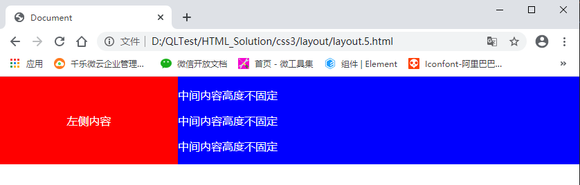
<!DOCTYPE html>
<html lang="en">

<head>
    <meta charset="UTF-8">
    <meta name="viewport" content="width=device-width, initial-scale=1.0">
    <title>Document</title>
    <style>
        html,
        body {
            padding: 0px;
            margin: 0px;
            width: 100%;
            height: 100%;
        }

        .flex {
            display: flex;
            width: 100%;
            /* height: 100%; */
            color: white;
        }

        .left {
            background: red;
            width: 200px;
        }

        .center {
            background: blue;
            width: 100%;
        }
    </style>
</head>

<body>

    <div class="flex">
        <div class="left">
            左侧内容
        </div>
        <div class="center flex-item">
            <p>中间内容高度不固定</p>
            <p>中间内容高度不固定</p>
            <p>中间内容高度不固定</p>
            <p>中间内容高度不固定</p>

        </div>
    </div>
</body>

</html>
显示效果:
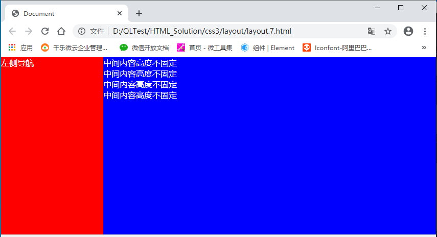
四、absolute 、fixed + scroll 定位 (推荐)
此方式主要针对页面整体布局,常用方式
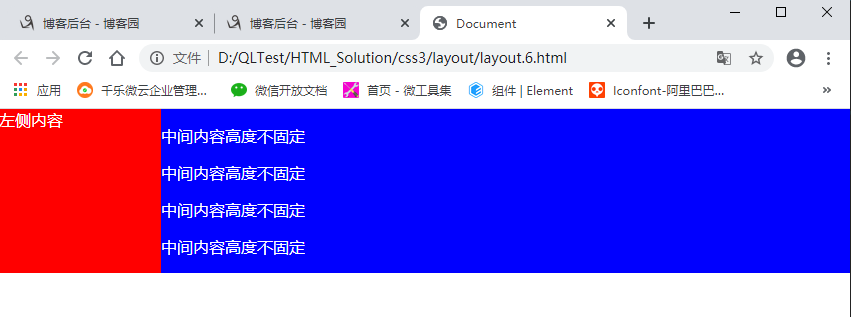
<!DOCTYPE html>
<html lang="en">

<head>
    <meta charset="UTF-8">
    <meta name="viewport" content="width=device-width, initial-scale=1.0">
    <title>Document</title>
    <style>
        body,
        html {
            padding: 0px;
            margin: 0px;
            width: 100%;
            height: 100%;

        }

        .wrap {
            color: white;
            width: 100%;
            height: 100%;
        }

        .left {
            width: 200px;
            height: 100%;
            display: fixed;
            background: red;
            left: 0px;
            top: 0px;
            float: left;
        }

        .center {
            background: blue;
            margin-left: 200px;
            height: 100%;
        }
    </style>
</head>

<body>
    <div class="wrap">
        <div class="left">
            左侧导航
        </div>
        <div class="center">
            中间内容高度不固定<br>
            中间内容高度不固定<br>
            中间内容高度不固定<br>
            中间内容高度不固定<br>
        </div>
    </div>
</body>

</html>
更多:
分类:
CSS


【推荐】国内首个AI IDE,深度理解中文开发场景,立即下载体验Trae
【推荐】编程新体验,更懂你的AI,立即体验豆包MarsCode编程助手
【推荐】抖音旗下AI助手豆包,你的智能百科全书,全免费不限次数
【推荐】轻量又高性能的 SSH 工具 IShell:AI 加持,快人一步
· AI与.NET技术实操系列:向量存储与相似性搜索在 .NET 中的实现
· 基于Microsoft.Extensions.AI核心库实现RAG应用
· Linux系列:如何用heaptrack跟踪.NET程序的非托管内存泄露
· 开发者必知的日志记录最佳实践
· SQL Server 2025 AI相关能力初探
· winform 绘制太阳,地球,月球 运作规律
· 震惊!C++程序真的从main开始吗?99%的程序员都答错了
· AI与.NET技术实操系列(五):向量存储与相似性搜索在 .NET 中的实现
· 【硬核科普】Trae如何「偷看」你的代码?零基础破解AI编程运行原理
· 超详细:普通电脑也行Windows部署deepseek R1训练数据并当服务器共享给他人
2017-10-31 Asp.Net Core获取请求信息/获取请求地址
2016-10-31 C#使用Process类调用外部程序(转)