
Css3 实现锯齿效果整理
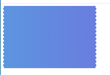
一、Css3 实现锯齿效果 优惠券锯齿效果

<!DOCTYPE html>
<html lang="en">

<head>
    <meta charset="UTF-8">
    <meta name="viewport" content="width=device-width, initial-scale=1.0">
    <meta http-equiv="X-UA-Compatible" content="ie=edge">
    <title>Document</title>
</head>


<style>
    .dotted {
        position: relative;
        background: linear-gradient(to right, #5d95e0, #697dde);
        width: 300px;
        height: 200px;
    }

    .dotted:before {
        content: ' ';
        width: 0;
        height: 100%;
        position: absolute;
        /* 小球形状 */
        border-right: 6px dotted white;
        left: -3px;
        top: 0px;
    }
    .dotted::after {
        content: ' ';
        width: 0;
        height: 100%;
        position: absolute;
        /* 小球形状 */
        border-right: 6px dotted white;
        right: -3px;
        top: 0px;
    }
</style>

<body>
    <div class="dotted"></div>
</body>

</html>
二、Css3 实现锯齿效果 半圆锯齿效果
<!DOCTYPE html>
<html lang="en">

<head>
    <meta charset="UTF-8">
    <meta name="viewport" content="width=device-width, initial-scale=1.0">
    <title>Document</title>
    <style>
        .toothbg {
            width: 100%;
            height: 50px;
            margin: 100px 0px;
            background: white;
            background-image: radial-gradient(15px at 25px 25px, transparent, transparent, transparent, transparent, green);
            background-size: 50px 50px;
            background-repeat: repeat-x;
            background-position: 0px 0px;
        }
    </style>
</head>

<body>
    <div class="toothbg"></div>
</body>

</html>

修改一下高度
        .toothbg {
            width: 100%;
            height: 25px;
            margin: 100px 0px;
            background: white;
            background-image: radial-gradient(15px at 25px 25px, transparent, transparent, transparent, transparent, green);
            background-size: 50px 50px;
            background-repeat: repeat-x;
            background-position: 0px 0px;
        }

更多:
分类:
CSS3
标签:
Css3 实现锯齿效果整理


【推荐】国内首个AI IDE,深度理解中文开发场景,立即下载体验Trae
【推荐】编程新体验,更懂你的AI,立即体验豆包MarsCode编程助手
【推荐】抖音旗下AI助手豆包,你的智能百科全书,全免费不限次数
【推荐】轻量又高性能的 SSH 工具 IShell:AI 加持,快人一步
· AI与.NET技术实操系列:向量存储与相似性搜索在 .NET 中的实现
· 基于Microsoft.Extensions.AI核心库实现RAG应用
· Linux系列:如何用heaptrack跟踪.NET程序的非托管内存泄露
· 开发者必知的日志记录最佳实践
· SQL Server 2025 AI相关能力初探
· winform 绘制太阳,地球,月球 运作规律
· 震惊!C++程序真的从main开始吗?99%的程序员都答错了
· AI与.NET技术实操系列(五):向量存储与相似性搜索在 .NET 中的实现
· 【硬核科普】Trae如何「偷看」你的代码?零基础破解AI编程运行原理
· 超详细:普通电脑也行Windows部署deepseek R1训练数据并当服务器共享给他人
2019-10-23 asp.net core session使用