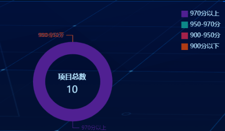
echarts饼图数据为0时隐藏数据指示线
echarts饼图当数据为0时候数据和指示线会叠在一起
方法一(暂时没想到好办法)
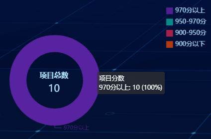
如果value是0就给null
tooltip: {
                    trigger: 'item',
                    formatter: '{a} <br/>{b}: {c} ({d}%)'
                },
                legend: {
                    orient: 'vertical',
                    icon: "rect",
                    top: -5,
                    right: 0,
                    itemWidth: 15,
                    itemHeight: 15,
                    textStyle: {
                        color: '#B4E4FF',
                        fontSize: 14
                    },
                    data: _result.legend.data
                },
                color : [ '#502092', '#0d8888', '#a4224a', '#af3b14' ],
                graphic: {
                    type: 'text',
                    style: {
                        textAlign: 'center',
                        fill: 'rgb(149,162,255)',
                        width: 30,
                        height: 30,
                    }
                },
                series: [
                    {
                        name: '项目分数',
                        type: 'pie',
                        radius: ['45%', '65%'],
                        center: ['50%', '58%'],
                        avoidLabelOverlap: false,
                        labelLine: {
                            show: true
                        },
                        //判断赋值
                        data: [
                            {value: arrVal[0] == 0 ? null:arrVal[0], name: arrName[0]},
                            {value: arrVal[1] == 0 ? null:arrVal[1], name: arrName[1]},
                            {value: arrVal[2] == 0 ? null:arrVal[2], name: arrName[2]},
                            {value: arrVal[3] == 0 ? null:arrVal[3], name: arrName[3]},
                        ]
                    },
                ]

 浙公网安备 33010602011771号