

vue-封装组件-超出部分限制...,并且提示
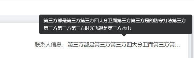
显示效果
代码:
<template>
        <div class="tip">
            <el-tooltip :content="content" placement="top" width="400" :disabled="!isShowTooltip">
                <span class="member-label member-span text-hidden" @mouseenter="visibilityChange($event)">{{ props.content }}</span>
            </el-tooltip>
        </div>
</template>
<script setup lang="ts" name="textEllipsis">
import { defineProps, ref } from 'vue';
const props = defineProps({
    content: String,
});
const isShowTooltip = ref(false);
const visibilityChange = (event: any) => {
    const ev = event.target;
    const ev_weight = ev.scrollWidth; // 文本的实际宽度   scrollWidth:对象的实际内容的宽度,不包边线宽度,会随对象中内容超过可视区后而变大。
    const content_weight = ev.clientWidth; // 文本的可视宽度 clientWidth:对象内容的可视区的宽度,不包滚动条等边线,会随对象显示大小的变化而改变。
    // const content_weight = this.$refs.tlp.$el.parentNode.clientWidth; // 文本容器宽度(父节点)
    if (ev_weight > content_weight) {
        // 实际宽度 > 可视宽度  文字溢出
        isShowTooltip.value = true;
    } else {
        // 否则为不溢出
        isShowTooltip.value = false;
    }
};
</script>
<style scoped lang="scss">
.tip {
    width: 100%;
    .text-hidden {
        display: inline-block;
        width: 100%;
        overflow: hidden;
        white-space: nowrap;
        text-overflow: ellipsis;
    }
    :deep(.el-tooltip__popper) {
        max-width: 100px;
    }
}
</style>
<style lang="scss">
.el-popper {
    max-width: 400px !important;
}
</style>

 浙公网安备 33010602011771号