点击爱心功能
点击爱心功能
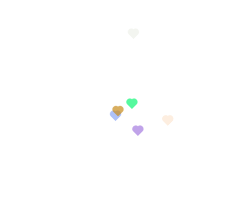
上面是要实现的效果,点击屏幕任何地方都会显示爱心并且上移后消失,接下来开始代码实现。
    // 调用函数实现效果
    let body = document.getElementsByTagName('html')[0]
    body.addEventListener('click', function(el) {
      createElementLove(el.x, el.y)
    })

    //创建节点和样式
    function setLover(x, y , color) {
      const span = document.createElement('div')
      const left = document.createElement('div')
      const right = document.createElement('div')
      //设置样式
      const SpanStyle = {
        transform: "rotate(-45deg)",
        backgroundColor: color,
        fontSize: "20px",
        pointerEvents: "none",
        left: x + "px",
        opacity: 1,
        display: "block",
        top: y + "px",
        width: "11px",
        height: "11px",
        position: "fixed",
      }
      const leftStyle = {
        position: "absolute",
        top: "-5px",
        left: 0,
        width: "11px",
        height: "11px",
        borderRadius: "50%",
        backgroundColor: color,
      }
      const rightStyle = {
        position: "absolute",
        top: "0px",
        left: "5px",
        width: "11px",
        height: "11px",
        borderRadius: "50%",
        backgroundColor: color,
      }
      //使用assing分配样式
      Object.assign(span.style, SpanStyle)
      Object.assign(left.style, leftStyle)
      Object.assign(right.style, rightStyle)
      //添加节点
      span.appendChild(left)
      span.appendChild(right)

      return span
    }

    //将节点添加到body中
    function createElementLove(x, y) {
      const color = getRandomCol();
      const span = setLover(x, y, color)
      body.appendChild(span)
      span.classList.add('active')
      setTimeout(() => {
        body.removeChild(span)
      }, 2000)
    }

    //随机设置颜色
    function getRandomCol() {
      const r = Math.floor(Math.random() * 256)
      const g = Math.floor(Math.random() * 256)
      const b = Math.floor(Math.random() * 256)
      const color =  '#' + r.toString(16) + g.toString(16) + b.toString(16)
      return color
    }

   //css动画
   .active {
      transition: all 1s;
      animation: love 1.5s ease-out forwards;
    }
    @keyframes love {
      100% {
        transform: translateY(-150px) rotate(-45deg);
        opacity: 0;
      }
    }
行百里者半九十