

echarts 折线图当xAxis.type='value'的时候,多条折线的显示问题
公司的折线图最开始的时候X轴的类型是'category'类型,这样做的话当数据量很大的时候,x轴上面的刻度值就会非常密集,虽然可以通过设置xAxis.axisLabel.interval来显示x轴刻度值间隔,但是这个是固定死的,不灵活。(axisLabel只有是'category'的时候才会生效)。
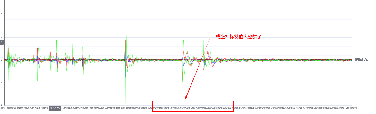
后来查看官方文档,发现折线图中xAxis.type='value'的时候,可以解决这个问题。但是当我只是修改type为'value'后,画出来的图时乱的。
继续查找资料。发现是因为维度映射的问题。
我的原始数据格式是: [[时刻0的x轴值, 折线1的y值,折线2的y值,折线3的y值,折线4的y值],[[时刻1的x轴值, 折线1的y值,折线2的y值,折线3的y值,折线4的y值],....]
原来的option设置是这样的,data就是原始数据源:
点击查看代码
myChart.setOption({
          legend: {
            right: '10%',   // 位置离右边10%
            top: 20,         // 上面距离20px
          },
          color: ['#ff0000', '#3030ff', '#00ff00', '#780000', '#660066', '#ff6699', '#ff9900', ' #8a00e6'],  // 为了让legend的颜色和折线的颜色相对应
          tooltip: {			//提示框
            trigger: 'axis',		//触发源,在提示框中显示坐标轴的值
            axisPointer: {			//设置那条垂直于x轴的标识线
              animation: false,		//关闭动画
              type: 'cross',			//光标是十字形的, 映射到x、y轴上的线会有高亮显示
              lineStyle: {				//设置标识线的类型
                type: 'dashed',			//标识虚线,没有type则是默认的solid
              }
            },
          },
          xAxis: [{
            type: 'value',
            minorTick: {
              show: true
            },
            minorSplitLine: {
              show: true
            },
            axisLine: {
              show: true  // 坐标轴轴线显示
            },
            name: '时间 /s',				// 坐标轴单位名称设置
            nameLocation: 'end',		// 坐标轴名称的位置
            boundaryGap: false,
            nameTextStyle: {
              fontWeight: 'bold',
              fontSize: 16,
            },

            axisLabel: {
              interval: 1000,    // x坐标标签间距,没1000个显示出来,因为x坐标轴是时间轴,时间点非常多,没有必要一个个都显示出来,几遍是默认的auto显示也不好看,调试1000合适
              showMinLabel: true,
              showMaxLabel: true
            },
          }],
          yAxis: {
            name: '幅度' + "(" + monitorData.portDatas[0].showUnit + ")",
            nameTextStyle: {
              fontWeight: 'bold',
              fontSize: 16,
            },
            minorTick: {
              show: true  // 坐标轴刻度线显示
            },
            minorSplitLine: {
              show: true
            },
            axisLine: {
              show: true  // 坐标轴轴线显示
            }
          },
          //数据缩放
          dataZoom: [{
            type: 'inside',
          }, {
            type: 'inside'  //可以通过鼠标滚轮,鼠标拖拽进行缩放
          }],

          dataset: {
            source: data
          },
          series: function () {
            let series = [];
            let names = ['通道1', '通道2', '通道3', '通道4', '通道5', '通道6', '通道7', '通道8',]
            for (let i = 0; i < monitorData.chanNum; i++) {
              series.push({
                name: names[i],
                type: 'line',
                smoothMonotone: 'x',
                showSymbol: false,			//不显示数据圆点(针对category类型数据),只有在鼠标移入时才显示,减少渲染时间
                animation: false,			//关闭动画效果,减少渲染时间
                lineStyle: {
                  width: 0.6    // 设置线宽
                },
                sampling: 'lttb'    // 数据量远大于像素点时,进行采样显示,降低卡顿。采用 Largest-Triangle-Three-Bucket 算法,可以最大程度保证采样后线条的趋势,形状和极值。
              })
            }
            return series;
          }()
        })
修改类型为'value'后,只有通道1的数据是对的,通道一的x值是第一列,第二列为通道一对应的y值,二通道二的y值是第三列,但对应的x坐标值是第二列,后面依次类推。显然这种显示时错误的。
正确的做法还需要在series里面添加encode,来指定哪个是x轴的值哪个是y轴上面的值。如:
点击查看代码
// 把第四列设为X轴,第二列设为Y轴
series:{
	encode:{x:3,y:1},
	...
}

// 把第四行设为X轴,第二行设为Y轴
series:{
 encode:{x:3,y:1},
 seriesLayoutBy:'row',
 ...
}
修改后的options设置:
点击查看代码
 myChart.setOption({
          legend: {           // 图例
            right: '45%',     // 位置
            bottom: 0,        //
            itemWidth: 25,
            itemHeight: 15,
            textStyle: {
              fontSize: 16
            }
          },
          color: ['#ff0000', '#3030ff', '#00ff00', '#780000', '#660066', '#ff6699', '#ff9900', '#8a00e6'],  // 为了让legend的颜色和折线的颜色相对应
          tooltip: {			      //提示框
            trigger: 'axis',		//触发源,在提示框中显示坐标轴的值
            axisPointer: {			//设置那条垂直于x轴的标识线
              animation: false,		// 关闭动画
              type: 'cross',			// 光标是十字形的, 映射到x、y轴上的线会有高亮显示
              lineStyle: {				// 设置标识线的类型
                type: 'dashed',		// 标识虚线,没有type则是默认的solid
              }
            },
          },
          toolbox: {
            show: true,
            itemSize: 20,
            orient: 'vertical',     // 垂直显示
            top: '8%',
            right: '6%',
            itemGap: 10,            // 组件之间的间距

            emphasis: {     // 当鼠标hover到图例上面时文字的设置
             iconStyle: {
               textPosition: 'right',
               textPadding: 10,
               borderWidth: 2,
               borderColor: 'rgba(28, 71, 198, 0.96)'
             }
            },
            feature: {
              dataZoom: {
                yAxisIndex: "none"
              },
              restore: {},      // 图形还原功能
              saveAsImage: {}   // 保存图片
            }
          },
          xAxis: {
            type: 'value',
            minorTick: {
              show: true
            },
            minorSplitLine: {
              show: true
            },
            axisLine: {
              show: true  // 坐标轴轴线显示
            },
            name: '时间 /s',				  // 坐标轴单位名称设置
            nameLocation: 'end',		// 坐标轴名称的位置
            boundaryGap: false,
            nameTextStyle: {
              fontWeight: 'bold',
              fontSize: 16,
            }
            // axisLabel: {         // 针对的是type为category的类型。这里将type改为value,就不需要使用了
            //   interval: 1000,    // x坐标标签间距,没1000个显示出来,因为x坐标轴是时间轴,时间点非常多,没有必要一个个都显示出来,几遍是默认的auto显示也不好看,调试1000合适
            //   showMinLabel: true,
            //   showMaxLabel: true
            // },
          },
          yAxis: {
            type: 'value',
            name: '幅度' + "(" + monitorData.portDatas[0].showUnit + ")",
            nameTextStyle: {
              fontWeight: 'bold',
              fontSize: 16,
            },
            minorTick: {
              show: true  // 坐标轴刻度线显示
            },
            minorSplitLine: {
              show: true
            },
            axisLine: {
              show: true  // 坐标轴轴线显示
            }
          },
          //数据缩放
          dataZoom: [{
            type: 'inside',
          }, {
            type: 'inside'  //可以通过鼠标滚轮,鼠标拖拽进行缩放
          }],

          dataset: {
            source: data
          },
          series: function () {
            let series = [];
            let names = ['通道1', '通道2', '通道3', '通道4', '通道5', '通道6', '通道7', '通道8',]
            // 数据处理
            for (let i = 0; i < monitorData.chanNum; i++) {
              series.push({
                name: names[i],
                type: 'line',
                encode: {
                  x: 0,       // 第一列的值为x轴
                  y: i + 1    // 第二列的值为y轴
                },
                smoothMonotone: 'x',
                showSymbol: false,			  //不显示数据圆点,只有在鼠标移入时才显示,减少渲染时间
                animation: false,			  //关闭动画效果,减少渲染时间
                lineStyle: {
                  width: 0.7    // 设置线宽
                },
                sampling: 'lttb'    // 数据量远大于像素点时,进行采样显示,降低卡顿。采用 Largest-Triangle-Three-Bucket 算法,可以最大程度保证采样后线条的趋势,形状和极值。
              })
            }
            return series;
          }()
        })
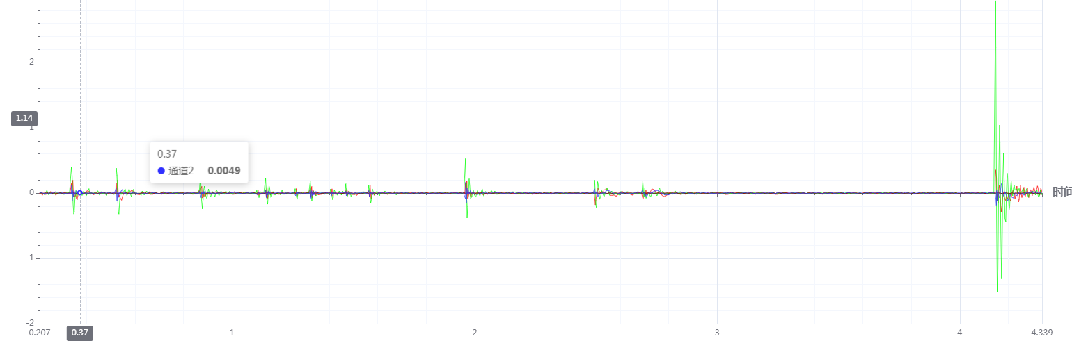
修改后的折线图显示,横坐标刻度就清爽很多了
分类:
echarts


【推荐】国内首个AI IDE,深度理解中文开发场景,立即下载体验Trae
【推荐】编程新体验,更懂你的AI,立即体验豆包MarsCode编程助手
【推荐】抖音旗下AI助手豆包,你的智能百科全书,全免费不限次数
【推荐】轻量又高性能的 SSH 工具 IShell:AI 加持,快人一步
· 开源Multi-agent AI智能体框架aevatar.ai,欢迎大家贡献代码
· Manus重磅发布:全球首款通用AI代理技术深度解析与实战指南
· 被坑几百块钱后,我竟然真的恢复了删除的微信聊天记录!
· 没有Manus邀请码?试试免邀请码的MGX或者开源的OpenManus吧
· 园子的第一款AI主题卫衣上架——"HELLO! HOW CAN I ASSIST YOU TODAY