(6.3)网格布局 grid
grid-template-column 和 grid-template-rows
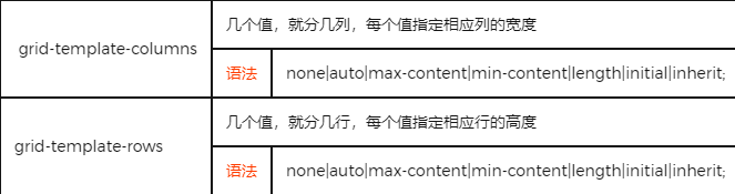
这2个属性都支持 [],它们代表给列/行之间的线的命名。
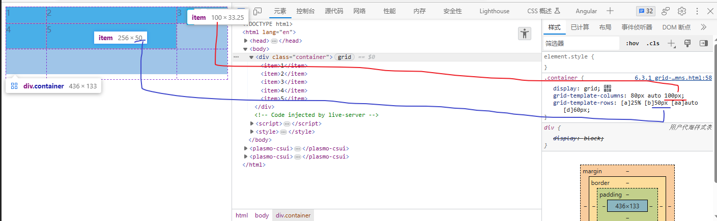
<body>
    <div class="container">
        <item>1</item>
        <item>2</item>
        <item>3</item>
        <item>4</item>
        <item>5</item>
    </div>
</body>
</html>
<style>
    .container {
    display: grid;
    grid-template-columns: 80px auto 100px;
    grid-template-rows: [1] 25% [2] 50px [3] auto [4] 60px [5];
}

item {
    background-color: deepskyblue;
    border: 1px salmon solid;
}
</style>
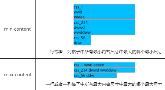
min-content
一排或者一列格子中所有最小内容尺寸中最大的哪个最小尺寸
网格布局专用单位fr
快速复习 grid
基本操作
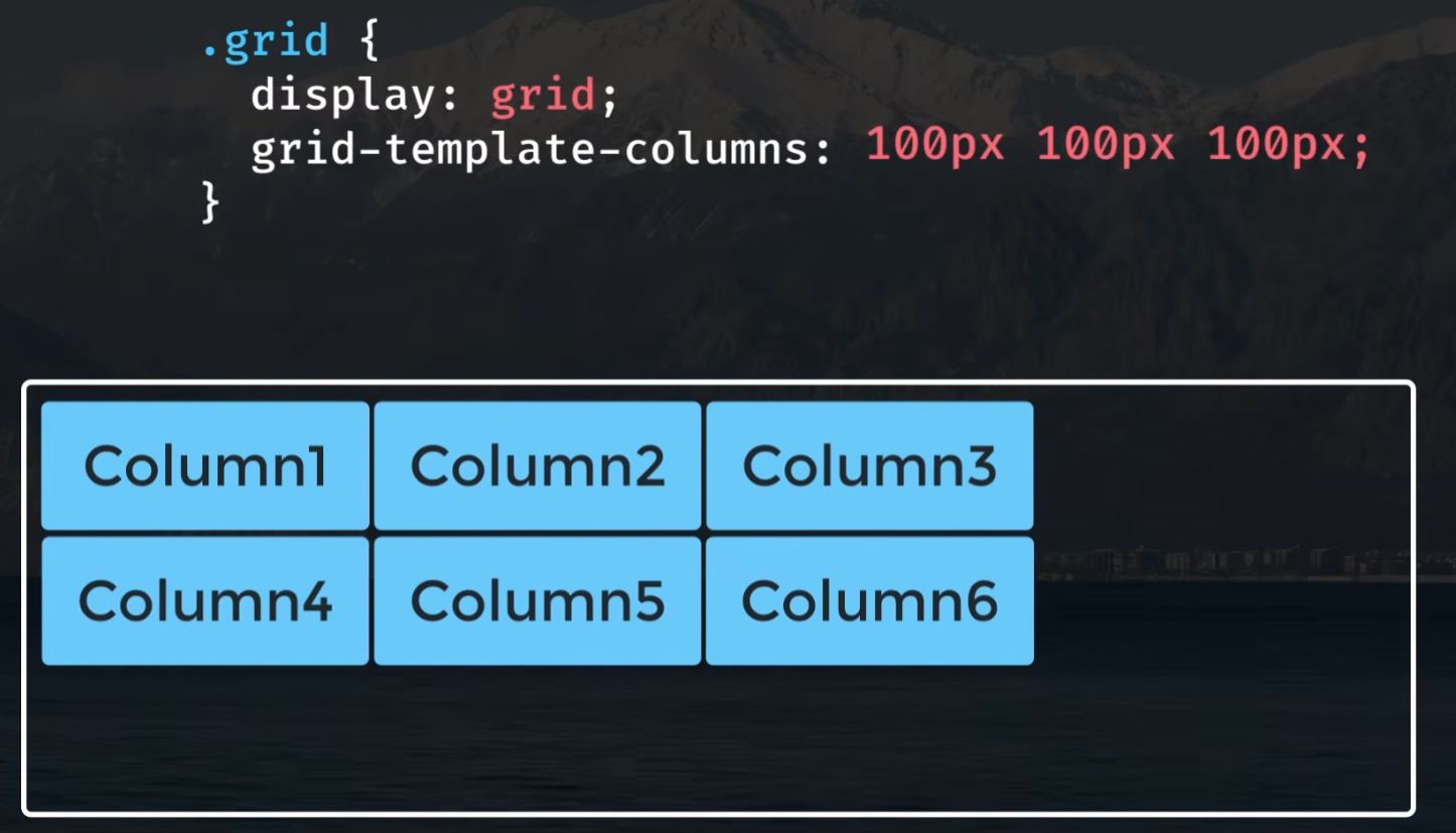
1 指定3列,每列宽度100px
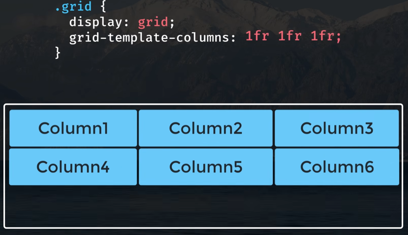
2 浮动宽度,(fr 剩余空间的比例)
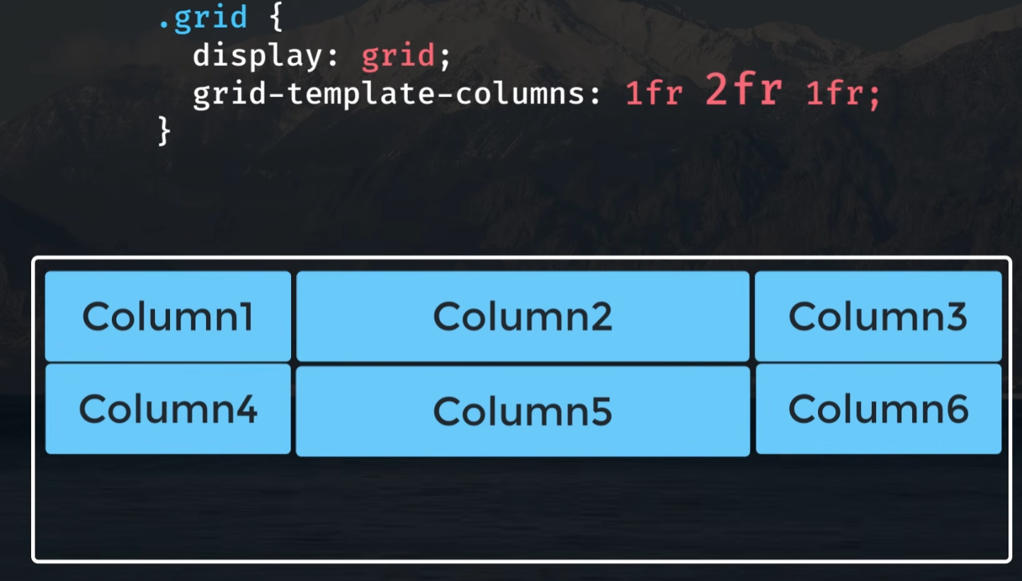
3 第2个参数改为 2fr, 占据 1/2 的空间
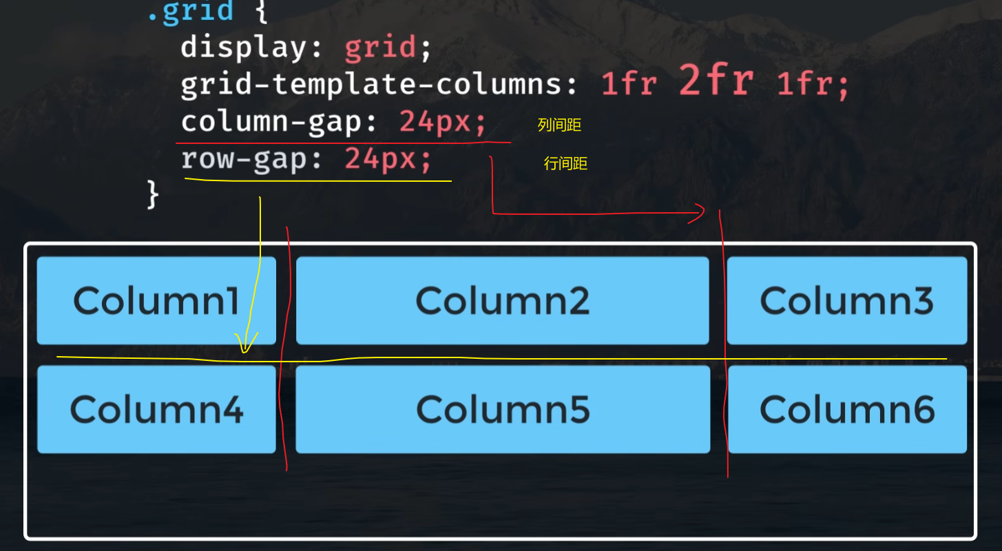
4 column-gap/row-gap 列/行间距
或者这里可以 gap: 24px 统一设置。
排列元素
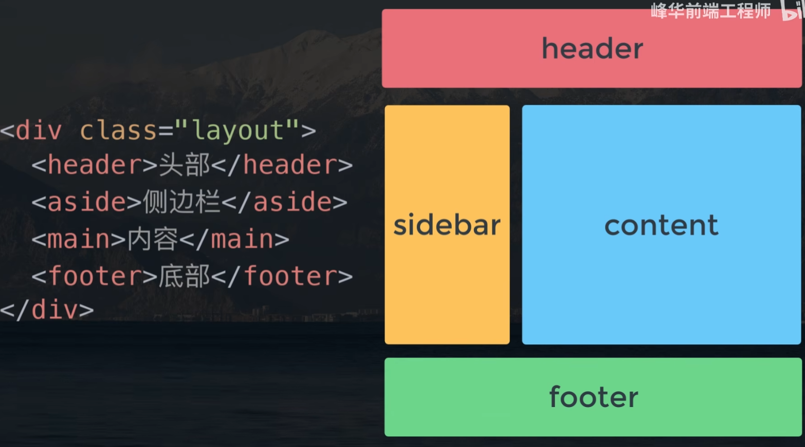
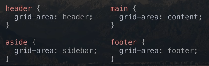
5 grid-template-areas

给元素设置各个的区域
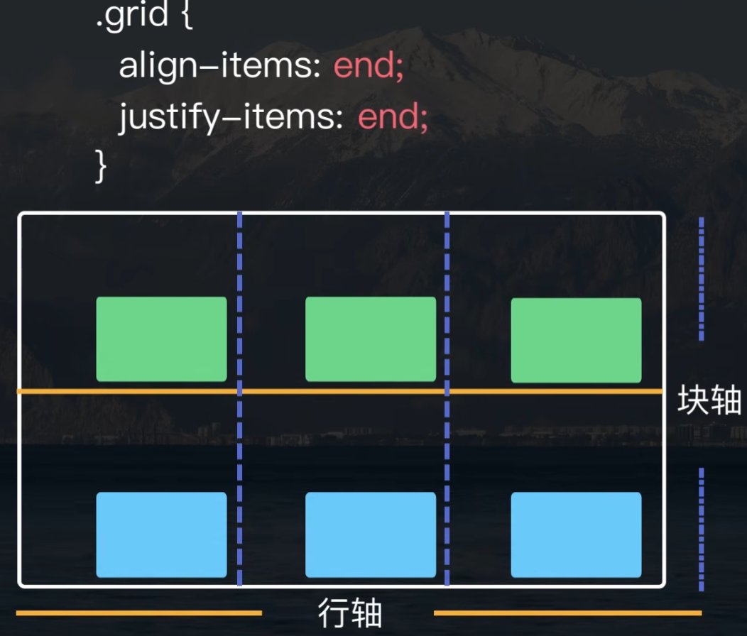
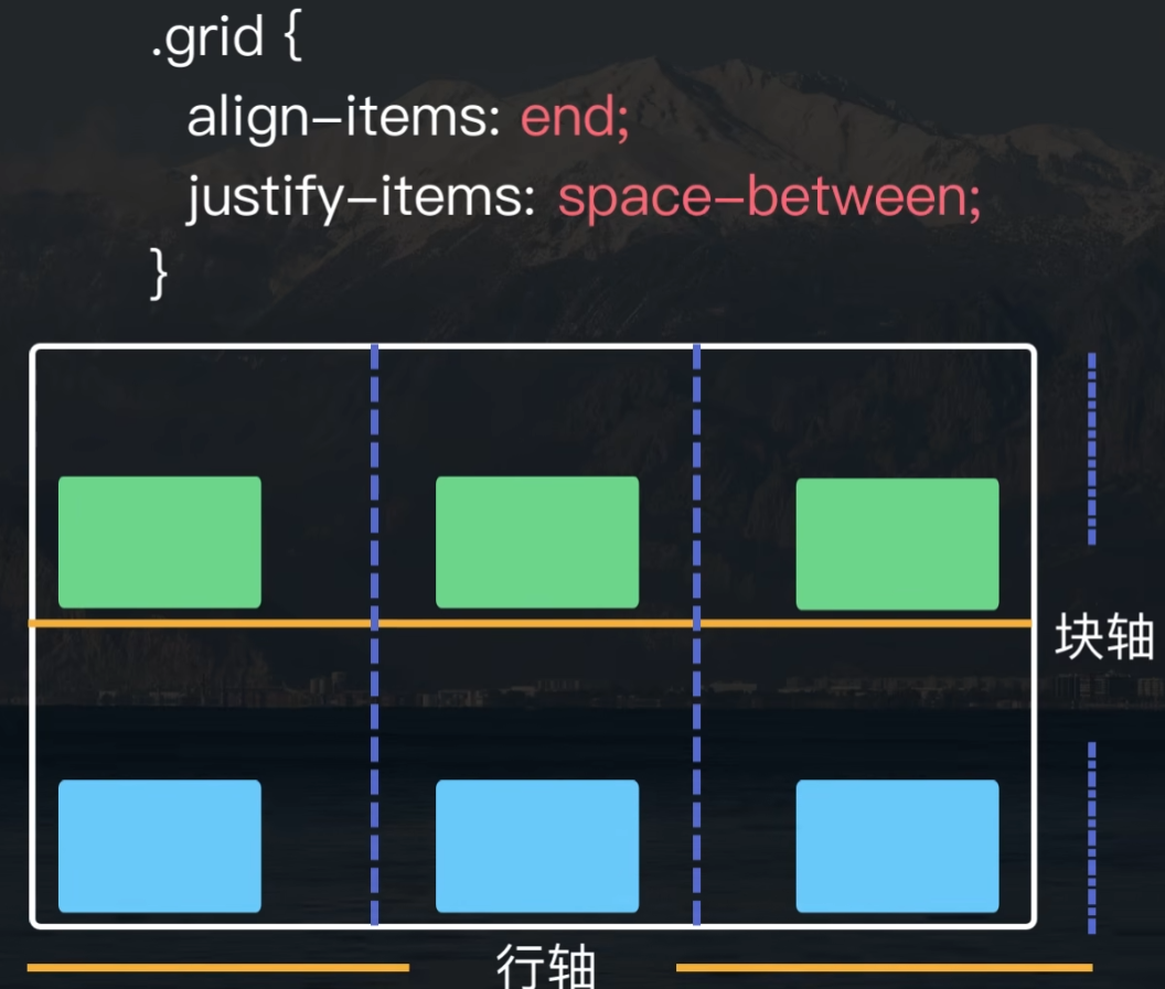
6 对齐:垂直方向 align-items
这里 center 居中,end 向下。
对齐:水平方向 justify-items
居中对齐 justify-items: center
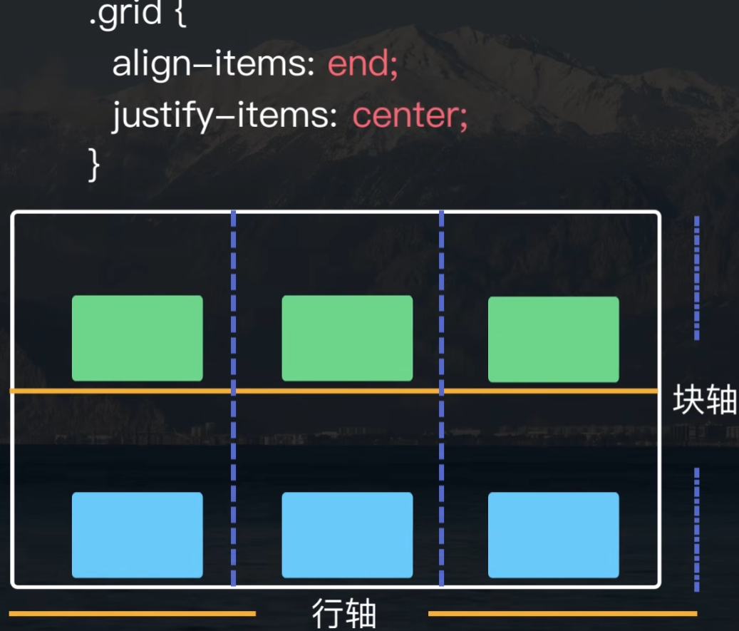
水平方向靠右对齐 justify-items: end
水平方向两端对齐 justify-items: space-between
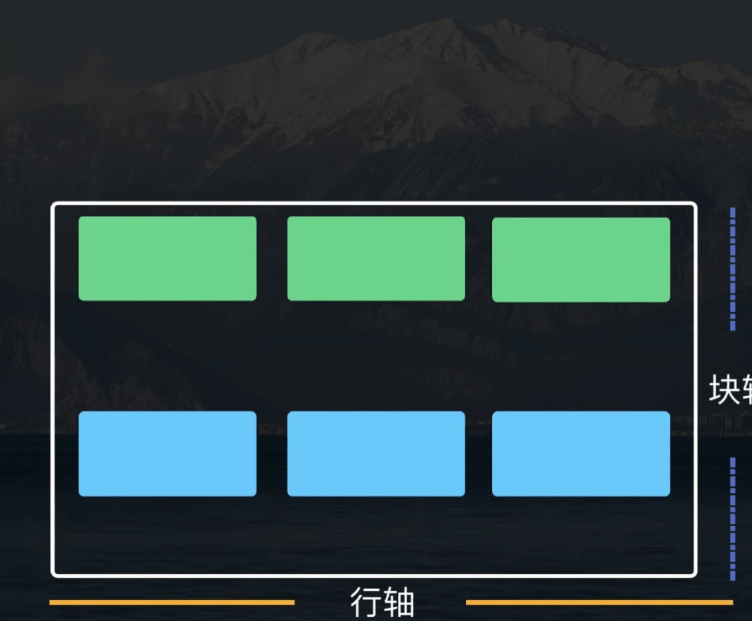
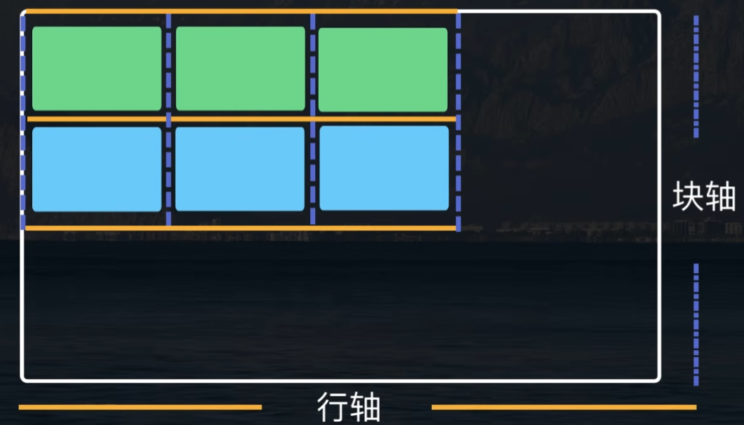
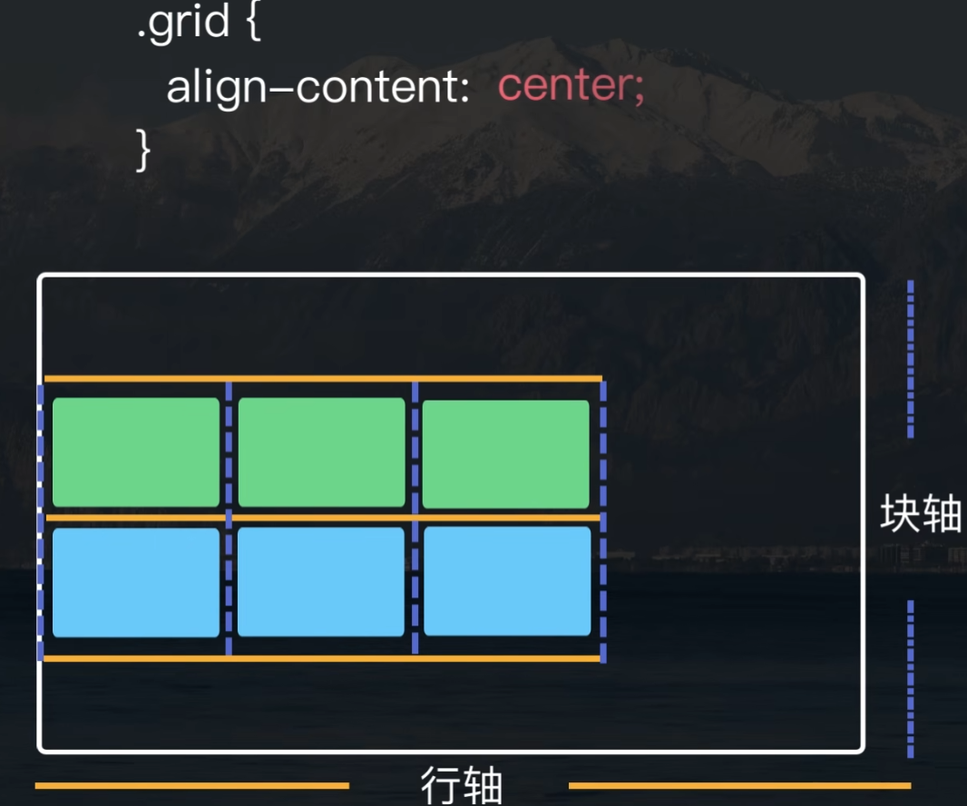
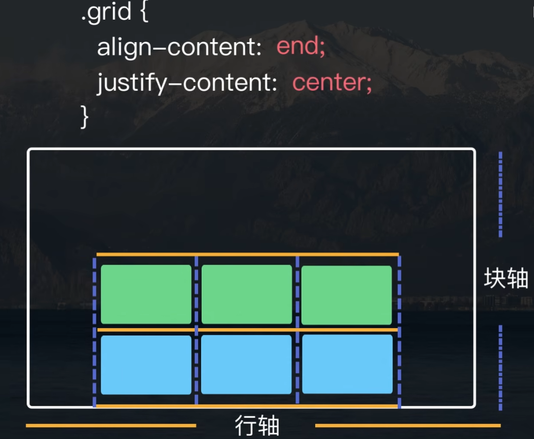
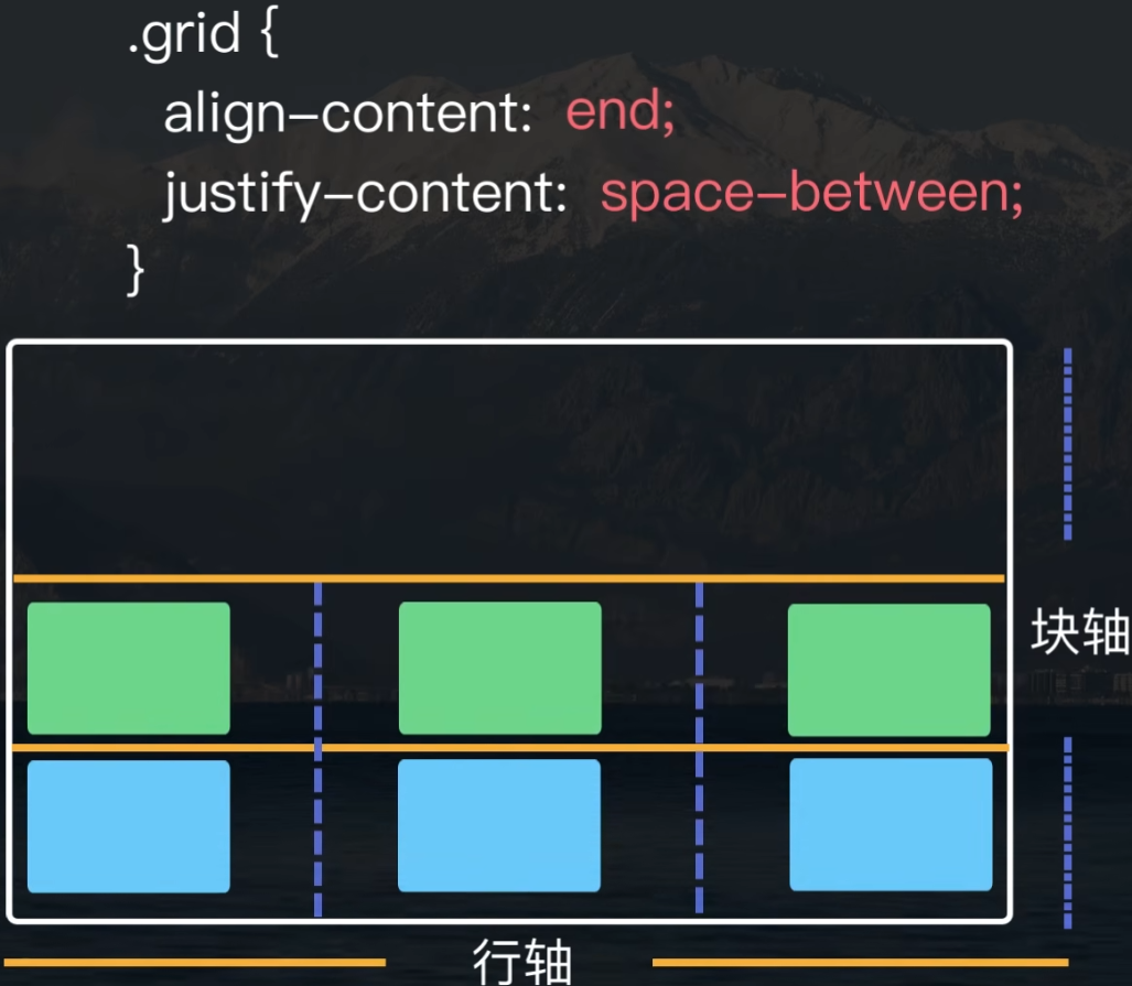
7 行轴和列轴小于 grid 容器
垂直方向:居中对齐 aligin-content
水平方向:居中 justify-content: center
水平方法:两端对齐 justify-content: space-between

 浙公网安备 33010602011771号