CSS3 - flexbox
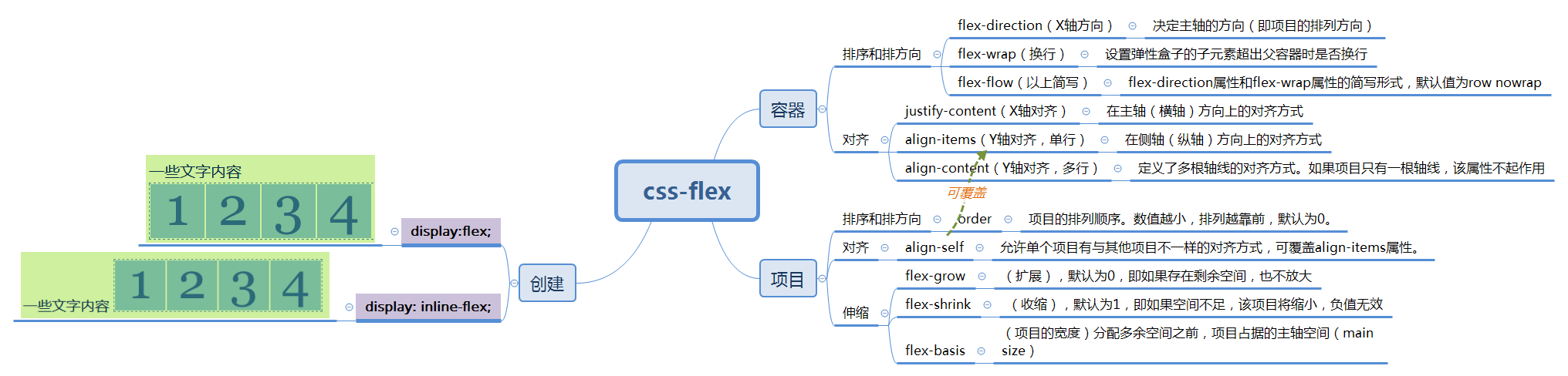
参考:Flex 布局教程:实例篇
为了实现骰子的实例,先建一个骰子的模型
<!DOCTYPE html>
<html lang="en">

<head>
    <meta charset="UTF-8">
    <meta name="viewport" content="width=device-width, initial-scale=1.0">
    <meta http-equiv="X-UA-Compatible" content="ie=edge">
    <title>Document</title>
    <style>
        [class$="face"] {
            margin: 16px;
            padding: 4px;
            background-color: #e7e7e7;
            width: 104px;
            height: 104px;
            object-fit: contain;
            box-shadow: inset 0 5px white, inset 0 -5px #bbb, inset 5px 0 #d7d7d7, inset -5px 0 #d7d7d7;
            border-radius: 10%;
        }

        .item {
            display: block;
            width: 24px;
            height: 24px;
            border-radius: 50%;
            margin: 4px;
            background-color: #333;
            box-shadow: inset 0 3px #111, inset 0 -3px #555;
        }
    </style>
</head>
<body>

</body>
</html>
一、骰子的布局
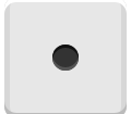
1.一点(单项目)
骰子的一面,最多可以放置9个点。
<div class="box-face">
        <span class="item"></span>
</div>
上面代码中,div元素(代表骰子的一个面)是Flex容器,span元素(代表一个点)是Flex项目。如果有多个项目,就要添加多个span元素,以此类推。

.box-face {
            display: flex;
            justify-content: center;
            align-items: center;
        }
2.两点(双项目)
<div class="box2-face">
        <span class="item"></span>
        <span class="item"></span>
    </div>
css
	.box2-face {
            display: flex;
            justify-content: space-between; /*space-between:两端对齐,项目之间的间隔都相等。 */
        }

        .box2-face .item:nth-child(2) {
            align-self: flex-end;
            }

3.三点(三项目)
<div class="box3-face">
        <span class="item"></span>
        <span class="item"></span>
        <span class="item"></span>
    </div>
css
      .box3-face {
            display: flex;
        }

        .box3-face .item:nth-child(2) {
            align-self: center;
        }

        .box3-face .item:nth-child(3) {
            align-self: flex-end;
        }

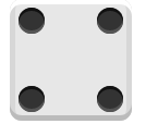
4.四点(四项目)
    <div class="box4-face">
        <div class="column">
            <span class="item"></span>
            <span class="item"></span>
        </div>
        <div class="column">
            <span class="item"></span>
            <span class="item"></span>
        </div>
    </div>
css
        .box4-face {
            display: flex;
            justify-content: space-between;
        }

        .box4-face .column {
            display: flex;
            flex-direction: column;
            justify-content: space-between;
        }

 浙公网安备 33010602011771号