css 优惠券波浪线效果
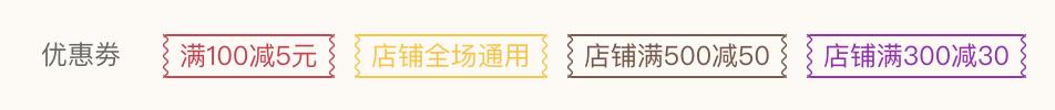
<ul>
    <li>
        <i class="left"></i><span class="center"></span><i class="right"></i>
    </li>
    ...
</ul>
li {
  position:relative;
  line-height: 30px;
}
i {
  position: absoute;
  top:0;
  width:2.5px;
  height: 100%;
  background-repeat: repeat-y, repeat-y;
  background-size: 0.5rem 0.5rem !important;
}
.left{
    left: 0;
}
.right{
    right: 0;
    transform: scale(-1, 1);
}
.center{
    display:inline-block;
    height:30px;
    border-style: solid;
    border-width: 1px 0;
    border-color: #D2364C;
    color: #D2364C;
}
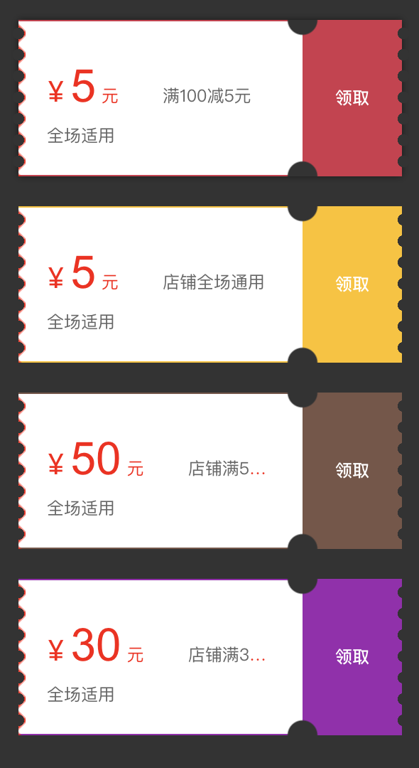
<ul>
    <li>
        <div class="yhq">
       <div class="yhq-left-border"></div>
       <div class="yhq--left-point"></div>
            <div class="yhq-left">
                <div class="yhq-content"></div>
            </div>
            <div class="yhq-right">
                <div class="yhq-content"></div>
            </div>
            <div class="yhq--right-point"></div>
        </div>
    </li>
    ...
</ul>
.yhq {
  border-width:1px 0;
  border-style: solid;
  border-color: #ff0000;
  height:110px;
}
.yhq-left-border {
    position: absolute;
    top: 0.1rem;
    left: 0rem;
    width: 0.5rem;
    height: 0.25rem;
    height: 100%;
    background: linear-gradient(135deg, transparent, transparent 40%, #f00, transparent 60%, transparent 100%),
linear-gradient(45deg, transparent, transparent 40%, #f00, transparent 60%, transparent 100%);
    background-size: 1rem 1.5rem;
}
.yhq-left-point,.yhq-right-point {
    position: absolute;
    top: 0.1rem;
    width: 0.9rem;
    height: 0.25rem;
    height: 100%;
    background: radial-gradient(circle, #333, #333 0.4rem, transparent 0.4rem);
    background-size: 1rem 1.5rem;
}
.yhq-left-point{
    left:-5px;
}
.yhq-right-point {
    right:-5px;
}
.yhq-left {
    position:relative;
    width:calc(100% - 70px)
    height: 110px;
    padding:20px;
}
.yhq-right {
    position:relative;
    width: 70px;
    height:110px;
    background:#ff000;
    padding:20px
}
大多为关键css,不是完整的图片中的代码,理解就行,搬运无果
附加:css+html做成的波浪线
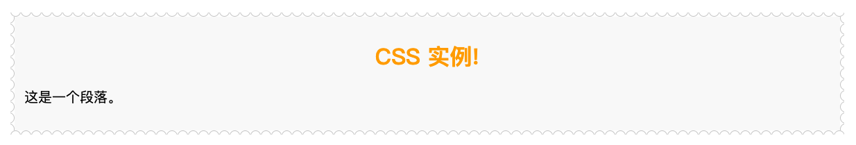
<div class="container">
	<div class="bor-left-list"></div>
	<div class="bor-right-list"></div>
	<div class="bor-top-list"></div>
	<div class="bor-bottom-list"></div>
	<h1>CSS 实例!</h1>
	<p>这是一个段落。</p>
</div>
$(document).ready(function(){
  var lr = 12;
  var tb = 80;
  for(var i = 0; i<lr; i++){
  	$('.bor-left-list').append('<div class="item"></div>');
  	$('.bor-right-list').append('<div class="item"></div>');
  }
  for(var i = 0; i<tb; i++){
  	$('.bor-top-list').append('<div class="item"></div>');
  	$('.bor-bottom-list').append('<div class="item"></div>');
  }
});
h1 {
    color:orange;
    text-align:center;
}
p {
    font-family:"Times New Roman";
    font-size:20px;
}
.container {
    background: #f9f9f9;
    padding: 20px;
    overflow: hidden;
    position: relative;
}
.bor-left-list,.bor-right-list {
    position: absolute;
    top: 0;
    bottom: 0;
}
.bor-top-list,.bor-bottom-list {
    position: absolute;
    left:0;
    right:0;
    display: flex;
    flex-flow: row nowrap;
}
.bor-top-list {
    top:-10px;
}
.bor-bottom-list {
    bottom:-10px;
}
.bor-left-list {
    left: -10px;
}
.bor-right-list {
    right: -10px;
}
.bor-left-list .item,
.bor-right-list .item,
.bor-top-list .item,
.bor-bottom-list .item {
    width: 14px;
    height: 14px;
    border: 1px solid #ccc;
    border-radius: 10px;
   background:#fff;
}
此方法较为老式,重在灵活运用!

 浙公网安备 33010602011771号