移动端 常见布局CSS3的细节
结合 Framework7 和ios UI系统,微信weUI,支付宝H5 我们在移动端一些css用法 细节的有了更深的了解;


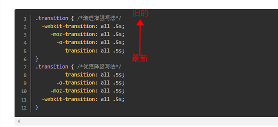
高斯模糊的显示效果,ios8以上支持,ios8以上0.5px,backdrop-filter: blur(10px)等新的属性被支持;

适当利用伪元素 比如menu 菜单icon; (ps:安卓uc 浏览器 伪元素transition支持的不是很好;)

list arrow 箭头,简易,不依赖字体,图片;减少请求;最早从weUI中看到这样写;支付宝 H5页面 一些 arrow 也是直接这么写的


list箭头 还可以做成返回顶部icon 箭头

上图返回顶部 icon css 代码 ,(css rotate 前面 GPU hack 一下,否则返回顶部箭头一点细微的 锯齿缺失, -webkit-transform:translateZ(0) rotate(-45deg);)
.goTop{ position:fixed; right:10px; bottom:40px; width:42px; height:42px; border:1px solid rgba(243,243,243,.9); background:rgba(0,0,0,.4); z-index:888; border-radius:22px; overflow:hidden; }
.goTop:before{content: " ";display: inline-block; width:1px; height:20px; position:absolute; left:50%; top:50%; margin-top:-10px; background:#fff; }
.goTop:after{    content: " ";display: inline-block;-webkit-transform:translateZ(0) rotate(-45deg);transform:translateZ(0) rotate(-45deg);
  height:14px;width: 14px; border-width: 1px 1px 0px 0px;border-color: #fff;border-style: solid; position: absolute;left: 50%;top: 50%;margin-top: -8px;margin-left: -7px;}
移动端 44,指尖的触摸面积有关;很早的概念了,导航条,list 最小高度44px, 微信ui许多都是 地方都是参照 ios 系统ui设计


导航栏 两端自适应布局 -webkit-box-pack:justify;
常见的地方 ios 这种nav 导航栏 ,充分利用css3 属性( -webkit-box-pack:justify; ps:目前安卓的 uc 浏览器 子元素不可以是行内元素(span a 等) 否则 这属性失效 )
还有人遇到过 ;flex下的子元素必须为块级元素,非块级元素在android2.3机器下flex失效 但是我的安卓手机 4.x以上 uc浏览器还是必须 块状元素;


弹性模型盒的变化
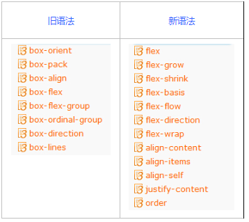
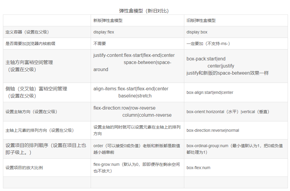
旧语法 CSS弹性盒(旧) http://caibaojian.com/css3/properties/flexible-box/index.htm
新语法 CSS弹性盒(新) http://caibaojian.com/css3/properties/flex/index.htm
关于flex1 撑大的问题
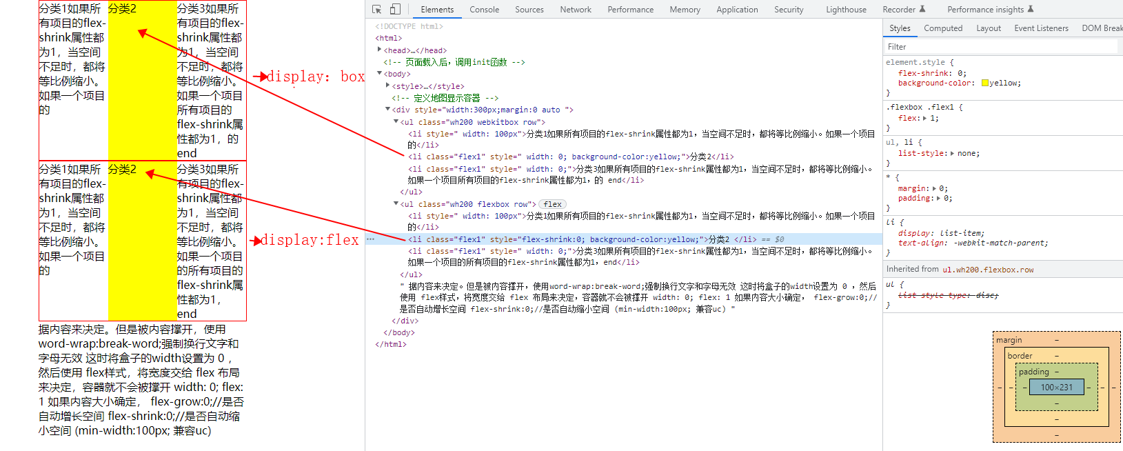
<style>
        *{ margin:0; padding:0;}
        ul,li{ list-style: none;}
        .wh200{ width: 300px; border:1px solid red;}

        .webkitbox{  display:-webkit-box;display:box;}
        .webkitbox .flex1{   -webkit-box-flex:1;  box-flex:1;}

        /* //1.box-orient属性作用:确定父元素里子元素的排列方式,是水平还是垂直。 */
        .webkitbox .row{box-orient:horizontal}


        .flexbox{ display:flex;}
        .flexbox .flex1{flex:1;}
        .flexbox .row{flex-direction: row}
    </style>
<!-- 定义地图显示容器 -->
<div style="width:800px;margin:0 auto ">
      <ul class="wh200 webkitbox row">
          <li  style=" width: 100px">分类1如果所有项目的flex-shrink属性都为1,当空间不足时,都将等比例缩小。如果一个项目的</li>
          <li class="flex1" style=" width: 0; background-color:yellow;">分类2</li>
          <li class="flex1" style=" width: 0;">分类3如果所有项目的flex-shrink属性都为1,当空间不足时,都将等比例缩小。如果一个项目所有项目的flex-shrink属性都为1,的 end</li>
        </ul>


        <ul class="wh200 flexbox row">
            <li style=" width: 100px">分类1如果所有项目的flex-shrink属性都为1,当空间不足时,都将等比例缩小。如果一个项目的</li>
            <li class="flex1" style="flex-shrink:0; background-color:yellow;">分类2  </li>
            <li class="flex1" style=" width: 0;">分类3如果所有项目的flex-shrink属性都为1,当空间不足时,都将等比例缩小。如果一个项目的所有项目的flex-shrink属性都为1,end</li>
          </ul>

    据内容来决定。但是被内容撑开,使用word-wrap:break-word;强制换行文字和字母无效
    这时将盒子的width设置为 0 ,然后使用 flex样式,将宽度交给 flex 布局来决定,容器就不会被撑开
     width: 0;
     flex: 1


    如果内容大小确定,
    flex-grow:0;//是否自动增长空间
    flex-shrink:0;//是否自动缩小空间 (min-width:100px; 兼容uc)


</div>
nvue,weex 子元素宽度自动 的处理方案
nvue weex 中如何设置 text 宽度自适应文本宽度 ,通过给 text 父级容器设置样式{display:flex; align-item: flex-start / center / flex-end ;} 就可以实现宽度自适应, 注意 修改默认方向 flex-direction:row;
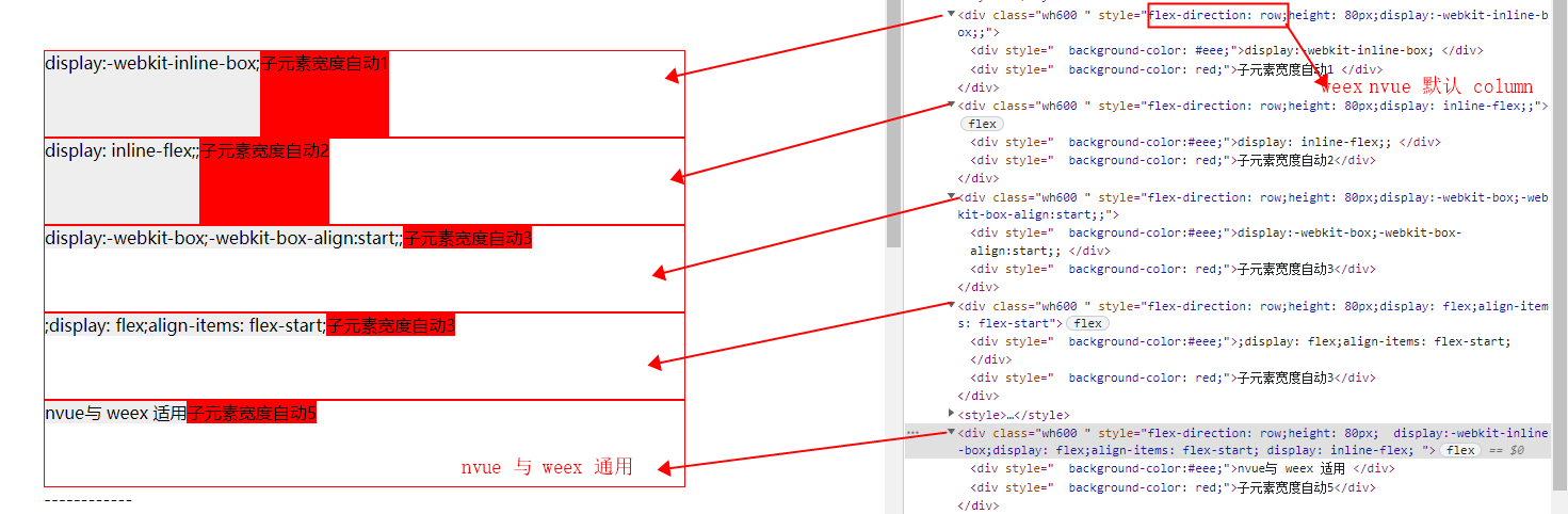
一版H5,web,小程序 子类宽度自动 =》 subclassWidthAuto
<style>
.flex-direction-row{flex-direction: row;}
.subclassWidthAuto
	{
	 display:-webkit-box;
	 -webkit-box-align:start;

	  display: flex;
	  align-items: flex-start;

	  display:-webkit-inline-box;
	   display: inline-flex;
	/* align-self: flex-start; */
 }
	</style>
	<div class="wh600 " style="flex-direction: row;height: 80px;display:-webkit-inline-box;;">
		<div style="  background-color: #eee;">display:-webkit-inline-box; </div>
	    <div style="  background-color: red;">子元素宽度自动1 </div>
	  </div>

	<div class="wh600 " style="flex-direction: row;height: 80px;display: inline-flex;;">
		<div style="  background-color:#eee;">display: inline-flex;; </div>
	    <div style="  background-color: red;">子元素宽度自动2</div>
	  </div>

	<div class="wh600 " style="flex-direction: row;height: 80px;display:-webkit-box;-webkit-box-align:start;;">
		<div style="  background-color:#eee;">display:-webkit-box;-webkit-box-align:start;; </div>
	    <div style="  background-color: red;">子元素宽度自动3</div>
	  </div>

	<div class="wh600 " style="flex-direction: row;height: 80px;display: flex;align-items: flex-start">
		<div style="  background-color:#eee;">;display: flex;align-items: flex-start; </div>
	    <div style="  background-color: red;">子元素宽度自动3</div>
	  </div>

		<style>
整合适用常规web,兼容 nvux与weex 子类宽度自动 =》widthAuto
	<style>
		.widthAuto{
			 display:-webkit-inline-box;display: flex;align-items: flex-start; display: inline-flex;

		/* display: flex;
		align-items: flex-start;

		 display:-webkit-inline-box;
		 display: inline-flex; */

		}
		</style>


		<div class="wh600 " style="flex-direction: row;height: 80px;  display:-webkit-inline-box;display: flex;align-items: flex-start; display: inline-flex; " >
		    <div style="  background-color:#eee;">nvue与  weex 适用 </div>
		    <div style="  background-color: red;">子元素宽度自动5</div>
		</div>
注意渐进增强
ios原生 checkbox 样式

 <label class="label-switch">
                            <input type="checkbox">
                            <div class="checkbox"></div>
 </label>
.label-switch {
    display: inline-block;
    vertical-align: middle;
    width: 52px;
    border-radius: 16px;
    box-sizing: border-box;
    height: 32px;
    position: relative;
    cursor: pointer;
    -ms-flex-item-align: center;
    -webkit-align-self: center;
    align-self: center;
}
.label-switch input[type="checkbox"] {
    display: none;
}


.label-switch .checkbox {
    width: 52px;
    border-radius: 16px;
    box-sizing: border-box;
    height: 32px;
    background: #e5e5e5;
    z-index: 0;
    margin: 0;
    padding: 0;
    -webkit-appearance: none;
    -moz-appearance: none;
    -ms-appearance: none;
    appearance: none;
    border: none;
    cursor: pointer;
    position: relative;
    -webkit-transition-duration: 300ms;
    transition-duration: 300ms;
}

.label-switch .checkbox:before {
    content: ' ';
    position: absolute;
    left: 2px;
    top: 2px;
    width: 48px;
    border-radius: 16px;
    box-sizing: border-box;
    height: 28px;
    background: #fff;
    z-index: 1;
    -webkit-transition-duration: 300ms;
    transition-duration: 300ms;
    -webkit-transform: scale(1);
    transform: scale(1);
}
.label-switch .checkbox:after {
    content: ' ';
    height: 28px;
    width: 28px;
    border-radius: 28px;
    background: #fff;
    position: absolute;
    z-index: 2;
    top: 2px;
    left: 2px;
    box-shadow: 0 2px 5px rgba(0, 0, 0, 0.4);
    -webkit-transform: translateX(0px);
    transform: translateX(0px);
    -webkit-transition-duration: 300ms;
    transition-duration: 300ms;
}
 .label-switch input[type="checkbox"] {
  display: none;
}
.label-switch input[type="checkbox"]:checked + .checkbox {
  background: #4cd964;
}
.label-switch input[type="checkbox"]:checked + .checkbox:before {
  -webkit-transform: scale(0);
  transform: scale(0);
}
.label-switch input[type="checkbox"]:checked + .checkbox:after {
  -webkit-transform: translateX(22px);
  transform: translateX(22px);
}
html.android .label-switch input[type="checkbox"] + .checkbox {
  -webkit-transition-duration: 0;
  transition-duration: 0;
}
html.android .label-switch input[type="checkbox"] + .checkbox:after,
html.android .label-switch input[type="checkbox"] + .checkbox:before {
  -webkit-transition-duration: 0;
  transition-duration: 0;
}
移动端调出搜索按钮

1. <form> 标签需要具有 action属性
2. <input> 标签需要设置 type="search"
<form action="#"> <input type="search" /> </form>
左右布局 父类display:box布局 左边固定宽度 width:100px 并且左边子元素的垂直居中 右侧width 自动分成1份 -webkit-box-flex:

display:box还有个好处,子类不需要计算外围宽度;为什么这么说,举个例子;最常见的应用场景;轮播图
以前我们总是手动计算 inner的总宽度 =outer的宽度*li的个数 还要监听resize时的导致的宽度变化

但是 display: -webkit-box; 可以自动 计算 inner的宽度;

关键css如下
 .flexbox{display: -webkit-box; display: -moz-box;display:box; /*display: -webkit-flex; display: -ms-flexbox; display: flex; display: table\9;*/ }
.flexbox .flex1{-webkit-box-flex: 1; -moz-box-flex: 1; -webkit-flex: 1; -ms-flex: 1; flex: 1; display: table-cell\9;}
注意点:
父类 元素 display: -webkit-box; 子类元素 如果 inupt 之类,设置 css宽度 100% 大部分 安卓手机uc 是无效的 input 需要设置 display:block;
安卓 uc浏览器 calc计算 ,display: -webkit-flex ,伪元素transition,等兼容性不怎么好;
扯一下 目前为止:
安卓 uc的坑深不见底,腾讯x5的坑能看见底,但你跳下去之后就发现特么爬不上来了=_=.....不过最近qq浏览器好多了。uc与微信自带浏览器 通病 就是缓存都比较难清理;
uc 有时候,dom 隐藏元素 display:none到block 页面所有 字体都 放大了 需要添加 <meta name="wap-font-scale" content="no">
部分手机(如三星),a链接支持鼠标:visited事件,也就是说链接访问后文字变为紫色
h5页面input.focus()放置事件或定时器中只聚焦光标,ios不弹出软键盘?
如果直接绑定A的点击事件,执行B.focus(),只聚焦,不弹出软键盘。
试过以下方式:
1、将B.focus()放至setTimeout中,只聚焦,不弹键盘;
2、监听setTimeout()延时,function中执行B.focus(),只聚焦,不弹键盘;
3、增加autofocus属性,只聚焦,不弹键盘;
ipad 默认设备宽度980;部分安卓第一次 获取设备宽度也是980;加个计时器延迟获取宽度 或者meta添加 shrink-to-fit=no
<meta name="viewport" content="width=device-width, initial-scale=1.0, user-scalable=no, maximum-scale=1, shrink-to-fit=no">

https://forums.developer.apple.com/thread/13510
iOS下的 Fixed + Input 失效 解决办法
参考淘宝的就好
判断软键盘弹出
-
android上,当软键盘状态改变的时候,会触发window的resize事件,所以我们可以进入页面的时候保存一次window.innerHeight的值,当window的resize事件触发的时候,比较window.innerHeight的值与前一次保存的window.innerHeight的值大小来判断软键盘的收拢和弹出状态。
var winHeight = window.innerHeight; if (isAndroid) { window.addEventListener('resize', function(e) { var tempHeight = window.innerHeight if (tempHeight < winHeight) { bShowRec = false; } else { bShowRec = true; } }); }
-
ios上,软键盘状态改变的时候,不会触发window的resize事件,但是当软键盘的“完成”按钮被点击的时候,会触发onblur事件。所以正常通过onfocus和onblur事件来判断就行。
虽然Javascript是可以在水果设备上运行的,但是用户还是可以禁用。它也会造成客户端刷新和额外的数据传输,所以下面是服务器端侦测和转向:
if(strstr($_SERVER['HTTP_USER_AGENT'],'iPhone') || strstr($_SERVER['HTTP_USER_AGENT'],'iPod')) {
  header('Location: http://yoursite.com/iphone');
  exit();
}
3D Transforms origin bug, only on safari
transition:visibility 失效
-webkit-transition:opacity .3s,visibility .3s;这样写 visibility 的 transition支持的不是很好,我的测试机器 三星自带浏览器(安卓4.3)的,无法促发,导致其他属性也无效;早期ios也存在 bug
http://stackoverflow.com/questions/7548833/ios-css-opacity-visibility-transition
input 的 compositionstart 和 compositionend 事件 移动端 Web 开发踩坑之旅

关于Android设备中,上传图片 操作导致浏览器刷新的问题
http://blog.shaochuancs.com/android-upload-page-refresh/
在最近的开发过程中,碰到一个比较疑难的bug:当在Android设备的浏览器中打开某张网页时,无论是使用系统自带的浏览器打开,还是用微信扫描二维码打开,网页中的图片上传功能经常会出问题。问题的具体描述为:
- 在上传组件中(哪怕是最简单的
<input type="file">),当选择好本地图片或者调取系统摄像头拍好照片后,网页被刷新。这一问题无法100%重现,但概率不低,在如红米等低端安卓机上发生的概率会比较高。 - 与用系统自带的浏览器打开的情况相比,在微信中打开的情况下该问题出现的更为频繁。
- 与选择本地图片上传相比,调取系统摄像头拍照上传的情况下该问题出现的更为频繁。
安卓自带浏览器 自定义事件 ele.addeventlistener('tap',function(){ window.open()}) 无效
css3 ios -webkit-backdrop-filter: brightness(1.1) blur(10px); border-radius:6px; overflow失效
其他的相关文章
移动端 Retina屏 各大主流网站1px的解决方案
99移动端知识集合 https://github.com/jtyjty99999/mobileTech?utm_source=caibaojian.com
博客园 白树 移动web资源整理 http://www.cnblogs.com/PeunZhang/p/3407453.html
移动端兼容问题 比较早的 http://www.cnblogs.com/surfaces/p/4502871.html
移动端资源集锦 http://caibaojian.com/mobile-tech.html
https://github.com/baijunjie/noclickdelay.js/blob/master/noclickdelay.js
Mobile开发经验沉淀 https://github.com/imweb/mobile/issues/2
附上代码:
<!doctype html>
<html>
<head>
<meta charset="utf-8">
<title>类似apple 菜单</title>
<meta name="viewport"   content="initial-scale=1.0,user-scalable=no,maximum-scale=1,width=device-width"  />
</head>

<body>

<style>


html,body,div,dl,dt,dd,ul,ol,li,h1,h2,h3,h4,h5,h6,pre,form,fieldset,input,textarea,p,blockquote,span,img,button ,em,i,b{margin:0;padding:0;}
html{-webkit-box-sizing:border-box;margin:0 auto;min-width: 320px;height:100%;-webkit-touch-callout:none;-webkit-user-select:none;-webkit-text-size-adjust:100%;-webkit-tap-highlight-color:transparent;overflow-x:hidden;  }
body{ height:auto;min-height:568px; font-family: Microsoft Yahei,'Helvetica Neue',Helvetica,tahoma,arial,sans-serif; text-rendering:optimizeLegibility;-webkit-font-smoothing:antialiased; line-height: 1; font-size:14px;}
article,aside,dialog,figure,footer,header,hgroup,menu,nav,section{display:block}
dl,li,menu,ol,ul{list-style:none}
address,em,i,th{font-weight:400;font-style:normal}
a{color:#999; display:block;}
a:link,a:visited{color:#999;text-decoration:none;cursor:pointer}
a:hover{cursor:pointer}
a:active,a:focus{outline:0;}
img{width:100%;border:0;vertical-align:middle;-webkit-user-select:none;}
input,select{outline:0}
h1,h2,h3,h4,h5,h6{font-size:100%;font-variant:normal}
button,input[type=button],input[type=tel],input[type=reset],input[type=submit]{line-height:normal!important;-webkit-appearance:none}
::-webkit-input-placeholder{color:#eee; text-align:center;}
.clearfix:after{clear:both;content:".";display:block;height:0;visibility:hidden}
.fl{float:left}
.fl,.fr{display:inline}
.fr{float:right}

.disabled { pointer-events: none; }
/*GPU hack*/
.translateZ{ -webkit-transform:translateZ(0);transform:translateZ(0); -webkit-backface-visibility:hidden;backface-visibility:hidden;}

/*背景高斯模糊*/
@supports (-webkit-backdrop-filter: none) or  (backdrop-filter: none) {
  .blurbk{
      -webkit-backdrop-filter: brightness(1.1) blur(10px);
	  backdrop-filter: brightness(1.1) blur(10px);
  }
}

.flexbox{display: -webkit-box; display: -moz-box;display:box; display: -webkit-flex; display: -ms-flexbox; display: flex; display: table\9; }
.flexbox .flex1{-webkit-box-flex: 1; -moz-box-flex: 1; -webkit-flex: 1; -ms-flex: 1; flex: 1; display: table-cell\9;}


/*两端对其*/
.justify{ -webkit-box-pack: justify; -ms-flex-pack: justify; box-pack:justify; -webkit-justify-content: space-between; justify-content: space-between; -webkit-box-align: center;-ms-flex-align: center;-webkit-align-items: center;align-items: center;}


/*css 指示箭头*/
.arrow:after {
    content: " "; display: inline-block; -webkit-transform: rotate(45deg); transform: rotate(45deg); height: 8px; width: 8px;border-width: 2px 2px 0 0;
    border-color: #c7c7cc;  border-style: solid; outline:1px solid transparent;position: absolute; right: 15px;top: 50%;margin-top: -5px;pointer-events: none;
}


/*css 1px retain*/
@media (-webkit-min-device-pixel-ratio:1.5),(min-device-pixel-ratio:1.5),(min-resolution: 144dpi),(min-resolution:1.5dppx) {
.retainbb{ position:relative;}
.retainbb:after {
    content: " "; position: absolute;left: 0; bottom: 0;
    width: 100%;
    height: 1px;
	background-color:rgba(200,199,204,.6);
    -webkit-transform-origin: 0 0; transform-origin: 0 0; -webkit-transform: scaleY(0.5);transform: scaleY(0.5);pointer-events: none;
   }
}
@media (-webkit-device-pixel-ratio:3) {
	.retainbb:after {
    -webkit-transform: scaleY(0.3333);
    transform: scaleY(0.3333);
    }
}
/**********************************************************************/

#wrap{width:100%; max-width:760px; min-height:548px;  margin:0 auto;height:auto;-webkit-box-sizing:border-box;box-sizing:border-box;position:relative;z-index:5; padding-bottom:10px; overflow:hidden; display:block; }

.nav{ height:44px; line-height:44px;background: rgba(0,0,0,0.8); color:#fff; font-size: 14px; padding:0 10px;  position:relative;-webkit-box-sizing:border-box;box-sizing:border-box;}

.menuBtn{ position:relative; width:44px; height:44px; }


.draw,.draw::before,.draw::after{width:22px;height:1px;background:#fff;position:absolute;left:0;-webkit-backface-visibility: hidden;
-webkit-transition:-webkit-transform .5s;
 transition:transform .5s}

.draw{top:21px;left:21px;}
.draw:before{content:"";-webkit-transform: translateY(-7px); }
.draw:after{content:"";-webkit-transform: translateY(7px);}
.G_close .draw{background:transparent;}
.G_close .draw:before{-webkit-transform:translateY(0) rotate(45deg);}
.G_close .draw:after{-webkit-transform:translateY(0) rotate(-45deg);}

.draw:checked{
	-webkit-transition:-webkit-transform .5s;
}

.menu_content{ width:100%; height:100%; max-width:760px; position:fixed; left:0; right:0; margin-left:auto; margin-right:auto; top:45px;background: rgba(0,0,0,0.8); visibility:hidden; opacity:0; -webkit-transition:opacity .3s,visibility .2s,height .5s ease-out; }
.menu_content.hide{  visibility: hidden; opacity:0; z-index:0; height:0%;-webkit-transition:opacity .6s,visibility .7s,height .54s;}
.menu_content.show{  visibility: visible; opacity:1; z-index:99; height:100%; -webkit-backface-visibility:hidden;}
.menu_content ul{padding:20px 10%;}
.menu_content ul li{ height:46px; line-height:46px; color:#fff; text-align:left; font-size:13px; text-indent:em;;

    -webkit-animation-duration: .52s;
    animation-duration: .52s;
    -webkit-animation-fill-mode: both;
    animation-fill-mode: both;

  }
.menu_content.menu_content_animated li{
/*-webkit-animation-name: returnToNormal;
    animation-name: returnToNormal;*/

	-webkit-animation-name: resize;
    animation-name: resize;
	}

.menu_content ul li a{ display:block; color:#fff;}


p{ font-size:14px; text-indent:2em; padding:0 12px; color:#6d6d72; line-height:24px; margin:10px auto;}
p i{ color: #c00; font-style:normal;}


@-webkit-keyframes returnToNormal {
  0% {
    opacity: 0;
    -webkit-transform: translate3d(0, -100%, 0);
            transform: translate3d(0, -100%, 0);
  }

  100% {
    opacity: 1;
    -webkit-transform: none;
            transform: none;
  }
}

@keyframes returnToNormal {
  0% {
    opacity: 0;
    -webkit-transform: translate3d(0, -100%, 0);
            transform: translate3d(0, -100%, 0);
  }

  100% {
    opacity: 1;
    -webkit-transform: none;
            transform: none;
  }
}


@-webkit-keyframes resize {
from, 60%, 75%, 90%, to {
  -webkit-animation-timing-function: cubic-bezier(0.215, 0.610, 0.355, 1.000);
  animation-timing-function: cubic-bezier(0.215, 0.610, 0.355, 1.000);
}
0% {
  opacity: 0;
  -webkit-transform: scale(3,3);
  transform: scale(3,3);
}
100% {
  opacity: 1;
  -webkit-transform: scale(1,1);
  transform: scale(1,1);
}
}

@keyframes resize {
from, 60%, 75%, 90%, to {
  -webkit-animation-timing-function: cubic-bezier(0.215, 0.610, 0.355, 1.000);
  animation-timing-function: cubic-bezier(0.215, 0.610, 0.355, 1.000);
}
0% {
  opacity: 0;
  -webkit-transform: scale(3,3);
  transform: scale(3,3);
}
100% {
  opacity: 1;
  -webkit-transform: scale(1,1);
  transform: scale(1,1);
}
}


html,body,#wrap{ background:#efeff4}
</style>


<div id="wrap" >
<div class="nav flexbox justify">
   <div >返回</div>
   <div >Apple</div>
   <div class="menuBtn" id="j_menuBtn" title="菜单开关">
     <i class="draw"></i>
   </div>
</div>

<img src="../../loveImg/QioA-fxehfqi8208393.jpg">
<p>简介:<i>泰勒·斯威夫特</i>(Taylor Swift),1989年12月13日出生于美国宾夕法尼亚州,美国流行音乐、乡村音乐创作型女歌手、音乐制作人、演员、慈善家。2006年与独立唱片公司大机器唱片签...</p>


<style>
.list-block{ background:#fff; border-radius:5px; display:block;}
.list-block ul{ position:relative;}
.list-block ul:after {
    content: '';
    position: absolute;
    left: 0;
    bottom: 0;
    right: auto;
    top: auto;
    height: 1px;
    width: 100%;
    background-color: #c8c7cc;
    display: block;
    z-index: 18;
    -webkit-transform-origin: 50% 100%;
    transform-origin: 50% 100%;
	-webkit-transform: scaleY(0.3333);transform: scaleY(0.3333);
	pointer-events: none;
}


.list-block ul:before {
 content: '';
    position: absolute;
    left: 0;
    top: 0;
    bottom: auto;
    right: auto;
    height: 1px;
    width: 100%;
    background-color: #c8c7cc;
    display: block;
    z-index: 18;
    -webkit-transform-origin: 50% 0%;
    transform-origin: 50% 0%;
	-webkit-transform: scaleY(0.3333);transform: scaleY(0.3333);
	pointer-events: none;
}


.list-block li{ -webkit-box-sizing: border-box; box-sizing: border-box;position: relative; color:#666}
.list-block .item-content{
	box-sizing: border-box;
    padding-left: 15px;
    min-height: 44px;
/*    display: -webkit-box;
    display: -ms-flexbox;
    display: -webkit-flex;
    display: flex;*/

    -webkit-align-items: stretch;
    align-items: stretch;}


 .list-block .item-media{ position:relative; min-width:45px;

	display: -webkit-box;
    display: -moz-box;
    display: box;


	 /*使子元素与父元素共同高*/
	  -webkit-align-items: stretch;
    align-items: stretch;


	 -webkit-align-self:stretch;
	 align-self:stretch;

	 /* 使子元素垂直居中 */
   -webkit-justify-content:center;
	  justify-content:center;

	 /* box-pack表示父容器里面子容器的水平对齐方式*/
	 -webkit-box-pack:center;
     -ms-box-pack:center;
	 box-pack:center;

	 /*表示容器里面字容器的垂直对齐方式,*/
	 -webkit-box-align: center;
     -ms-box-align: center;
	 box-align: center;

 }

.list-block .item-media img{width:50px; height:50px;}

.list-block .item-inner{
	margin-left:15px;

    position: relative;

	padding-right: 15px;
    padding-top: 12px;
    padding-bottom:11px;

    min-height: 44px;

	display: -webkit-box;
    display: box;
    -webkit-box-orient: vertical;
    box-orient: vertical;

    -webkit-box-pack: Justify;
    box-pack: Justify;

    -webkit-box-align: start;
    box-align: start;

    -webkit-align-self: stretch;
    align-self: stretch;


}
.list-block .item-content:active{ background: rgba(17,17,17,.1)
}

.list-block .item-inner:after{
    content: '';
    position: absolute;
    left: 0;
    bottom: 0;
    right: auto;
    top: auto;
    height: 1px;
    width: 100%;
    background-color: #c8c7cc;
    z-index: 15;
    -webkit-transform-origin: 50% 100%;
    transform-origin: 50% 100%;
	-webkit-transform: scaleY(0.3333);transform: scaleY(0.3333);
	pointer-events: none;
}

.list-block .item-title {
    font-weight:600; color:#666; font-size:16px;
	white-space: nowrap;
    overflow: hidden;
    text-overflow: ellipsis;
    max-width: 100%;
}


.list-block .item-subtitle {
    font-size: 14px;
    position: relative;
    overflow: hidden;
    white-space: nowrap;
    max-width: 100%;
    text-overflow: ellipsis;
}


.list-block .item-title-row {
    display: -webkit-box;
    display: -ms-flexbox;
    display: -webkit-flex;
    display: flex;
    -webkit-box-pack: justify;
    -ms-flex-pack: justify;
    -webkit-justify-content: space-between;
    justify-content: space-between;
}
</style>


<div class="list-block">
   <ul>
     <li class="item-content flexbox arrow">
           <div class="item-media">
                 <img src="../../loveImg/2345.jpg">
           </div>
           <div class="item-inner flex1">
                <div class="item-title">Don't Stop Me Now</div>
                <div class="item-subtitle">Red Hot Chili Peppers</div>
           </div>
     </li>


     <li class="item-content flexbox arrow">
           <div class="item-media">
                   <img src="../../loveImg/2345.jpg">
           </div>
           <div class="item-inner flex1">
                <div class="item-title">Don't Stop Me Now</div>
                <div class="item-subtitle">Red Hot Chili Peppers</div>
           </div>
     </li>

     <li class="item-content flexbox arrow">
           <div class="item-media">
                   <img src="../../loveImg/2345.jpg">
           </div>
           <div class="item-inner flex1">
                 <div class="item-title-row">
                    <div class="item-title">Yellow Submarine</div>
                  </div>
                <div class="item-subtitle">Red Hot Chili Peppers</div>
           </div>
     </li>


   </ul>
</div>


<style>
.item-inner2{ margin:10px; background:#333; color:#fff; /*box-orient: horizontal;*/ min-height:100px;}
.item-inner2 .left{ width:90px; overflow:hidden; background:#999;
    display: -webkit-box;
    display: -moz-box;
    display: box;


	 /*使子元素与父元素共同高*/
	  -webkit-align-items: stretch;
    align-items: stretch;


	 -webkit-align-self:stretch;
	 align-self:stretch;

	 /* 使子元素垂直居中 */
   -webkit-justify-content:center;
	  justify-content:center;

	 /* box-pack表示父容器里面子容器的水平对齐方式*/
	 -webkit-box-pack:center;
     -ms-box-pack:center;
	 box-pack:center;

	 /*表示容器里面字容器的垂直对齐方式,*/
	 -webkit-box-align: center;
     -ms-box-align: center;
	 box-align: center;
}


.item-inner2 .right{   background:red; padding:20px 0 20px 15px; text-align:left;
    display: -webkit-box;
    display: -moz-box;
    display: box;

    -webkit-box-orient: vertical;
    box-orient: vertical;


    /*pack 作用于上下*/
    -webkit-box-pack: Justify;
    box-pack: Justify;

	 /*每个div水平 朝左*/
    -webkit-box-align: start;
    -moz-box-align: start;
    box-align: start;

}
.item-inner2 .title{ font-weight:600; }
.item-inner2 .text{overflow: hidden;

    white-space: nowrap;
    max-width: 95%;
    text-overflow: ellipsis; }
</style>
  <div class="item-inner2 flexbox">
                 <div class="item-title2 left"> <img src="../../loveImg/2345.jpg" style="width:60px"></div>
                 <div class="item-subtitle2 right  flex1">
                    <div class="title">surfaces</div>
                   <!-- <div class="text">描述空1111111111111111旦撒顺路快 </div>-->
                    <div class="text">描述空112222222222211旦撒顺路快 </div>
                </div>
  </div>


<div class="menu_content hide blurbk translateZ">
  <ul id="j_menutentUl" class="j_menutentUl">
    <li class="retainbb"><a class="arrow">首页</a></li>
    <li class="retainbb"><a class="arrow">首页</a></li>
    <li class="retainbb"><a class="arrow">首页</a></li>
    <li class="retainbb"><a class="arrow">首页</a></li>
    <li class="retainbb"><a class="arrow">首页</a></li>
  </ul>

</div>
</div>


<style>
.box {
    width: 300px;
    height: 300px; margin:30px auto;
    border: 1px solid pink;

	 display: -webkit-box;
    display: -moz-box;
    display: box;


	-webkit-box-orient:vertical;
       box-orient:vertical;


	 /* 子元素在父元素空间中等分排列 */
    -webkit-box-pack:Justify;
    -moz-box-pack:Justify; /* firefox不支持此属性 */
	box-pack:Justify;

	/* 子元素垂直居中 */
	/* -webkit-box-pack:center;
     -ms-box-pack:center;
	 box-pack:center;
	*/

  -webkit-box-align: center;
    -moz-box-align: center;
	box-align: center;

	/*   -webkit-box-align: left;
    -moz-box-align: left;
	box-align: left;*/


}
.box div {
    width: 30px;
    height: 30px;
    background-color: orange;
    border: 1px solid #ccc;
    font: 30px/30px "";
    color: #fff;
    text-align: center;
}
</style>

<div class="box">
    <div class="ch_0">0</div>
    <div class="ch_1">1</div>
    <div class="ch_2">2</div>
    <div class="ch_3">3</div>
</box>
<script>
  document.body.addEventListener('touchstart', function () { });

  var doc=document;
  var  j_menuBtn=doc.getElementById("j_menuBtn");
  var  menu_content=doc.querySelector(".menu_content");
  var menu_contentLi=menu_content.getElementsByTagName("li");
  var liLen=menu_contentLi.length;
  var j_menutentUl=doc.getElementById("j_menutentUl");
  var isHide=true;

  j_menuBtn.addEventListener("click",function(){
	   var that=this;
	   if(isHide){
		  menu_content.classList.add('menu_content_animated');
		  that.classList.add('G_close');
		  menu_content.className =menu_content.className.replace('hide','show')

	  }else{
		   that.classList.remove('G_close');
		   menu_content.className =menu_content.className.replace('show','hide')
		   menu_content.classList.remove('menu_content_animated');

	  }
	 isHide=!isHide;
	 for(var i=0;i<liLen;i++){
		 menu_contentLi[i].style.webkitAnimationDelay=0.1*i+'s';

	 }

  });


</script>


</body>
</html>
其他杂项 忽略
<!doctype html>
<html>
<head>
<meta charset="utf-8">
<title>无标题文档</title>
<meta name="viewport"   content="initial-scale=1.0,user-scalable=no,maximum-scale=1,width=device-width"  />

</head>

<body>


<style>
*{ margin:0; padding:0;}
html,body{ width:100%;}
ul,li{ list-style:none;}

.box{display: -webkit-box; display: -moz-box; display: -ms-flexbox; display: -webkit-flex; display: flex; height: 43px; line-height: 42px; border-bottom: #bcbcbc 1px solid; background-color: #fafafa; color: #666; font-size: 15px; display: table\9; width: 100%;-webkit-box-sizing:border-box;box-sizing:border-box; }


.box li{text-align: center; -webkit-box-flex: 1; -moz-box-flex: 1; -webkit-flex: 1; -ms-flex: 1; flex: 1; display: table-cell\9;border-left:1px solid red;overflow: hidden;

/*width:33.33%;*//*UC */

  text-overflow: ellipsis;
  white-space: nowrap;-webkit-box-sizing:border-box;box-sizing:border-box;}
</style>

    <style>
	/*弹性模型盒*/
.webkitbox{display: -webkit-box;
           display: -moz-box;
		   display: -ms-flexbox;
		   display: box;
		 }

.flexbox{display: -webkit-box;
         display: -moz-box;
		 display: box;
		 display: -ms-flexbox;
		 display: -webkit-flex;
		 display: flex;
		 display: table\9;
}
.flexbox .flex1{
	-webkit-box-flex: 1;
	   -moz-box-flex: 1;
	        box-flex: 1;
	    -webkit-flex: 1;
		    -ms-flex: 1;
			    flex: 1;
				display: table-cell\9;
}

.flexbox  .box-vertical-orient{  /*垂直*/
	-webkit-box-orient:vertical;        /* 兼容webkit内核 */
    -moz-box-orient:vertical;               /* 兼容gecko内核 */
	-ms-box-orient:vertical;
	box-orient:vertical;

	-webkit-flex-direction:column;
	-moz-flex-direction:column;
	        flex-direction:column;
}


  #fls{

		 width:100%;
		 border:1px solid red;
     min-height: 43px; margin:30px auto; padding:10px;
     -webkit-box-sizing:border-box;box-sizing:border-box;}


   #fls .left{


	  /*http://caibaojian.com/demo/flexbox/align-items.html*/

   /*适用于父类容器上) 父元素是left 使子元素im个垂直居中   设置在父元素上 ul上   是子元素 li垂直居中      <ul style="-webkit-align-items: center;">   <li></li>> >   <li></li>>   <li></li>  </ul>*/
	  -webkit-align-items: center;
    align-items: center;


		 /*适用于弹性盒模型子元素) 作用于自己left,  与 fls,与父类fls同高   设置或检索弹性盒子元素自身在侧轴(纵轴)方向上的对齐方式。  <ul >   <li style="-webkit-align-self: center;"</li>   <li></li>>   <li></li>  </ul>*/
	 -webkit-align-self:stretch;
	 align-self:stretch;

	 /* 使子元素垂直居中*/
   -webkit-justify-content:center;
	  justify-content:center;

	 /* box-pack表示父容器里面子容器的水平对齐方式*/
	 -webkit-box-pack:center;
	 box-pack:center;

	 /*表示容器里面字容器的垂直对齐方式,*/
	 -webkit-box-align: center;
	 box-align: center;


	   /* align-items: center;  2016 08 23  新增 display: flex; */

   width:80px; margin-right:10px; background:#999;}
   #fls .left img{ width:50px;}

   #fls .right{

/* 使子元素垂直 布局*/

	 -webkit-box-sizing:border-box;box-sizing:border-box;
   border-left:1px solid red; padding:10px; background:#AB0D10; margin-left:10px;

}

#fls .right input{ height:40px;  line-height:40px; overflow: hidden; display:block; width:100%; -webkit-appearance:none; border:0; background:#eee; margin-bottom:5px;}
#fls .right div{ height:30px; line-height:30px; max-width:100%; overflow: hidden;text-overflow: ellipsis; white-space: nowrap;}
#fls .right p{height:20px; line-height:20px; max-width:100%; overflow: hidden;text-overflow: ellipsis; white-space: nowrap;
   }
  </style>


<ul class="box">
    <li class="cui-item cui-tab-current">中国</li>
    <li  class="cui-item">美美国222222美国国222222美国国222222美国美国</li>
    <li  class="cui-item">日本</li>
    <i   class="cui-tab-scrollbar cui-tabnum3"><span>1</span></i>
  </ul>

  <style>
  #bas{
  border:1px solid #000; height: 43px; line-height: 43px; margin:30px auto;
 width:100%;-webkit-box-sizing:border-box;box-sizing:border-box; }


   #bas li{  text-align: center;  font-size:12px;    -webkit-flex-grow:1; -webkit-flex-shrink:1;  width:100%  /*解决 文本超出 安卓浏览器 兼容*/

   border-left:1px solid red;-webkit-box-sizing:border-box;box-sizing:border-box;
   overflow: hidden;
  text-overflow: ellipsis;
  white-space: nowrap;}
  </style>


  <ul id="bas" class="flexbox">
     <li class="flex1 ">111111</li>
      <li class="flex1 ">2a少时诵诗书s国美222222222萨达dddd2</li>
       <li class="flex1 ">3333</li>
  </ul>


  <div id="fls" class="flexbox">
    <div class="left flexbox ">
        <img src="../images/3.jpg">
    </div>
     <div class="right  flex1">
    <!--<div class="right  flex1 webkitbox box-vertical-orient">-->
         <input type="text" value="222" >
         <div> 有道桌面词典显示文有“收缩”之意。不过”房子-x”一词中文有“收缩”之意。不过”房子-。box子”。</div>
          <p>pppppppppppppppp”flex”一词中文有“收缩”之意。不pppp过释都显得很牵强。pppp</p>
    </div>
  </div>


  <style>
   #fls2{

		 width:100%;
		 border:1px solid red;
     min-height: 43px; margin:30px auto; padding:10px;
     -webkit-box-sizing:border-box;box-sizing:border-box;}


   #fls2 .left{


	  /*http://caibaojian.com/demo/flexbox/align-items.html*/

   /*适用于父类容器上) 父元素是left 使子元素im个垂直居中   设置在父元素上 ul上   是子元素 li垂直居中      <ul style="-webkit-align-items: center;">   <li></li>> >   <li></li>>   <li></li>  </ul>*/
	  -webkit-align-items: center;
    align-items: center;


		 /*适用于弹性盒模型子元素) 作用于自己left,  与 fls,与父类fls同高   设置或检索弹性盒子元素自身在侧轴(纵轴)方向上的对齐方式。  <ul >   <li style="-webkit-align-self: center;"</li>   <li></li>>   <li></li>  </ul>*/
	 -webkit-align-self:stretch;
	 align-self:stretch;

	 /* 使子元素垂直居中*/
   -webkit-justify-content:center;
	  justify-content:center;

	 /* box-pack表示父容器里面子容器的水平对齐方式*/
	 -webkit-box-pack:center;
	 box-pack:center;

	 /*表示容器里面字容器的垂直对齐方式,*/
	 -webkit-box-align: center;
	 box-align: center;


	   /* align-items: center;  2016 08 23  新增 display: flex; */

   width:80px; margin-right:10px; background:#999;}
   #fls2 .left img{ width:50px;}

   #fls2 .right{

/* 使子元素垂直 布局*/


	 -webkit-box-sizing:border-box;box-sizing:border-box;
   border-left:1px solid red; padding:10px; background:#AB0D10; margin-left:10px;

}

#fls2 .right input{ height:40px;  line-height:40px; overflow: hidden; display:block; width:100%; -webkit-appearance:none; border:0; background:#eee; margin-bottom:5px;}
#fls2 .right div{ height:30px; line-height:30px; max-width:100%; overflow: hidden;text-overflow: ellipsis; white-space: nowrap;}
#fls2 .right p{height:20px; line-height:20px; max-width:100%; overflow: hidden;text-overflow: ellipsis; white-space: nowrap;}
</style>

  <div id="fls2" class="flexbox">
    <div class="left flexbox ">
        <img src="../images/3.jpg">
    </div>
   <!-- <div class="right  flex1  box-vertical-orient">-->
    <div class="right flexbox flex1  box-vertical-orient">
         <input type="text" value="222" >
         <div> 有道桌面词典显示文有“收缩”之意。不过”房子-x”一词中文有“收缩”之意。不过”房子-。box子”。</div>
          <p>pppppppppppppppp”flex”一词中文有“收缩”之意。不pppp过释都显得很牵强。pppp</p>
    </div>
  </div>
</body>
</html>
<style>

		   .clearfix{*zoom:1;}
		   .clearfix:after{clear:both; content:"."; display:block; height:0; visibility:hidden;}

			.fl{float:left; display:inline;}
			.fr{float:right; display:inline;}

			.list3{ min-height: 44px;; margin: 10px; height: auto; overflow: hidden; border: 2px solid red;;}
			.list3 .left3{ overflow: hidden;width: 300px;    max-height: 215px; margin-right: 10px;}
			.list3 .right3{ background: #eee;}
		</style>


		<article class="list3 clearfix">
			<div class="left3 fl" href="http://www.itvfans.com/jianjie/32775.html" title=士(Madam Secretary)" class="fancyimg home-blog-entry-thumb">

						<img class="box-hide box-show" src="http://img.itvfans.com/wp-content/uploads/32775.jpg?imageView2/1/w/300/h/450/q/100" data-original="http://img.itvfans.com/wp-content/uploads/32775.jpg?imageView2/1/w/300/h/450/q/100" alt="士(Madam Secretary)" style="display: block;">

		  </div>
				<div class="right3 clearfix">
					右边
				</div>
			</article>
<!doctype html>
<html>
<head>
<meta charset="utf-8">
<title>无标题文档</title>
<meta name="viewport"   content="initial-scale=1.0,user-scalable=no,maximum-scale=1,width=device-width"  />

</head>

<body>


<style>
*{ margin:0; padding:0;}
html,body{ width:100%;}
ul,li{ list-style:none;}

.box{display: -webkit-box; display: -moz-box; display: -ms-flexbox; display: -webkit-flex; display: flex; height: 43px; line-height: 42px; border-bottom: #bcbcbc 1px solid; background-color: #fafafa; color: #666; font-size: 15px; display: table\9; width: 100%;-webkit-box-sizing:border-box;box-sizing:border-box; }


.box li{text-align: center; -webkit-box-flex: 1; -moz-box-flex: 1; -webkit-flex: 1; -ms-flex: 1; flex: 1; display: table-cell\9;border-left:1px solid red;overflow: hidden;


/*width:33.33%;*//*UC */
width:100%;  /*2016 1012  解决溢出 问题*/

  text-overflow: ellipsis;
  white-space: nowrap;-webkit-box-sizing:border-box;box-sizing:border-box;}
</style>


    /*http://caibaojian.com/demo/flexbox/align-items.html*/
    <style>
	/*弹性模型盒*/
.webkitbox{display: -webkit-box;
           display: -moz-box;
		   display: -ms-flexbox;
		   display: box;
		 }

.flexbox{display: -webkit-box;
         display: -moz-box;
		 display: box;
		 display: -ms-flexbox;
		 display: -webkit-flex;
		 display: flex;
		 display: table\9;
}
.flexbox .flex1{
	-webkit-box-flex: 1;
	   -moz-box-flex: 1;
	        box-flex: 1;
	    -webkit-flex: 1;
		    -ms-flex: 1;
			    flex: 1;
				display: table-cell\9;
}

.flexbox  .box-vertical-orient{  /*垂直*/
	-webkit-box-orient:vertical;        /* 兼容webkit内核 */
       -moz-box-orient:vertical;               /* 兼容gecko内核 */
	    -ms-box-orient:vertical;
	        box-orient:vertical;

	-webkit-flex-direction:column;
	   -moz-flex-direction:column;
	    -ms-flex-direction:column;
	        flex-direction:column;
}


	/*使子元素 左右居中  上下垂直居中*/
.children_center{ -webkit-align-items: center;
				   align-items: center;
			-webkit-align-self:stretch;
					align-self:stretch;
	   -webkit-justify-content:center;
			   justify-content:center;
			  -webkit-box-pack:center;
					  box-pack:center;
			 -webkit-box-align: center;
			         box-align: center;

}


  #fls{

		 width:100%;
		 border:1px solid red;
     min-height: 43px; margin:30px auto; padding:10px;
     -webkit-box-sizing:border-box;box-sizing:border-box;}


   #fls .left{

  display: -webkit-box;
		   display: box;
		    display: -webkit-flex;
			 display:flex;


   /*适用于父类容器上) 父元素是left 使子元素im个垂直居中   设置在父元素上 ul上   是子元素 li垂直居中      <ul style="-webkit-align-items: center;">   <li></li>> >   <li></li>>   <li></li>  </ul>*/
	  -webkit-align-items: center;
    align-items: center;


		 /*适用于弹性盒模型子元素) 作用于自己left,  与 fls,与父类fls同高   设置或检索弹性盒子元素自身在侧轴(纵轴)方向上的对齐方式。  <ul >   <li style="-webkit-align-self: center;"</li>   <li></li>>   <li></li>  </ul>*/
	 -webkit-align-self:stretch;
	 align-self:stretch;

	 /* 使子元素垂直居中*/
   -webkit-justify-content:center;
	  justify-content:center;

	 /* box-pack表示父容器里面子容器的水平对齐方式*/
	 -webkit-box-pack:center;
	 box-pack:center;

	 /*表示容器里面字容器的垂直对齐方式,*/
	 -webkit-box-align: center;
	 box-align: center;


	   /* align-items: center;  2016 08 23  新增 display: flex; */

   width:80px; margin-right:10px; background:#999;}
   #fls .left img{ width:50px;}

   #fls .right{

/* 使子元素垂直 布局*/

	 -webkit-box-sizing:border-box;box-sizing:border-box;
   border-left:1px solid red; padding:10px; background:#AB0D10; margin-left:10px;

}

#fls .right input{ height:40px;  line-height:40px; overflow: hidden; display:block; width:100%; -webkit-appearance:none; border:0; background:#eee; margin-bottom:5px;}
#fls .right div{ height:30px; line-height:30px; max-width:100%; overflow: hidden;text-overflow: ellipsis; white-space: nowrap;}
#fls .right p{height:20px; line-height:20px; max-width:100%; overflow: hidden;text-overflow: ellipsis; white-space: nowrap;
   }
  </style>


<ul class="box">
    <li class="cui-item cui-tab-current">中国</li>
    <li  class="cui-item">美美国222222美国国222222美国国222222美国美国</li>
    <li  class="cui-item">日本</li>
    <i   class="cui-tab-scrollbar cui-tabnum3"><span>1</span></i>
  </ul>

  <style>
  #bas{
  border:1px solid #000; height: 43px; line-height: 43px; margin:30px auto;
 width:100%;-webkit-box-sizing:border-box;box-sizing:border-box; }


   #bas li{  text-align: center;  font-size:12px;    -webkit-flex-grow:1; -webkit-flex-shrink:1;

   border-left:1px solid red;-webkit-box-sizing:border-box;box-sizing:border-box;
   overflow: hidden;
  text-overflow: ellipsis;
  white-space: nowrap;}
  </style>


  <ul id="bas" class="flexbox">
     <li class="flex1 ">111111</li>
      <li class="flex1 ">2a少时诵诗书s国美222222222萨达dddd2</li>
       <li class="flex1 ">3333</li>
  </ul>


  <div id="fls" class="flexbox">
    <div class="left " style="min-height:150px;">
        <img src="../images/3.jpg">
    </div>
     <div class="right  flex1 " style="position:relative; display:block; background:#ddd; height: auto; overflow: hidden;">
    <!--<div class="right  flex1 webkitbox box-vertical-orient">-->
         <input type="text" value="222" >
         <div> 有道桌面词典显示文有“收缩”之意子”。</div>
          <p style="position:absolute; bottom:0; left:0; display:block;">pppppppppppppppp”flex”一词中文有“收缩”之意。不pppp过释都显得很牵强。pppp</p>
    </div>
  </div>


  <style>
   #fls2{

		 width:100%;
		 border:1px solid red;
     min-height: 43px; margin:30px auto; padding:10px;
     -webkit-box-sizing:border-box;box-sizing:border-box;}


   #fls2 .left{


	  /*http://caibaojian.com/demo/flexbox/align-items.html*/

   /*适用于父类容器上) 父元素是left 使子元素im个垂直居中   设置在父元素上 ul上   是子元素 li垂直居中      <ul style="-webkit-align-items: center;">   <li></li>> >   <li></li>>   <li></li>  </ul>*/
	  -webkit-align-items: center;
    align-items: center;


		 /*适用于弹性盒模型子元素) 作用于自己left,  与 fls,与父类fls同高   设置或检索弹性盒子元素自身在侧轴(纵轴)方向上的对齐方式。  <ul >   <li style="-webkit-align-self: center;"</li>   <li></li>>   <li></li>  </ul>*/
	 -webkit-align-self:stretch;
	 align-self:stretch;

	 /* 使子元素垂直居中*/
   -webkit-justify-content:center;
	  justify-content:center;

	 /* box-pack表示父容器里面子容器的水平对齐方式*/
	 -webkit-box-pack:center;
	 box-pack:center;

	 /*表示容器里面字容器的垂直对齐方式,*/
	 -webkit-box-align: center;
	 box-align: center;


	   /* align-items: center;  2016 08 23  新增 display: flex; */

   width:80px; margin-right:10px; background:#999;}
   #fls2 .left img{ width:50px;}

   #fls2 .right{

/* 使子元素垂直 布局*/


	 -webkit-box-sizing:border-box;box-sizing:border-box;
   border-left:1px solid red; padding:10px; background:#AB0D10; margin-left:10px;

}

#fls2 .right input{ height:40px;  line-height:40px; overflow: hidden; display:block; width:100%; -webkit-appearance:none; border:0; background:#eee; margin-bottom:5px;}
#fls2 .right div{ height:30px; line-height:30px; max-width:100%; overflow: hidden;text-overflow: ellipsis; white-space: nowrap;}
#fls2 .right p{height:20px; line-height:20px; max-width:100%; overflow: hidden;text-overflow: ellipsis; white-space: nowrap;}
</style>

  <div id="fls2" class="flexbox">
    <div class="left flexbox ">
        <img src="../images/3.jpg">
    </div>
   <!-- <div class="right flexbox  flex1  box-vertical-orient">-->
    <div class="right  flex1  " style="position:relative; display:block; background:#ddd; height: auto; overflow: hidden;">
         <input type="text" value="222" >
         <div> 有道桌面词典显示文有“收缩”之意。不过”房子-x”一词中文有“收缩”之意。不过”房子-。box子”。</div>
          <p>pppppppppppppppp”flex”一词中文有“收缩”之意。不pppp过释都显得很牵强。pppp</p>
    </div>
  </div>


     上面  style="position:relative; display:block; background:#ddd; height: auto; overflow: hidden;">中的
 overflow: hidden;  影响 ios10


		<style>

		   .clearfix{*zoom:1;}
		   .clearfix:after{clear:both; content:"."; display:block; height:0; visibility:hidden;}

			.fl{float:left; display:inline;}
			.fr{float:right; display:inline;}

			.list3{ min-height: 44px;; margin: 10px; height: auto; overflow: hidden; border: 2px solid red;;}
			.list3 .left3{ overflow: hidden;width: 300px;    max-height: 215px; margin-right: 10px;}
			.list3 .right3{ background: #eee;}
		</style>


		<article class="list3 clearfix">
			<div class="left3 fl" href="http://www.itvfans.com/jianjie/32775.html" title="国务卿女士(Madam Secretary)" class="fancyimg home-blog-entry-thumb">

						<img class="box-hide box-show" src="http://img.itvfans.com/wp-content/uploads/32775.jpg?imageView2/1/w/300/h/450/q/100" data-original="http://img.itvfans.com/wp-content/uploads/32775.jpg?imageView2/1/w/300/h/450/q/100" alt="国务卿女士(Madam Secretary)" style="display: block;">

		  </div>
				<div class="right3 clearfix">
					右边
				</div>
			</article>
</body>
</html>

 浙公网安备 33010602011771号
opacity: 1; visibility: visible; transition: opacity 1s, visibility 0s;and state2=opacity: 0; visibility: hidden; transition: opacity 1s, visibility 0s 1s;– memsOct 6 '15 at 15:18