移动端 Retina屏 各大主流网站1px的解决方案
Retina屏的移动设备如何实现真正1px的线?
在retina屏下面,如果你写了这样的meta <meta name="viewport" content="initial-scale=1, maximum-scale=1, minimum-scale=1, user-scalable=no">
你将永远无法写出1px宽度的东西,除此之外,inline的SVG等元素,也会按照逻辑像素来渲染,整个页面的清晰度会打折;
先看看 “诸子百家 ” 是如何实现的;
先看看百度糯米的
@media only screen and (-webkit-min-device-pixel-ratio:2),only screen and (min-device-pixel-ratio:2) {
.normal-goods .good-content {
border: none;
background-image: -webkit-linear-gradient(90deg,#e0e0e0,#e0e0e0 50%,transparent 50%);
background-image: -moz-linear-gradient(90deg,#e0e0e0,#e0e0e0 50%,transparent 50%);
background-image: -o-linear-gradient(90deg,#e0e0e0,#e0e0e0 50%,transparent 50%);
background-image: linear-gradient(0,#e0e0e0,#e0e0e0 50%,transparent 50%);
background-size: 100% 1px;
background-repeat: no-repeat;
background-position: bottom
}
}

再看看 大众点评的
.index-rec .home-tuan-list .cnt {
    padding: 7px 10px 10px 0;
    display: box;
    display: -webkit-box;
    display: -ms-flexbox;
    height: 78px;
    background-image: url(//www.dpfile.com/mod/app-m-style/1.7.2/css/img/repeat-x.png);
    background-repeat: repeat-x;
    background-position: 0 bottom;
    background-size: auto 1px
}

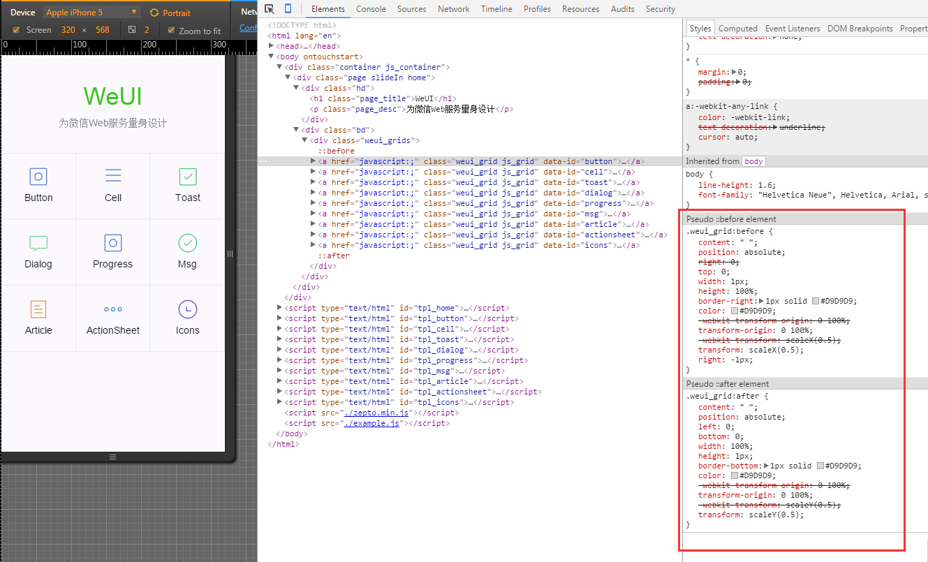
微信WeUI的
.weui_grid:before {
    content: " ";
    position: absolute;
    right: 0;
    top: 0;
    width: 1px;
    height: 100%;
    border-right: 1px solid #D9D9D9;
    color: #D9D9D9;
    -webkit-transform-origin: 0 100%;
    transform-origin: 0 100%;
    -webkit-transform: scaleX(0.5);
    transform: scaleX(0.5);
    right: -1px;
}

.weui_grid:after {
    content: " ";
    position: absolute;
    left: 0;
    bottom: 0;
    width: 100%;
    height: 1px;
    border-bottom: 1px solid #D9D9D9;
    color: #D9D9D9;
    -webkit-transform-origin: 0 100%;
    transform-origin: 0 100%;
    -webkit-transform: scaleY(0.5);
    transform: scaleY(0.5);
}
再看再看看 阿里去啊 ,利用.5px 其中 hairlines挂到 <html class='hairlines'上> ios8以上支持 .5px
<script>
	if (/iP(hone|od|ad)/.test(navigator.userAgent)) {  //  就是放到html根节点上的   ios8现在普及率高了,可以省略
		var v = (navigator.appVersion).match(/OS (\d+)_(\d+)_?(\d+)?/), version = parseInt(
				v[1], 10);
		if (version >= 8) {
			document.documentElement.classList.add('hairlines')
		}
	};
</script>
.r1bt {
    border-top: 1px solid rgba(32,35,37,.15)
}

.r1bb {
    border-bottom: 1px solid rgba(32,35,37,.15)
}

.r1bl {
    border-left: 1px solid rgba(32,35,37,.15)
}

.r1br {
    border-right: 1px solid rgba(32,35,37,.15)
}

.r1b {
    border: 1px solid rgba(32,35,37,.15)
}

.hairlines .r1bt,.hairlines .r1bb,.hairlines .r1bl,.hairlines .r1br,.hairlines .r1b {
    border-width: .5px!important
}
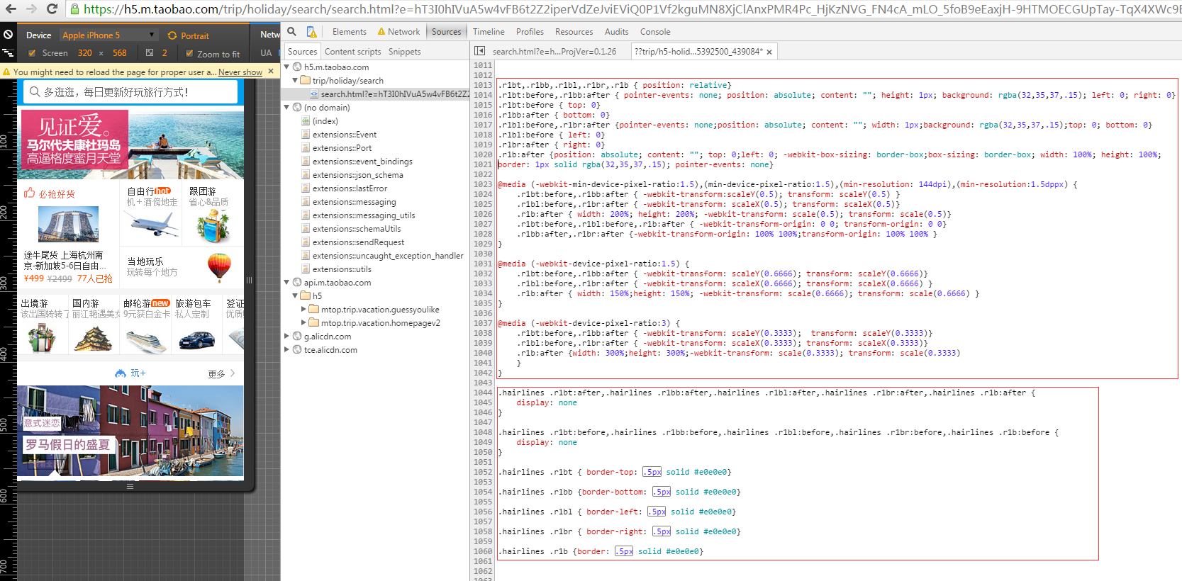
阿里去啊 另一种 transform: scale(x) 缩放 ,兼容性适用性非常好 推荐使用
/*Retian 1px border start */
.retinabt,.retinabb,.retinabl,.retinabr,.retinab{position:relative;}
.retinabt:before,.retinabb:after{pointer-events:none;position:absolute;content:"";height:1px;background:rgba(32,35,37,.14);left:0;right:0;z-index:26;}
.retinabt:before{top:0;z-index:26;}
.retinabb:after{bottom:0;z-index:26;}
.retinabl:before,.retinabr:after{pointer-events:none;position:absolute;content:"";width:1px;background:rgba(32,35,37,.14);top:0;bottom:0}
.retinabl:before{left:0;z-index:26;}
.retinabr:after{right:0;z-index:26;}
.retinab:after{position:absolute;content:"";top:0;left:0;-webkit-box-sizing:border-box;box-sizing:border-box;width:100%;height:100%;border:1px solid rgba(32,35,37,.14);pointer-events:none;z-index:26;}
@media (-webkit-min-device-pixel-ratio:1.5),(min-device-pixel-ratio:1.5),(min-resolution:144dpi),(min-resolution:1.5dppx){
.retinabt:before,.retinabb:after{-webkit-transform:scaleY(.5);transform:scaleY(.5) }
.retinabl:before,.retinabr:after{-webkit-transform:scaleX(.5);transform:scaleX(.5) }
.retinab:after{width:200%;height:200%;-webkit-transform:scale(.5);transform:scale(.5) }
.retinabt:before,.retinabl:before,.retinab:after{-webkit-transform-origin:0 0;transform-origin:0 0}
.retinabb:after,.retinabr:after{-webkit-transform-origin:100% 100%;transform-origin:100% 100%}
}
@media (-webkit-device-pixel-ratio:1.5){
.retinabt:before,.retinabb:after{-webkit-transform:scaleY(.6666);transform:scaleY(.6666) }
.retinabl:before,.retinabr:after{-webkit-transform:scaleX(.6666);transform:scaleX(.6666)}
.retinab:after{width:150%;height:150%;-webkit-transform:scale(.6666);transform:scale(.6666) }
}
@media (-webkit-device-pixel-ratio:3){
.retinabt:before,.retinabb:after{-webkit-transform:scaleY(.3333);transform:scaleY(.3333)}
.retinabl:before,.retinabr:after{-webkit-transform:scaleX(.3333);transform:scaleX(.3333)}
.retinab:after{width:300%;height:300%;-webkit-transform:scale(.3333);transform:scale(.3333)}
}
@media (-webkit-min-device-pixel-ratio:4),(min-device-pixel-ratio:4){
.retinabt:before,.retinabb:after{-webkit-transform:scaleY(.25);transform:scaleY(.25)}
.retinabl:before,.retinabr:after{-webkit-transform:scaleX(.25);transform:scaleX(.25)}
.retinab:after{width:400%;height:400%;-webkit-transform:scale(.25);transform:scale(.25)}
}
/*Retina 1px border end */
然后 再看看rem的解决方案
美团的 (使用rem,但是不随屏幕大小而计算根节点html的font-size,适合列表较多)
<script type="text/javascript">
        //根据屏幕大小及dpi调整缩放和大小
        (function() {
            var scale = 1.0;
            var ratio = 1;
            if (window.devicePixelRatio >= 2) {
                scale *= 0.5;
                ratio *= 2;
            }
            var text = '<meta name="viewport" content="initial-scale=' + scale + ', maximum-scale=' + scale +', minimum-scale=' + scale + ', width=device-width, user-scalable=no" />';
            document.write(text);
            document.documentElement.style.fontSize = 50*ratio + "px";
        })();
    </script>
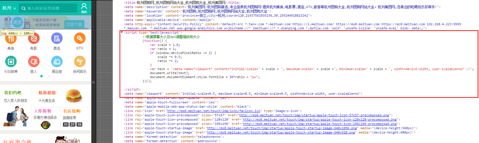
我们把美团的 拷贝过来使用,发现 安卓自带的浏览器(app内嵌h5不得不考虑)有的 不兼容 开始整体字体放大,应该是没有正确获取设备的实际宽度,(手头没有那么多安卓测试手机,主要是自带浏览器出现问题),不知到美团怎么处理的,我想到的用这个 target-densittydpi=device-dpi hack下;是可以的 或者加个 计时器 延迟 50毫秒 获取设备的正确实际宽度;
 <meta name="viewport" content="target-densitydpi=device-dpi">  <!--安卓自带的 device-width 先不加 否则iphone 随进线条出现问题 -->
<script>
+function(win,doc,undefined) {//根据屏幕大小及dpi调整缩放和大小
	var scale = 1.0,ratio = 1,dc=doc,viewporttexts='';
	if (win.devicePixelRatio && devicePixelRatio >= 1.5) {
		ratio = devicePixelRatio;
		scale = scale/(devicePixelRatio);
	}
	//var texts = '<meta  name="viewport" content="initial-scale=' + scale + ', maximum-scale=' + scale +', minimum-scale=' + scale + ', width=device-width, user-scalable=no" />';
	// dc.write(texts);
	  viewporttexts = ' width=device-width, initial-scale=' + scale + ', maximum-scale=' + scale +', minimum-scale=' + scale + ',user-scalable=no';
      doc.querySelector('meta[name="viewport"]').setAttribute("content",viewporttexts);

	   console.log('111');
      dc.documentElement.style.fontSize =doc.getElementsByTagName("html")[0].style.fontSize=Math.ceil(50*ratio) + "px";
}(window,document);
 </script>
最后淘宝的 等等(大部分rem都是 随屏幕大小而计算 根节点大小 ) 这段代码有点旧了 https://github.com/amfe/lib-flexible
;(function(win, lib) {
    var doc = win.document;
    var docEl = doc.documentElement;
    var metaEl = doc.querySelector('meta[name="viewport"]');
    var flexibleEl = doc.querySelector('meta[name="flexible"]');
    var dpr = 0;
    var scale = 0;
    var tid;
    var flexible = lib.flexible || (lib.flexible = {});

    if (metaEl) {
        console.warn('将根据已有的meta标签来设置缩放比例');
        var match = metaEl.getAttribute('content').match(/initial\-scale=([\d\.]+)/);
        if (match) {
            scale = parseFloat(match[1]);
            dpr = parseInt(1 / scale);
        }
    } else if (flexibleEl) {
        var content = flexibleEl.getAttribute('content');
        if (content) {
            var initialDpr = content.match(/initial\-dpr=([\d\.]+)/);
            var maximumDpr = content.match(/maximum\-dpr=([\d\.]+)/);
            if (initialDpr) {
                dpr = parseFloat(initialDpr[1]);
                scale = parseFloat((1 / dpr).toFixed(2));
            }
            if (maximumDpr) {
                dpr = parseFloat(maximumDpr[1]);
                scale = parseFloat((1 / dpr).toFixed(2));
            }
        }
    }

    if (!dpr && !scale) {
        var isAndroid = win.navigator.appVersion.match(/android/gi);
        var isIPhone = win.navigator.appVersion.match(/iphone/gi);
        var devicePixelRatio = win.devicePixelRatio;
        if (isIPhone) {
            // iOS下,对于2和3的屏,用2倍的方案,其余的用1倍方案
            if (devicePixelRatio >= 3 && (!dpr || dpr >= 3)) {
                dpr = 3;
            } else if (devicePixelRatio >= 2 && (!dpr || dpr >= 2)){
                dpr = 2;
            } else {
                dpr = 1;
            }
        } else {
            // 其他设备下,仍旧使用1倍的方案
            dpr = 1;
        }
        scale = 1 / dpr;
    }

    docEl.setAttribute('data-dpr', dpr);
    if (!metaEl) {
        metaEl = doc.createElement('meta');
        metaEl.setAttribute('name', 'viewport');
        metaEl.setAttribute('content', 'initial-scale=' + scale + ', maximum-scale=' + scale + ', minimum-scale=' + scale + ', user-scalable=no');
        if (docEl.firstElementChild) {
            docEl.firstElementChild.appendChild(metaEl);
        } else {
            var wrap = doc.createElement('div');
            wrap.appendChild(metaEl);
            doc.write(wrap.innerHTML);
        }
    }

    function refreshRem(){
        var width = docEl.getBoundingClientRect().width;
        if (width / dpr > 540) {
            width = 540 * dpr;
        }
        var rem = width / 10;
        docEl.style.fontSize = rem + 'px';
        flexible.rem = win.rem = rem;
    }

    win.addEventListener('resize', function() {
        clearTimeout(tid);
        tid = setTimeout(refreshRem, 300);
    }, false);
    win.addEventListener('pageshow', function(e) {
        if (e.persisted) {
            clearTimeout(tid);
            tid = setTimeout(refreshRem, 300);
        }
    }, false);

    if (doc.readyState === 'complete') {
        doc.body.style.fontSize = 12 * dpr + 'px';
    } else {
        doc.addEventListener('DOMContentLoaded', function(e) {
            doc.body.style.fontSize = 12 * dpr + 'px';
        }, false);
    }


    refreshRem();

    flexible.dpr = win.dpr = dpr;
    flexible.refreshRem = refreshRem;
    flexible.rem2px = function(d) {
        var val = parseFloat(d) * this.rem;
        if (typeof d === 'string' && d.match(/rem$/)) {
            val += 'px';
        }
        return val;
    }
    flexible.px2rem = function(d) {
        var val = parseFloat(d) / this.rem;
        if (typeof d === 'string' && d.match(/px$/)) {
            val += 'rem';
        }
        return val;
    }

})(window, window['lib'] || (window['lib'] = {}));
用rem写1px 维护行方便;图片高度可以用rem固定高度,防止加载时出现高度自动网速加载慢导致的明显塌陷;
缺点: 动态控制 viewport retina下,无论美团还是淘宝用 rem始终还有许多细小的问题;在ios上浏览器打开仔细看还是看的出的,安卓上没看出来;
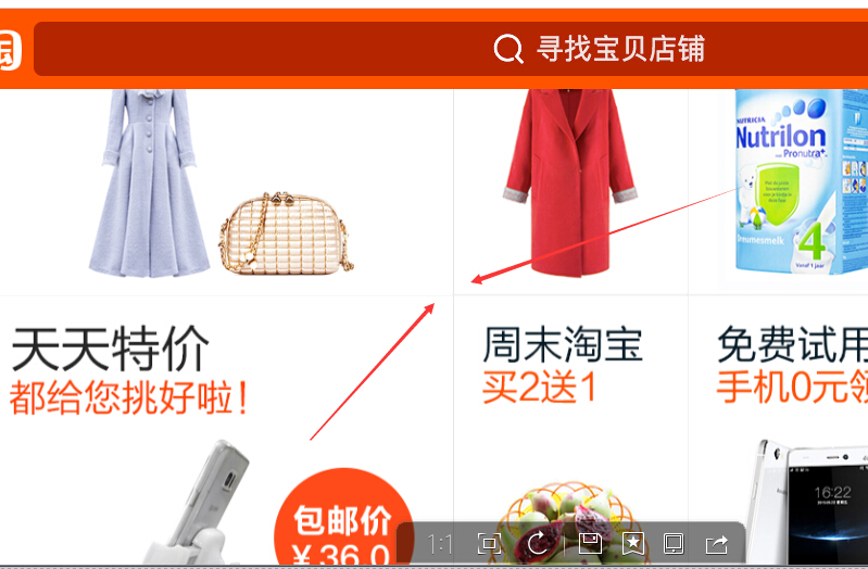
有时候retina下, viewport 缩放动态控制字体大小;<meta name="viewport" content="initial-scale=0.5, maximum-scale=0.5, minimum-scale=0.5, user-scalable=no"> 竖线或者奇数偶数行横线 或者动态添加显示的元素 之后的1px线条,有的1.1px 或者1.2px等等...拿手机仔细看下,观察iphone5 以及iphone6 safari以及其他浏览器对比下就知道,以下是截图出来问题的(只是示范一下 红色箭头的 border 线条 ),同样都是像素比 ratio=2 真机上细看还是明显的;
先看看iphone6 的截图 文字 ktv右侧的1px border正常;

再看看 下面 iphone5s的截图 刷选左侧的1px正常; ip6第一条正常;ip5s最后一条正常;


上面iphone5s 截图 美团KTV 全城 默认排序 刷选的 分割线 ;iphone5s 刷选的那条是正常的鹅;前面3条1px多了点;ip6上则不是;
有的 竖线始终 感觉 宽度是 不是1px;宽了一点点;首页美食类目进去;每个店铺边框 偶尔几条线条是1px多了一点点;
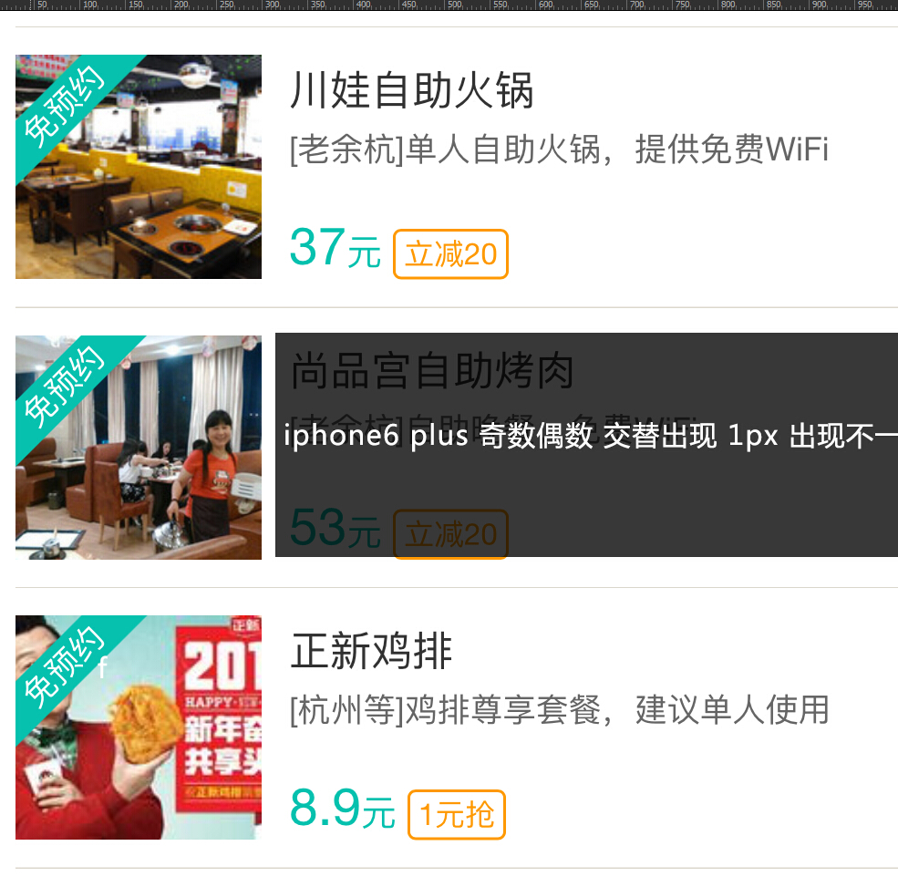
下面是iphone6 plus 的截图 100状态下 ; iphone6 plus 的截图还是看的出来 ;比较明显 奇数偶数行线条 不一致的 问题;;
淘宝网 iophone5s 横向 屏幕截图
喜欢那种就用那种好了;
顺便附个H5 Canvas Retina屏幕处理的1px的函数
/**
 * HiDPI Canvas Polyfill (1.0.9)
 *
 * Author: Jonathan D. Johnson (http://jondavidjohn.com)
 * Homepage: https://github.com/jondavidjohn/hidpi-canvas-polyfill
 * Issue Tracker: https://github.com/jondavidjohn/hidpi-canvas-polyfill/issues
 * License: Apache 2.0
*/
;(function(prototype) {

	var pixelRatio = (function(context) {
			var backingStore = context.backingStorePixelRatio ||
						context.webkitBackingStorePixelRatio ||
						context.mozBackingStorePixelRatio ||
						context.msBackingStorePixelRatio ||
						context.oBackingStorePixelRatio ||
						context.backingStorePixelRatio || 1;

			return (window.devicePixelRatio || 1) / backingStore;
		})(prototype),

		forEach = function(obj, func) {
			for (var p in obj) {
				if (obj.hasOwnProperty(p)) {
					func(obj[p], p);
				}
			}
		},

		ratioArgs = {
			'fillRect': 'all',
			'clearRect': 'all',
			'strokeRect': 'all',
			'moveTo': 'all',
			'lineTo': 'all',
			'arc': [0,1,2],
			'arcTo': 'all',
			'bezierCurveTo': 'all',
			'isPointinPath': 'all',
			'isPointinStroke': 'all',
			'quadraticCurveTo': 'all',
			'rect': 'all',
			'translate': 'all',
			'createRadialGradient': 'all',
			'createLinearGradient': 'all'
		};

	if (pixelRatio === 1) return;

	forEach(ratioArgs, function(value, key) {
		prototype[key] = (function(_super) {
			return function() {
				var i, len,
					args = Array.prototype.slice.call(arguments);

				if (value === 'all') {
					args = args.map(function(a) {
						return a * pixelRatio;
					});
				}
				else if (Array.isArray(value)) {
					for (i = 0, len = value.length; i < len; i++) {
						args[value[i]] *= pixelRatio;
					}
				}

				return _super.apply(this, args);
			};
		})(prototype[key]);
	});

	 // Stroke lineWidth adjustment
	prototype.stroke = (function(_super) {
		return function() {
			this.lineWidth *= pixelRatio;
			_super.apply(this, arguments);
			this.lineWidth /= pixelRatio;
		};
	})(prototype.stroke);

	// Text
	//
	prototype.fillText = (function(_super) {
		return function() {
			var args = Array.prototype.slice.call(arguments);

			args[1] *= pixelRatio; // x
			args[2] *= pixelRatio; // y

			this.font = this.font.replace(
				/(\d+)(px|em|rem|pt)/g,
				function(w, m, u) {
					return (m * pixelRatio) + u;
				}
			);

			_super.apply(this, args);

			this.font = this.font.replace(
				/(\d+)(px|em|rem|pt)/g,
				function(w, m, u) {
					return (m / pixelRatio) + u;
				}
			);
		};
	})(prototype.fillText);

	prototype.strokeText = (function(_super) {
		return function() {
			var args = Array.prototype.slice.call(arguments);

			args[1] *= pixelRatio; // x
			args[2] *= pixelRatio; // y

			this.font = this.font.replace(
				/(\d+)(px|em|rem|pt)/g,
				function(w, m, u) {
					return (m * pixelRatio) + u;
				}
			);

			_super.apply(this, args);

			this.font = this.font.replace(
				/(\d+)(px|em|rem|pt)/g,
				function(w, m, u) {
					return (m / pixelRatio) + u;
				}
			);
		};
	})(prototype.strokeText);
})(CanvasRenderingContext2D.prototype);
;(function(prototype) {
	prototype.getContext = (function(_super) {
		return function(type) {
			var backingStore, ratio,
				context = _super.call(this, type);

			if (type === '2d') {

				backingStore = context.backingStorePixelRatio ||
							context.webkitBackingStorePixelRatio ||
							context.mozBackingStorePixelRatio ||
							context.msBackingStorePixelRatio ||
							context.oBackingStorePixelRatio ||
							context.backingStorePixelRatio || 1;

				ratio = (window.devicePixelRatio || 1) / backingStore;

				if (ratio > 1) {
					this.style.height = this.height + 'px';
					this.style.width = this.width + 'px';
					this.width *= ratio;
					this.height *= ratio;
				}
			}

			return context;
		};
	})(prototype.getContext);
})(HTMLCanvasElement.prototype);
本文地址 http://www.cnblogs.com/surfaces/p/4324044.html

 浙公网安备 33010602011771号