
python之matplotlib
matplotlib可以将数据绘制成图像呈现,风格与matlab画图相似,是一款很好用的python库 。
这篇文档记录matplotlib的学习过程。主要参考见参考1。
1 概述
Matplotlib代码库十分庞大,这可能会让初学者望而生畏。然而,大多数matplotlib都可以通过一个相当简单的概念框架和几个要点来理解。
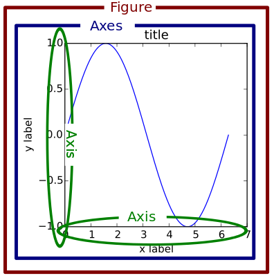
框架之Figure、Axes、Axis:
下图引用自matplotlib官网。
- Figure可以理解为画板,可以包括多个Axes(可理解为画布);
- Axes是Axis的复数形式,表示一个Axes包含多个Axis(x轴、y轴、z轴);
- Axis 表示一个轴(x轴或y轴或z轴(3-D))
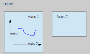
这个图来自网络,表现了Figure、Axes、Axis之间的关系,或许更清晰。
所以一般画图分为三步: 创建画板--> 创建画布-->通过坐标画图
2 Figure--创建画板
如下示例,创建了3个画板,之后又切到画板1。
import matplotlib.pyplot as plt

# create figure
'''
plt.figure(num=None,         # 当给它一个数字时,就作为画板的编号,相当于 ID 号;当给它一个字符串时,就作为画板的名称
           figsize=None,     # 画板的宽、高,单位为英寸 (2.5cm)
           dpi=None,         # 指定在该画板上绘制的图像的分辨率,即每英寸多少个像素
		   facecolor=None,   # 画板的背景颜色
		   edgecolor=None,   # 画板的边框颜色
		   frameon=True,     # 是否显示边框
		   FigureClass,
		   clear=False,
		   **kwargs)
'''
# 如果figure不存在,则创建,否则切到此figure
fig1 = plt.figure(1)
fig2 = plt.figure(2)
fig3 = plt.figure(3)
fig1 = plt.figure(1)

plt.show()    # show
3 Axes--创建画布
创建画布有多种方法:
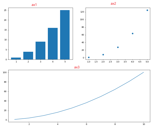
- 方法1:Figure.add_subplot方法
import numpy as np
import matplotlib.pyplot as plt

# create data
A1 = np.arange(1, 6)  # x ∈ [1,5]
A2 = np.arange(1, 11) # x ∈ [1,10]
B = A1 ** 2
C = A1 ** 3
D = A2 ** 2

# step1: create figure
fig = plt.figure()
# step2: create axes
ax1 = fig.add_subplot(221) # 在画板上添加画布
ax2 = fig.add_subplot(222)
ax3 = fig.add_subplot(212)
# step3: plot data
ax1.bar(A1, B)
ax2.scatter(A1, C)
ax3.plot(A2, D)

plt.show()    # show
其效果如下:
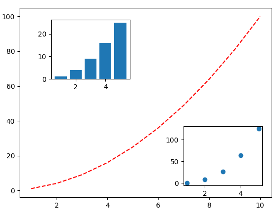
- 方法2: fig.add_axes()方法
使用fig.add_axes()方法可以很容易添加子图。
import numpy as np
import matplotlib.pyplot as plt

# create data
A1 = np.arange(1, 6)  # x ∈ [1,5]
A2 = np.arange(1, 11) # x ∈ [1,10]
B = A1 ** 2
C = A1 ** 3
D = A2 ** 2

# step1: create figure
fig = plt.figure()
# step2: create axes
# 左边轴从整个figure10%的地方开始,下边轴整个figure10%的地方开始,
# 宽度为整个figure的80%,高度为整个figure的80%
left,bottom,width,height = 0.1,0.1,0.8,0.8
ax1 = fig.add_axes([left,bottom,width,height]) # 在画板上添加画布
left,bottom,width,height = 0.2,0.7,0.20,0.20
ax2 = fig.add_axes([left,bottom,width,height])
left,bottom,width,height = 0.65,0.1,0.20,0.20
ax3 = fig.add_axes([left,bottom,width,height])
# step3: plot data
ax1.plot(A2, D)
ax2.bar(A1, B)
ax3.scatter(A1, C)

plt.show()    # show
-
方法3: pyplot.subplot(nrows, ncols, index, **kwargs)
通过subplot方法创建画布后,可以直接使用plt.plot直接在当前活跃的axes上面作图。
有如下两种写法(为了方便区分,创建2张画板):
import numpy as np
import matplotlib.pyplot as plt

# create data
A1 = np.arange(1, 6)  # x ∈ [1,5]
A2 = np.arange(1, 11) # x ∈ [1,10]
B = A1 ** 2
C = A1 ** 3
D = A2 ** 2

############ 写法1 ############
# step1: create figure
fig1 = plt.figure(1)   # 创建画板1
# step2: create axes
ax1 = plt.subplot(221) # 在画板上添加画布,等价于ax1 = plt.gcf().subplot(221)
                       # 其中 .gcf() 的作用是获取当前 figure, 即 get current figure;
ax2 = plt.subplot(222)
ax3 = plt.subplot(212)
# step3: plot data
ax1.bar(A1, B)
ax2.scatter(A1, C)
ax3.plot(A2, D)

############ 写法2 ############

# step1: create figure
fig2 = plt.figure(2)  # 创建画板2
# step2: create axes and plot
plt.subplot(221) # 在画板上添加画布
plt.bar(A1, B)   # 直接使用plt.plot直接在当前活跃的axes上面作图,plt.plot等价于plt.gca().plot()
                 # 其中.gca() 就是获取当前 axes,即 get current axes
plt.subplot(222)
plt.scatter(A1, C)
plt.subplot(212)
plt.plot(A2, D)

plt.show()    # show
方法3同样可以画出方法1一样的图。
-
方法4:fig, axes = pyplot.subplots()
subplots与subplot区别:
- subplots() 既创建了一个包含子图区域的画布axes,又创建了一个 figure 图形对象,而 subplot() 只是创建一个包含子图区域的画布axes。
- subplots() 只能创建nRows * nCols 的规则画布,而subplot()可以创建不规则画布(如:下图与方法1画图的区别,也可见参考3)
import numpy as np
import matplotlib.pyplot as plt
# create data
A1 = np.arange(1, 6) # x ∈ [1,5]
A2 = np.arange(1, 11) # x ∈ [1,10]
B = A1 ** 2
C = A1 ** 3
D = A2 ** 2
# step1: create fig and create axes
fig, ax = plt.subplots(2,2) # 创建画板并添加画布
# ax0, ax1, ax2, ax3 = ax.ravel() # 将数组多维度拉成一维数组
# step2: plot data
ax[0][0].bar(A1, B)
ax[0][1].scatter(A1, C)
ax[1][0].plot(A2, D)
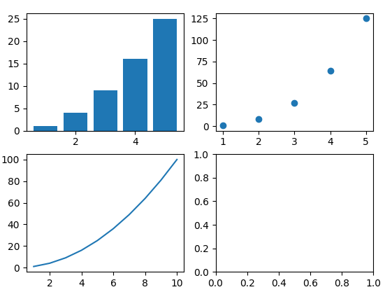
plt.show() # show
其结果如下:
4 Axis--坐标轴操作
下图展示的是matplotlib库Axis的一些操作。
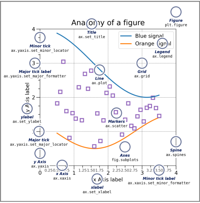
上图的函数列表如下:
| 函数 | 作用 |
|---|---|
| ax.plot | 折线图 |
| ax.scatter | 画散点图 |
| ax.bar | 画柱状图 |
| ax.set_title | 设置图标标题 |
| ax.set_xlable | 给x坐标轴加上标签 |
| ax.set_ylable | 给y坐标轴加上标签 |
| ax.set_xticks | 轴的x刻度 |
| ax.set_yticks | 轴的y刻度 |
| ax.text | 添加文本框 |
| ax.grid | 添加网格线 |
颜色与线条:
| 颜色标记(c=) | 颜色含义 | 线条标记(marker=) | 线条含义 |
|---|---|---|---|
| b | blue 蓝 | . | point |
| g | green 绿 | o | circle |
| r | red 红 | x | x-mark |
| c | cyan 青 | + | plus |
| m | magenta 品红 | * | star |
| y | yellow 黄 | s | square |
| k | black 黑 | d | diamond |
| w | white 白 | v | triangle (down) |
| ^ | triangle (up) | ||
| < | triangle (left) | ||
| > | triangle (right) | ||
| p | pentagram 五角星 | ||
| h | hexagram 六角星 | ||
| - | solid | ||
| : | dotted | ||
| -. | dashdot | ||
| -- | dashed |
参考:

 浙公网安备 33010602011771号