
React实现Antd的tabs切换——选项卡切换组件
一.组件代码
tabs/index.tsx文件
import React, { useState } from 'react';
import { TabBar, TabContent, TabBarItem } from './styled';
interface PropsInter {
  defaultActiveKey?: any;
  disabled?: boolean;
  onChange?: (activeKey: any) => any;
}

function TabPane(props: any) {
  return <div>{props.children}</div>;
}

function Tabs(props: PropsInter) {
  const [currentIndex, setCurrentIndex] = useState(props.defaultActiveKey);

  const onChange = (activeKey: any) => {
    if (typeof props.onChange === 'function') props.onChange(activeKey);
    setCurrentIndex(activeKey);
  };

  return (
    <div style={{ overflow: 'hidden' }}>
      <TabBar>
        {React.Children.map(props.children, (element, index) => {
          let { disabled, tab } = element.props;
          return (
            <TabBarItem
              className={currentIndex === element.key ? 'active' : ''}
              onClick={() => onChange(element.key)}
              key={element.key}
              disabled={disabled}
            >
              {tab}
            </TabBarItem>
          );
        })}
      </TabBar>
      <TabContent>
        {React.Children.map(props.children, (element, index) => {
          return (
            <div
              key={element.key}
              style={{
                display: currentIndex === element.key ? 'block' : 'none',
              }}
            >
              {element}
            </div>
          );
        })}
      </TabContent>
    </div>
  );
}
export { Tabs, TabPane };
tabs/styled.ts文件
import styled from 'styled-components';
import { Button } from 'antd';
export const TabBar = styled.div`
  background: #fff;
  padding: 8px 16px;
  z-index: 1;
  flex-shrink: 0;
  display: flex;
  position: relative;
`;

export const TabBarItem = styled(Button)`
  margin: 0 34px 0 0;
  padding: 12px 0px;
  font-size: 14px;
  display: flex;
  justify-content: center;
  align-items: center;
  box-sizing: border-box;
  border: none;
  box-shadow: none;
  &.active,
  &.hover {
    color: #108ee9;
    border-bottom: 2px solid #1890ff;
  }
`;

export const TabContent = styled.div`
  background: #fff;
  display: flex;
  flex: 1;
  height: 100%;
  div {
    flex-shrink: 0;
    width: 100%;
    overflow-y: auto;
  }
`;
二.使用组件:
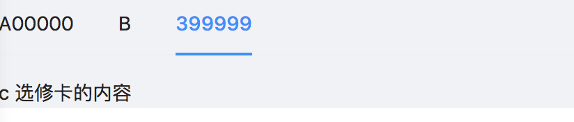
import React from 'react';
import { Tabs, TabPane } from './tabs';
export interface BasicLayoutProps {}
const BasicLayout: React.FC<BasicLayoutProps> = props => {
  const { children } = props;
  return (
    <>
      <Tabs
        defaultActiveKey="1"
        onChange={activeKey => console.log('activeKey', activeKey)}
      >
        <div tab="A00000" key="1">
          <TabPane>A 选修卡的内容</TabPane>
        </div>
        <TabPane tab="B" key="2">
          B 选修卡的内容
        </TabPane>
        <TabPane tab="399999" key="3">
          c 选修卡的内容
        </TabPane>
      </Tabs>
    </>
  );
};
export default BasicLayout;
三.结果图解:
四.组件内容详解
1.Tabs组件控制tab栏切换 TabPane展示tab真实内容
2.React.Children.map结构:React.Children.map(object children,callback)
如:React.Children.map(props.children, (element, index) => {}
props.children:=>子元素集合数组 这里是Tabs里面的内容
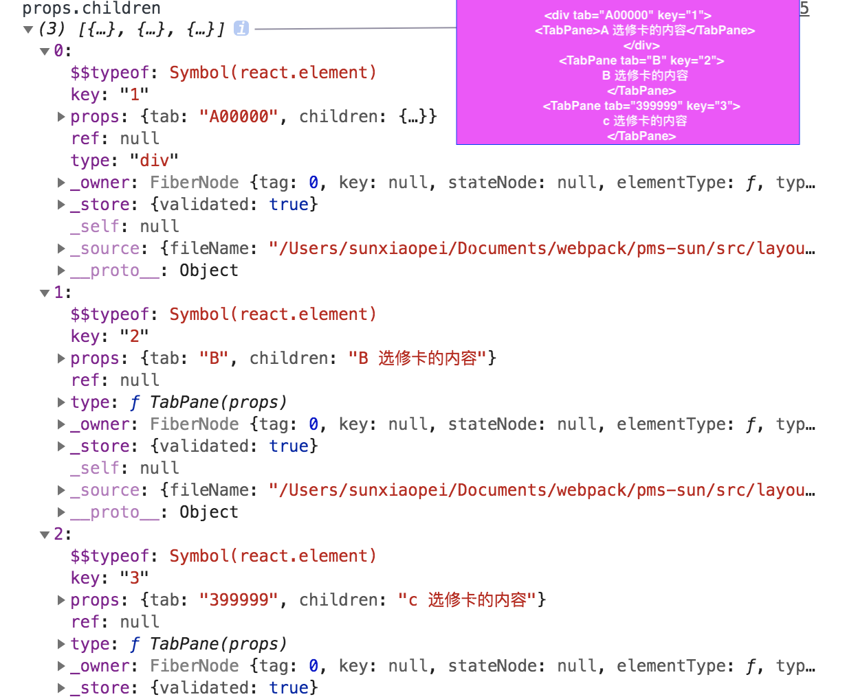
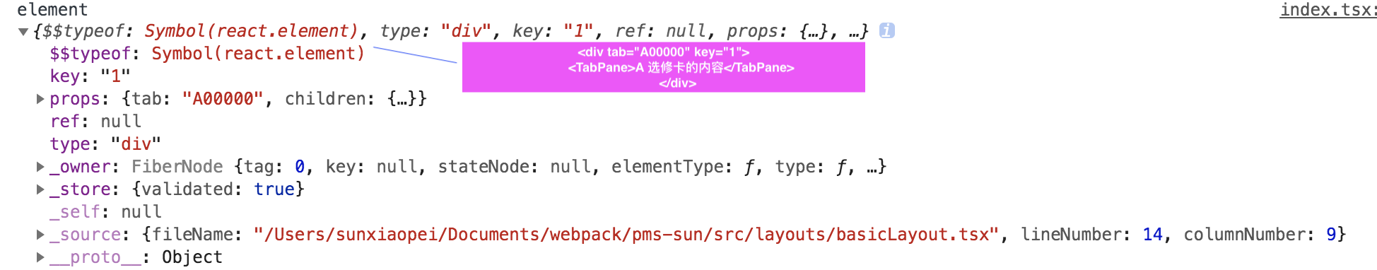
element:=>子组件数组的每一个子项 这里是每一个TabPane里面的内容

 浙公网安备 33010602011771号