

grid网格布局
grid网格布局
一、Html样式
<body>
<div class="grid-grid">
<div class="grid-header">Header</div>
<div class="grid-content-left">Left</div>
<div class="grid-content-bodyTop">Top Contetn</div>
<div class="grid-content-bodyBottom">Bottom Contetn</div>
<div class="grid-content-right">Right</div>
<div class="grid-footer">Footer</div>
</div>
</body>
二、第一种布局方式
css样式
.grid-grid{ //整个容器
display: grid; //grid布局
grid-gap: 5px; //单元格之间的距离
width: 100%;
grid-template-areas: "header header header"
"left top right"
"left bottom right"
". bottom right"
". bottom . "
"footer footer footer";
//块级元素定义的grid-area: header;
grid-template-rows: 40px 100px 50px 80px 80px 50px; //网格指定行数和行高
grid-template-columns: 20% 59% 20%; //网格指定列数和列宽
//grid-template-columns:1fr 3fr 1fr ;这里的1fr自动根据容器的宽度计算,不设置的话为auto,
}
@media only screen and (max-width: 600px) { //媒体查询修改布局
.grid-grid{
display: grid;
grid-gap: 5px;
width: 100%;
grid-template-areas: "header"
"top"
"left"
"right"
"bottom "
"footer";
grid-template-rows: 40px 100px 50px 80px 60px 20px;
grid-template-columns: 100%;
}
}
.grid-header{
background: #ff0;
grid-area: header;
}
.grid-content-left{
background: #f0f;
grid-area: left;
}
.grid-content-bodyTop{
background: #00f;
grid-area: top;
}
.grid-content-bodyBottom{
background: #00f;
grid-area: bottom;
}
.grid-content-right{
background: #f0f;
grid-area: right;
}
.grid-footer{
background: #ccc;
grid-area: footer;
}
实现效果如下:
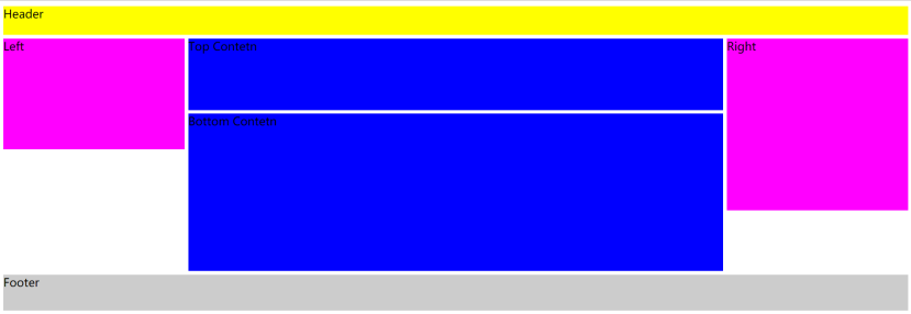
grid-template-areas: "header header header"
"left top right"
"left bottom right"
". bottom right" // . 代表空着
". bottom . "
"footer footer footer"; 布局方式
grid-template-rows: 40px 100px 50px 80px 80px 50px; 每一个栅格布局的高度;
grid-template-columns: 20% 59% 20%; 宽度
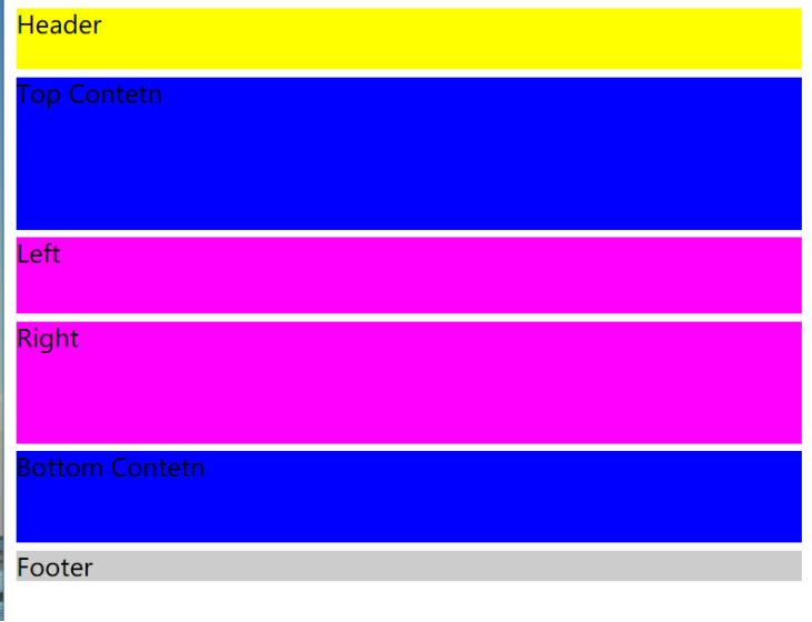
媒体查询动态修改后效果:

媒体查询后:
grid-template-areas: "header"
"top"
"left"
"right"
"bottom "
"footer";//元素的布局方式
grid-template-rows: 40px 100px 50px 80px 60px 20px; 每一个栅格布局的高度;
grid-template-columns: 100%; 高度
三、第二种布局方式
.grid-grid{
display: grid;
grid-gap: 5px;
margin: 5px 0;
width: 100%;
grid-template-rows: 80px 150px 50px repeat(3,100px); //repeat三个重复的100px
grid-template-columns: 1fr 2fr 2fr 1fr; //类分为4等分,每个等分占的比例
}
.grid-header{
background: #ff0;
grid-column: 1/5;
}
.grid-content-left{
background: #f0f;
grid-column: 1/2;
}
.grid-content-bodyTop{
background: #00f;
grid-column: 2/4;
}
.grid-content-bodyBottom{
background: #00f;
grid-column: 2/4;
}
.grid-content-right{
background: #f0f;
grid-column: 4/5;
grid-row:2/span 2;
}
.grid-footer{
background: #ccc;
grid-column: 1/5;
}
呈现如图:
grid-template-rows: 80px 150px 50px repeat(3,100px); //目前只有4行
grid-template-columns: 1fr 2fr 2fr 1fr; //类分为4等分,每个等分占的比例
.grid-header{
background: #ff0;
grid-column: 1/5; //Header纵轴占有的格子数 1-5(全部占有)
}
.grid-content-right{
background: #f0f;
grid-column: 4/5; //Right纵轴占有的格子数 4-5(4等份的最后一份)
grid-row:2/span 2; //Right横轴占有的格子数 2(第二行)/span 2(站两行)
}
Grid栅格布局的样式,对屏幕大小的自适应,解决了div顺序排列问题;可以自动调节div排放的位置; 可以随意设置div放置的位置;
如果要这样居中设置
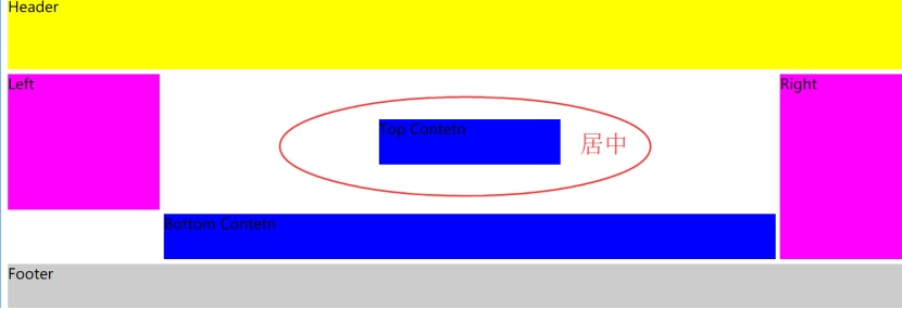
.grid-content-bodyTop{
background: #00f;
grid-column: 2/4;
width: 200px; //宽
height: 50px; //高
justify-self:center; //水平居中
align-self:center; //垂直剧中
}
地址:https://gitee.com/sunshine-annie/codes/zjmhngxv79bp3sc0yq54d84
