
Apache ECharts图表使用demo案例
背景描述:
vue项目中使用echarts绘制图表,包括折线图,饼图,地图,柱状图等。
代码:
<template>
   <div class="page-container">
       <div id="myChart"></div>
   </div>
</template>

<script>
   export default {
      name: 'Demo',
      data(){
         return {
            myChart: null
         }
      },
      mounted(){
        this.drawChart();
        this.handleChartResize();
      },
      methods:{
        drawChart() {
        // 基于准备好的dom,初始化echarts实例
        var myChart = echarts.init(document.getElementById("myChart"));
         this.myChart = myChart;
        let option = {
           tooltip: {
               trigger: "axis",
               axisPointer: { type: "cross" },
             },
             legend: {},
             xAxis: [
               {
                type: "category",
                axisTick: {
                  alignWithLabel: true,
                },
                data: [
                  "1月",
                  "2月",
                  "3月",
                  "4月",
                  "5月",
                  "6月",
                  "7月",
                  "8月",
                  "9月",
                  "10月",
                  "11月",
                  "12月",
                 ],
              },
            ],
            yAxis: [
            {
              type: "value",
              name: "降水量",
              min: 0,
              max: 250,
              position: "right",
              axisLabel: {
                formatter: "{value} ml",
              },
            },
            {
              type: "value",
              name: "温度",
              min: 0,
              max: 25,
              position: "left",
              axisLabel: {
                formatter: "{value} °C",
              },
            },
          ],
          series: [
            {
              name: "降水量",
              type: "bar",
              yAxisIndex: 0,
              data: [
                6, 32, 70, 86, 68.7, 100.7, 125.6, 112.2, 78.7, 48.8, 36.0, 19.3,
              ],
              itemStyle: {
                color: '#5470c6'
              }
            },
            {
              name: "温度",
              type: "line",
              smooth: true,
              yAxisIndex: 1,
              data: [
                6.0, 10.2, 10.3, 11.5, 10.3, 13.2, 14.3, 16.4, 18.0, 16.5, 12.0,
                5.2,
              ],
              itemStyle: {
                color: '#91cc75'
              }
            },
          ],
        };
        // 绘制图表
        myChart.setOption(option);
      },
       // 图表大小自适应
       handleChartResize(){
         window.addEventListener('resize', function(){
            if(this.myChart){
              this.myChart.resize();
            }
         })
       }
      },
      beforeDestroy(){
        // 销毁实例之前调用
        if(this.myChart){
          this.myChart.dispose(); //图表容器销毁实例释放资源,避免内存泄漏。
          this.myChart = null;
        }
      },
   }
</script>
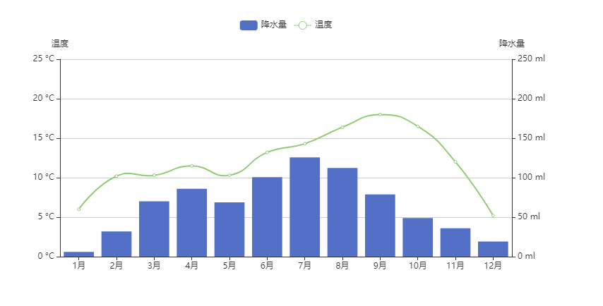
效果图:
常用API/属性介绍:
高亮的样式-emphasis:
   series: {
      type: 'scatter',
      // 普通样式
      itemStyle: {
         color: 'blue',
      },
      label: {
         show: true,
         formatter: 'textcontent'
      },
     emphasis: {
        itemStyle: {
          //高亮时点的颜色
          color: 'red',
           shadowBlur: 10,
           shadowOffsetX: 0,
           shadowColor: 'rgba(0,0,0,.2)'
        },
        label: {
          show: true,
          // 高亮时标签的文字
          formatter: 'textcontent'
        }
     }
   }
坐标轴-xAxis/yAxis:
   xAxis: {
     axisLine: { //轴线
       symbol: 'arrow',
       lineStyle: {
         type: 'dashed'
       },
     },
     axisLabel: { // 刻度标签内容
       formatter: 'textcontent',
       align: 'center
     },
     axisTick: {//刻度
       length: 6,
       lineStyle: {
         type: 'dashed'
       }
     },
   },
   yAxis: {}

视觉映射-visualMap:

图例-legend:
  legend:{
    type: 'scroll',
    orient: 'vertical',
    right: 0,
    top; 20,
    data: ['图例一', '图例二', '图例三'],
    backgroundColor: '背景颜色',
    textStyle: {
       color: '文字颜色'
    }
  }

事件与行为:
  a:例如鼠标事件处理:
  myChart.on('click', function(params){
    console.log(params)// 包含点击图形的数据信息对象
    例如:name-数据名, data-传入的原始数据项, value-传入的数据值等等
  })
  //还有很多事件,例如,mousemove, mouseover,mouseout等等

  b:代码触发echarts组件行为-dispatchAction:
     tooltip: {
       trigger: 'item',
       formatter: 'textcontent'
     }
     //假设现在要轮流高亮饼图的每个扇形
     let currentIndex = -1;
     setInterval(function(){
       var dataLen = option.series[0].data.length;
       //取消之前高亮的图形
       myChart.dispatchAction({
         type: 'downplay',
         seriesIndex: 0,
         dataIndex: currentIndex
       })
       currentIndex = (currentIndex+1)%dataLen
       //高亮当前图形
       myChart.dispatchAction({
         type: 'hightlight',
         seriesIndex: 0,
         dataIndex: currentIndex
       })
       // 显示tooltip
       myChart.dispatchAction({
         type: 'showTip',
         seriesIndex: 0,
         dataIndex: currentIndex
       })
     },1000)
  c:监听空白处的点击事件
      myChart.getZr().on('click', function(event){
         if(!event.target){
           //TODO 点击空白处做了什么
         }
      })

柱状图样式设置:
   设置柱状图的样式将 series 的 type 设为 'bar'。
   series:[{},{}...] // 多系列柱状图
   柱条样式通过  series.itemStyle 设置, 包括:
      柱条颜色color,
      柱条描边颜色 borderColor, 宽度 borderWidth, 样式 borderType,
      柱条圆角半径 barBorderRadius,
      柱条透明度 opacity,
      阴影 shadowBlur, shadowColor, shadowOffsetX, shadowOffsetY
      例如:
         series: [
           {
             type: 'bar',
             data: [],
             itemStyle: {
               borderWidth: 2,
               borderColor: 'red',
               borderType: 'solid',
               opacity: 0.5,
               shadowBlur: 2
             }
           }
         ]
      柱条宽度和高度: barWidth
      柱条间距: barGap(不同系列在同一类目下的距离), barCategoryGap(类目与类目之间的距离)
      为柱条添加背景颜色:showBackground: true + backgroundStyle: { color: 'rgba(1,1,1,.6)' }


loading动画:
  例如:
     myChart.showLoading();
     //获取数据后隐藏动画
     myChart.hideLoading();
     myChart.setOption(...);
常用api介绍
线条相关api:
option={
// x轴
xAxis:{

},
// y轴
yAxis:{
  type: 'value',
  name: '我是y轴名称',
  nameLocation: 'middle',//坐标轴名称位置
  //坐标轴名称文字样式
  nameTextStyle:{
    color: 'red',
    fontSize: 20
  },
  nameGap: 20,//坐标轴名称与轴线之间的距离
},
//工具箱
toolbox: {
 feature:{
   //保存图片
   saveAsImage:{
     icon: 'xx图片地址',
     title: '保存为图片', // 工具箱标题
   },
   dataZoom: {},
   dataView: { readOnly: false },
   magicType: { type: ['line','bar'] },
   restore:{},
 }
},
// 类别显示
legend: {
  data: ['Mon','Tue'],
  left: 'right',//类别显示位置
  icon: 'circle',//类别显示图标
  itemWidth: 20, //类别显示图标大小
  itemHeight: 20,
  itemGap: 20, //类别显示图标间距
  // 类别显示图标文字大小
  textStyle:{
    fontSize: 20,
    color: 'red', //类别显示图标文字颜色
  }
},
series:[
  {
    name: 'Mon',
    data: [1,20,40,23,61],//数据
    type: 'line',// 折线图
    smooth: true, //线条平滑
    symbol: 'circle',
    symbolSize: 20,//线条节点大小
    //显示标签
    label: {
      show: true,
      position: 'left',//标签位置
      //标签文字样式
      textStyle: {
        color: 'red',
        fontSize: 20
      },
      backgroundColor: 'blue',//标签背景颜色
      //标签边框
      borderColor:'#888',
      borderWidth: 2,
      borderRadius: 10,//标签边框圆角
      //标签内边距
      padding: 10,
      //标签阴影
      shadowColor: 'red',
      shadowBlur: 10,
      shadowOffsetX: 1,
      shadowOffsetY:1,
      rotate: 45, //标签旋转
    },
    itemStyle: {
      normal: {
        color: '#999',//节点颜色
        lineStyle: {
          color: '#666',//线条颜色
          width: 5,//线条粗细
          type: 'dashed', // 线条样式,虚线还是实线
          shadowColor:'rgba(0,0,0,.5)',// 阴影颜色
          shadowBlur: 10,//阴影距离
          shadowOffsetY: 10,//
        },
        areaStyle: { //线条节点阴影
          color: 'rgba(0,0,0,.3)'
        },
        // 线条节点边框
        borderColor: '#ccc',
        borderWidth: 5,
        // 线条节点边框阴影
        shadowColor: 'rgba(0,0,0,.5)',
        shadowBlur: 10,
        shadowOffsetY: 10
      }
    },
    // 工具提醒
    tooltip: {
      trigger: 'axis',
      //自定义提醒样式
      formatter:'{b}<br/>{a}:{c}',
      //或者
      formatter:function(params){
        return params[0].name+'<br/><span style="color:red">hello</span>'
      },
      //工具提醒背景颜色
      backgroundColor: 'red',
      // 工具提醒边框
      borderWidth: 15,
      borderColor: '#fff',
      //工具提醒阴影
      shadowColor: 'rgba(0,0,0,.6)',
      shadowBlur: 10,
      shadowOffsetY: 10,
      //工具提醒文字样式
      textStyle: {
        color:'blue',
        fontSize: 20
      }
    }
  },
  {
    name: 'Tue',
    ...
  }
]
}
官方文档:
https://echarts.apache.org/handbook/zh/get-started
https://blog.csdn.net/qq_36205206/article/details/119996356 - 可以配置地图json文件 - 地图标题居中 - cp属性
https://www.isqqw.com/viewer?id=17999 - 图表饼图动画效果
https://blog.csdn.net/muguli2008/article/details/102622315 - echarts地图绘制
如果快乐太难,那祝你平安。