
Flutter文本输入框TextField属性(InputDecoration、textInputAction、inputFormatters等等)详解
文章目录
TextField
Flutter中的文本输入框(TextField)就类似于Android中的EditText,但是用起来比EditText方便很多,改变样式也更加的方便。下面我们来看一下TextField的构造方法
构造方法
  const TextField({
    Key key,
    this.controller,    //编辑框的控制器,跟文本框的交互一般都通过该属性完成,如果不创建的话默认会自动创建
    this.focusNode,  //用于管理焦点
    this.decoration = const InputDecoration(),   //输入框的装饰器,用来修改外观
    TextInputType keyboardType,   //设置输入类型,不同的输入类型键盘不一样
    this.textInputAction,   //用于控制键盘动作(一般位于右下角,默认是完成)
    this.textCapitalization = TextCapitalization.none,
    this.style,    //输入的文本样式
    this.textAlign = TextAlign.start,   //输入的文本位置
    this.textDirection,    //输入的文字排列方向,一般不会修改这个属性
    this.autofocus = false,   //是否自动获取焦点
    this.obscureText = false,   //是否隐藏输入的文字,一般用在密码输入框中
    this.autocorrect = true,   //是否自动校验
    this.maxLines = 1,   //最大行
    this.maxLength,   //能输入的最大字符个数
    this.maxLengthEnforced = true,  //配合maxLength一起使用,在达到最大长度时是否阻止输入
    this.onChanged,  //输入文本发生变化时的回调
    this.onEditingComplete,   //点击键盘完成按钮时触发的回调,该回调没有参数,(){}
    this.onSubmitted,  //同样是点击键盘完成按钮时触发的回调,该回调有参数,参数即为当前输入框中的值。(String){}
    this.inputFormatters,   //对输入文本的校验
    this.enabled,    //输入框是否可用
    this.cursorWidth = 2.0,  //光标的宽度
    this.cursorRadius,  //光标的圆角
    this.cursorColor,  //光标的颜色
    this.keyboardAppearance,
    this.scrollPadding = const EdgeInsets.all(20.0),
    this.dragStartBehavior = DragStartBehavior.down,
    this.enableInteractiveSelection,
    this.onTap,    //点击输入框时的回调(){}
    this.buildCounter,
  })
可以看到,属性还是很多的,但都比较简单,下面我们来看一下常用的属性。
TextField decoration
我们首先来看一下decoration
decoration(装饰器) 接收一个InputDecoration类型的值,主要用于控制TextField的外观以及提示信息等
我们来看看InputDecoration的构造方法
InputDecoration({
    this.icon,    //位于装饰器外部和输入框前面的图片
    this.labelText,  //用于描述输入框,例如这个输入框是用来输入用户名还是密码的,当输入框获取焦点时默认会浮动到上方,
    this.labelStyle,  // 控制labelText的样式,接收一个TextStyle类型的值
    this.helperText, //辅助文本,位于输入框下方,如果errorText不为空的话,则helperText不会显示
    this.helperStyle, //helperText的样式
    this.hintText,  //提示文本,位于输入框内部
    this.hintStyle, //hintText的样式
    this.hintMaxLines, //提示信息最大行数
    this.errorText,  //错误信息提示
    this.errorStyle, //errorText的样式
    this.errorMaxLines,   //errorText最大行数
    this.hasFloatingPlaceholder = true,  //labelText是否浮动,默认为true,修改为false则labelText在输入框获取焦点时不会浮动且不显示
    this.isDense,   //改变输入框是否为密集型,默认为false,修改为true时,图标及间距会变小
    this.contentPadding, //内间距
    this.prefixIcon,  //位于输入框内部起始位置的图标。
    this.prefix,   //预先填充的Widget,跟prefixText同时只能出现一个
    this.prefixText,  //预填充的文本,例如手机号前面预先加上区号等
    this.prefixStyle,  //prefixText的样式
    this.suffixIcon, //位于输入框后面的图片,例如一般输入框后面会有个眼睛,控制输入内容是否明文
    this.suffix,  //位于输入框尾部的控件,同样的不能和suffixText同时使用
    this.suffixText,//位于尾部的填充文字
    this.suffixStyle,  //suffixText的样式
    this.counter,//位于输入框右下方的小控件,不能和counterText同时使用
    this.counterText,//位于右下方显示的文本,常用于显示输入的字符数量
    this.counterStyle, //counterText的样式
    this.filled,  //如果为true,则输入使用fillColor指定的颜色填充
    this.fillColor,  //相当于输入框的背景颜色
    this.errorBorder,   //errorText不为空,输入框没有焦点时要显示的边框
    this.focusedBorder,  //输入框有焦点时的边框,如果errorText不为空的话,该属性无效
    this.focusedErrorBorder,  //errorText不为空时,输入框有焦点时的边框
    this.disabledBorder,  //输入框禁用时显示的边框,如果errorText不为空的话,该属性无效
    this.enabledBorder,  //输入框可用时显示的边框,如果errorText不为空的话,该属性无效
    this.border, //正常情况下的border
    this.enabled = true,  //输入框是否可用
    this.semanticCounterText,
    this.alignLabelWithHint,
  })
我们先来用一下InputDecoration,这里我们主要介绍一下常用的属性
默认样式
TextField(
      decoration: InputDecoration(),
    );

icon
TextField(
      decoration: InputDecoration(
        icon: Icon(Icons.person),
      ),
    );
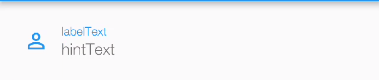
labelText
用于描述输入框,例如这个输入框是用来输入用户名还是密码的,当输入框获取焦点时默认会浮动到上方
TextField(
      decoration: InputDecoration(
        icon: Icon(Icons.person),
        labelText: "labelText",
      ),
    );
下面输入框的用户名对应的就是labelText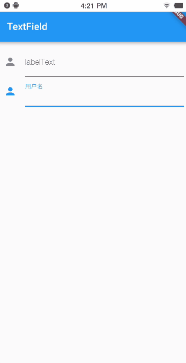
labelStyle
设置labelText的样式
TextField(
      decoration: InputDecoration(
          icon: Icon(Icons.person),
          labelText: "labelText",
          labelStyle: TextStyle(
            color: Colors.red,
            fontSize: 20,
          )),
    );
helperText
辅助文本,位于输入框下方,如果errorText不为空的话,则helperText不会显示
TextField(
      decoration: InputDecoration(
        icon: Icon(Icons.person),
        labelText: "labelText",
        helperText: "helperText",
      ),
    );
helperStyle
TextField(
      decoration: InputDecoration(
        icon: Icon(Icons.person),
        labelText: "labelText",
        helperText: "helperText",
        helperStyle: TextStyle(
          color: Colors.green,//绿色
          fontSize: 20,//字体变大
        ),
      ),
    );

errorText
错误提示信息,如果该属性不为null的话,labelText失效。
TextField(
      decoration: InputDecoration(
        icon: Icon(Icons.person),
        labelText: "labelText",
        helperText: "helperText",
        errorText: "errorText",
      ),
    );

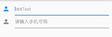
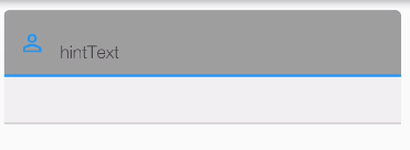
hintText
输入框中的提示信息,这个没啥好说的
TextField(
      decoration: InputDecoration(
        icon: Icon(Icons.person),
        hintText: "hintText",
      ),
    );
hasFloatingPlaceholder
labelText是否浮动,默认为true,修改为false则labelText在输入框获取焦点时不会浮动且不显示
TextField(
      decoration: InputDecoration(
        icon: Icon(Icons.person),
        hasFloatingPlaceholder: false,
        labelText: "labelText",
        helperText: "helperText",
        errorText: "errorText",
        hintText: "hintText",
      ),
    );
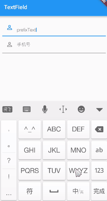
prefixIcon、prefixText
图片和预填充的文字
TextField(
      decoration: InputDecoration(
        icon: Icon(Icons.person),
        hasFloatingPlaceholder: false,
        labelText: "labelText",
        helperText: "helperText",
        errorText: "errorText",
       // hintText: "hintText",
        prefixIcon: Icon(Icons.perm_identity),
        prefixText: "prefixText",
      ),
    );
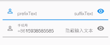
suffixIcon、suffixText
TextField(
      decoration: InputDecoration(
        //icon: Icon(Icons.person),
        hasFloatingPlaceholder: false,
        labelText: "labelText",
//        helperText: "helperText",
//        errorText: "errorText",
        // hintText: "hintText",
        prefixIcon: Icon(Icons.perm_identity),
        prefixText: "prefixText",
        suffixIcon: Icon(
          Icons.remove_red_eye,
        ),
        suffixText: "suffixText",
      ),
    );
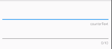
counterText
TextField(
      decoration: InputDecoration(
        //icon: Icon(Icons.person),
        hasFloatingPlaceholder: false,
        labelText: "labelText",
        // helperText: "helperText",
//        errorText: "errorText",
        // hintText: "hintText",
//        prefixIcon: Icon(Icons.perm_identity),
//        prefixText: "prefixText",
//        suffixIcon: Icon(
//          Icons.remove_red_eye,
//        ),
//        suffixText: "suffixText",

        counterText: "counterText",
      ),
    );
filled,fillColor
颜色填充
TextField(
      decoration: InputDecoration(
        //icon: Icon(Icons.person),
        hasFloatingPlaceholder: false,
        labelText: "labelText",
        // helperText: "helperText",
//        errorText: "errorText",
         hintText: "hintText",
        prefixIcon: Icon(Icons.perm_identity),
//        prefixText: "prefixText",
//        suffixIcon: Icon(
//          Icons.remove_red_eye,
//        ),
//        suffixText: "suffixText",

       // counterText: "counterText",
        filled: true,
        fillColor: Colors.grey,
      ),
    );
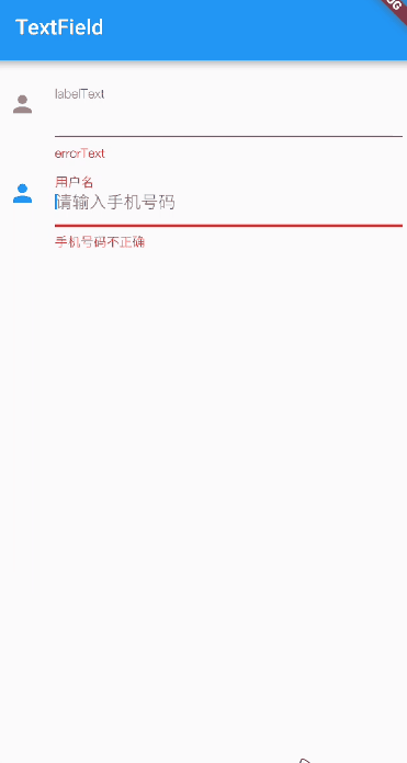
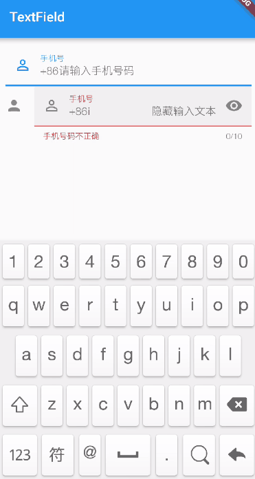
下面来看一下两个输入框的对比:
上面的输入框代码:
TextField(
      decoration: InputDecoration(
        icon: Icon(Icons.person),
       // hasFloatingPlaceholder: false,
        labelText: "labelText",
        helperText: "helperText",
        errorText: "errorText",
        hintText: "hintText",
        prefixIcon: Icon(Icons.perm_identity),
        prefixText: "prefixText",
        suffixIcon: Icon(
          Icons.remove_red_eye,
        ),
        suffixText: "suffixText",
        counterText: "counterText",
        filled: true,
       // fillColor: Colors.grey,
      ),
    );
下面的输入框代码:
TextField(
decoration: InputDecoration(
icon: Icon(Icons.person),
prefixIcon: Icon(Icons.perm_identity),
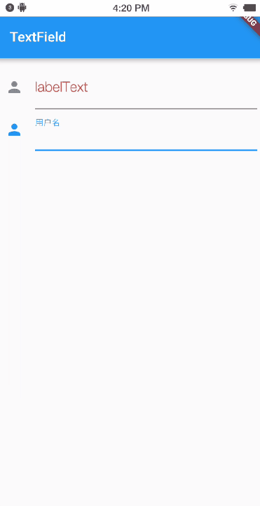
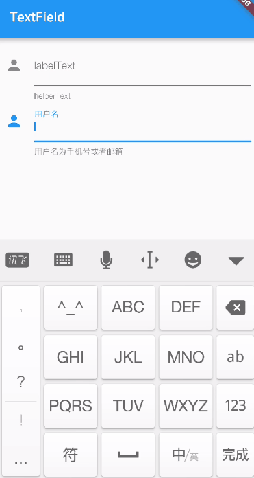
labelText: "手机号",
helperText: "用户名为手机号或者邮箱",
errorText: "手机号码不正确",
hintText: "请输入手机号码",
prefixText: "+86",
suffixIcon: Icon(
Icons.remove_red_eye,
),
suffixText: "隐藏输入文本",
counterText: "0/10",
filled: true,
),
);
图示: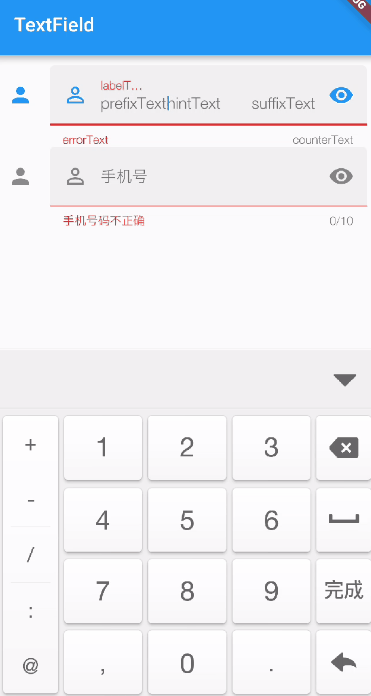
border、errorBorder、focusedBorder、focusedErrorBorder、disabledBorder、enabledBorder
不同状态下的边框样式,他们接收值的类型都一样,不过需要注意优先级。
大致分为一下几种情况
1. 控件禁用时
当enabled为false时,如果指定了disabledBorder,优先使用disabledBorder,没有的话设置disabledBorder则使用border的部分样式(颜色默认是灰色)
2. 控件启用(enable为true),但errorText有值
输入框没有焦点时,优先使用errorBorder的样式,输入框有焦点时,优先使用focusedErrorBorder,如果这两个都没有设置则使用border的部分样式(颜色默认是红色)
3. 控件启用状态,且errorText没有值
输入框没有焦点时,优先使用enabledBorder ,有焦点时,优先使用focusedBorder,两者均没有指定时,使用默认的border
总体来说,默认的border优先级别较低。
建议:
- 在开发过程中我们如果需要errorText的话,我们只需要设置 errorBorder、focusedErrorBorder这三个即可。不需要errorText的话
- 不需要errorText的话,只需要设置enabledBorder 、focusedBorder
下面我们来看一下border的值
1. InputBorder.none 没有任何边框
代码:
TextField(
      decoration: InputDecoration(
        border:InputBorder.none,
        labelText: "labelText",
        helperText: "helperText",
       // errorText: "errorText",
        hintText: "hintText",
        prefixIcon: Icon(Icons.perm_identity),
      ),
    );
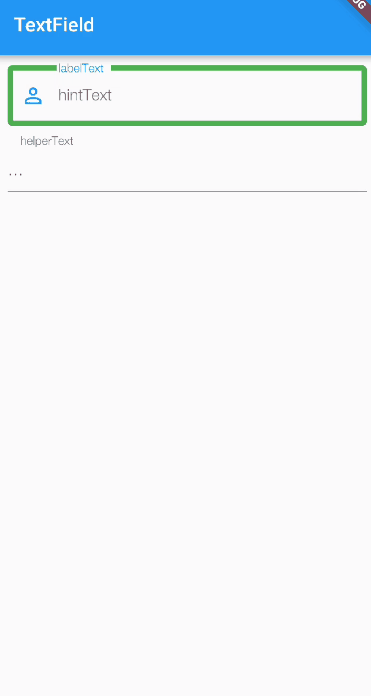
2. OutlineInputBorder(外边线)
代码:
TextField(
      decoration: InputDecoration(
        enabledBorder: OutlineInputBorder(
          /*边角*/
          borderRadius: BorderRadius.all(
            Radius.circular(30), //边角为30
          ),
          borderSide: BorderSide(
            color: Colors.amber, //边线颜色为黄色
            width: 2, //边线宽度为2
          ),
        ),
        focusedBorder: OutlineInputBorder(
            borderSide: BorderSide(
          color: Colors.green, //边框颜色为绿色
          width: 5, //宽度为5
        )),
        labelText: "labelText",
        helperText: "helperText",
        // errorText: "errorText",
        hintText: "hintText",
        prefixIcon: Icon(Icons.perm_identity),
      ),
    );
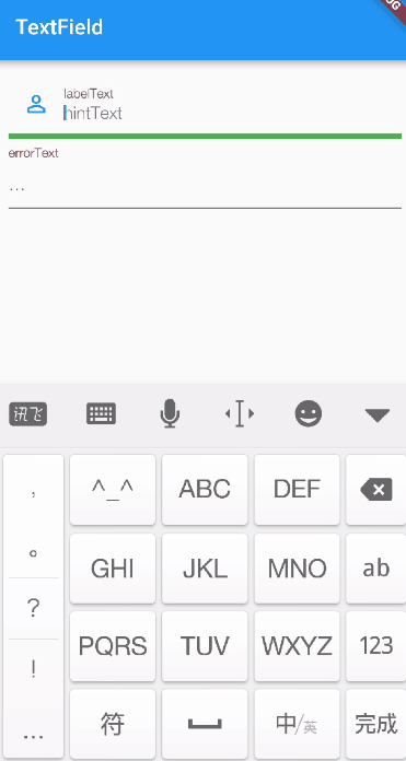
2. UnderlineInputBorder(底边线,默认就是这个)
TextField(
      decoration: InputDecoration(
        errorBorder: UnderlineInputBorder(
          /*边角*/
          borderRadius: BorderRadius.all(
            Radius.circular(30), //边角为30
          ),
          borderSide: BorderSide(
            color: Colors.amber, //边线颜色为黄色
            width: 2, //边线宽度为2
          ),
        ),
        focusedErrorBorder: UnderlineInputBorder(
            borderSide: BorderSide(
          color: Colors.green, //边框颜色为绿色
          width: 5, //宽度为5
        )),
        labelText: "labelText",
        helperText: "helperText",
         errorText: "errorText",
        hintText: "hintText",
        prefixIcon: Icon(Icons.perm_identity),
      ),
    );
到这里基本上InputDecoration的属性都介绍完毕了。
keyboardType
键盘的类型,常用值如下,比较简单

TextField(
      decoration: InputDecoration(
        labelText: "labelText",
        helperText: "helperText",
        errorText: "errorText",
        hintText: "hintText",
        prefixIcon: Icon(Icons.perm_identity),
      ),

      keyboardType: TextInputType.phone, //手机号
    );
可以看到 键盘变成了数字键盘,其他的值就不在演示了。
TextField textInputAction
键盘操作按钮的类型,接收一个TextInputAction 类型的值。
TextInputAction 是一个枚举类型,值如下,其中有些值需要考虑Android和ios是否兼容的问题
enum TextInputAction {
//没有任何动作
  none,

//让操作系统决定哪个动作更合适
  unspecified,

//完成动作,一般会显示“完成”二字
  done,

  /// 跳转动作,一般用于输入了一个超链接后执行该动作。键盘上会显示“前往”二字
  go,
//搜索动作
  search,

//发送
  send,

  ///下个
  next,

  /// 返回前一个
  previous,

//继续动作,在Android上好像没反应,不显示键盘
  continueAction,

//在Android上好像没反应,不显示键盘
  route,

//拨打紧急电话,在Android上好像没反应,不显示键盘
  emergencyCall,

//换行
  newline,
}
例如:
textInputAction: TextInputAction.search,

textInputAction: TextInputAction.go,

TextField onChanged
输入文本发生变化时的回调,参数即为输入框中的值
 onChanged: (val) {
        print(val);
      },
TextField onEditingComplete
点击键盘的动作按钮时的回调,没有参数
  onEditingComplete: (){
        print("点击了键盘上的动作按钮");
      },
TextField onSubmitted
点击键盘的动作按钮时的回调,参数为当前输入框中的值
  onSubmitted: (val){
        print("点击了键盘上的动作按钮,当前输入框的值为:${val}");
      },
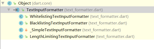
TextField inputFormatters
用于限制输入的内容,接收一个TextInputFormatter 类型的集合。
TextInputFormatter是一个抽象类,
源码如下:
继承关系如下
官方给我们提供了三种校验方法,分别是
- WhitelistingTextInputFormatter 白名单校验,也就是只允许输入符合规则的字符
- BlacklistingTextInputFormatter 黑名单校验,除了规定的字符其他的都可以输入
- LengthLimitingTextInputFormatter 长度限制,跟maxLength作用类似
WhitelistingTextInputFormatter
首先我们来看看白名单,
部分源码如下:
他接受一个Pattern类型的参数,Pattern是一个接口,而RegExp实现了Pattern接口,

看到RegExp是不是很熟悉了,这不就是正则表达式么,那这样就好办了。
下面我们用一下白名单:
inputFormatters: [WhitelistingTextInputFormatter(RegExp("[a-z]"))],


例如,我们只允许输入小写的a到z。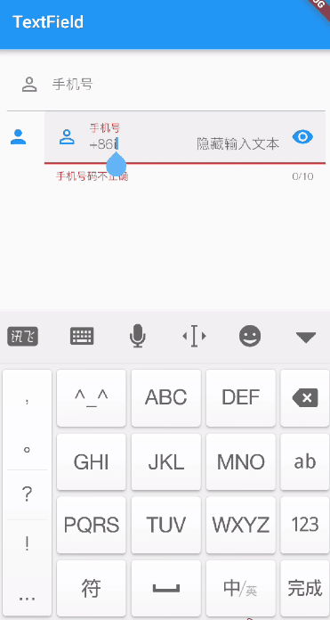
BlacklistingTextInputFormatter
黑名单跟白名单用法类似,这里我就直接用了
  inputFormatters: [BlacklistingTextInputFormatter(RegExp("[a-z]"))],


除了小写的a到z都可以输入
LengthLimitingTextInputFormatter
限制输入的长度
这里我们配合之前的黑名单一起使用
 inputFormatters: [
        BlacklistingTextInputFormatter(RegExp("[a-z]")),
        LengthLimitingTextInputFormatter(5)
      ],
TextField controller
controller常用于赋值和取值操作
示例代码:
import 'package:flutter/material.dart';

class TextFieldWidget extends StatefulWidget {
  @override
  State<StatefulWidget> createState() {
    return _TextFieldState();
  }
}

class _TextFieldState extends State<TextFieldWidget> {
  TextEditingController _userEtController = TextEditingController();

  @override
  Widget build(BuildContext context) {
    return Scaffold(
      appBar: AppBar(
        title: Text("TextField"),
      ),
      body: Container(
        padding: EdgeInsets.all(10),
        child: Column(
          children: <Widget>[
            TextField(
              controller: _userEtController,
            ),
            RaisedButton(
              child: Text("赋值"),
              onPressed: () {
                setState(() {
                  _userEtController.text = "15937600635";
                });
              },
            ),
            RaisedButton(
              child: Text("获取值"),
              onPressed: () {
                setState(() {});
              },
            ),
            Text(_userEtController.text),
          ],
        ),
      ),
    );
  }
}
如下: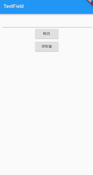
如果你觉得本文对你有帮助,麻烦动动手指顶一下,算是对本文的一个认可。也可以关注我的 Flutter 博客专栏,我会不定期的更新,如果文中有什么错误的地方,还望指正,转载请注明转自喻志强的博客 ,谢谢!
Flutter TextField详解
实现TextField说简单也简单,说有坑,坑也不小,下面从易到难介绍一下使用
1.最简单的就是无参数调用构造方法:
TextField()
2.光有输入框还不行,还得获取其中的内容,所以需要传递controller:
import 'package:flutter/material.dart';
class TextFieldPage extends StatelessWidget {
Widget buildTextField(TextEditingController controller) {
return TextField(
controller: controller,
);
}
我通过给controller添加通知来获取TextField的值,这种使用场景不一定合适,更多的时候是在点击按钮的时候直接读取controller.text的值
3.另外TextFiled还有一下小的属性:
import 'package:flutter/material.dart';
import 'package:flutter/services.dart';
class TextFieldPage extends StatelessWidget {
Widget buildTextField(TextEditingController controller) {
return TextField(
controller: controller,
maxLength: 30,//最大长度,设置此项会让TextField右下角有一个输入数量的统计字符串
maxLines: 1,//最大行数
autocorrect: true,//是否自动更正
autofocus: true,//是否自动对焦
obscureText: true,//是否是密码
textAlign: TextAlign.center,//文本对齐方式
style: TextStyle(fontSize: 30.0, color: Colors.blue),//输入文本的样式
inputFormatters: [WhitelistingTextInputFormatter.digitsOnly],//允许的输入格式
onChanged: (text) {//内容改变的回调
print('change $text');
},
onSubmitted: (text) {//内容提交(按回车)的回调
print('submit $text');
},
enabled: true,//是否禁用
);
}
4.接着我还能显示placeholder
decoration可以给TextField添加装饰
TextField(
      decoration:
          InputDecoration(fillColor: Colors.blue.shade100, filled: true, labelText: 'Hello'),
    );
fillColor设置填充颜色,labelText设置标签文字,这个标签在没有输入的时候是占满输入框的,当输入聚焦以后,就会缩小到输入框左上角:
TextField(
      decoration: InputDecoration(
          fillColor: Colors.blue.shade100, filled: true, hintText: 'Hello', errorText: 'error'),
    );
hintText就是普通的placeholder,输入后就不显示了,errorText是错误提示
5.还能显示一些别的装饰
import 'package:flutter/material.dart';
class TextFieldPage extends StatelessWidget {
Widget buildTextField() {
return TextField(
decoration: InputDecoration(
fillColor: Colors.blue.shade100,
filled: true,
helperText: 'help',
prefixIcon: Icon(Icons.local_airport),
suffixText: 'airport'),
);
}
6.这些还不过瘾,我不喜欢这个安卓风格的下面的装饰线,我想变成圆角矩形的边框
import 'package:flutter/material.dart';
class TextFieldPage extends StatelessWidget {
Widget buildTextField() {
return TextField(
decoration: InputDecoration(
contentPadding: EdgeInsets.all(10.0),
border: OutlineInputBorder(
borderRadius: BorderRadius.circular(15.0),
// borderSide: BorderSide(color: Colors.red, width: 3.0, style: BorderStyle.solid)//没什么卵效果
)),
);
}
7.改变装饰线颜色
无论是下面的装饰线,还是矩形边框装饰线,对焦后显示的颜色,都是主题颜色的primaryColor,失去焦点以后就是黑色,这显然不能满足自定义的需求,但是通过各种努力发现,改变边框颜色很困难,最后发现了这个答案:https://stackoverflow.com/questions/49600139/how-to-change-textfield-underline-color
所以正确的设置边框颜色的方式是这样的:
import 'package:flutter/material.dart';
class TextFieldPage extends StatelessWidget {
Widget buildTextField() {
return Theme(
data: new ThemeData(primaryColor: Colors.red, hintColor: Colors.blue),
child: TextField(
decoration: InputDecoration(
contentPadding: EdgeInsets.all(10.0),
border: OutlineInputBorder(
borderRadius: BorderRadius.circular(15.0),
// borderSide: BorderSide(color: Colors.red, width: 3.0, style: BorderStyle.solid)//没什么卵效果
)),
),
);
}
8.改变边框的粗细
这些TextField的decoration彻底不能满足要求了,需要重构成这种方式:
import 'package:flutter/material.dart';
class TextFieldPage extends StatelessWidget {
Widget buildTextField() {
return Container(
padding: const EdgeInsets.all(8.0),
alignment: Alignment.center,
height: 60.0,
decoration: new BoxDecoration(
color: Colors.blueGrey,
border: new Border.all(color: Colors.black54, width: 4.0),
borderRadius: new BorderRadius.circular(12.0)),
child: new TextFormField(
decoration: InputDecoration.collapsed(hintText: 'hello'),
),
);
}
InputDecoration.collapsed可以禁用装饰线,而是使用外面包围的Container的装饰线
致此,所有的输入框的坑都趟完了,欢迎大家多多交流

