

Flutter之textTheme
MaterialApp
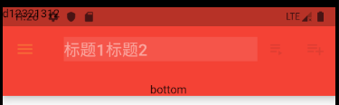
先看下上图的具体用法:
1. title:标题
2. actions:表示右侧的按钮的动作
3. leading:表示左侧的按钮的动作
4. flexibleSpace:
5. backgroundColor: Colors.red, //导航栏和状态栏的的颜色
6. elevation: 10, //阴影的高度
7.bottom :导航栏下面显示的widget
8.brightness :状态栏的亮度
9. iconTheme,左侧图表的样式
12. toolbarOpacity: 0.5, //整个导航栏的不透明度
14. titleSpacing: 10, //标题两边的空白区域,
appBar代码:

appBar: AppBar(
        title: Container(
          color: Colors.white10,
          child: Row(
            children: <Widget>[Text('标题1'), Text('标题2')],
          ),
        ),
        actions: <Widget>[
          IconButton(
            icon: Icon(Icons.playlist_play),
            tooltip: 'Air it',
            onPressed: null,
          ),
          IconButton(
            icon: Icon(Icons.playlist_add),
            tooltip: 'Restitch it',
            onPressed: null,
          ),
        ],
        leading: Builder(
          builder: (BuildContext context) {
            return IconButton(
              icon: const Icon(Icons.menu),
              onPressed: () {
                Scaffold.of(context).openDrawer();
              },
              tooltip: MaterialLocalizations.of(context).openAppDrawerTooltip,
            );
          },
        ), // 左侧返回按钮,可以有按钮,可以有文字
        flexibleSpace: Text('d12321312'),
        backgroundColor: Colors.red, //导航栏和状态栏的的颜色
        elevation: 10, //阴影的高度
        bottom: PreferredSize(
            child: Text('bottom'),
            preferredSize: Size(30, 30)), // 在appbar下面显示的东西
        brightness: Brightness.light, //控制状态栏的颜色,lignt 文字是灰色的,dark是白色的
        iconTheme: IconThemeData(
            color: Colors.yellow,
            opacity: 0.5,
            size: 30), //icon的主题样式,默认的颜色是黑色的,不透明为1,size是24
        textTheme: TextTheme(), //这个主题的参数比较多,flutter定义了13种不同的字体样式
        centerTitle: true, //标题是否居中,默认为false
        toolbarOpacity: 0.5, //整个导航栏的不透明度
        bottomOpacity: 0.8, //bottom的不透明度
        titleSpacing: 10, //标题两边的空白区域,
  ),
1. title:标题
可以是文字或者widget,可以自定义
如:
  Container(
       color: Colors.white10,
       child: Row(
          children: <Widget>[Text('标题1'), Text('标题2')],
       ),
  ),
2. actions:表示右侧的按钮的动作
是一个包含widget的数组:
actions: <Widget>[
    IconButton(
         icon: Icon(Icons.playlist_play),
         tooltip: 'Air it',
         onPressed:(){} ,
    ),
    IconButton(
         icon: Icon(Icons.playlist_add),
         tooltip: 'Restitch it',
         onPressed:(){},
    ),
 ],
上面表示两个按钮,同时还有点击事件,只不过上面我把点击事件写成了空的。
3. leading:表示左侧的按钮的动作
这个也是一个widget,也可以自定义动作,如下:
        leading: Builder(
          builder: (BuildContext context) {
            return IconButton(
              icon: const Icon(Icons.menu),
              onPressed: () {
                Scaffold.of(context).openDrawer();
              },
              tooltip: MaterialLocalizations.of(context).openAppDrawerTooltip,
            );
          },
        ), // 左侧返回按钮,可以有按钮,可以有文字
4. flexibleSpace:
堆叠在工具栏和标签栏后面。 它的高度与应用栏的整体高度相同。
flexible space 实际上并不灵活,除非[AppBar]的容器改变了[AppBar]的大小。 [CustomScrollView]中的[SliverAppBar]在滚动时更改[AppBar]的高度。
也可以看下 FlexibleSpaceBar
flexibleSpace: Text('d12321312'),
   flexibleSpace: FlexibleSpaceBar(
       title: Text('flexibleSpace'),
       background: Icon(Icons.add), //背景,一般是一个图片,在title后面,[Image.fit] set to [BoxFit.cover].
       centerTitle: true,
       collapseMode: CollapseMode.pin, // 背景 固定到位,直到达到最小范围。 默认是CollapseMode.parallax(将以视差方式滚动。),还有一个是none,滚动没有效果
   ),
5. backgroundColor: Colors.red, //导航栏和状态栏的的颜色
导航栏的颜色和样式可以再Main.dart的MaterialApp里面配置统一的。
但有时间我们的某些页面有单独的设计,这个背景也是可以修改的。
6. elevation: 10, //阴影的高度
默认在导航栏的下面有4的高度阴影,这个也可以修改的
7.bottom :导航栏下面显示的widget
看上面图片中的bottom文字
bottom: PreferredSize(
            child: Text('bottom'),
            preferredSize: Size(30, 30)
), // 在appbar下面显示的东西
其中这个bottom是需要PreferredSize的,里面有child和宽高,宽高用size来设置
8.brightness :状态栏的亮度
这与[backgroundColor],[iconTheme],[textTheme]一起设置。
默认是和 ThemeData.primaryColorBrightness一致的.
Brightness.light,   白底黑字
Brightness.dark,   黑底白字
9.iconTheme,左侧图标的样式
iconTheme: IconThemeData(
       color: Colors.yellow,
       opacity: 0.5,
       size: 30
), //icon的主题样式,默认的颜色是黑色的,不透明为1,size是24
表示颜色是黄色,不透明度是0.5,最大值是1;以及大小是30,默认的大小是24
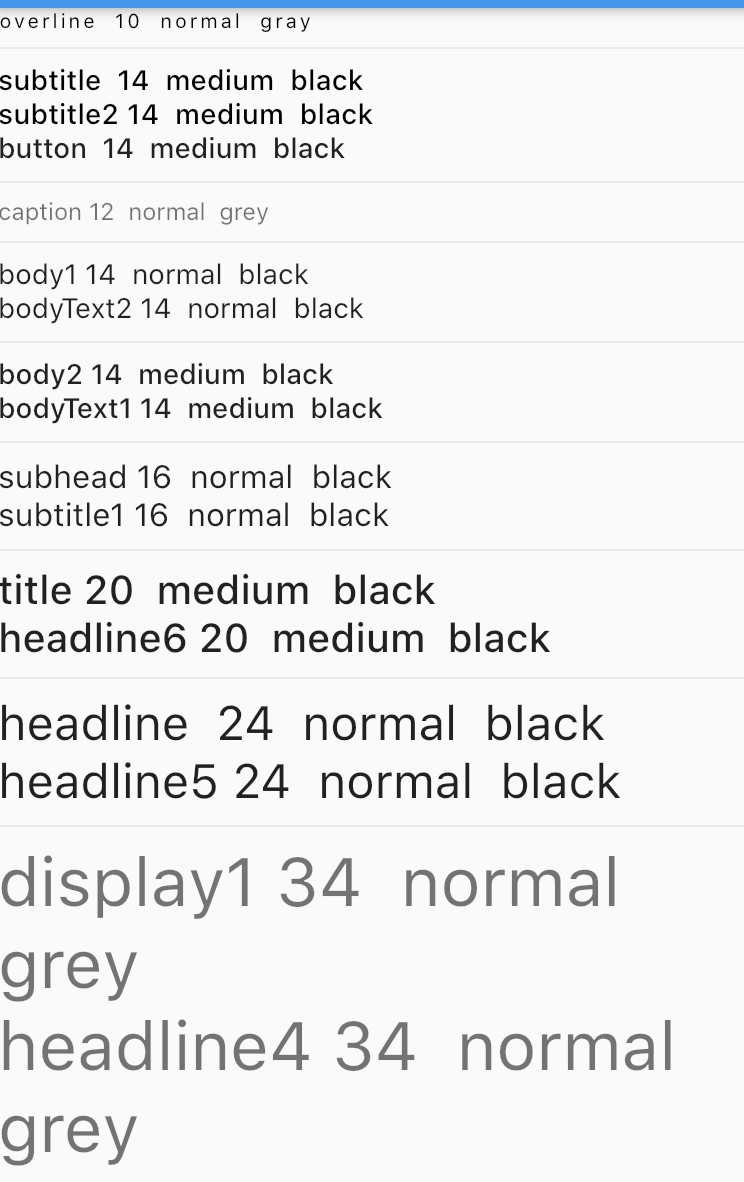
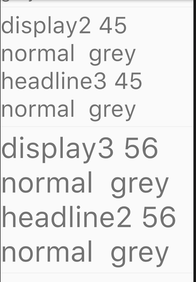
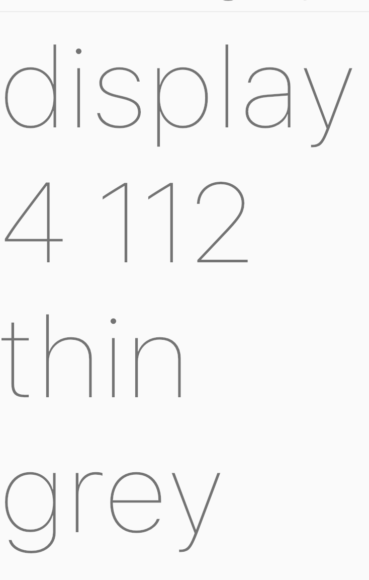
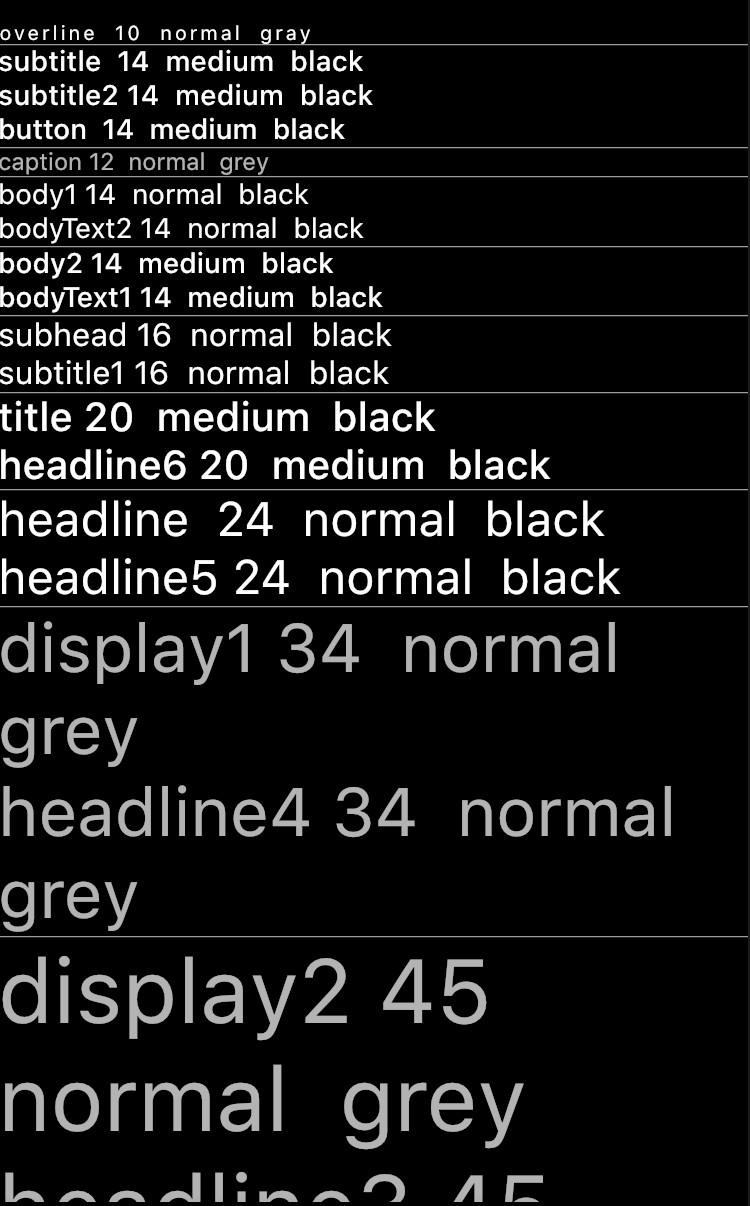
10.textTheme:字体的样式
我们要设置的话一般用merge,这样不会改变其他的值。
默认有13中样式:
NAME SIZE WEIGHT SPACING 2018 NAME Color
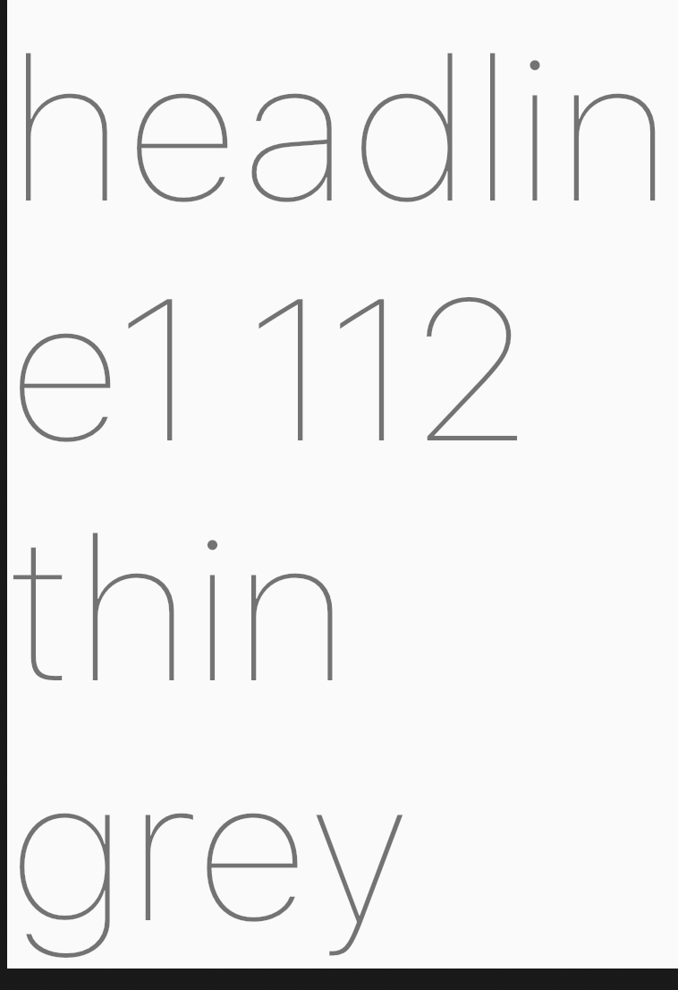
display4 112.0 thin 0.0 headline1 grey
display3 56.0 normal 0.0 headline2 grey
display2 45.0 normal 0.0 headline3 grey
display1 34.0 normal 0.0 headline4 grey
headline 24.0 normal 0.0 headline5 black
title 20.0 medium 0.0 headline6 black
subhead 16.0 normal 0.0 subtitle1 black
body2 14.0 medium 0.0 bodyText1 black
body1 14.0 normal 0.0 bodyText2 black
caption 12.0 normal 0.0 caption grey
button 14.0 medium 0.0 button black
subtitle 14.0 medium 0.0 subtitle2 black
overline 10.0 normal 0.0 overline grey
其中thin 表示字体的粗细为FontWeight.w100
normal是FontWeight.w400
medium是FontWeight.w500
字符间距为0.0
size就是字体的大小
////////////////////////////////////////////////////////////////////////////////////////////////////////////
////////////////////////////////////////////////////////////////////////////////////////////////////////////
深色模式下
11.centerTitle:标题是否居中
centerTitle: true, //标题是否居中,默认为false
默认是false,一般我们的设计都是把导航栏的标题居中,不遵循android的md设计,都是按照苹果的设计来的
12. toolbarOpacity: 0.5, //整个导航栏的不透明度
13. bottomOpacity: 0.8, //bottom的不透明度
14. titleSpacing: 10, //标题两边的空白区域
示例所在的位置:https://github.com/LiuC520/flutterlayout/blob/master/lib/material/appbar.dart

