echarts系列-带图教你调整左右位置x轴样式网格虚线刻度居中双轴Y轴滚动上下移动文字旋转改分割线颜色部分字体改色折注混合,X轴的颜色,X轴字体颜色,调整柱子颜色,调整小图标图例的大小和位置,鼠标hover时候的样式,用纵向阴影
上面先说注意事项
1.如果使用show hidden控制图表显示隐藏,某些切换效果很奇怪,比如饼图,会从左上角开始放大,很丑,这个时候我们可以设置其宽高来解决问题,给其设置宽高后,切换的奇怪效果即可消失。
<!-- 饼图組件 -->
<div class="chart01" echarts #myEchart01 [options]="option01"></div>
.chart01{
width: 23.426vw;
height: 21.523vw;
}
import { Component, OnInit, ElementRef, ViewChild } from '@angular/core';
import { NgxEchartsService } from 'ngx-echarts';
@Component({
selector: 'app-echart04',
templateUrl: './echart04.component.html',
styleUrls: ['./echart04.component.less']
})
export class Echart04Component implements OnInit {
constructor(
private es: NgxEchartsService,
) { }
ngOnInit(): void {
}
ngAfterViewInit() {
this.setEcharts01()
}
@ViewChild('myEchart01', { static: false }) myEchart01: ElementRef;
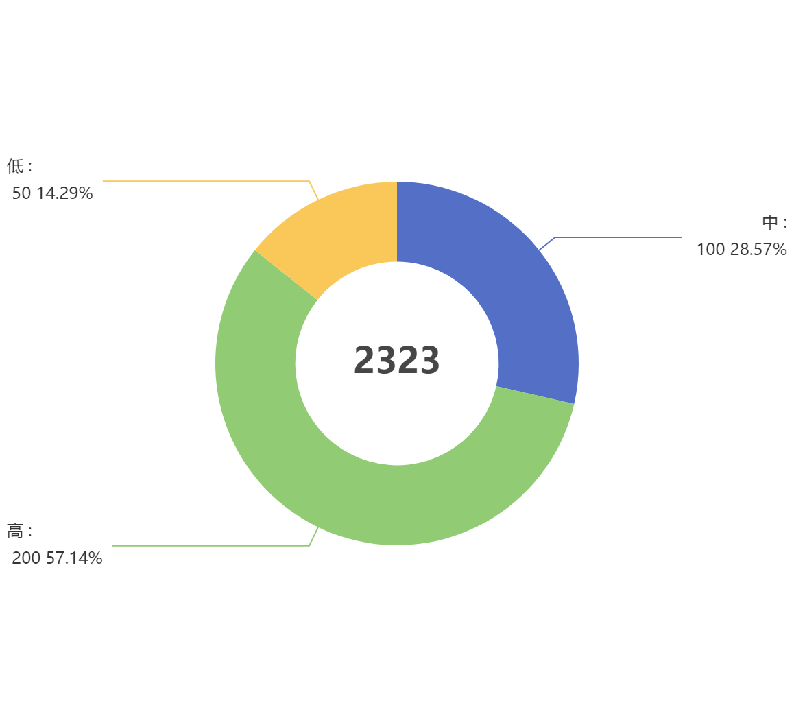
option01 = {
title: {
text: '2323',
textStyle: { fontSize: 26 },
left: 'center',
top: 'center',
},
tooltip: {
trigger: 'item',
formatter: '{b} : {c} ({d}%)',
},
series: [
{
type: 'pie',
radius: ['34%', '57%'],
center: ['50%', '50%'],
selectedMode: 'single',
data: [
{ value: 100, name: '中' },
{ value: 200, name: '高' },
{ value: 50, name: '低' },
],
emphasis: {
// 这个是鼠标放上去时候的阴影
itemStyle: {
shadowBlur: 10,
shadowOffsetX: 5,
shadowColor: 'rgba(0, 0, 0, 0.5)',
},
},
},
],
};
setEcharts01() {
this.es.getInstanceByDom(this.myEchart01.nativeElement).setOption(this.option01);
}
}
1.饼图怎么调整左右位置
只需要调整option.series里的center: ['30%', '50%']
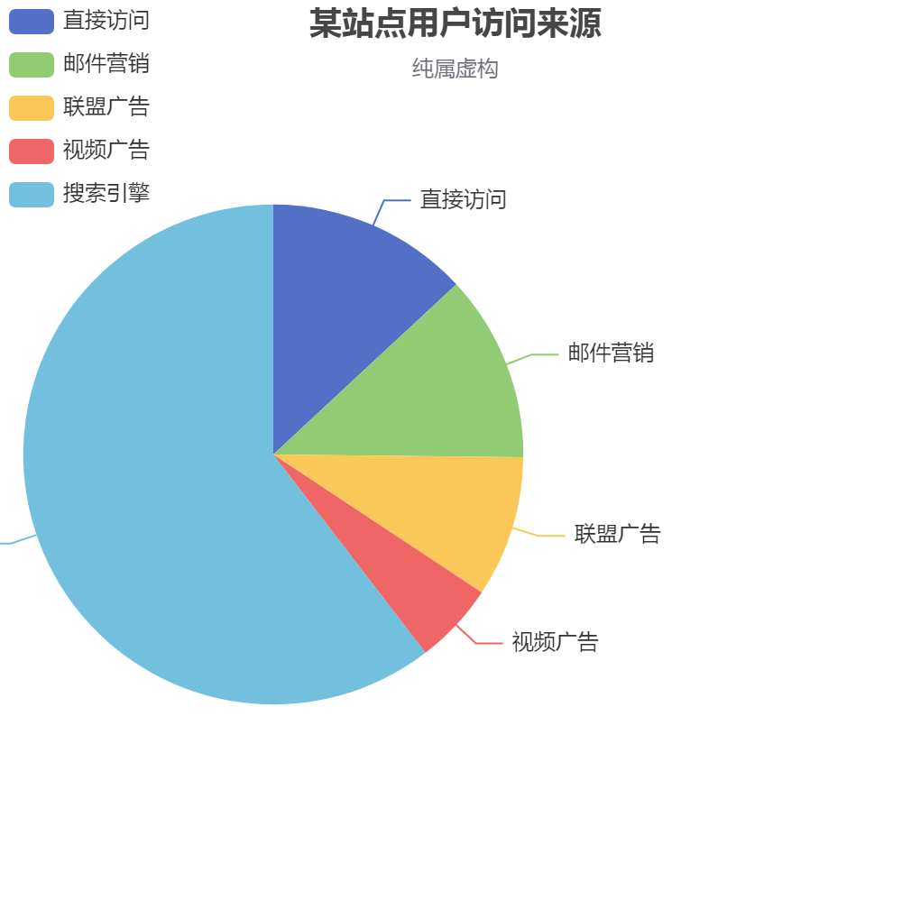
option = {
    title: {
        text: '某站点用户访问来源',
        subtext: '纯属虚构',
        left: 'center'
    },
    tooltip: {
        trigger: 'item'
    },
    legend: {
        orient: 'vertical',
        left: 'left',
    },
    series : [  // 把饼图挪到了左边
        {
            name: '访问来源',
            type: 'pie',
            radius : '55%',
            center: ['30%', '50%'],  //  这个代码~~
            data:[
                {value:335, name:'直接访问'},
                {value:310, name:'邮件营销'},
                {value:234, name:'联盟广告'},
                {value:135, name:'视频广告'},
                {value:1548, name:'搜索引擎'}
            ],
            itemStyle: {
                emphasis: {
                    shadowBlur: 10,
                    shadowOffsetX: 0,
                    shadowColor: 'rgba(0, 0, 0, 0.5)'
                }
            }
        }
    ]
};
    ]
2.更改x轴样式,控制样式里的X轴字在中间, 距离Y轴还有点距离

xAxis: {
      type: 'category',
      axisTick: { alignWithLabel: true }, // 控制样式里的X轴字在中间距离Y轴还有点距离
      data: ['5', '10', '15', '20', '25', '30'],
    },
3.echarts将网格线设置成虚线
yAxis: {
    splitLine :{    //网格线
        lineStyle:{
            type:'dashed'    //设置网格线类型 dotted:虚线   solid:实线
        },
        show:true //隐藏或显示
    }
}
4.x轴刻度居中
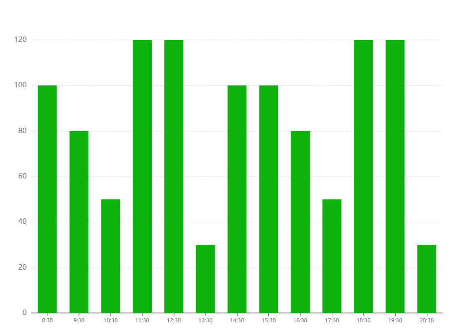
option = {
    tooltip: {
      trigger: 'axis',
      axisPointer: {
        // 坐标轴指示器,坐标轴触发有效
        type: 'shadow',
        // 默认为直线,可选为:'line' | 'shadow'
      },
    },
    toolbox: {
        show: true,
        feature: {
            dataView: {readOnly: false},
            restore: {},
            saveAsImage: {}
        }
    },
    grid: { top: '12%', left: '3%', right: '4%', bottom: '3%', containLabel: true },
    xAxis: [
      {
        type: 'category',
        data: ['8:30', '9:30', '10:30', '11:30', '12:30', '13:30', '14:30', '15:30', '16:30', '17:30', '18:30', '19:30', '20:30'],
        axisTick: { alignWithLabel: true }, // 刻度居中核心代码
        axisLabel: {
          textStyle: {
            // color: 'black', // 修改X轴文字的颜色
            fontSize: '9', // 修改X轴文字大小
          }
        },
      },
    ],
    // xAxis: [
    //   {
    //     data: [100, 80, 50, 120, 120, 30, 100, 100, 80, 50, 120, 120, 30, 100],
    //     show: false,
    //   },
    //   {
    //     data: ['8:30', '9:30', '10:30', '11:30', '12:30', '13:30', '14:30', '15:30', '16:30', '17:30', '18:30', '19:30', '20:30', '21:30'],
    //     position: 'bottom',
    //     boundaryGap: false,
    //     axisPointer: {
    //       show: false,
    //     },
    //     nameTextStyle: {
    //       color: '#999',
    //     },
    //     axisLine: {
    //       show: false,
    //     },
    //     axisTick: {
    //       show: false,
    //     },
    //     axisLabel: {
    //       // interval: 0,
    //       // color: '#999999',
    //       textStyle: {
    //         color: 'red', // 修改X轴文字的颜色
    //         fontSize: '9', // 修改X轴文字大小
    //       }
    //     },
    //     // splitLine: { // 背景竖着的刻度线
    //     //     show: true,
    //     //     lineStyle: {
    //     //         color: '#F1F1F1',
    //     //     },
    //     // },
    //   },
    // ],
    yAxis: [{
      type: 'value',
      splitLine: {    //网格线
        lineStyle: {
          type: 'dashed'    //设置网格线类型 dotted:虚线   solid:实线
        },
        show: true //隐藏或显示
      }
    }],
    series: [{
      name: '直接访问', type: 'bar', barWidth: '60%', data: [100, 80, 50, 120, 120, 30, 100, 100, 80, 50, 120, 120, 30, 100],

      itemStyle: {
        normal: {
          //这里是重点
          color: function (params) {
            // var colorList = ['#c23531', '#2f4554', '#61a0a8', '#d48265', '#91c7ae', '#749f83', '#ca8622'];
            // return colorList[params.dataIndex]
            return '#0eb30e'
          }
        }
      }
    }],
  }
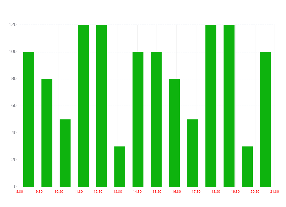
5.echarts X轴区间柱形图,X轴 刻度数组长度 比 数据数组长度 多一个
option = {
    tooltip: {
      trigger: 'axis',
      axisPointer: {
        // 坐标轴指示器,坐标轴触发有效
        type: 'shadow',
        // 默认为直线,可选为:'line' | 'shadow'
      },
    },
    toolbox: {
        show: true,
        feature: {
            dataView: {readOnly: false},
            restore: {},
            saveAsImage: {}
        }
    },
    grid: { top: '12%', left: '3%', right: '4%', bottom: '3%', containLabel: true },
    // xAxis: [
    //   {
    //     type: 'category',
    //     data: ['8:30', '9:30', '10:30', '11:30', '12:30', '13:30', '14:30', '15:30', '16:30', '17:30', '18:30', '19:30', '20:30'],
    //     axisTick: { alignWithLabel: true }, // 刻度居中核心代码
    //     axisLabel: {
    //       textStyle: {
    //         // color: 'black', // 修改X轴文字的颜色
    //         fontSize: '9', // 修改X轴文字大小
    //       }
    //     },
    //   },
    // ],
    xAxis: [  // 核心代码--双x轴刻度
      {
        data: [100, 80, 50, 120, 120, 30, 100, 100, 80, 50, 120, 120, 30, 100],
        show: false,
      },
      {
        data: ['8:30', '9:30', '10:30', '11:30', '12:30', '13:30', '14:30', '15:30', '16:30', '17:30', '18:30', '19:30', '20:30', '21:30'],
        position: 'bottom',
        boundaryGap: false,
        axisPointer: {
          show: false,
        },
        nameTextStyle: {
          color: '#999',
        },
        axisLine: {
          show: false,
        },
        axisTick: {
          show: false,
        },
        axisLabel: {
          // interval: 0,
          // color: '#999999',
          textStyle: {
            color: 'red', // 修改X轴文字的颜色
            fontSize: '9', // 修改X轴文字大小
          }
        },
        splitLine: { // 背景竖着的刻度线
            show: true,
            lineStyle: {
                color: '#F1F1F1',
            },
        },
      },
    ],
    yAxis: [{
      type: 'value',
      splitLine: {    //网格线
        lineStyle: {
          type: 'dashed'    //设置网格线类型 dotted:虚线   solid:实线
        },
        show: true //隐藏或显示
      }
    }],
    series: [{
      name: '直接访问', type: 'bar', barWidth: '60%', data: [100, 80, 50, 120, 120, 30, 100, 100, 80, 50, 120, 120, 30, 100],

      itemStyle: {
        normal: {
          //这里是重点
          color: function (params) {
            // var colorList = ['#c23531', '#2f4554', '#61a0a8', '#d48265', '#91c7ae', '#749f83', '#ca8622'];
            // return colorList[params.dataIndex]
            return '#0eb30e'
          }
        }
      }
    }],
  }
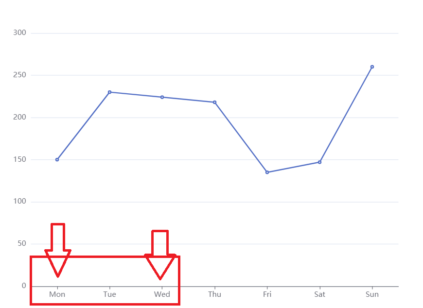
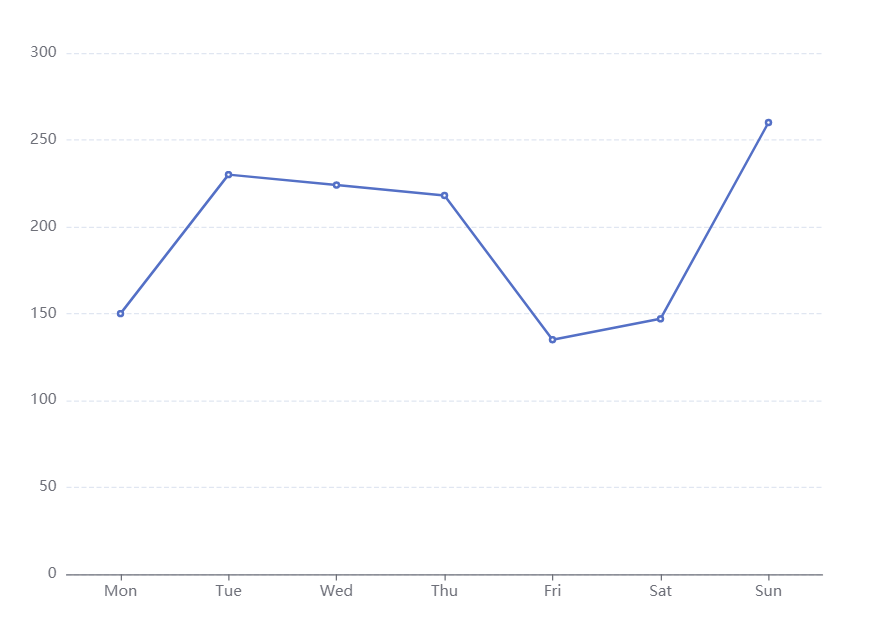
6.设置y轴区间,最大值最小值,显得数据波动很好~~~
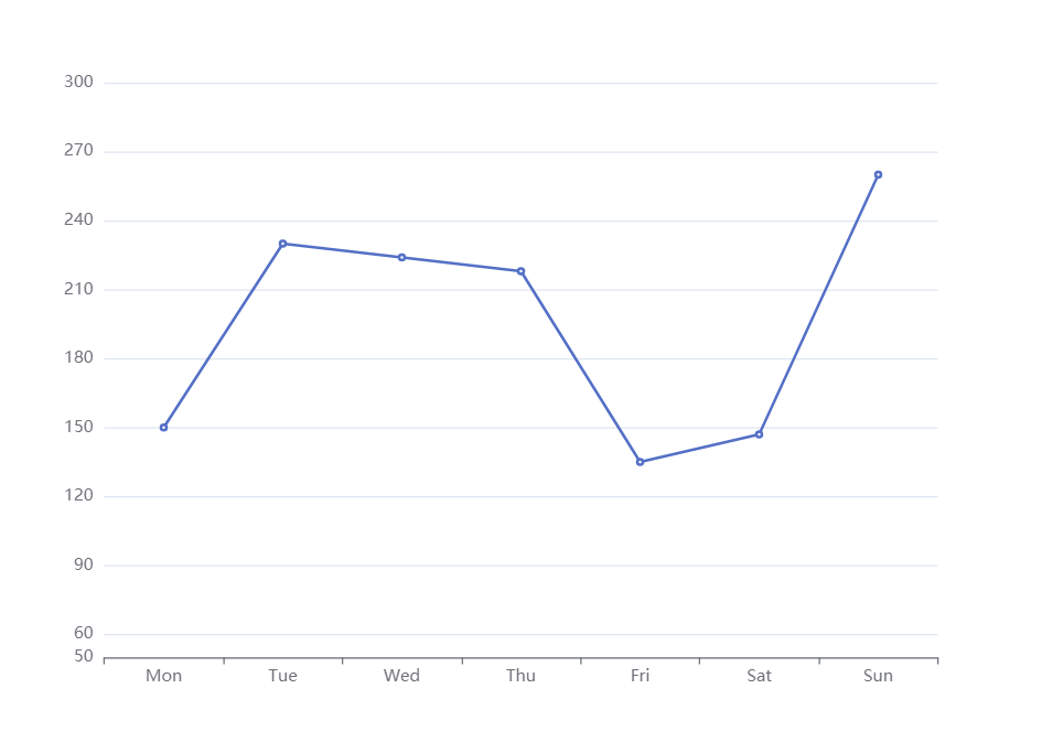
option = {
    xAxis: {
        type: 'category',
        data: ['Mon', 'Tue', 'Wed', 'Thu', 'Fri', 'Sat', 'Sun']
    },
    toolbox: {
        feature: {
            saveAsImage: {}
        }
    },
    yAxis: {
        type: 'value',
        min:50,
        max:300,
        splitNumber:10 // 好用切割成十份
    },
    series: [{
        data: [150, 230, 224, 218, 135, 147, 260],
        type: 'line'
    }]
};
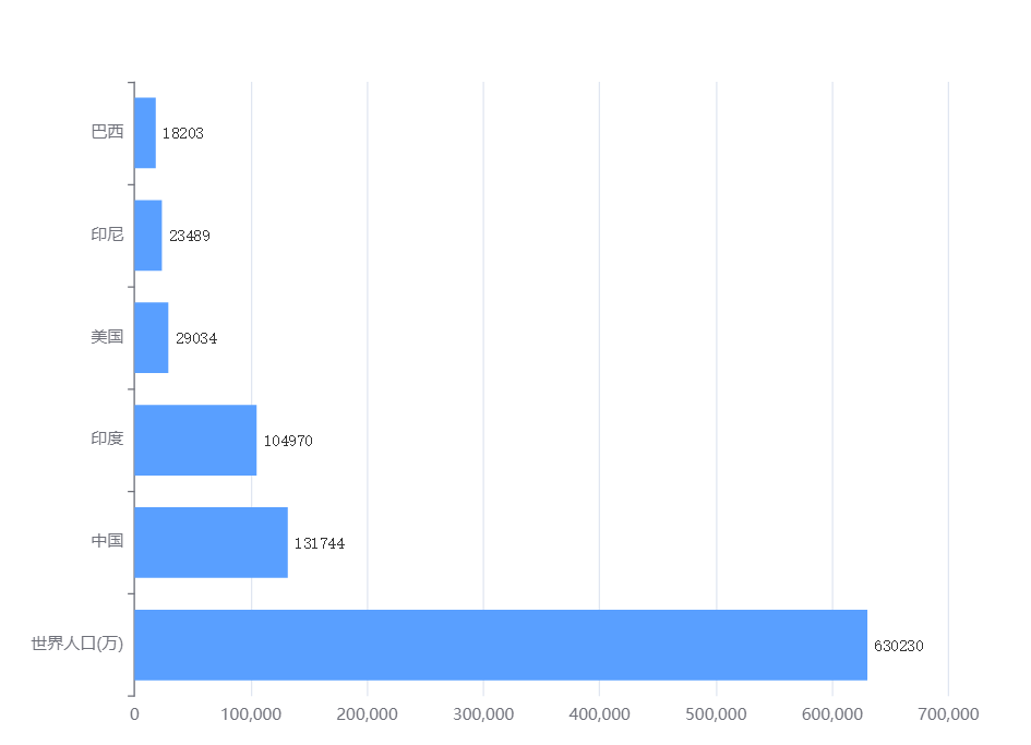
7.dataZoom控制Y轴滚动
看图
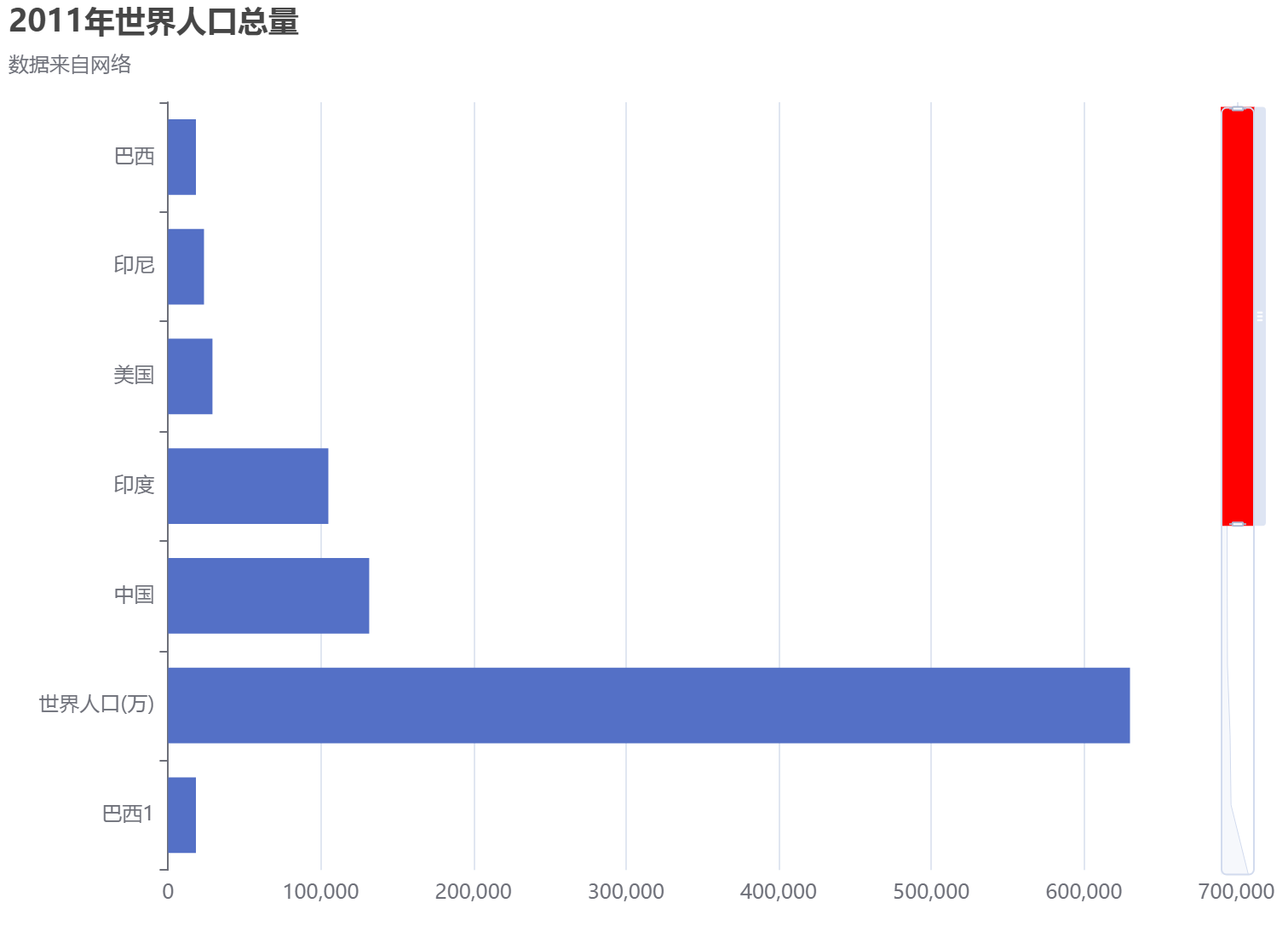
option = {
  title: {
    text: '2011年世界人口总量',
    subtext: '数据来自网络',
  },
  tooltip: {
    trigger: 'axis',
    axisPointer: {
      type: 'shadow',
    },
  },
  // legend: {
  //     data: ['2011年']
  // },
  grid: {
    left: '3%',
    right: '4%',
    bottom: '3%',
    containLabel: true,
  },
  xAxis: {
    type: 'value',
    boundaryGap: [0, 0.01],
  },
  yAxis: {
    type: 'category',
    inverse: true,
    data: [
      '巴西',
      '印尼',
      '美国',
      '印度',
      '中国',
      '世界人口(万)',
      '巴西1',
      '印1尼',
      '美1国',
      '印度1',
      '中1国',
      '世界1人口(万)',
    ],
  },
  dataZoom: [
    {
       show: false,
      zoomLock: true,
    },
    { type: 'slider',
      show: true,
      startValue: 0, // 控制显示几个数据
      endValue: 5, // 控制显示几个数据
      orient: 'vertical',
      showDetail: false, // 拖动时候滚动条上下是否显示详情
      showDataShadow: true,
      zoomLock: true,//设置为 true 则锁定选择区域的大小,也就是说,只能平移,不能缩放
      backgroundColor: 'white',
      fillerColor: 'red', // 滚动条颜色
      handleSize: '10', // 滚动条上面的那个把手大小
      x2: 20, // 滚动条距离右边的距离
      width: 20, // 滚动条的宽度
      zoomOnMouseWheel:true,  //滚轮是否触发缩放
      moveOnMouseMove:true,  //鼠标滚轮触发滚动
      moveOnMouseWheel:true

    }
  ],
  series: [
    {
      name: '2011年',
      type: 'bar',
      data: [
        18203,
        23489,
        29034,
        104970,
        131744,
        630230,
        18203,
        23489,
        29034,
        104970,
        131744,
        630230,
      ],
    },
  ],
}
鼠标滚动控制Y轴数据上下移动
option = {
  title: {
    text: '2011年世界人口总量',
    subtext: '数据来自网络',
  },
  tooltip: {
    trigger: 'axis',
    axisPointer: {
      type: 'shadow',
    },
  },
  // legend: {
  //     data: ['2011年']
  // },
  grid: {
    left: '3%',
    right: '4%',
    bottom: '3%',
    containLabel: true,
  },
  xAxis: {
    type: 'value',
    boundaryGap: [0, 0.01],
  },
  yAxis: {
    type: 'category',
    inverse: true,
    data: [
      '巴西',
      '印尼',
      '美国',
      '印度',
      '中国',
      '世界人口(万)',
      '巴西1',
      '印1尼',
      '美1国',
      '印度1',
      '中1国',
      '世界1人口(万)',
      '巴西12',
      '印12尼',
      '美12国',
      '印度12',
      '中12国',
      '世界12人口(万)',
    ],
  },
  dataZoom: [
    {
       show: false,
      zoomLock: false,
    },
    { type: 'inside', //改为slider的话就会出现滚动条,inside隐藏滚动条
      show: true,
      startValue: 0, // 控制显示几个数据
      endValue: 5, // 控制显示几个数据
      orient: 'vertical',
      showDetail: false, // 拖动时候滚动条上下是否显示详情
      showDataShadow: true,
    //   zoomLock: true,//设置为 true 则锁定选择区域的大小,也就是说,只能平移,不能缩放
      backgroundColor: 'white',
      fillerColor: 'red', // 滚动条颜色
      handleSize: '10', // 滚动条上面的那个把手大小
      x2: 20, // 滚动条距离右边的距离
      width: 20, // 滚动条的宽度
      zoomOnMouseWheel:false,  //滚轮是否触发缩放,同时要设置zoomLock: false
      moveOnMouseMove:true,  //鼠标左键拖动触发滚动,同时要设置zoomLock: false
      moveOnMouseWheel:true // 鼠标滚轮带动滚动,同时要设置zoomLock: false
    }
  ],
  series: [
    {
      name: '2011年',
      type: 'bar',
      data: [
        18203,
        23489,
        29034,
        104970,
        131744,
        630230,
        18203,
        23489,
        29034,
        104970,
        131744,
        630230,
        18203,
        23489,
        29034,
        104970,
        131744,
        630230,
      ],
    },
  ],
}
折线图+离散图
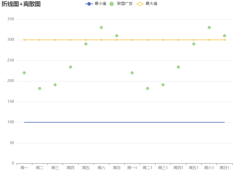
option = {
    title: {
        text: '折线图+离散图'
    },
    tooltip: {
        trigger: 'axis'
    },
    legend: {
        data: ['最小值', '联盟广告', '最大值']
    },
    grid: {
        left: '3%',
        right: '4%',
        bottom: '3%',
        containLabel: true
    },
    toolbox: {
        feature: {
            saveAsImage: {}
        }
    },
    xAxis: {
        type: 'category',
        // boundaryGap: false, // 控制折线图距离Y轴是否有距离
        data: ['周一', '周二', '周三', '周四', '周五', '周六', '周日','周一1', '周二1', '周三1', '周四1', '周五1', '周六1', '周日1']
    },
    yAxis: {
        type: 'value'
    },
    series: [
        {
            name: '最小值',
            type: 'line',
            symbol: "none", // 去掉折线上面的小圆点
            // stack: '总量', // 几个设置一样的会变成堆叠
            data: [100, 100, 100, 100, 100, 100, 100,100, 100, 100, 100, 100, 100, 100]
        },
        {
            name: '联盟广告',
            type: 'scatter',
            // stack: '总量', // 几个设置一样的会变成堆叠
            data: [220, 182, 191, 234, 290, 330, 310,220, 182, 191, 234, 290, 330, 310]
        },
        {
            name: '最大值',
            type: 'line',
            // symbol: "none", // 去掉折线上面的小圆点
            // stack: '总量', // 几个设置一样的会变成堆叠
            data: [300, 300, 300, 300, 300, 300, 300,300, 300, 300, 300, 300, 300, 300]
        },
    ]
};
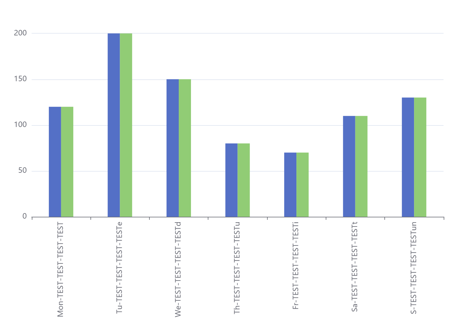
配置了横坐标旋转,同一个X轴所属柱子间距,非同一个X轴柱子间距,上下左右距离
option = {
  // 配置了横坐标旋转,同一个X轴所属柱子间距,非同一个X轴柱子间距,上下左右距离,以及横坐标部分涂色
  tooltip: {
    trigger: 'axis',
    axisPointer: {
      type: 'cross',
      crossStyle: {
        color: '#999'
      }
    }
  },
  grid: { top: '10%', left: '3%', right: '4%', bottom: '5%', containLabel: true },
  xAxis: {
    type: 'category',
    axisLabel: {
      interval: 0,
      rotate: 90
    },
    data: [
      'Mon-TEST-TEST-TEST-TEST',
      'Tu-TEST-TEST-TEST-TESTe',
      'We-TEST-TEST-TEST-TESTd',
      'Th-TEST-TEST-TEST-TESTu',
      'Fr-TEST-TEST-TEST-TESTi',
      'Sa-TEST-TEST-TEST-TESTt',
      'S-TEST-TEST-TEST-TESTun'
    ]
  },
  yAxis: {
    type: 'value'
  },
  series: [
    {
      name: '蒸发量1',
      barWidth: 20, //设置柱子的宽度
      barGap: '0%' /*控制的是单个X坐标的多个柱子的间距*/,
      //   barCategoryGap:'0%',/*控制非自己孩子之间的间距*/
      data: [120, 200, 150, 80, 70, 110, 130],
      type: 'bar'
    },
    {
      name: '蒸发量2',
      barWidth: 20, //设置柱子的宽度
      data: [120, 200, 150, 80, 70, 110, 130],
      type: 'bar'
    }
  ]
}
饼图添加中间的数字
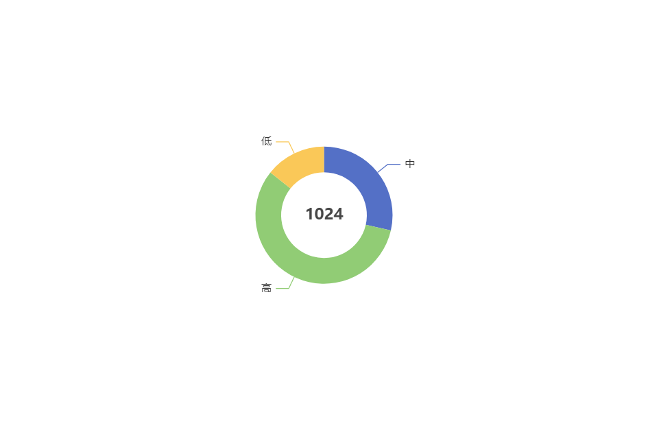
option = {
    title: {
        text: '1024',
        left: 'center',
        top: 'center',

            // center: ['50%', '50%'],
    },
     toolbox: {
        show: true,
        feature: {
            mark: {show: true},
            dataView: {show: true, readOnly: false},
            restore: {show: true},
            saveAsImage: {show: true}
        }
    },
    tooltip: {
        trigger: 'item',
        formatter: '{a} <br/>{b} : {c} ({d}%)'
    },
    series: [
        {
            type: 'pie',
            // radius: '65%',
            radius: [50, 80],
            center: ['50%', '50%'],
            selectedMode: 'single',
            data: [
                {value: 100, name: '中'},
                {value: 200, name: '高'},
                {value: 50, name: '低'}
            ],
            emphasis: { // 这个是鼠标放上去时候的阴影
                itemStyle: {
                    shadowBlur: 10,
                    shadowOffsetX: 5,
                    shadowColor: 'rgba(0, 0, 0, 0.5)'
                }
            }
        }
    ]
};
鼠标滚轮滚动移动数据,以及添加标识字
option = {
  tooltip: {
    trigger: 'axis',
    axisPointer: {
      type: 'shadow',
    },
  },
   toolbox: {
        feature: {
            saveAsImage: {}
        }
    },
  // legend: {
  //     data: ['2011年']
  // },
  grid: {
    left: '3%',
    right: '8%',
    bottom: '3%',
    containLabel: true,
  },
  xAxis: {
    type: 'value',
    boundaryGap: [0, 0.01],
  },
  yAxis: {
    type: 'category',
    inverse: true,
    data: [
      '巴西',
      '印尼',
      '美国',
      '印度',
      '中国',
      '世界人口(万)',
      '巴西1',
      '印1尼',
      '美1国',
      '印度1',
      '中1国',
      '世界1人口(万)',
      '巴西12',
      '印12尼',
      '美12国',
      '印度12',
      '中12国',
      '世界12人口(万)',
    ],
  },
  dataZoom: [
    {
       show: false,
    backgroundColor: 'red',
      zoomLock: false,
    },
    { type: 'inside', //改为slider的话就会出现滚动条,inside隐藏滚动条
      show: true,
      startValue: 0, // 控制显示几个数据
      endValue: 5, // 控制显示几个数据
      orient: 'vertical',
      showDetail: false, // 拖动时候滚动条上下是否显示详情
      showDataShadow: true,
    //   zoomLock: true,//设置为 true 则锁定选择区域的大小,也就是说,只能平移,不能缩放
      backgroundColor: 'white',
      fillerColor: 'red', // 滚动条颜色
      handleSize: '10', // 滚动条上面的那个把手大小
      x2: 20, // 滚动条距离右边的距离
      width: 20, // 滚动条的宽度
      zoomOnMouseWheel:false,  //滚轮是否触发缩放,同时要设置zoomLock: false
      moveOnMouseMove:true,  //鼠标左键拖动触发滚动,同时要设置zoomLock: false
      moveOnMouseWheel:true // 鼠标滚轮带动滚动,同时要设置zoomLock: false
    }
  ],
  series: [
    {
      name: '2011年',
      type: 'bar',
      itemStyle: {
                color:  '#599fff' // 柱子的颜色
            },
             label: {
                show: true, // 柱子后面的字体
                precision: 1,
                position: 'right',
                valueAnimation: true,
                fontFamily: 'monospace'
            },
      data: [
        18203,
        23489,
        29034,
        104970,
        131744,
        630230,
        18203,
        23489,
        29034,
        104970,
        131744,
        630230,
        18203,
        23489,
        29034,
        104970,
        131744,
        630230,
      ],
    },
  ]
};
多种样式调节,X轴颜色Y轴颜色 、分割线颜色
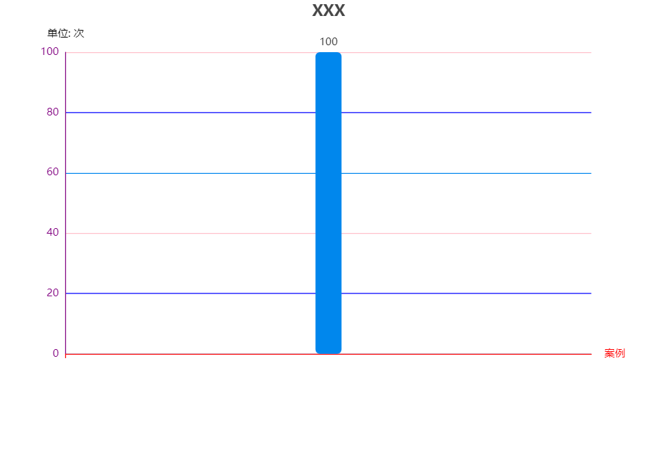
option = {
  title: {
    text: 'XXX',
    x: 'center'
  },
  //color: colorArr,
  tooltip: {
    trigger: 'axis',
    axisPointer: { // 坐标轴指示器,坐标轴触发有效
      type: 'shadow' // 默认为直线,可选为:'line' | 'shadow'
    }
  },

  toolbox: {
    feature: {
      saveAsImage: {}
    }
  },
  grid: {
    y2: 140
  },
  xAxis: {
    type: 'category',
    name: '案例',
    data: [''],
    axisLabel: {
      interval: 0,//横轴信息全部显示
      rotate: -30,//-30度角倾斜显示
    },
    axisLine: {
      lineStyle: {
        color: 'red', // x轴颜色
        width: 1,//这里是为了突出显示加上的
      }
    }
  },

  yAxis: {
    type: 'value',
    name: '单位: 次',
    splitLine: {
      lineStyle: {
        // 使用深浅的间隔色
        color: ['#0087ED', 'blue', 'pink']
      }
    },
    nameTextStyle: {
      color: ['#ddddd'] // y轴的标识字
    },
    axisLine: {
      show: true, // 控制y轴这个线是否出来
      lineStyle: {
        color: 'purple', // y轴字体颜色
        width: 1,//这里是为了突出显示加上的
      }
    }
  },
  series: [{
    name: '这里放名字',
    type: 'bar',
    stack: '次数',
    label: {
      normal: {
        show: true,
        position: 'top'
      }
    },
    data: ['100'],
    color: ['#0087ED'],
    itemStyle: {
      normal: {
        barBorderRadius: 5,
      }
    },
    barWidth: 30,
  }]
};
修改标题到中间,调整大小
{
    title: {
      text: '1024',
      textStyle:{fontSize:50},
      left: 'center',
      top: 'center',
    },
    tooltip: {
      trigger: 'item',
      formatter: '{b} : {c} ({d}%)'
    },
    series: [
      {
        type: 'pie',
        // radius: [120, 200],
radius: ['50%', '80%'], // 这个是按比例,上面那个是按固定值
        center: ['50%', '50%'],
        selectedMode: 'single',
        data: [
          { value: 100, name: '中' },
          { value: 200, name: '高' },
          { value: 50, name: '低' }
        ],
        emphasis: { // 这个是鼠标放上去时候的阴影
          itemStyle: {
            shadowBlur: 10,
            shadowOffsetX: 5,
            shadowColor: 'rgba(0, 0, 0, 0.5)'
          }
        }
      }
    ]
  };
修改部分字体颜色
    let data1 = [150, 230, 224, 218, 147, 260, 500]
    option = {
      xAxis: {
        type: 'category',
        axisLabel: {
          color: function (value, index) {
            console.log(value, index)
            return data1[index] > 200 ? 'red' : 'blue'
          }
        },
        data: ['Mon', 'Tue', 'Wed', 'Thu', 'Fri', 'Sat', 'Sun']
      },
      yAxis: {
        type: 'value'
      },
      series: [{

        data: data1,
        type: 'line'
      }]
    };
修改柱状图每个柱子的颜色,根据数据橫坐標部分字體顏色,修改柱子間距
 myData = {
    nameData: [ // 橫坐標顯示的值
      'TEST-數據名字01',
      'TEST-數據名字02',
      'TEST-數據名字03',
      'TEST-數據名字04',
      'TEST-數據名字05',
      'TEST-數據名字06',
      'TEST-數據名字07'
    ],
    pData: [120, 200, 150, 80, 70, 110, 130],
    rData: [120, 0, 150, 80, 0, 110, 130]
  }
  option = {
       toolbox: {
        feature: {
            saveAsImage: {}
        }
    },
    legend: {
      data: ['Pr', 'Ro'],
      right: 20,
      itemHeight: 10,
      itemWidth: 10,
      itemGap: 30,
    },
    // 配置了横坐标旋转,同一个X轴所属柱子间距,非同一个X轴柱子间距,上下左右距离,以及横坐标部分涂色
    tooltip: {
      trigger: 'axis',
      axisPointer: {
        type: 'cross',
        crossStyle: {
          color: '#999'
        }
      }
    },
    grid: { top: '10%', left: '3%', right: '4%', bottom: '5%', containLabel: true },
    xAxis: {
      type: 'category',

      axisLabel: {
        interval: 0,
        rotate: 90,
        color: (value, index) => {
          // 柱狀圖用紅色框線標出壓力值為0的設備Station ID ,若進行壓力參數名稱的點選,紅色框線隨之改變
          return this.myData.rData[index] === 0 ? 'red' : 'black'
        }
      },
      data: this.myData.nameData
    },
    yAxis: {
      type: 'value'
    },
    series: [
      {
        name: 'Press',
        barWidth: 20, //设置柱子的宽度
        barGap: '0%' /*控制的是单个X坐标的多个柱子的间距*/,
        //   barCategoryGap:'0%',/*控制非自己孩子之间的间距*/
        data: this.myData.pData,
        itemStyle: {
          normal: {
            color: '#599fff'
          }
        },
        type: 'bar'
      },
      {
        name: 'Robot',
        barWidth: 20, //设置柱子的宽度
        data: this.myData.rData,
        itemStyle: {
          normal: {
            color: '#ffb752'
          }
        },
        type: 'bar'
      }
    ]
  }
修改echarts折线图拐点大小样式以及添加点点的边框,改变折线的样式
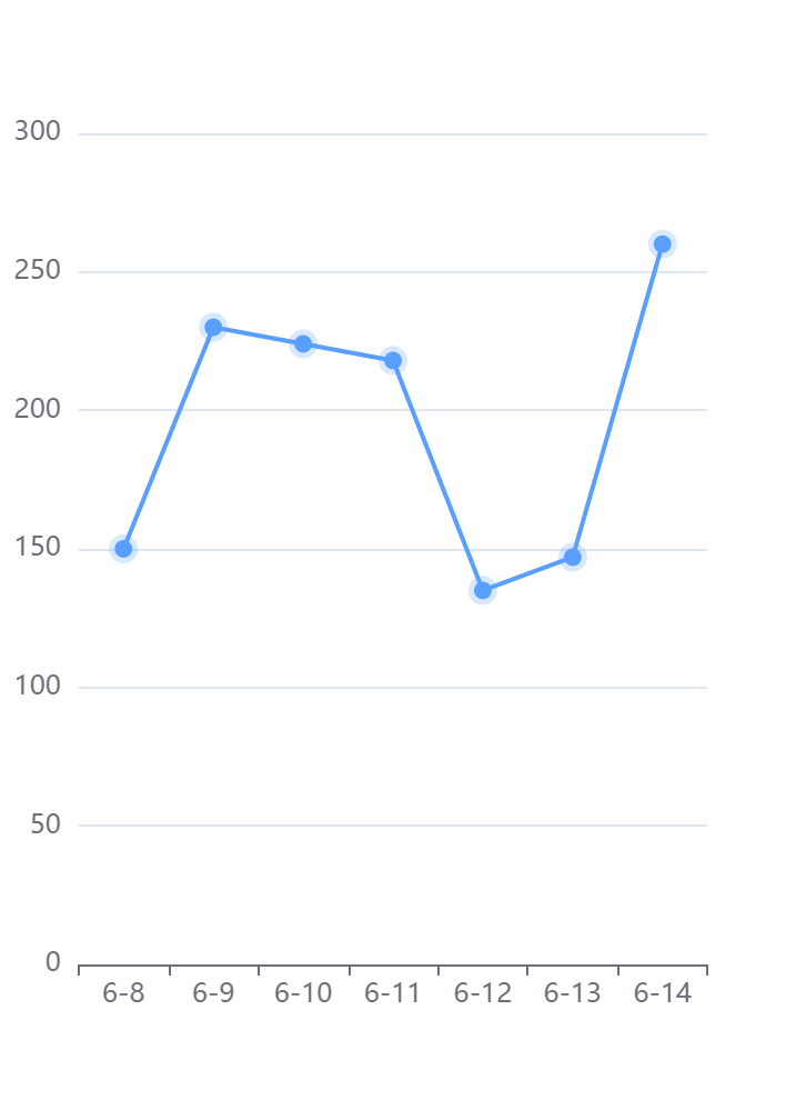
option = {
        tooltip: {
          trigger: 'axis',
        },
        xAxis: {
          type: 'category',
          data: ['6-8', '6-9', '6-10', '6-11', '6-12', '6-13', '6-14'],
        },
        yAxis: {
          type: 'value',
        },
        series: [
          {
            data: [150, 230, 224, 218, 135, 147, 260],
            type: 'line',
            symbol: 'circle', //拐点设置为实心
            symbolSize: 8, //拐点大小
            animation: true, //false: hover圆点不缩放 .true:hover圆点默认缩放
            lineStyle: {
              normal: {
                color: '#599fff', //折线的颜色
                width: '2', //折线粗细
              },
            },
            itemStyle: {
              normal: {
                color: '#599fff', //拐点颜色
                borderColor: 'rgba(89, 159, 255, 0.24)', //拐点边框颜色
                borderWidth: 5, //拐点边框大小
              },
              //   emphasis: {
              //         color: '#000000'//hover拐点颜色定义
              //     }
            },
          },
        ],
      }
折注混合,X轴的颜色,X轴字体颜色,调整柱子颜色,调整小图标图例的大小和位置,鼠标hover时候的样式,用纵向阴影
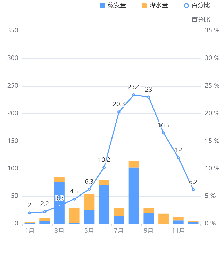
// 折注混合,X轴的颜色,X轴字体颜色,调整柱子颜色,调整小图标图例的大小和位置,鼠标hover时候的样式,用纵向阴影
      option = {
        tooltip: {
          trigger: 'axis',
          axisPointer: {
            // 坐标轴指示器,坐标轴触发有效
            type: 'shadow', // 默认为直线,可选为:'line' | 'shadow'
          },
        },
        legend: {
          // 调整小图标图例的大小和位置
          data: ['蒸发量', '降水量', '百分比'],
          right: 20,
          itemHeight: 10,
          itemWidth: 10,
          itemGap: 30,
        },
        xAxis: [
          {
            type: 'category',
            data: [
              '1月',
              '2月',
              '3月',
              '4月',
              '5月',
              '6月',
              '7月',
              '8月',
              '9月',
              '10月',
              '11月',
              '12月',
            ],
            axisPointer: {
              type: 'shadow',
            },
            axisLabel: {
              color: '#828c99', // x轴字体颜色
            },
            axisLine: {
              lineStyle: {
                color: '#d9d9d9', // x轴颜色
                width: 1, //这里是为了突出显示加上的
              },
            },
          },
        ],
        yAxis: [
          {
            type: 'value',
            // name: '水量', 左侧y轴标题
            min: 0,
            max: 350,
            interval: 50,
            // axisLabel: { 左侧y轴单位
            //     formatter: '{value} ml'
            // }
          },
          {
            type: 'value',
            name: '百分比',
            min: 0,
            max: 35,
            interval: 5,
            axisLabel: {
              formatter: '{value} %',
            },
          },
        ],
        series: [
          {
            name: '蒸发量',
            type: 'bar',
            stack: '堆叠',
            itemStyle: {
              normal: {
                // 柱子颜色--蓝色
                color: '#599fff',
              },
            },
            data: [
              1.0,
              4.9,
              76.0,
              2.2,
              25.6,
              70.7,
              13.6,
              102.2,
              20.6,
              0.0,
              6.4,
              3.3,
            ],
          },
          {
            name: '降水量',
            type: 'bar',
            stack: '堆叠',
            itemStyle: {
              normal: {
                // 柱子颜色--黄色
                color: '#ffb752',
              },
            },
            data: [
              2.6,
              5.9,
              9.0,
              26.4,
              28.7,
              9.7,
              15.6,
              12.2,
              8.7,
              18.8,
              6.0,
              2.3,
            ],
          },
          {
            name: '百分比',
            type: 'line',
            itemStyle: {
              normal: {
                // 颜色
                color: '#599fff',
              },
            },
            label: {
              show: true,
              position: 'top',
            },
            yAxisIndex: 1,
            data: [
              2.0,
              2.2,
              3.3,
              4.5,
              6.3,
              10.2,
              20.3,
              23.4,
              23.0,
              16.5,
              12.0,
              6.2,
            ],
          },
        ],
      }
去除饼图标注省略号配置
option = {
    title: {
      text: '2323',
      textStyle: { fontSize: 26 },
      left: 'center',
      top: 'center',
    },

    tooltip: {
      trigger: 'item',
      formatter: '{b} : {c} {d}%',
    },
    series: [
      {
        type: 'pie',
        radius: ['28%', '50%'],
        label: {
              alignTo: 'edge', // 去除标注省略号配置
                edgeDistance: 5, // 去除标注省略号配置
                lineHeight:20, // 去除标注省略号配置
          formatter: '{b} :\n {c} {d}%', // 去除标注省略号配置
      },
        data: [
          { value: 100, name: '中' },
          { value: 200, name: '高' },
          { value: 50, name: '低' },
        ],
        emphasis: {
          // 这个是鼠标放上去时候的阴影
          itemStyle: {
            shadowBlur: 10,
            shadowOffsetX: 5,
            shadowColor: 'rgba(0, 0, 0, 0.5)',
          },
        },
      },
    ],
  };
修改饼图颜色
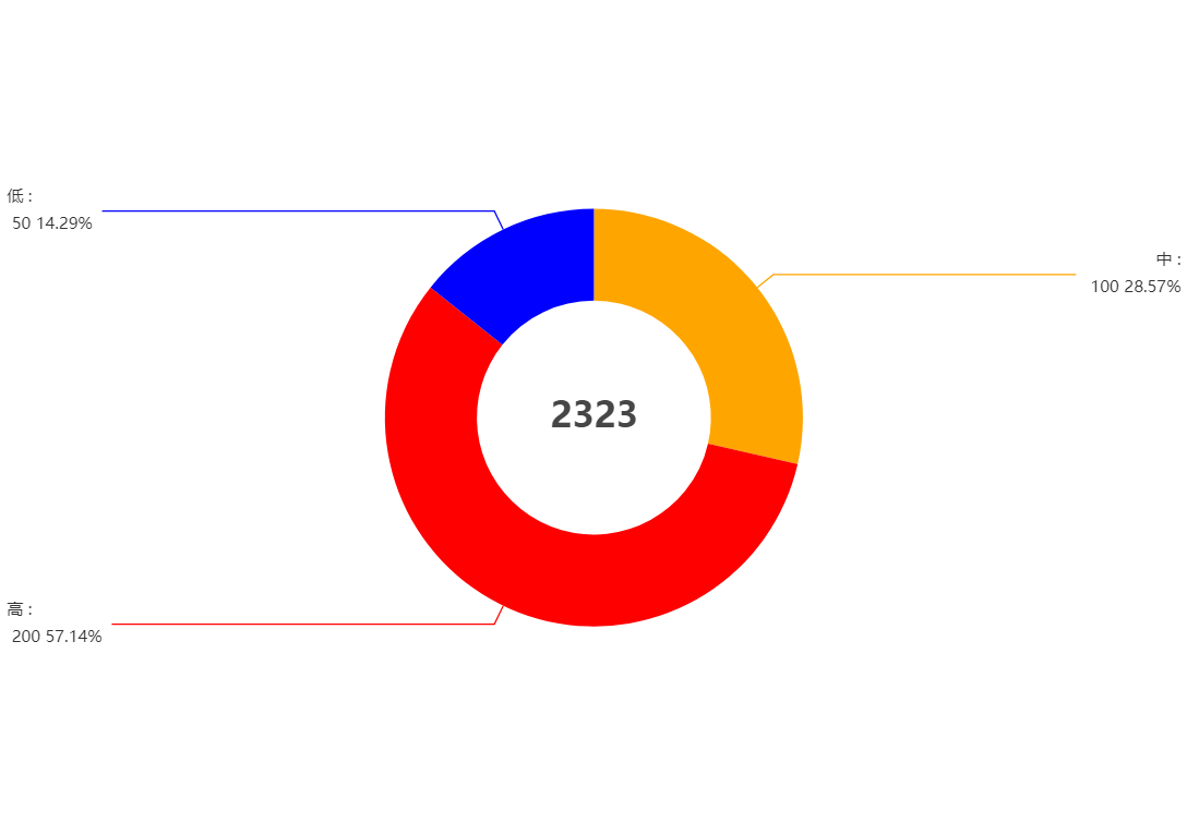
option = {
    title: {
      text: '2323',
      textStyle: { fontSize: 26 },
      left: 'center',
      top: 'center',
    },
    toolbox: {
        feature: {
            saveAsImage: {}
        }
    },
    tooltip: {
      trigger: 'item',
      formatter: '{b} : {c} {d}%',
    },
    series: [
      {
        type: 'pie',
        radius: ['28%', '50%'],
        label: {
              alignTo: 'edge', // 去除标注省略号配置
                edgeDistance: 5, // 去除标注省略号配置
                lineHeight:20, // 去除标注省略号配置
          formatter: '{b} :\n {c} {d}%', // 去除标注省略号配置
      },
        data: [
          { value: 100, name: '中',itemStyle: {color:"orange"} },
          { value: 200, name: '高' ,itemStyle: {color:"red"}},
          { value: 50, name: '低' ,itemStyle: {color:"blue"}},
        ],
        emphasis: {
          // 这个是鼠标放上去时候的阴影
          itemStyle: {
            shadowBlur: 10,
            shadowOffsetX: 5,
            shadowColor: 'rgba(0, 0, 0, 0.5)',
          },
        },
      },
    ],
  };

 浙公网安备 33010602011771号