案例
学习网址:https://seaborn.pydata.org/examples/errorband_lineplots.html
| import seaborn as sns |
| import pandas as pd |
| sns.set_theme(style="darkgrid") |
| |
| # 导入数据 |
| fmri = pd.read_csv("../../seaborn-data-master/fmri.csv") |
| |
| # 查看数据 |
| fmri.head() |
|
subject |
timepoint |
event |
region |
signal |
| 0 |
s13 |
18 |
stim |
parietal |
-0.017552 |
| 1 |
s5 |
14 |
stim |
parietal |
-0.080883 |
| 2 |
s12 |
18 |
stim |
parietal |
-0.081033 |
| 3 |
s11 |
18 |
stim |
parietal |
-0.046134 |
| 4 |
s10 |
18 |
stim |
parietal |
-0.037970 |
| |
| sns.lineplot( |
| x = "timepoint", y = 'signal', |
| hue = 'region', style = 'event', |
| data = fmri |
| ) |

sns.lineplot() 的案例
example 1
| # 导入数据 |
| import pandas as pd |
| import seaborn as sns |
| flights = pd.read_csv("../../seaborn-data-master/flights.csv") # 10年中 |
| flights.head() |
| year |
month |
passengers |
| 0 |
1949 |
January |
| 1 |
1949 |
February |
| 2 |
1949 |
March |
| 3 |
1949 |
April |
| 4 |
1949 |
May |
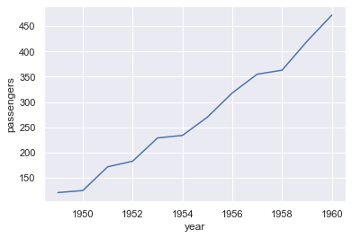
| may_flights = flights.query("month == 'May'") |
| # may_flights = flights.loc[flights["month"] == 'May'] 也行 |
| print(may_flights) |
| sns.lineplot(data = may_flights, x = 'year', y = 'passengers') |
| [out]: |
| year month passengers |
| 4 1949 May 121 |
| 16 1950 May 125 |
| 28 1951 May 172 |
| 40 1952 May 183 |
| 52 1953 May 229 |
| 64 1954 May 234 |
| 76 1955 May 270 |
| 88 1956 May 318 |
| 100 1957 May 355 |
| 112 1958 May 363 |
| 124 1959 May 420 |
| 136 1960 May 472 |
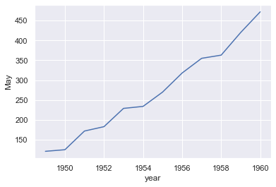
example 2
换一种形式处理数据
| flights_wide = flights.pivot("year", "month", "passengers") |
| ''' |
| 参数解读: |
| year : 指定每一行的输出内容 |
| month : 指定每一列的输出内容 |
| passengers : 指定输出的内容 |
| ''' |
| flights_wide.head() |
| month |
April |
August |
December |
February |
January |
July |
June |
March |
May |
November |
October |
September |
| year |
|
|
|
|
|
|
|
|
|
|
|
|
| 1949 |
129 |
148 |
118 |
118 |
112 |
148 |
135 |
132 |
121 |
104 |
119 |
136 |
| 1950 |
135 |
170 |
140 |
126 |
115 |
170 |
149 |
141 |
125 |
114 |
133 |
158 |
| 1951 |
163 |
199 |
166 |
150 |
145 |
199 |
178 |
178 |
172 |
146 |
162 |
184 |
| 1952 |
181 |
242 |
194 |
180 |
171 |
230 |
218 |
193 |
183 |
172 |
191 |
209 |
| 1953 |
235 |
272 |
201 |
196 |
196 |
264 |
243 |
236 |
229 |
180 |
211 |
237 |
| sns.lineplot(data = flights_wide['May']) |
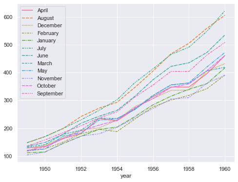
example 3
| |
| import matplotlib.pyplot as plt |
| plt.figure(figsize=(8, 6)) |
| sns.lineplot(data = flights_wide) |
| plt.legend(loc='upper left') |
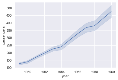
example 4
| |
| sns.lineplot(data = flights, x = 'year', y = 'passengers') |
example 5
| |
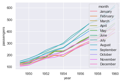
| sns.lineplot(data = flights, x = 'year', y = 'passengers', hue = 'month') |
example 6
| |
| plt.figure(figsize=(8,6)) |
| sns.lineplot(data = flights, x = 'year', y = 'passengers', hue = 'month', style = 'month') |
| plt.legend(loc='upper left') |
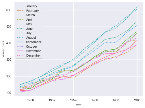
可以发现颜色图例和example3一致(除了月份顺序)
example 7
| sns.lineplot(data = flights, x = 'passengers', y = 'year', orient = 'y') |
| |
| |
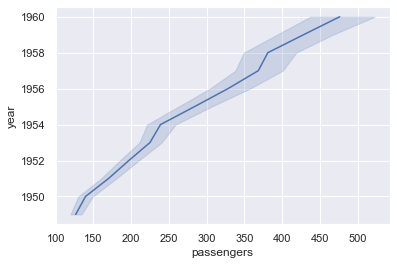
注:使用 orient 参数前需要将seaborn版本升级到 0.12.0
| # 查看 seaborn 版本 |
| sns.__version__ |
example 8
| |
| fmri = pd.read_csv("../../seaborn-data-master/fmri.csv") |
| fmri.head() |
| subject |
timepoint |
event |
region |
signal |
| 0 |
s13 |
18 |
stim |
parietal |
| 1 |
s5 |
14 |
stim |
parietal |
| 2 |
s12 |
18 |
stim |
parietal |
| 3 |
s11 |
18 |
stim |
parietal |
| 4 |
s10 |
18 |
stim |
parietal |
| sns.lineplot(data = fmri, x = 'timepoint', y = 'signal', hue = 'event') |

example 9
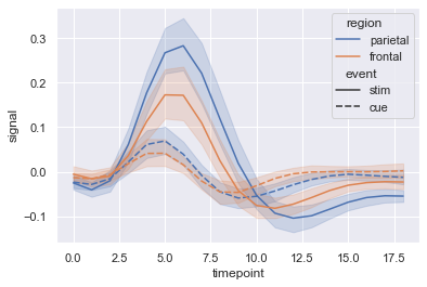
| # 接着 example 8 的例子,用不同的色调区分 region,用不同的线条类型区分 event |
| sns.lineplot(data=fmri, x='timepoint', y='signal', hue='region', style='event') |
example 10
| |
| sns.lineplot( |
| data=fmri, |
| x='timepoint', |
| y='signal', |
| hue='event', |
| style='event', |
| markers=True, |
| dashes=False |
| ) |
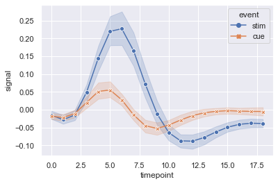
example 11
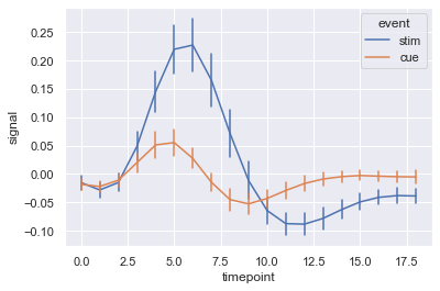
| |
| sns.lineplot( |
| data = fmri, |
| x='timepoint', |
| y='signal', |
| hue='event', |
| err_style='bars', |
| errorbar=('se',2) |
| ) |
| |
| |
| |
| |
| |
example 12
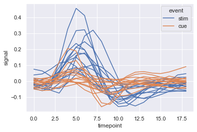
| |
| sns.lineplot( |
| data = fmri.query("region == 'frontal'"), |
| x='timepoint', |
| y='signal', |
| hue='event', |
| units='subject', |
| estimator=None, |
| |
| ) |
example 13
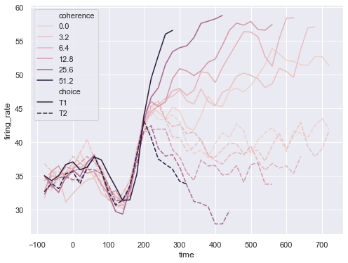
| |
| dots = pd.read_csv("../../seaborn-data-master/dots.csv").query("align == 'dots'") |
| dots.head() |
| align |
choice |
time |
coherence |
firing_rate |
| 0 |
dots |
T1 |
-80 |
0.0 |
| 1 |
dots |
T1 |
-80 |
3.2 |
| 2 |
dots |
T1 |
-80 |
6.4 |
| 3 |
dots |
T1 |
-80 |
12.8 |
| 4 |
dots |
T1 |
-80 |
25.6 |
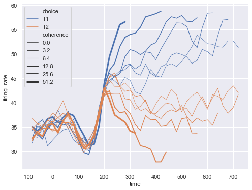
| # 对不同的coherence(数字变量)调不同的颜色,以 choice 为依据划分线条的类型 |
| import matplotlib.pyplot as plt |
| plt.figure(figsize = (8,6)) |
| sns.lineplot( |
| data = dots, |
| x = 'time', |
| y = 'firing_rate', |
| hue = 'coherence', |
| style = 'choice' |
| ) |
| plt.legend(loc='upper left') |
example 14
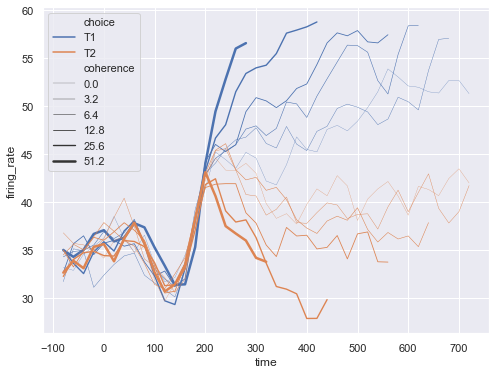
| # 可以以python列表或字典的形式传递特定的颜色 |
| import matplotlib.pyplot as plt |
| plt.figure(figsize = (8,6)) |
| palette = sns.color_palette('mako_r', 6) |
| sns.lineplot( |
| data = dots, |
| x = 'time', |
| y = 'firing_rate', |
| hue = 'coherence', |
| style = 'choice', |
| palette = palette |
| ) |
| plt.legend(loc='upper left') |

example 15
| |
| plt.figure(figsize=(8,6)) |
| sns.lineplot( |
| data = dots, |
| x = 'time', |
| y = 'firing_rate', |
| size = 'coherence', |
| hue = 'choice', |
| legend = 'full' |
| ) |
| plt.legend(loc='upper left') |
| |
| plt.figure(figsize=(8,6)) |
| sns.lineplot( |
| data = dots, |
| x = 'time', |
| y = 'firing_rate', |
| size = 'coherence', |
| hue = 'choice', |
| sizes = (.25, 2.5) |
| ) |
| plt.legend(loc='upper left') |
example 16
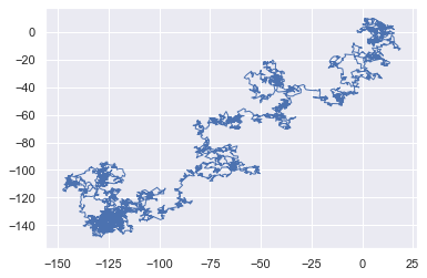
| # 默认情况下,绘图时按 x 排序,若 调节 sort = False,则绘图时按数据集中的顺序绘制 |
| import numpy as np |
| x, y = np.random.normal(size = (2, 5000)).cumsum(axis = 1) |
| sns.lineplot(x=x, y=y, lw=1) |
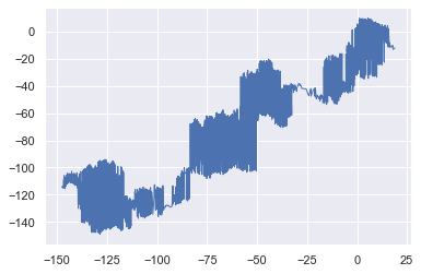
| sns.lineplot(x=x, y=y, sort=False, lw=1) |
example 17
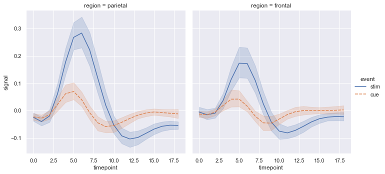
| |
| sns.relplot( |
| data = fmri, |
| x = 'timepoint', |
| y = 'signal', |
| col = 'region', |
| hue = 'event', |
| style = 'event', |
| kind = 'line' |
| ) |


【推荐】国内首个AI IDE,深度理解中文开发场景,立即下载体验Trae
【推荐】编程新体验,更懂你的AI,立即体验豆包MarsCode编程助手
【推荐】抖音旗下AI助手豆包,你的智能百科全书,全免费不限次数
【推荐】轻量又高性能的 SSH 工具 IShell:AI 加持,快人一步
· 无需6万激活码!GitHub神秘组织3小时极速复刻Manus,手把手教你使用OpenManus搭建本
· C#/.NET/.NET Core优秀项目和框架2025年2月简报
· Manus爆火,是硬核还是营销?
· 一文读懂知识蒸馏
· 终于写完轮子一部分:tcp代理 了,记录一下