
QCustomPlot简单应用
应用背景
对于一些测量系统,有时直接看数据并不是很直观,若将数据转换成图像来显示,会更直观,同时也能根据图像或曲线引出新的规律。
将数据换成图像显示时,有些也能验证的整个系统的测量是否正确。接下来介绍一种易用基于QT的曲线控件QCustomPlot。
介绍
QCustomPlot是一个用绘图与数据可视化的QT C++部件,没有基于其他依赖,同时有良好的文档说明。这个库可用于好看的,可出版的2D绘图,图形,图表。
并对于实时曲线绘制也有很高的性能。QCustomPlot可以导出多种格式,PDF,PNG,JPG,BMP等。QCustomPlot也是开源的基于GPL协议。用户可自由查看其源码。
可去其官网QCustomPlot查看详细说明。
Demo
Windows操作环境
- 先从官网下载代码,选择其中一个版本即可
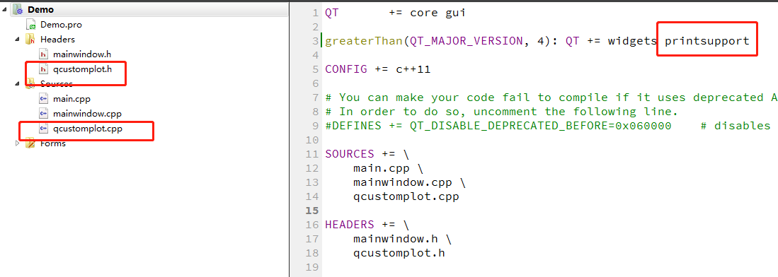
- 将下载的源文件复制到工程目录,并将添加至工程,工程添加printsupport选项
如下图所示
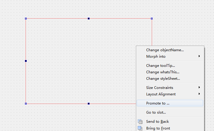
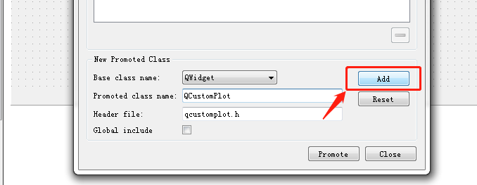
- 添加一个widget控件并promote to(提升至)QCustomPlot
- 直接使用widget的名字进行QCustomPlot API的调用来实现想要的结果

// add two new graphs and set their look:
customPlot->addGraph();
customPlot->graph(0)->setPen(QPen(Qt::blue)); // line color blue for first graph
customPlot->graph(0)->setBrush(QBrush(QColor(0, 0, 255, 20))); // first graph will be filled with translucent blue
customPlot->addGraph();
customPlot->graph(1)->setPen(QPen(Qt::red)); // line color red for second graph
// generate some points of data (y0 for first, y1 for second graph):
QVector<double> x(251), y0(251), y1(251);
for (int i=0; i<251; ++i)
{
  x[i] = i;
  y0[i] = qExp(-i/150.0)*qCos(i/10.0); // exponentially decaying cosine
  y1[i] = qExp(-i/150.0);              // exponential envelope
}
// configure right and top axis to show ticks but no labels:
// (see QCPAxisRect::setupFullAxesBox for a quicker method to do this)
customPlot->xAxis2->setVisible(true);
customPlot->xAxis2->setTickLabels(false);
customPlot->yAxis2->setVisible(true);
customPlot->yAxis2->setTickLabels(false);
// make left and bottom axes always transfer their ranges to right and top axes:
connect(customPlot->xAxis, SIGNAL(rangeChanged(QCPRange)), customPlot->xAxis2, SLOT(setRange(QCPRange)));
connect(customPlot->yAxis, SIGNAL(rangeChanged(QCPRange)), customPlot->yAxis2, SLOT(setRange(QCPRange)));
// pass data points to graphs:
customPlot->graph(0)->setData(x, y0);
customPlot->graph(1)->setData(x, y1);
// let the ranges scale themselves so graph 0 fits perfectly in the visible area:
customPlot->graph(0)->rescaleAxes();
// same thing for graph 1, but only enlarge ranges (in case graph 1 is smaller than graph 0):
customPlot->graph(1)->rescaleAxes(true);
// Note: we could have also just called customPlot->rescaleAxes(); instead
// Allow user to drag axis ranges with mouse, zoom with mouse wheel and select graphs by clicking:
customPlot->setInteractions(QCP::iRangeDrag | QCP::iRangeZoom | QCP::iSelectPlottables);
基础API注释
addgraph
要加一个曲线时,必需先加一个graph,再在graph的基础上添加
customPlot->graph(0)->setData(x,y0);
setData
两维数据分为key与value,如果这两者被打包成VECTOR,那么setData,设置整张graph的数据
addData
用于添加一个点的数据
replot
用于重绘当前图形显示
用以上几个API基本就可以显示一张曲线图了,总体来说QCustomPlot做简单的曲线显示,还是比较好上手。当然想到实现很好的效果,还是多了解API文档及试验。
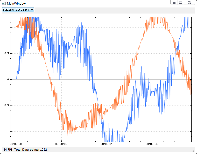
整体来说QCustomPlot的功能还是很强大,能实现很多复杂的应用。官方也提供了很的示例。
标签:
其他


【推荐】国内首个AI IDE,深度理解中文开发场景,立即下载体验Trae
【推荐】编程新体验,更懂你的AI,立即体验豆包MarsCode编程助手
【推荐】抖音旗下AI助手豆包,你的智能百科全书,全免费不限次数
【推荐】轻量又高性能的 SSH 工具 IShell:AI 加持,快人一步
· 基于Microsoft.Extensions.AI核心库实现RAG应用
· Linux系列:如何用heaptrack跟踪.NET程序的非托管内存泄露
· 开发者必知的日志记录最佳实践
· SQL Server 2025 AI相关能力初探
· Linux系列:如何用 C#调用 C方法造成内存泄露
· 震惊!C++程序真的从main开始吗?99%的程序员都答错了
· 【硬核科普】Trae如何「偷看」你的代码?零基础破解AI编程运行原理
· 单元测试从入门到精通
· 上周热点回顾(3.3-3.9)
· winform 绘制太阳,地球,月球 运作规律