数组和字符串//杨辉三角 II

给定一个非负索引 k,其中 k ≤ 33,返回杨辉三角的第 行。

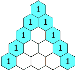
在杨辉三角中,每个数是它左上方和右上方的数的和。

示例:

输入: 3
输出: [1,3,3,1]

进阶:

你可以优化你的算法到 O(k) 空间复杂度吗?

class Solution {
    public List<Integer> getRow(int rowIndex) {
        List<Integer> list = new ArrayList<Integer>();
        for(int i = 0; i <= rowIndex; i++){
            list.add(1);
            for(int j = i-1; j >= 1; j--){
                list.set(j,list.get(j)+list.get(j-1));
            }
        }
        return list;
    }
}
class Solution {
public:
    vector<int> getRow(int rowIndex) {
        vector<int> out;
        if(rowIndex < 0) return out;
        out.assign(rowIndex+1,0);
        for(int i = 0; i <= rowIndex; i++){
            if(i == 0){
                out[0] = 1;
                continue;
            }
            for(int j = rowIndex; j >= 1; j--){
                out[j] = out[j] + out[j-1];
            }
        }
        return out;
    }
};


posted @ 2018-11-20 12:27  strawqqhat  阅读(97)  评论(0编辑  收藏  举报
#home h1{ font-size:45px; } body{ background-image: url("放你的背景图链接"); background-position: initial; background-size: cover; background-repeat: no-repeat; background-attachment: fixed; background-origin: initial; background-clip: initial; height:100%; width:100%; } #home{ opacity:0.7; } .wall{ position: fixed; top: 0; left: 0; bottom: 0; right: 0; } div#midground{ background: url("https://i.postimg.cc/PP5GtGtM/midground.png"); z-index: -1; -webkit-animation: cc 200s linear infinite; -moz-animation: cc 200s linear infinite; -o-animation: cc 200s linear infinite; animation: cc 200s linear infinite; } div#foreground{ background: url("https://i.postimg.cc/z3jZZD1B/foreground.png"); z-index: -2; -webkit-animation: cc 253s linear infinite; -o-animation: cc 253s linear infinite; -moz-animation: cc 253s linear infinite; animation: cc 253s linear infinite; } div#top{ background: url("https://i.postimg.cc/PP5GtGtM/midground.png"); z-index: -4; -webkit-animation: da 200s linear infinite; -o-animation: da 200s linear infinite; animation: da 200s linear infinite; } @-webkit-keyframes cc { from{ background-position: 0 0; transform: translateY(10px); } to{ background-position: 600% 0; } } @-o-keyframes cc { from{ background-position: 0 0; transform: translateY(10px); } to{ background-position: 600% 0; } } @-moz-keyframes cc { from{ background-position: 0 0; transform: translateY(10px); } to{ background-position: 600% 0; } } @keyframes cc { 0%{ background-position: 0 0; } 100%{ background-position: 600% 0; } } @keyframes da { 0%{ background-position: 0 0; } 100%{ background-position: 0 600%; } } @-webkit-keyframes da { 0%{ background-position: 0 0; } 100%{ background-position: 0 600%; } } @-moz-keyframes da { 0%{ background-position: 0 0; } 100%{ background-position: 0 600%; } } @-ms-keyframes da { 0%{ background-position: 0 0; } 100%{ background-position: 0 600%; } }