

Principles of spacing in UI Design
Principles of spacing in UI Design (Part 2)
https://medium.com/dwarves-design/the-principle-of-spacing-part-2-e3cf31b909fa
Vertical spacing
Spacing within each paragraph


-
the title of 1.2, the subtitle of 1.3 and the body copy of 1.5.
-
如果全部都用 1.5, 那么层次就出不来
Spacing between two consecutive paragraphs

-
空行的距离为一个字的 line-height
Spacing within the list items in a list

-
Before title 是 2 个字的 line-height
-
After title 是 1 个字的 line-height
Spacing within input fields with labels

-
一致的空间没有区分层次和分类
-
使用 large, medium, small 来区分
-
方法
-
先给一点空间
-
如果拥挤,再给一点
Horizontal spacing
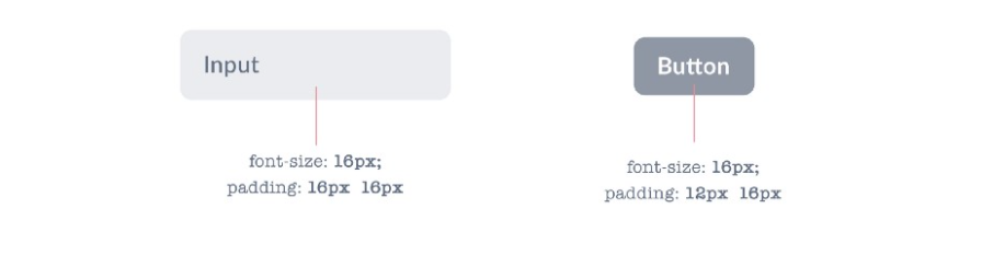
Spacing inside components
-
作者建议在 input padding 16px
-
Button padding 12px 16px
Spacing two components

-
Container 的 padding, 和组件有区分
-
关系非常密切的组件,空间要更小
Spacing between icons

-
通过空间让让元素无形中有了分组,这也是我们想要达到的目的