antd-table 表格样式设置
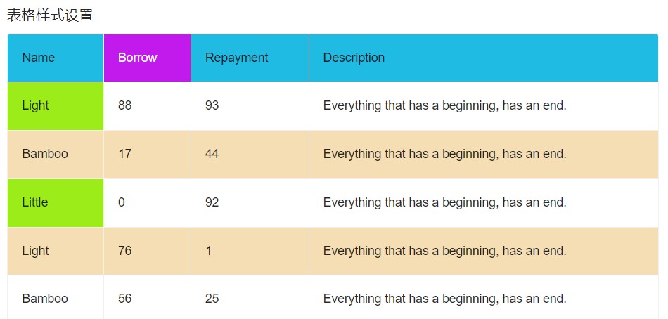
效果图:
ant-design-vue 的表格有几个属性可以设置表格的样式
1. rowClassName: 可以设置表格行的样式,返回样式名
使用:
<template>
  <div>
    <h3>表格样式设置</h3>
    <a-table
      class="container"
      :columns="columns"
      :data-source="fixedData"
      bordered
      :rowClassName="rowClassName"
    >
    </a-table>
  </div>
</template>

<script>
import { ref } from "vue";
export default {
  name: "tableStyle",
  setup() {
    // 表格行样式
    const rowClassName = (record, index) => {
      if (index % 2 === 1) {
        return "default-row double-row";
      }
      return "default-row";
    };

    ]);
    return {
      columns,
      fixedData,
      rowClassName,
    };
  },
};
</script>

<style lang="less">
.container {
  .double-row > td {
    background-color: wheat;
  }
  .default-row:hover > td.ant-table-cell-row-hover {
    background-color: wheat;
  }
}
</style>
2. customHeaderRow: 可以设置表格头的样式,返回对象,里面包含多个属性,class,style,onClick....
使用:
<template>
  <div>
    <h3>表格样式设置</h3>
    <a-table
      class="container"
      :columns="columns"
      :data-source="fixedData"
      bordered
      :customHeaderRow="customHeaderRow"
    >
    </a-table>
  </div>
</template>

<script>
import { ref } from "vue";
export default {
  name: "tableStyle",
  setup() {
    // 表格头样式
    const customHeaderRow = (column, index) => {
      return {
        class: "header-row",
      };
    };

    return {
      columns,
      fixedData,
      customHeaderRow,
    };
  },
};
</script>

<style lang="less">
.container {
  .header-row > th {
    background-color: rgb(32, 187, 226);
  }
}
</style>
3. customCell: 可以单元格的样式,返回对象,里面包含多个属性,class,style,onClick....
使用:
<template>
  <div>
    <h3>表格样式设置</h3>
    <a-table
      class="container"
      :columns="columns"
      :data-source="fixedData"
      bordered
    >
    </a-table>
  </div>
</template>

<script>
import { ref } from "vue";
export default {
  name: "tableStyle",
  setup() {
    const fixedData = ref([]);
    for (let i = 0; i < 20; i += 1) {
      fixedData.value.push({
        key: i,
        name: ["Light", "Bamboo", "Little"][i % 3],
        borrow: Math.floor(Math.random() * 100),
        repayment: Math.floor(Math.random() * 100),
        description: "Everything that has a beginning, has an end.",
      });
    }
  // 单元格样式
    const customCell = (column, index) => {
      // console.log(column, index);
      if (index === 0 || index === 2) {
        return {
          class: "custom-row",
        };
      }
      return {};
    };
   const columns = ref([
      {
        title: "Name",
        dataIndex: "name",
        fixed: true,
        customCell: customCell,
      },
      {
        title: "Borrow",
        dataIndex: "borrow",
      },
      {
        title: "Repayment",
        dataIndex: "repayment",
      },
      {
        title: "Description",
        dataIndex: "description",
      },
    ]);
    return {
      columns,
      fixedData,
      customCell,
    };
  },
};
</script>
<style lang="less">
.container {
  .custom-row {
    background-color: rgb(156, 236, 26);
  }
}
4. customHeaderCell: 设置表格头单元格样式,返回的也是对象,与 customCell 用法一致,
这里不单独放了,直接把四种设置方式完整代码放下面
<template>
  <div>
    <h3>表格样式设置</h3>
    <a-table
      class="container"
      :columns="columns"
      :data-source="fixedData"
      bordered
      :rowClassName="rowClassName"
      :customHeaderRow="customHeaderRow"
    >
    </a-table>
  </div>
</template>

<script>
import { ref } from "vue";
export default {
  name: "tableStyle",
  setup() {
    const fixedData = ref([]);
    for (let i = 0; i < 20; i += 1) {
      fixedData.value.push({
        key: i,
        name: ["Light", "Bamboo", "Little"][i % 3],
        borrow: Math.floor(Math.random() * 100),
        repayment: Math.floor(Math.random() * 100),
        description: "Everything that has a beginning, has an end.",
      });
    }

    // 表格行样式
    const rowClassName = (record, index) => {
      if (index % 2 === 1) {
        return "default-row double-row";
      }
      return "default-row";
    };
    // 表格头样式
    const customHeaderRow = (column, index) => {
      return {
        class: "header-row",
      };
    };
    // 单元格样式
    const customCell = (column, index) => {
      // console.log(column, index);
      if (index === 0 || index === 2) {
        return {
          class: "custom-row",
        };
      }
      return {};
    };
    // 表头单元格样式
    const customHeaderCell = (column, index) => {
      return {
        class: "custom-header-row",
      };
    };

    const columns = ref([
      {
        title: "Name",
        dataIndex: "name",
        fixed: true,
        customCell: customCell,
      },
      {
        title: "Borrow",
        dataIndex: "borrow",
        customHeaderCell: customHeaderCell,
      },
      {
        title: "Repayment",
        dataIndex: "repayment",
      },
      {
        title: "Description",
        dataIndex: "description",
      },
    ]);
    return {
      columns,
      fixedData,
      rowClassName,
      customHeaderRow,
      customCell,
      customHeaderCell,
    };
  },
};
</script>

<style lang="less">
.container {
  .header-row > th {
    background-color: rgb(32, 187, 226);
  }
  .header-row .custom-header-row {
    background-color: rgb(194, 26, 236);
    color: #fff;
  }
  .double-row > td {
    background-color: wheat;
  }
  .custom-row {
    background-color: rgb(156, 236, 26);
  }
  .default-row:hover > td.ant-table-cell-row-hover {
    background-color: wheat;
  }
}
</style>
这几种设置方式是官方 API 提供的,如果不符合你的样式设置需求,也可以直接样式覆盖

 浙公网安备 33010602011771号