day8-20230223-布局作业三
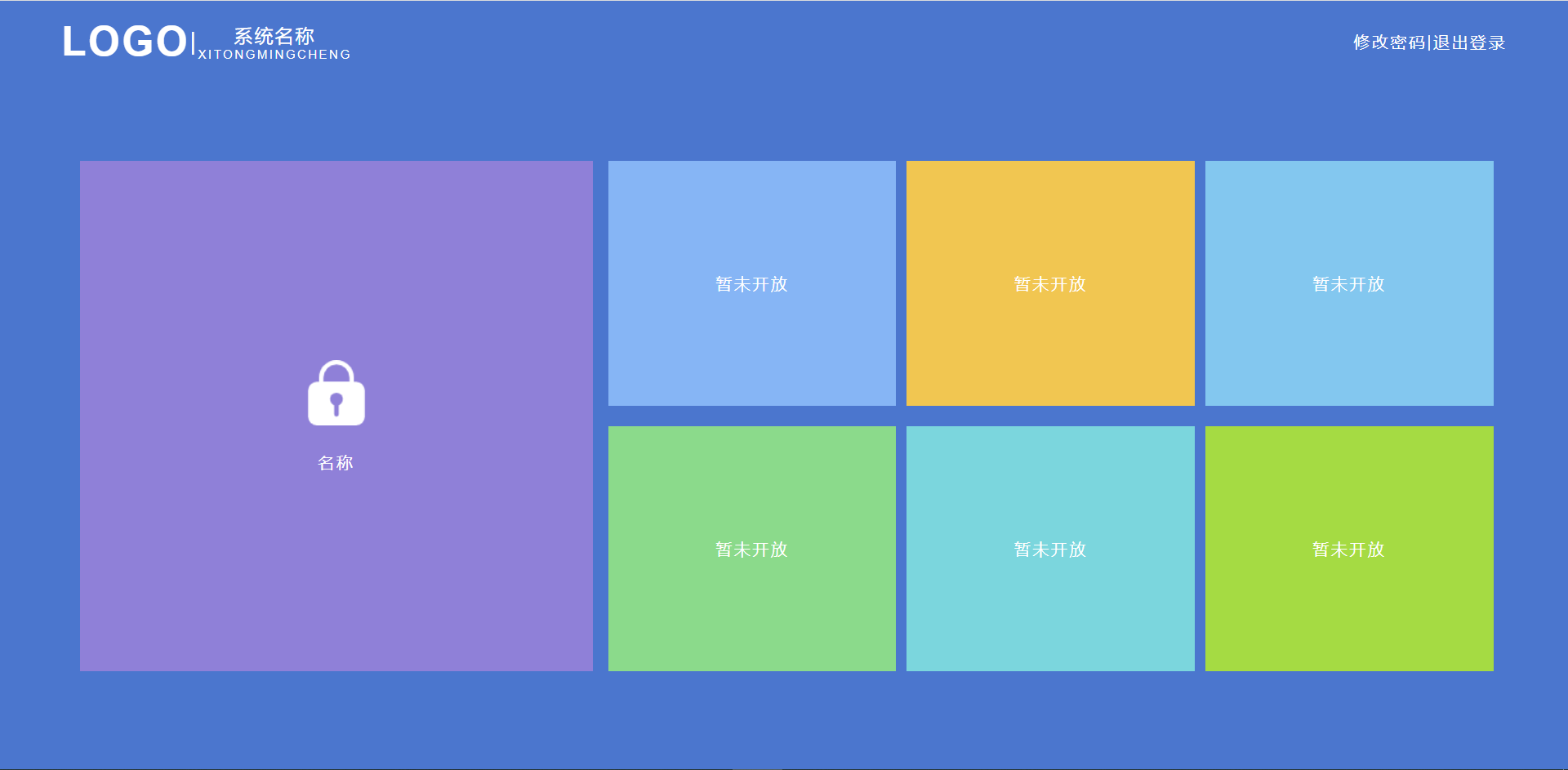
一、完成如下页面布局
二、代码实现如下
<template>
    <div class="father">
        <div class="box">
            <div class="up">
                <div class="up-left">
                    <div class="logo">LOGO</div>
                    <div class="fuhao">|</div>
                    <div class="up-name">
                        <div class="N-name">系统名称</div>
                        <div class="E-name">XITONGMINGCHENG</div>
                    </div>
                </div>
                <div class="up-right">
                    <div class="pass">修改密码</div>
                    <div class="sign">|</div>
                    <div class="logout">退出登录</div>
                </div>
            </div>
            <div class="down">
                <div class="down-b">
                    <div class="left">
                        <div class="fuhao">
                            <img src="../assets/lock.png">
                        </div>
                        <div class="name">名称</div>
                    </div>
                    <div class="right">
                        <div class="items">暂未开放</div>
                        <div class="items">暂未开放</div>
                        <div class="items">暂未开放</div>
                        <div class="items">暂未开放</div>
                        <div class="items">暂未开放</div>
                        <div class="items">暂未开放</div>
                    </div>
                </div>
            </div>

        </div>
    </div>

</template>

<script setup>

</script>

<style scoped lang="scss">
    .father {
        width: 100%;
        height: 100%;
    }
    .box {
        width: 100%;
        height: 100%;
        background: #2f77d4;
        color: white;
        letter-spacing: 2px;
    }
    .up {
        height: 40px;
        width: calc(100% - 120px);
        display: flex;
        justify-content: space-between;
        align-items: center;
        padding: 20px 60px 0px 60px;
    }
    .up-left {
        display: flex;
        justify-content: center;
        align-items: center;
    }
    .up-right {
        display: flex;
        justify-content: center;
        align-items: center;
    }
    .logo {
        font-size: 40px;
        font-weight: bold;
        //border-right:1px solid red;
    }
    .fuhao {
        font-size: x-large;
    }
    .N-name{
        font-size: large;
    }
    .E-name{
        font-size: xx-small;
    }
    .up-name {
        /*display: flex;*/
        /*justify-content: center;*/
        /*flex-wrap: wrap;*/
        /*align-items: center;*/
        >div{
            width: 100%;
        }
    }
    .down{
        width: 100%;
        height: calc(100% - 60px);
        display: flex;
        justify-content: center;
        align-items: center;
    }
    .down-b {
        width: 1400px;
        height: 500px;
        display: flex;
        justify-content: center;
        align-items: center;
    }
    .left {
        width: 510px;
        height: 100%;
        display: flex;
        justify-content: center;
        align-content: center;
        flex-wrap: wrap;
        background: #927fde;
        margin: 10px;
        >div{
            width: 100%;
        }
        .name{
            margin-top: 20px;
        }
    }
    .right {
        width: calc(100% - 510px);
        height: 100%;
        display: flex;
        justify-content: space-around;
        /*align-items: center;*/
        flex-wrap: wrap;
        .items {
            width: calc(33.3% - 10px);
            height: calc(50% - 10px);
            display: flex;
            justify-content: center;
            align-items: center;
            /*margin: 10px;*/
            /*margin-left: 10px ;*/
            /*margin-right: 10px ;*/
        }
        :nth-of-type(1){
            background: #70b6fb;
            margin-bottom: 20px;
        }
        :nth-of-type(2)
        {
            background: #fec431;
        }
        :nth-of-type(3)
        {
            background: #5fc9f3;
        }
        :nth-of-type(4)
        {
            background: #63dd83;
        }
        :nth-of-type(5)
        {
            background: #3dd9df;
        }
        :nth-of-type(6)
        {
            background: #91dd02;
        }


    }

</style>
  三、知识点总结
  1、布局前一定要划分好结构,今日作业与前两次有所不同,左边的框是要比右边的大。那么我们就需要清楚这个结构,应该划分好上下左右。

  2、高度、宽度的继承是一级一级来继承的。
  3、右边六个框中间有间距且对齐的解决方式如下:
    1)横向间距:items的宽度减10px,right的水平对齐方式选择space-around(项目两侧的间隔相等)
    2)横向间距:增加margin-left:10px margin-right:10px items的宽度减20px,right的水平对齐方式选择center(居中)
    3)横向间距:直接给items宽度由原来的width:cale(33.33% - 10px)改成width:32%,这样的好处是不用去计算减多少宽度,剩下的1%的宽度自由分配。
    4)纵向间距:items高度减去10px,底部整体向上移动了10px,在items的公共样式中添加margin-bottom:10px下移10px实现了跟左边大框对齐。
  4、文字间的间距:letter-spacing
  5、font-weight:字体加粗
  6、>div{}:加大于号是指该类的下一层所有div
  7、:nth-of-type(1):指class类名下的第一个元素(用来解决类名一致但需要给出不同背景色)
在任何时候去学习都不晚,永远不要放弃自己!人生就是一个不断去学习的过程,任何时候,只要你想学,Come on !

 浙公网安备 33010602011771号