计算时序数据的周期性
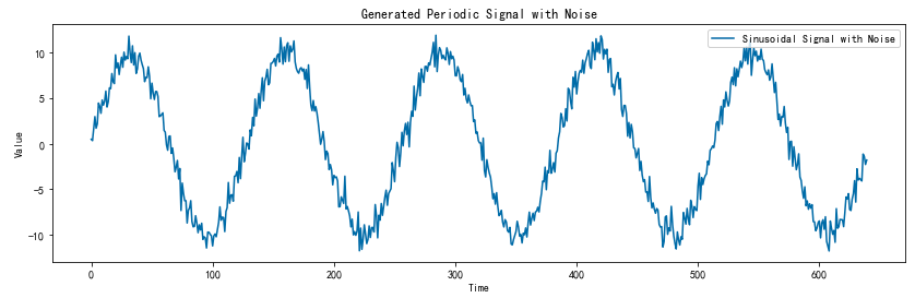
构造时序数据
import numpy as np
import matplotlib.pyplot as plt

# 设置参数
period = 128
num_cycles = 5
total_length = period * num_cycles

# 生成周期性信号(正弦波形)
np.random.seed(42)
time = np.arange(0, total_length, 1)
signal = 10 * np.sin(2 * np.pi * time / period)

# 加上噪声
noise = np.random.normal(0, 1, len(time))
signal_with_noise = signal + noise

# 打印生成的数据列表
signal = signal_with_noise.tolist()
# print(signal)

# 绘制周期性信号
plt.figure(figsize=(14, 4))
plt.plot(time, signal_with_noise, label='Sinusoidal Signal with Noise')
plt.xlabel('Time')
plt.ylabel('Value')
plt.title('Generated Periodic Signal with Noise')
plt.legend()
plt.show()
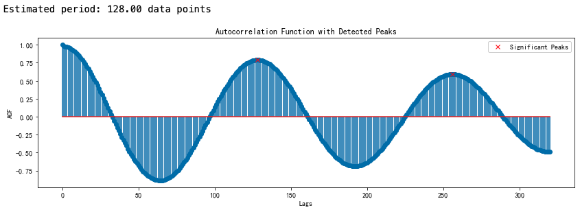
方法一:自相关函数
import numpy as np
import matplotlib.pyplot as plt
from statsmodels.tsa.stattools import acf
from scipy.signal import find_peaks

# 计算自相关函数
nlags = len(signal)/2  # 数据长度的一半
acf_values = acf(signal, nlags=nlags)

# 寻找显著峰值
peaks, _ = find_peaks(acf_values, height=0.5)  # height 参数决定阈值,可以调整

# 拟合周期(根据发现的峰值)
if len(peaks) > 1:
    peak_intervals = np.diff(peaks)  # 计算相邻峰值之间的距离
    estimated_period = np.mean(peak_intervals)
    print(f"Estimated period: {estimated_period:.2f} data points")
else:
    print("No significant period found. Consider adjusting the peak detection threshold.")

# 绘制自相关函数图
plt.figure(figsize=(14, 4))
plt.stem(acf_values, use_line_collection=True, markerfmt='C0o')
plt.plot(peaks, acf_values[peaks], "x", label='Significant Peaks', color='red')
plt.xlabel('Lags')
plt.ylabel('ACF')
plt.title('Autocorrelation Function with Detected Peaks')
plt.legend()
plt.show()
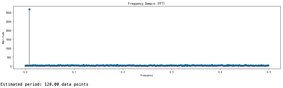
方法二:傅里叶变换
import numpy as np
import matplotlib.pyplot as plt
from scipy.fftpack import fft, fftfreq


# 计算傅里叶变换
N = len(signal)
signal_fft = fft(signal)
frequencies = fftfreq(N, d=1)

# 仅保留非负频率部分
frequencies = frequencies[:N//2]
signal_fft = signal_fft[:N//2]

# 绘制频谱
plt.figure(figsize=(14, 4))
plt.stem(frequencies, np.abs(signal_fft), use_line_collection=True)
plt.xlabel('Frequency')
plt.ylabel('Amplitude')
plt.title('Frequency Domain (FFT)')
plt.tight_layout()
plt.show()

# 找到频率域中的峰值
peak_freq = frequencies[np.argmax(np.abs(signal_fft))]
estimated_period = 1 / peak_freq
print(f"Estimated period: {estimated_period:.2f} data points")
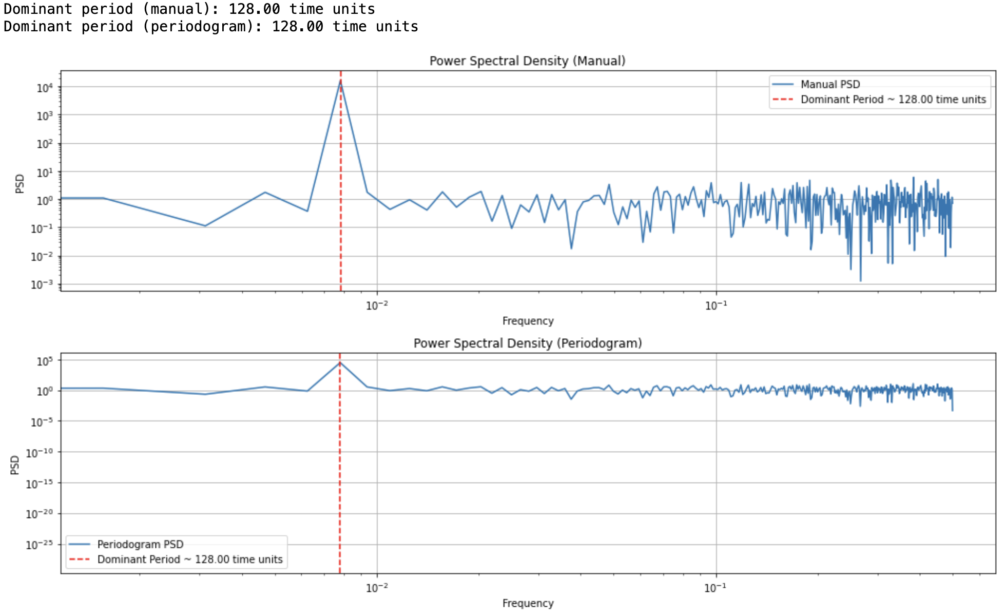
方法三:在傅里叶变换基础上计算功率谱密度
import numpy as np
import matplotlib.pyplot as plt
from scipy.fft import fft, fftfreq
from scipy.signal import periodogram

# 设置字体
plt.rcParams['font.family'] = 'DejaVu Sans'

# 构造时序数据
np.random.seed(42)
period = 128
num_cycles = 5
total_length = period * num_cycles
time = np.arange(0, total_length, 1)
signal = 10 * np.sin(2 * np.pi * time / period)
noise = np.random.normal(0, 1, len(time))
signal_with_noise = signal + noise


# 时序数据长度
N = len(signal_with_noise)
# 采样间隔
T = 1.0  # 假设采样频率为 1 Hz

# 方法一:手动计算 FFT 和功率谱密度
signal_fft = fft(signal_with_noise)
frequencies = fftfreq(N, d=T)
psd = (1.0 / N) * np.abs(signal_fft) ** 2
# 只取正频率部分
positive_freqs = frequencies[:N//2]
psd_positive = psd[:N//2]
# 找到频谱密度最大的频率(去掉零频率)
dominant_frequency_idx = np.argmax(psd_positive[1:]) + 1
dominant_period = 1 / positive_freqs[dominant_frequency_idx]
print(f"Dominant period (manual): {dominant_period:.2f} time units")


# 方法二:使用 scipy 的 periodogram 函数
frequencies_p, psd_p = periodogram(signal_with_noise, fs=1.0/T)
# 找到 periodogram 的主导周期
dominant_frequency_idx_p = np.argmax(psd_p[1:]) + 1
dominant_period_p = 1 / frequencies_p[dominant_frequency_idx_p]
print(f"Dominant period (periodogram): {dominant_period_p:.2f} time units")


# 绘制结果比较
plt.figure(figsize=(14, 8))

# 绘制手动计算的功率谱密度
plt.subplot(2, 1, 1)
plt.plot(positive_freqs, psd_positive, label='Manual PSD')
plt.axvline(x=positive_freqs[dominant_frequency_idx], color='red', linestyle='--',
            label=f'Dominant Period ~ {dominant_period:.2f} time units')
plt.title('Power Spectral Density (Manual)')
plt.xlabel('Frequency')
plt.ylabel('PSD')
plt.legend(loc='best')
plt.xscale('log')
plt.yscale('log')
plt.grid()

# 绘制 periodogram 计算的功率谱密度
plt.subplot(2, 1, 2)
plt.plot(frequencies_p, psd_p, label='Periodogram PSD')
plt.axvline(x=frequencies_p[dominant_frequency_idx_p], color='red', linestyle='--',
            label=f'Dominant Period ~ {dominant_period_p:.2f} time units')
plt.title('Power Spectral Density (Periodogram)')
plt.xlabel('Frequency')
plt.ylabel('PSD')
plt.legend(loc='best')
plt.xscale('log')
plt.yscale('log')
plt.grid()
plt.tight_layout()
plt.show()
作者:Standby — 一生热爱名山大川、草原沙漠、风情名城、雪域高原!
出处:http://www.cnblogs.com/standby/
本文版权归作者和博客园共有,欢迎转载,但未经作者同意必须保留此段声明,且在文章页面明显位置给出原文连接,否则保留追究法律责任的权利。
出处:http://www.cnblogs.com/standby/
本文版权归作者和博客园共有,欢迎转载,但未经作者同意必须保留此段声明,且在文章页面明显位置给出原文连接,否则保留追究法律责任的权利。

 浙公网安备 33010602011771号