CSS常用总结
css3常用
圆角边框
border-radius: 10px;
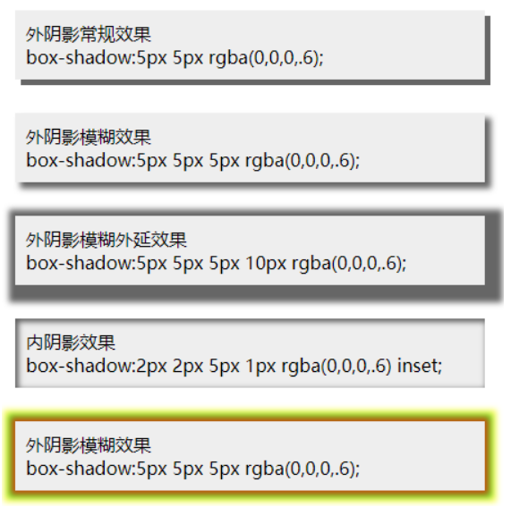
边框阴影
box-shadow: 10px 10px 5px 5px #888888;
box-shadow:none; //无边框阴影

参数一:第1个长度值用来设置对象的  阴影水平偏移值。可以为负值

参数二:第2个长度值用来设置对象的  阴影垂直偏移值。可以为负值

参数三:如果提供了第3个长度值则用来设置对象的    阴影模糊值。不允许负值

参数四:如果提供了第4个长度值则用来设置对象的    阴影外延值。可以为负值

参数五:(color):设置对象的阴影的颜色。
边框图片
border-image-source 用在边框的图片的路径
border-image-slice 图片边框向内偏移
border-image-width 图片边框的宽度
border-image-outset 边框图像区域超出边框的量
border-image-repeat图像边框是否应平铺(repeat)、铺满(round)或拉伸(stretch)
背景
background-clip:规定背景的绘制区域,与background-image和 background-repeat结合使用
background-origin:规定背景图片的定位区域:content-box, padding-box,和 border-box区域内可以放置背景图像
background-size:规定背景图片的尺寸
渐变
gradients可以在两个或多个指定的颜色之间显示平稳的过渡
线性渐变(Linear Gradients):向下/向上/向左/向右/对角方向
径向渐变(Radial Gradients):由它们的中心定义
更多内容可以参考:菜鸟
文本阴影
text-shadow:text-shadow:1px 1px 0px rgba(255,255,255,1)
参数一:第1个长度值用来设置对象的阴影水平偏移值。可以为负值
参数二:第2个长度值用来设置对象的阴影垂直偏移值。可以为负值
参数三:如果提供了第3个长度值则用来设置对象的阴影模糊值。不允许负值
参数四:(color):设置对象的阴影的颜色
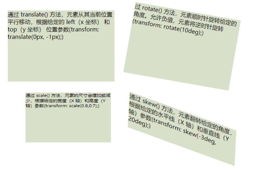
transform:能够对元素进行移动(translate)、缩放(scale)、旋转(rotate)、翻转(skew)
translate移动
通过 translate() 方法,元素从其当前位置移动,根据给定的 left(x 坐标) 和 top(y 坐标) 位置参数
rotate旋转
通过 rotate() 方法,元素顺时针旋转给定的角度。允许负值,元素将逆时针旋转
scale缩放
通过 scale() 方法,元素的尺寸会增加或减少,根据给定的宽度(X 轴)和高度(Y 轴)参数
skew翻转
通过 skew() 方法,元素翻转给定的角度,根据给定的水平线(X 轴)和垂直线(Y 轴)参数
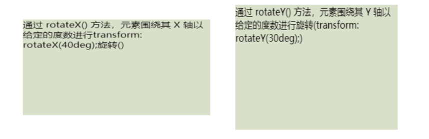
3D转换
通过 rotateX() 方法,元素围绕其 X 轴以给定的度数进行旋转==transform: rotateX(40deg);
通过 rotateY() 方法,元素围绕其 Y 轴以给定的度数进行旋转transform: rotateY(30deg);
过渡(transtion)-- 过渡是元素从一种样式逐渐改变为另一种样式的过程
//当hover触发时,宽度变宽
.item13 {
    height: 50px;
    width: 100px;
    background-color: rgb(217, 224, 201);
    /*设置时长,如果不设置,则不会有过渡效果,因为默认值是 0*/
    transition: width 2s;
}

.item13:hover {
    width: 300px;
}
多列
能够创建多个列来对文本进行布局,就像报纸那样:
column-count:规定元素应该被分隔的列数
column-gap:规定列之间的间隔
column-rule:设置列之间的宽度、样式、颜色 1px red solid
.item{
    column-gap: 30px;
    column-count: 3;
    -webkit-column-count: 3;
    column-rule: red 2px solid;
}
动画
@keyframes 规则用于创建动画。
在 @keyframes 中规定某项 CSS 样式,就能创建由当前样式逐渐改为新样式的动画效果
在 @keyframes 中创建动画时,要把它捆绑到某个选择器,否则不会产生动画效果
通过规定至少以下两项 CSS3 动画属性,即可将动画绑定到选择器:规定动画的名称和时长
动画是使元素从一种样式逐渐变化为另一种样式的效果,请用百分比来规定变化发生的时间,或用关键词 "from" 和 "to",等同于 0% 和 100%。 0% 是动画的开始,100% 是动画的完成。
为了得到最佳的浏览器支持,您应该始终定义 0% 和 100% 选择器
.item110 {
    position: relative;
    width: 100px;
    height: 100px;
    background-color: red;
}

.item110:hover {
    animation: myFirst 5s;
    -webkit-animation: myFirst 5s;
    animation-direction: alternate;
    animation-play-state: running;
}

@-webkit-keyframes myFirst {
    0% {
        background: red;
        left: 0px;
        top: 0px;
    }
    25% {
        background: yellow;
        left: 95%;
        top: 0px;
    }
    50% {
        background: blue;
        left: 0px;
        top: 0px;
    }
    75% {
        background: green;
        left: 95%;
        top: 0px;
    }
    100% {
        background: red;
        left: 0px;
        top: 0px;
    }
}
重置样式
html, body, ul, li, a, p, div {
  padding: 0;
  margin: 0;
  // 设置盒模型
  box-sizing: border-box;
  // 移除移动端特有的点击高亮效果
  -webkit-tap-highlight-color: transparent;
}

body {
  font-family: "PingFang SC", "Microsoft YaHei", "Helvetica", "Helvetica Neue", "Tahoma", "Arial", "sans-serif";
  font-size: 14px;
}

a, a:hover {
  color: #222;
  text-decoration: none;
  transition-duration: .3s;
}

ul {
  list-style: none;
}

input {
  outline: none;
}
// 清除浮动
.clearfix:after, .clearfix:before {
  content: '';
  display: block;
  height: 0;
  line-height: 0;
  clear: both;
  visibility: hidden;
}
多余的文字显示...(默认一行)
@mixin ellipsisTxt($line:1) {
  text-overflow: ellipsis;
  overflow: hidden;
  display: -webkit-box;
  -webkit-box-orient: vertical;
  -webkit-line-clamp: $line;
}
遮罩层
@mixin coverMask {
  width: 100%;
  height: 100%;
  background: rgba(0, 0, 0, 0.6);
  position: fixed;
  top: 0;
  left: 0;
}
关闭按钮,默认是16px
@mixin commonCloseStyle($width:16px) {
  position: absolute;
  width: $width;
  height: $width;
  right: calc(#{$width}/2);
  top: calc(#{$width}/2);
  background: transparent;
  cursor: pointer;

  &:after,
  &:before {
    content: "\a0";
    position: absolute;
    transition: .3s;
    background: #bbb;
    -webkit-transform: rotate(45deg);
    transform: rotate(45deg);
  }
  &:before {
    left: 0;
    top: calc(#{$width}/2);
    width: $width;
    height: 1px;
  }

  &:after {
    top: 0;
    left: calc(#{$width}/2);
    width: 1px;
    height: $width;
  }
  &:hover:after,
  &:hover:before {
    transition: .3s;
    -webkit-transform: rotate(225deg);
    transform: rotate(225deg);
  }
}
滚动条
@mixin scrollStyle($height:400px) {
  height: $height;
  overflow-y: auto;
  overflow-x: hidden;
  position: relative;
  // 滚动条宽
  &::-webkit-scrollbar {
    width: 4px;
    border-radius: 10px;
  }
  // 滚动条 背景槽
  &::-webkit-scrollbar-track {
    border-radius: 10px;
    background-color: #C1CAD2;
  }
  // 滚动条 拖动条
  &::-webkit-scrollbar-thumb {
    border-radius: 10px;
    background-color: #889098;
  }
}
垂直居中显示
@mixin centerBlock {
  position: absolute;
  left: 50%;
  top: 50%;
  transform: translate(-50%, -50%);
}
设置对象 变大变小
.btnKaihu {
  width: 405px;
  height: 112px;
  position: absolute;
  left: 50%;
  top: 50%;
  -webkit-animation: bouncedelay 1.2s infinite;
  animation: bouncedelay 1.2s infinite;
}

@keyframes bouncedelay {
  0%,
  80%,
  100% {
    transform: scale(0.8);
    -webkit-transform: scale(0.8);
  }
  40% {
    transform: scale(1.0);
    -webkit-transform: scale(1.0);
  }
}
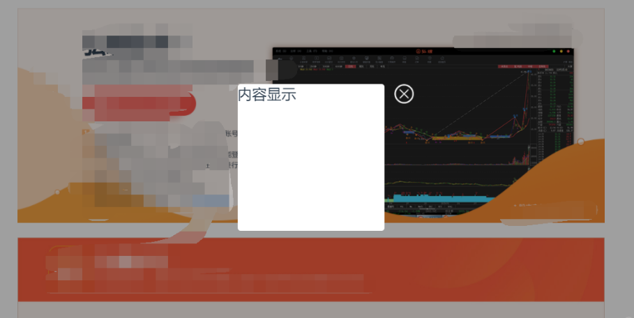
遮罩层 内容垂直水平居中 显示
1. html设置
<div class="dialog_module">
  <div class="contArea">
    <div class="content">内容显示</div>
    <img src="/template/web/skin/default/images/close.png" class="btnClose">
  </div>
</div>

2. scss样式设置
.dialog_module {
  width: 100%;
  height: 100%;
  background: #00000060;
  position: fixed;
  z-index: 10;

  .contArea {
    width: 300px;
    height: 300px;
    position: absolute;
    left: 50%;
    top: 50%;
    transform: translate(-50%, -50%);
    background-color: white;
    border-radius: 6px;

    .content {
      font-size: 30px;
    }

    .btnClose {
      width: 40px;
      height: 40px;
      cursor: pointer;
      position: absolute;
      right: -60px;
      top: 0;
    }
  }
}
图片onerror设置
<img src="" onerror="this.src='/template/web/skin/default/images/errorImg.png'">
css样式修改背景图
&:hover {
    img {
        content: url("/skin/default/images/default.svg");
    }
}
解决在SCSS中使用calc时不能使用变量的问题
在scss中使用calc计算变量的时候,不会产生任何效果,如下代码:
.app-inner {
    display: flex;
    height: calc(100% - $topbarheight);
}
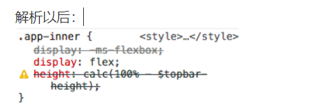
把代码改为以下方式就可以了:
.app-inner {
    display: flex;
    height: calc(100% - #{$topbarheight});  //添加 #{变量}
}

 浙公网安备 33010602011771号