
第二十三篇 - d3绘制直方图
当下探讨用d3制作简单横向直方图
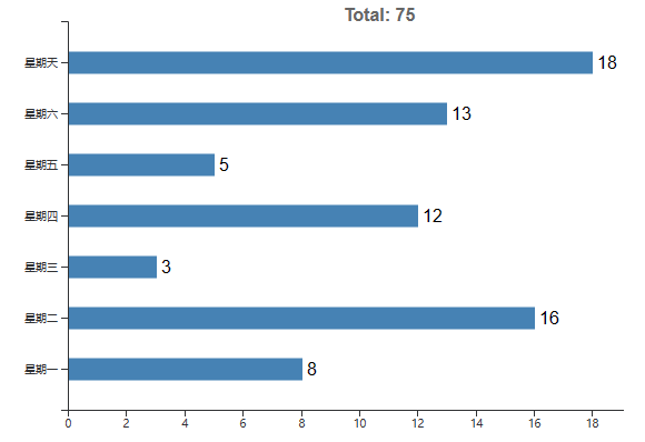
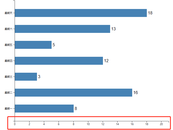
效果图:
一、下载d3【npm install d3】
二、导入d3【import * as d3 from "d3";】
二、画直方图
参考链接:https://www.cnblogs.com/xuepei/p/7527082.html
1. 准备表格数据
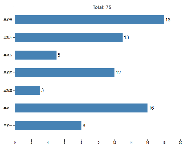
rectlist:[
        {
          week: "星期一",
          product: 8,
        },
        {
          week: "星期二",
          product: 16,
        },
        {
          week: "星期三",
          product: 3,
        },
        {
          week: "星期四",
          product: 12,
        },
        {
          week: "星期五",
          product: 5,
        },
        {
          week: "星期六",
          product: 13,
        },
        {
          week: "星期天",
          product: 18,
        },
      ]
2. 处理表格数据
// 求和计算total的值
let sum = 0
for(let i=0;i<this.rectlist.length;i++){
   sum = sum + this.rectlist[i].product
}
// 得到纵轴描述列表
const nameArr = this.rectlist.map((item)=> { return item.week});
// 得到横轴数值列表即每个矩形的长度
const valueArr = this.rectlist.map((item)=> { return item.product});
3. 画横纵坐标轴
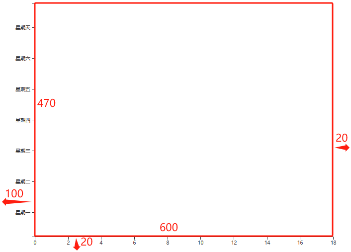
      //指定容器的宽高,左上角是[0,0]
      let width = 600
      let height = 470

      //x,y轴比例尺
      let xscale = d3.scaleLinear().domain([0,d3.max(valueArr)]).rangeRound([0,width]);
      let yscale = d3.scaleBand().domain(nameArr).rangeRound([height,0]).padding(0.5);

      //创建svg svg的高比容器低20px,可以用来放置x轴的描述,宽比容器宽100 + 20,其中100是右侧移动的100px,目的是放下y轴的描述,另外的20则是为了让x轴最右侧的标尺显示完整
      const svg = d3.select('#bar-chart-container').append('svg')
          .attr('width',width + 100 + 20)
          .attr('height',height + 20);
      //添加g标签 坐标轴偏移[100,0]向右侧移动100px,想下面移动0px
      const g = svg.append('g')
          .attr('transform',`translate(100, 0)`)

      //像svg添加x轴
      g.append('g')
          .attr('class','axis')
          .attr('transform',`translate(0, ${height})`)
          .call(d3.axisBottom(xscale))
          .attr('font-weight','blod')
      //像svg添加y轴
      g.append('g')
          .attr('class','axis')
          .call(d3.axisLeft(yscale))
4. 画直方图
const chart = g.selectAll('bar').data(this.rectlist).enter().append('g')
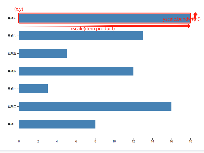
// [x,y]是起始点的位置,也就是直方条的左上角的位置确定,x设置为1的原因是,y轴坐标轴的线粗细大概是1px,若x从0开始会压到y轴坐标轴
// width是直方条的长度,即x轴的长度;height是直方条的宽度,即y轴的长度
chart.append('rect')
.attr('class','bar')
.attr('y', function (item) {
return yscale(item.week)
})
.attr('width', function (item) {
return xscale(item.product)
})
.attr('x', function (item) {
return 1
})
.attr('height', yscale.bandwidth())
.attr('fill','steelblue')
5. 在直方图右侧写直方图的长度
      chart.append("text")
          .text(function(item){
            return item.product;
          })
          .attr('x', function (item) {
            return xscale(item.product) + 5
          })
          .attr('y', function (item) {
            return yscale(item.week) + yscale.bandwidth()/2 + 5
          })
可以看到那个数字18没有显示完全,因为右边当时只留了20px的空余,塞不下18这个数字,将右侧的空间延伸20px


或者不延伸右侧空间,将x轴最大值在原先最大值的基础上加3

这样X轴比例就会改变,直方图最长也不会超出坐标轴,两种方法都可以
6. 为整个图添加一个total标题
      g.attr('class','title')
          .append('text')
          .attr('transform',`translate(${width/2}, 20)`)
          .attr('text-anchor','middle')
          .attr('font-weight','600')
          .text('Total: ' + sum)
          .attr('fill','#666')
位置都可以自行调节的,主要是一定要明确坐标是从左上角开始算的,若x,y的坐标是[10,50]就说明是左上角右移10px,下移50px