CSS--房间开关灯泡效果
 层叠样式表(英文全称:Cascading Style Sheets)是一种用来表现HTML(标准通用标记语言的一个应用)或XML(标准通用标记语言的一个子集)等文件样式的计算机语言。CSS不仅可以静态地修饰网页,还可以配合各种脚本语言动态地对网页各元素进行格式化。熟练掌握CSS的基本原理可以实现更好的页面交互效果,提升用户的使用体验。
概要
层叠样式表(英文全称:Cascading Style Sheets)是一种用来表现HTML(标准通用标记语言的一个应用)或XML(标准通用标记语言的一个子集)等文件样式的计算机语言。CSS不仅可以静态地修饰网页,还可以配合各种脚本语言动态地对网页各元素进行格式化。熟练掌握CSS的基本原理可以实现更好的页面交互效果,提升用户的使用体验。
代码实现
新建文件夹light-bulb,light-bulb下新建index.html和style.css文件,新建audio文件夹用于存放开关音效
目录结构
/**
light-bulb
   ├─ audio
   ├─ index.html
   └─ style.css
*/
index.html代码
<!DOCTYPE html>
<html lang="en">
<head>
  <meta charset="UTF-8">
  <meta http-equiv="X-UA-Compatible" content="IE=edge">
  <meta name="viewport" content="width=device-width, initial-scale=1.0">
  <link rel="stylesheet" href="./style.css">
  <title>灯泡开关效果</title>
</head>
<body>
  <div class="light">
    <div class="wire"></div>
    <div class="bulb">
      <span></span>
      <span></span>
    </div>
    <div class="switch">
      <div class="btn"></div>
    </div>
    <audio id="audio" src="./audio/switch.mp3" autostart="false"></audio>
  </div>
  <script>
    let btn = document.querySelector('.btn')
    let body = document.querySelector('body')
    let audio = document.querySelector('#audio')
    btn.onclick = function () {
      body.classList.toggle('on')
      audio.play()
    }
  </script>
</body>
</html>
style.css代码
* {
  padding: 0;
  margin: 0;
  box-sizing: border-box;
}

body {
  display: flex;
  justify-content: center;
  align-items: center;
  min-height: 100vh;
  background-color: #222;
}

body.on {
  background: radial-gradient(#555, #111);
}

.bulb {
  position: relative;
  width: 80px;
  height: 80px;
  background-color: #444;
  border-radius: 50%;
  z-index: 2;
}

body.on .bulb {
  background-color: #fff;
  box-shadow: 0 0 50px #fff,
  0 0 100px #fff,
  0 0 150px #fff,
  0 0 200px #fff,
  0 0 250px #fff,
  0 0 300px #fff,
  0 0 350px #fff;
}

.bulb::before {
  content: '';
  position: absolute;
  top: -50px;
  left: 22.5px;
  width: 35px;
  height: 80px;
  background: #444;
  border-top: 30px solid #000;
  border-radius: 10px;
}

body.on .bulb::before {
  background-color: #fff;
}

body.on .bulb::after {
  content: '';
  position: absolute;
  top: 50%;
  left: 50%;
  transform: translate(-50%, -50%);
  width: 120px;
  height: 120px;
  background-color: #fff;
  border-radius: 50%;
  filter: blur(40px);
}

.bulb span:nth-child(1) {
  position: absolute;
  top: -16px;
  left: -4px;
  display: block;
  width: 30px;
  height: 30px;
  background-color: transparent;
  transform: rotate(342deg);
  border-bottom-right-radius: 40px;
  box-shadow: 20px 20px 0 10px #444;
}

body.on .bulb span:nth-child(1) {
  box-shadow: 20px 20px 0 10px #fff;
}

.bulb span:nth-child(2) {
  position: absolute;
  top: -16px;
  right: -4px;
  display: block;
  width: 30px;
  height: 30px;
  background-color: transparent;
  transform: rotate(17deg);
  border-bottom-left-radius: 40px;
  box-shadow: -20px 20px 0 10px #444;
}

body.on .bulb span:nth-child(2) {
  box-shadow: -20px 20px 0 10px #fff;
}

.wire {
  position: absolute;
  left: calc(50% - 2px);
  bottom: 50%;
  width: 4px;
  height: 60vh;
  background-color: #000;
  z-index: 1;
}

.switch {
  position: absolute;
  bottom: 50px;
  right: 50px;
  width: 80px;
  height: 80px;
  background: linear-gradient(#eee, #ccc, #eee);
  border: 3px solid #000;
  border-radius: 10px;
  display: flex;
  justify-content: center;
  align-items: center;
}

.switch .btn {
  position: relative;
  width: 25px;
  height: 40px;
  background: linear-gradient(#777, #fff, #777);
  border-radius: 6px;
  border: 2px solid #000;
  cursor: pointer;
}

.switch .btn::before {
  content: '';
  position: absolute;
  top: 0;
  left: 0;
  width: 100%;
  height: 85%;
  background: linear-gradient(#fff, #fff);
  border-radius: 4px;
}

.on .switch .btn::before {
  top: 15%;
}

#audio {
  display: none;
}
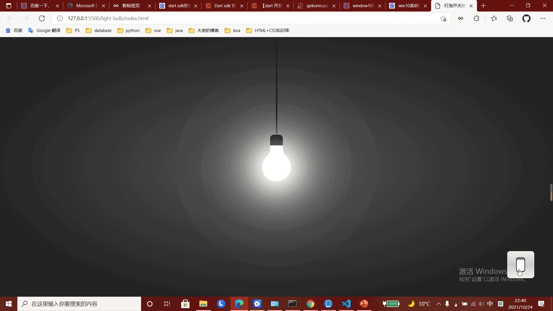
效果展示