Android-Toolbar相关
Android-Toolbar相关
学习自
《Android第一行代码》
https://www.jianshu.com/p/79604c3ddcae
https://www.jianshu.com/p/ac56f11e7ce1
https://developer.android.google.cn/reference/android/widget/Toolbar
https://developer.android.com/reference/android/support/design/widget/CoordinatorLayout
Toolbar漫谈
Toolbar是Android5.0 退出的Material Design风格的控件,用来替代原来的ActionBar。Toobar的灵活性要远远大于ActionBar,我们可以通过Toolbar和其他相关控件的结合实现各种各样的效果。甚至我们可以将ActionBar作为一个容器再里面放入我们自己的布局。
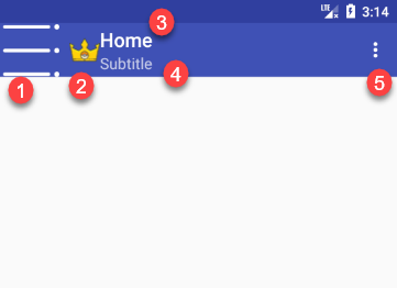
- 返回按钮,通过setDisplayHomeAsUpEnabled方法可以将返回按钮显示出来,通过setHomeAsUpIndicator方法可以更改返回按钮的图标
- Logo,如果不设置默认不显示
- 主标题,如果不设置默认为应用的名称
- 子标题, 默认不显示
- Menu, 设置OperationMenu
使用Toolbar
如果想要使用Toolbar请添加MaterialDesign库到gradle中
dependencies {
    //...
    implementation 'com.android.support:design:26.1.0'
}
想要使用Toolbar的话首先需要将我们的默认的主题改为NotactionBar的主题。如下,因为我们要使用Toolbar来替换ActionBar所以原来的ActionBar当然是不能存在的。
<resources>

    <!-- Base application theme. -->
    <!--将主题改为没有ActionBar的主题-->
    <style name="AppTheme" parent="Theme.AppCompat.Light.NoActionBar">
        <!-- Customize your theme here. -->
        <item name="colorPrimary">@color/colorPrimary</item>
        <item name="colorPrimaryDark">@color/colorPrimaryDark</item>
        <item name="colorAccent">@color/colorAccent</item>
    </style>

</resources>
在XML布局中使用它
<?xml version="1.0" encoding="utf-8"?>
<LinearLayout xmlns:android="http://schemas.android.com/apk/res/android"
    xmlns:app="http://schemas.android.com/apk/res-auto"
    xmlns:tools="http://schemas.android.com/tools"
    android:layout_width="match_parent"
    android:layout_height="match_parent"
    android:orientation="vertical"
    tools:context="top.littledavid.studymaterialdesign.ToolbarActivity">

    <android.support.v7.widget.Toolbar
        android:id="@+id/toolbar_HomeActivity"
        android:layout_width="match_parent"
        android:layout_height="?attr/actionBarSize"
        android:background="@color/colorPrimary"
        android:theme="@style/ThemeOverlay.AppCompat.Dark.ActionBar"
        app:popupTheme="@style/ThemeOverlay.AppCompat.Light" />
</LinearLayout>
请注意我们在上面设置了两个主题,分别对应的是 theme 和 popupTheme 两个属性,作用如下
- theme: 对应着Toolbar的主题,主要影响力Toolbar上面的元素的颜色等,因为我们在这里使用了一个深色的背景,但是Application的Theme设置的时候一个浅色背景的主题,如果不设置此属性的话,那么Toolbar的元素(title,menu标识等)都将是黑色的,显然是和我们的深色背景是不相符的。
- popupTheme: 对应着Toolbar上的弹出式OperationMenu的主题,因为已经通过theme属性设置了一个深色的ActinBar的主题,所以不设置此属性的话,那么弹出式menu将会收到theme属性的主题的影响,将会是一个黑色背景白色文字的效果,与深色背景不相配,因此这里设置了一个浅色的主题。
大家可以分别将两个属性删除掉,看看效果就明白了。
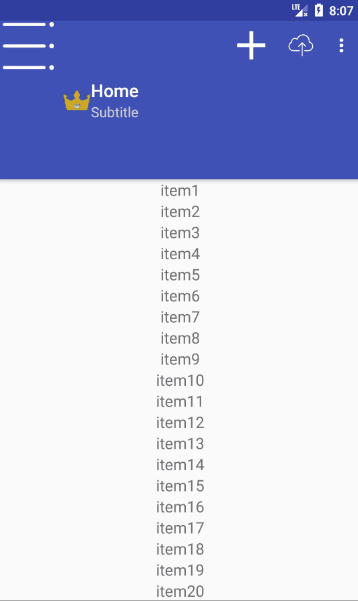
在Activity中将ToolBar设置为我们的ActionBar
class ToolbarActivity : AppCompatActivity() {
    private lateinit var mToolbar: ActionBar

    @RequiresApi(Build.VERSION_CODES.LOLLIPOP)
    override fun onCreate(savedInstanceState: Bundle?) {
        super.onCreate(savedInstanceState)
        setContentView(R.layout.activity_toolbar)

        //将toolbar作为Actionbar
        this.setSupportActionBar(homeTB)
        mToolbar = this.supportActionBar!!
        //设置Toolbar的标题
        mToolbar.title = "Home"
        //设置副标题
        mToolbar.subtitle = "Subtitle"
        //设置Logo
        mToolbar.setLogo(R.drawable.logo)
        //显示返回按钮,我们一般都会将返回按钮替换掉
        //用来作为开启侧边栏的标识
        mToolbar.setDisplayHomeAsUpEnabled(true)
        mToolbar.setHomeAsUpIndicator(R.mipmap.navigate)
    }
}
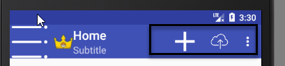
Toolbar与Menu
Toolbar还可以很好与Menu结合,可以更方便的时候Menu中的操作。
先声明在 res/menu 下声明一个menu home
<?xml version="1.0" encoding="utf-8"?>
<menu xmlns:android="http://schemas.android.com/apk/res/android"
    xmlns:app="http://schemas.android.com/apk/res-auto">
    <item
        android:id="addMenu"
        android:icon="@drawable/add"
        android:title="Add"
        app:showAsAction="always" />
    <item
        android:id="@+id/uploadMenu"
        android:icon="@drawable/upload"
        android:title="Upload"
        app:showAsAction="ifRoom" />
    <item
        android:id="@+id/item1Menu"
        android:title="Item1" />
    <item
        android:id="@+id/item2Menu"
        android:title="Item2" />
</menu>
其中Add Menu将会显示在Toolbar上,更方便操作,因为我们设置了 app:showAsAction 属性为 always ,同样的我们也为 uploadMenu 设置了该属性,但是值为 ifRoom 表示如果Toolbar有足够的空间的话,那么Menu 的Icon会显示在Toolbar上,否则则会隐藏。
创建菜单
override fun onCreateOptionsMenu(menu: Menu?): Boolean {
    //MenuInflater(this).inflate(R.menu.home, menu)
    //要使用Activity的Menu inflater 否则我们设置的效果不会显示出来
    this.menuInflater.inflate(R.menu.home, menu)
    return true
}
AppBarLayout
AppBarLayout 可以根据滚动的行为来控制其ChildView的显示效果,我们经常会用AppBarLayout来帮助我们控制Toolbar的隐藏和显示,为了最大限度的利用屏幕空间来显示更多的内容。效果如下:
想要是实现上面的这种效果,并不需要添加任何代码,我们只需要修改布局文件即可。
<?xml version="1.0" encoding="utf-8"?>
<android.support.design.widget.CoordinatorLayout
    xmlns:android="http://schemas.android.com/apk/res/android"
    xmlns:app="http://schemas.android.com/apk/res-auto"
    xmlns:tools="http://schemas.android.com/tools"
    android:id="@+id/homeLayoutC"
    android:layout_width="match_parent"
    android:layout_height="match_parent"
    tools:context="top.littledavid.studymaterialdesign.ToolbarActivity">

    <android.support.design.widget.AppBarLayout
        android:id="@+id/homeABL"
        android:layout_width="match_parent"
        android:layout_height="wrap_content">
        <!--layout_scrollFlags设置滚动的动作-->
        <android.support.v7.widget.Toolbar
            android:id="@+id/homeTB"
            android:layout_width="match_parent"
            android:layout_height="?attr/actionBarSize"
            android:background="@color/colorPrimary"
            android:theme="@style/ThemeOverlay.AppCompat.Dark.ActionBar"
            app:layout_scrollFlags="snap|scroll|enterAlways"
            app:popupTheme="@style/ThemeOverlay.AppCompat.Light" />
    </android.support.design.widget.AppBarLayout>

    <android.support.v7.widget.RecyclerView
        android:id="@+id/itemRV"
        android:layout_width="match_parent"
        android:layout_height="match_parent"
        app:layout_behavior="@string/appbar_scrolling_view_behavior" />
</android.support.design.widget.CoordinatorLayout>
在上面的布局文件中,有两个比较默认的布局文件 AppBarLayout 和 CoordinatorLayout 还有Toolbar和RecycleView设置了两个属性,我们一个一个来看。
CoordinatorLayout
这个布局比较陌生,我们先来看看官方文档
CoordinatorLayout is a super-powered FrameLayout.
CoordinatorLayout 是一个超级FrameLayout
CoordinatorLayout is intended for two primary use cases:
CoordinatorLayout主要在这两种情况下使用:
- As a top-level application decor or chrome layout
- 作为一个应用顶层的装饰布局(最外层布局)
- As a container for a specific interaction with one or more child views
- 作为一个为与一个或多个子View的特殊交互的协调者
通过官方文档我们了解到CoordinatorLayout是用来协调子View的动作的(比如说动图中的滚动隐藏Toolbar)。通过为ChideView设置不同的 Behavior 可以再View之间可以很好的交互。
Behavior
Behavior是CoordinatorLayout的ChildView的交互行为的插件。
一个Behavior实现了一个或多个交互动作,Behavior可以被设置到ChideView上,可以交互动作包含: 拖拽,滑动,抛掷或者其他的手势动作。系统已经为我们提供了一些Behavior(上面RecycleView使用的就是一个系统滑动的Behavior),同时我们也可以实现自定义的Behavior。Behavior是CoordinatorLayout协调子View动作的实现,即CoordinatorLayout可以通过Behavior来协调子View。
我们为RecycleView设置Behavior是 AppBarLayout.ScrollingViewBehavior ,该Behavior需要设置给AppBarLayout的兄弟View(在上面的例子中兄弟节点就是我们的RecycleView),并且该View应该是可以滑动的。
AppBarLayout
AppBarLayout 继承自LinearLayout,实现了一些MaterialDesign的相关概念和特性(滑动手势),AppBarLayout可以根据某个可滑动的兄弟View的滑动动作来决定AppBarLayout的内部的View的行为。AppBarLayout依赖于CoordinatorLayout,必须要作为CoordinatorLayout的直接子View(否则会不起作用)。
要想响应View的滑动,需要为AppBarLayout的子View设置 scrollFlags ,可选的值如下:
- scroll
- enterAlwaysCollapsed
- exitUntilCollapsed
- snap
☆☆☆__上面的RecycleView将被称为【ScrollView】__
☆☆☆__AppBarLayout的子View将会被简称为【ChildView】__
scroll
ChildView将会随ScrollView的滑动而滑动,就像是ScrollView的一部分似的。效果如下
<android.support.design.widget.AppBarLayout
    android:id="@+id/homeABL"
    android:layout_width="match_parent"
    android:layout_height="wrap_content">
    <!--layout_scrollFlags设置滚动的动作-->
    <android.support.v7.widget.Toolbar
        android:id="@+id/homeTB"
        android:layout_width="match_parent"
        android:layout_height="?attr/actionBarSize"
        android:background="@color/colorPrimary"
        android:theme="@style/ThemeOverlay.AppCompat.Dark.ActionBar"
        app:layout_scrollFlags="scroll"
        app:popupTheme="@style/ThemeOverlay.AppCompat.Light" />
</android.support.design.widget.AppBarLayout>
enterAlways
这一个个FLAG需要和Scrol 结合使用(否则不起作用), 不管ScrollView上滑到什么位置,一旦ScrollView向下滑动,那么ChildView都将会出现。注意在下面的gif图中,已经向上滑动到了 item50+ 的位置了,但是一旦我们一旦向下滑动ChildView就出现了。
<android.support.design.widget.AppBarLayout
    android:id="@+id/homeABL"
    android:layout_width="match_parent"
    android:layout_height="wrap_content">
    <!--layout_scrollFlags设置滚动的动作-->
    <android.support.v7.widget.Toolbar
        android:id="@+id/homeTB"
        android:layout_width="match_parent"
        android:layout_height="?attr/actionBarSize"
        android:background="@color/colorPrimary"
        android:theme="@style/ThemeOverlay.AppCompat.Dark.ActionBar"
        app:layout_scrollFlags="scroll|enterAlways"
        app:popupTheme="@style/ThemeOverlay.AppCompat.Light" />
</android.support.design.widget.AppBarLayout>

enterAlwaysCollapsed
此FLAG必须和Scroll和enterAlways结合使用,是对enterAlways的补充,效果是: 无论ScrollView向上滑动滑动到什么位置(此位置要高于ChildView的高度),一旦向下滑动那么首先最小高度的ChildView将会被显示出来,然后继续向下滑动到一定程度,整个ChildView才会被显示出来。 就像下图那样,向上滑动到一定位置了以后,开始向下滑动,ChildView首先将会以最小高度的样式先出现,然后随着向下的滑动,然后整个ChildView将会逐渐的整个显示出来。
<android.support.design.widget.AppBarLayout
    android:id="@+id/homeABL"
    android:layout_width="match_parent"
    android:layout_height="wrap_content">
    <!--layout_scrollFlags设置滚动的动作-->
    <android.support.v7.widget.Toolbar
        android:id="@+id/homeTB"
        android:layout_width="match_parent"
        android:layout_height="180dp"
        android:background="@color/colorPrimary"
        android:minHeight="?attr/actionBarSize"
        android:theme="@style/ThemeOverlay.AppCompat.Dark.ActionBar"
        app:layout_scrollFlags="scroll|enterAlways|enterAlwaysCollapsed"
        app:popupTheme="@style/ThemeOverlay.AppCompat.Light" />
</android.support.design.widget.AppBarLayout>

exitUntilCollapsed
必须要和scroll FLAG 结合使用否则不起作用,效果是,ChildView随着ScrollView的向上滑动而逐折叠,但是无论ScrollView无论滑动到什么位置(比ChildView的高度要高),ChildView至多折叠到最小高度。
<android.support.design.widget.AppBarLayout
    android:id="@+id/homeABL"
    android:layout_width="match_parent"
    android:layout_height="wrap_content">
    <!--layout_scrollFlags设置滚动的动作-->
    <android.support.v7.widget.Toolbar
        android:id="@+id/homeTB"
        android:layout_width="match_parent"
        android:layout_height="180dp"
        android:background="@color/colorPrimary"
        android:minHeight="?attr/actionBarSize"
        android:theme="@style/ThemeOverlay.AppCompat.Dark.ActionBar"
        app:layout_scrollFlags="scroll|exitUntilCollapsed"
        app:popupTheme="@style/ThemeOverlay.AppCompat.Light" />
</android.support.design.widget.AppBarLayout>

snap
必须与scroll FLAG结合使用否则不会起作用,他这个翻译很有意思也形象( 😮 在此赞美伟大的有道词典),翻译叫做【突然折断】,这个FLAG的效果是,假设现在ChiledView的高度为 180,如果你一次向上滑动了没有超过一半(180/2=90)那么,已经滑动到了位置将会回弹到0,并且ChildView也会回弹到未折叠状态。如果一次向上滑动超过了一半那么,会直接折叠消失,向下滑动的效果也是类似。正如下图,当我向上滑动没有超过一半就结束了这一次的滑动操作的时候,直接回弹了回去,但是一旦我的一次滑动操作超过了一般,那么ChildView将会直接折叠。
<android.support.design.widget.AppBarLayout
    android:id="@+id/homeABL"
    android:layout_width="match_parent"
    android:layout_height="wrap_content">
    <!--layout_scrollFlags设置滚动的动作-->
    <android.support.v7.widget.Toolbar
        android:id="@+id/homeTB"
        android:layout_width="match_parent"
        android:layout_height="180dp"
        android:background="@color/colorPrimary"
        android:minHeight="?attr/actionBarSize"
        android:theme="@style/ThemeOverlay.AppCompat.Dark.ActionBar"
        app:layout_scrollFlags="scroll|snap"
        app:popupTheme="@style/ThemeOverlay.AppCompat.Light" />
</android.support.design.widget.AppBarLayout>
上面就是这个几个FLAG的作用,要想完全理解,还是得需要自己写一遍才行。
CollapsingToolbarLayout
CollapsingToolbarLayout 提供折叠标题栏的功能,它需要作为AppBarLayout的直接子布局来使用,其中有几个比较重要的属性:
- app:title 设置标题,如果设置了此标题,那么标题栏的标识将不会显式
- app:contentScrim(内容纱布..不知道翻译是否准确),设置一个颜色或者Drawable,当值达到或小于一定的阈值后,将会生效,一般会设置成标题栏的颜色。
- app:statusBarScrim(标题栏纱布)与内容纱布相似,但是在这里设置不设置没啥反应。。
- app:layout_collapseMode: 设置折叠的方式
- parallax 提供一个视差效果,会随着ScrollView的滑动显示或消失
- pin 始终固定在屏幕上
效果图如下:

布局代码
<?xml version="1.0" encoding="utf-8"?>
<android.support.design.widget.CoordinatorLayout
    xmlns:android="http://schemas.android.com/apk/res/android"
    xmlns:app="http://schemas.android.com/apk/res-auto"
    xmlns:tools="http://schemas.android.com/tools"
    android:layout_width="match_parent"
    android:layout_height="match_parent"
    tools:context="top.littledavid.studymaterialdesign.BluewhaleActivity">
    <!--可折叠的标题栏的布局-->
    <android.support.design.widget.AppBarLayout
        android:id="@+id/whaleABL"
        android:layout_width="match_parent"
        android:layout_height="250dp">

        <android.support.design.widget.CollapsingToolbarLayout
            android:id="@+id/whaleCTL"
            android:layout_width="match_parent"
            android:layout_height="match_parent"
            android:theme="@style/ThemeOverlay.AppCompat.Dark.ActionBar"
            app:layout_scrollFlags="scroll|exitUntilCollapsed">

            <ImageView
                android:layout_width="match_parent"
                android:layout_height="match_parent"
                android:scaleType="centerCrop"
                android:src="@drawable/blue_whale"
                app:layout_collapseMode="pin" />

            <android.support.v7.widget.Toolbar
                android:id="@+id/whaleTb"
                android:layout_width="match_parent"
                android:layout_height="?attr/actionBarSize"
                app:layout_collapseMode="pin"
                app:popupTheme="@style/ThemeOverlay.AppCompat.Light" />
        </android.support.design.widget.CollapsingToolbarLayout>
    <!--收藏按钮的布局-->
    </android.support.design.widget.AppBarLayout>

    <!--图片下方的描述信息-->
    <android.support.v4.widget.NestedScrollView
        android:layout_width="match_parent"
        android:layout_height="match_parent"
        app:layout_behavior="@string/appbar_scrolling_view_behavior">

        <LinearLayout
            android:layout_width="match_parent"
            android:layout_height="wrap_content">

            <android.support.v7.widget.CardView
                android:layout_width="match_parent"
                android:layout_height="wrap_content"
                android:layout_marginBottom="15dp"
                android:layout_marginLeft="15dp"
                android:layout_marginRight="15dp"
                android:layout_marginTop="35dp"
                app:cardCornerRadius="5dp">

                <TextView
                    android:id="@+id/descTV"
                    android:layout_width="wrap_content"
                    android:layout_height="wrap_content"
                    android:layout_margin="10dp"
                    android:background="#FFF"
                    android:textColor="#000"
                    android:textSize="18sp" />
            </android.support.v7.widget.CardView>
        </LinearLayout>
    </android.support.v4.widget.NestedScrollView>
    <!--收藏按钮-->
    <android.support.design.widget.FloatingActionButton
        android:layout_width="wrap_content"
        android:layout_height="wrap_content"
        android:layout_margin="16dp"
        android:src="@drawable/star"
        app:layout_anchor="@id/whaleABL"
        app:layout_anchorGravity="bottom|end" />
</android.support.design.widget.CoordinatorLayout>
Activity代码
class BluewhaleActivity : AppCompatActivity() {

    @RequiresApi(Build.VERSION_CODES.LOLLIPOP)
    override fun onCreate(savedInstanceState: Bundle?) {
        super.onCreate(savedInstanceState)
        setContentView(R.layout.activity_bluewhale)
        setText()
        //set action bar
        this.setSupportActionBar(whaleTb)
        this.supportActionBar!!.title = "Blue Whale"
        this.supportActionBar!!.setDisplayHomeAsUpEnabled(true)
    }

    private fun setText() {
        val text = assets.open("bluewhale.txt").reader().readText()
        descTV.text = text
    }
}
总结
本章讲了Toolbar、CoordinatorLayout 、AppBarLayout和CollapsingToolbarLayout,这几个控件通常会相互结合着使用。通过他们之间的配合可以实现非常炫酷的效果。

 浙公网安备 33010602011771号