CSS 进阶 布局 覆盖 排版
覆盖
选择器的特异度(Specificity)
| # | . | E | |
|---|---|---|---|
| #nav .list li a:link | 1 | 2 | 2 |
| .hd ul.links a | 0 | 2 | 2 |
122 优先级更高,会 覆盖 022
<button class="btn">普通按钮</button>
<button class="btn primary">主要按钮</button>

<style>
  .btn {
    display: inline-block;
    padding: 0.36em 0.8em;
    margin-right: 0.5em;
    line-height: 1.5;
    text-align: center;
    cursor: pointer;
    border-radius: 0.3em;
    border: none;
    background: #e6e6e6;
    color: #333;
  }
  .btn.primary {
    color: #fff;
    background: #218de6;
  }
</style>
继承
某些属性会自动继承其父元素的计算值,除非显式指定一个值
This is a test of inherit
<p>This is a <em>test</em> of <strong> inherit </strong></p>
<style>
  body {
    font-size: 20px;
  }
  p {
    color: blue;
  }
  em {
    color: red;
  }
</style>
显式继承
inherit 关键字
* {
  box-sizing: inherit;
}
html {
  box-sizing: border-box;
}
.some-widget {
  box-sizing: content-box;
}
初始值
初始值
- CSS 中, 每个属性都有一个初始值
- background-color 的初始值为 transparent
- margin-left 的初始值为 0
- 可以使用 initial 关键字显式重置为初始值
- background-color: initial
CSS 求值过程
得到 DOM 树 样式规则后开始计算
| 过程 | 内容 |
|---|---|
| filter | 对应用到该页面的规则用以下条件进行筛选 |
| 声明值 | Declared Values,一个元素的某属性可能有 0 到多个声明值。比如 |
| cascading | 按照来源、important、 选择器特异性、书写顺序等选出优先级最高的一个属性值 |
| resolving | 将一些相对值或者关键字转化成绝对值,比如 em 转为 px,相对路径转为绝对路径 |
| 计算值 | Computed Value,一般来说是,浏览器会在不进行实际布局的情况下,所能得到的最具体的值。比如 60% |
| formatting | 将计算值进一步转换,比如关键字、百分比等都转为绝对值 |
| 使用值 | Used Value,进行实际布局时使用的值,不会再有相对值或关键字。比如 400.2px |
| constraining | 将小数像素值转为整数;进过限制,如 Chrome 字体最小 12px |
| 实际值 | 渲染时实际生效的值,比如 400px |
布局(Layout)
布局(Layout)是什么?
- 确定内容的大小和位置的算法
- 依据元素、容器、兄弟节点和
内容等信息来计算
布局相关技术
-
常规流
- 行级
- 块级
- 表格布局
- FlexBox
- Grid 布局
-
浮动
-
绝对定位
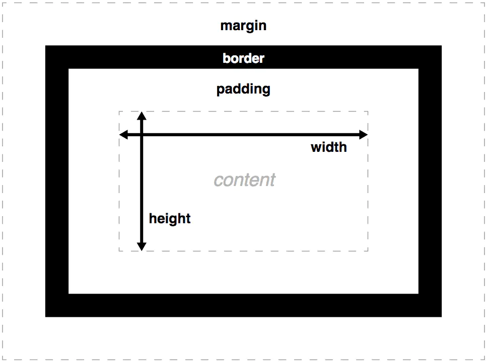
width
- 指定 content box 宽度
- 取值为长度、百分数、auto
- auto 由浏览器根据其它属性确定
- 百分数相对于容器的 content box 宽度
height
- 指定 content box 高度
- 取值为长度、百分数、auto
- auto 取值由内容计算得来
- 百分数相对于容器的 content box 高度,
- 容器有指定的高度时,百分数才生效
padding
- 指定元素四个方向的内边距
- 百分数相对于容器宽度
/* 应用于所有边 */
padding: 1em;

/* 上边下边 | 左边右边 */
padding: 5% 10%;

/* 上边 | 左边右边 | 下边 */
padding: 1em 2em 2em;

/* 上边 | 右边 | 下边 | 左边 */
padding: 5px 1em 0 2em;
border
- 指定容器边框样式、粗细和颜色
- 三种属性
- border-width
- border-style
- border-color
- 四个方向
- border-top
- border-right
- border-bottom
- border-left
border: 1px solid #ccc;

border-left: 1px solid #ccc;
border-right: 2px dotted red;

border-width: 1px 2px 3px 4px;
border-style: solid;
border-color: green blue;

border-left-width: 3px;
border-top-color: #f00;
margin
- 指定元素四个方向的外边距
- 取值可以是长度、百分数、auto
- 百分数相对于容器宽度
使用margin:auto水平居中
<div></div>
<style>
  div {
    width: 200px;
    height: 200px;
    background: coral;
    margin-left: auto;
    margin-right: auto;
  }
</style>
margin collapse
<div class="a"></div>
<div class="b"></div>
<style>
  .a {
    background: lightblue;
    height: 100px;
    margin-bottom: 100px;
  }
  .b {
    background: coral;
    height: 100px;
    margin-top: 100px;
  }
</style>
box-sizing; border-box
This is the behavior of width and height as specified by CSS2.1. The specified width and height (and respective min/max properties) apply to the width and height respectively of the content box of the element.
Length and percentages values for width and height (and respective min/max properties) on this element determine the border box of the element.
<p class="a">
  This is the behavior of width and height as specified by CSS2.1. The specified
  width and height (and respective min/max properties) apply to the width and
  height respectively of the content box of the element.
</p>
<p class="b">
  Length and percentages values for width and height (and respective min/max
  properties) on this element determine the border box of the element.
</p>
<style>
  html {
  font-size: 24px;
  }
   .a {
  width: 100%;
  padding: 1em;
  border: 3px solid #CCC;
  }
   .b {
  box- S izing: border-box;
  width :100%;
  padding: 1em;
  border: 3px solid #CCC ;
  }
</style>
overflow
visible:默认,溢出显示
hidden:溢出部分隐藏
scroll:滚动条
auto:自动
块级 vs.行级
| Block Level Box | Inline Level Box |
|---|---|
| 不和其它盒子并列摆放 | 和其它行级盒子一起放在一行或拆开成多行 A |
| 适用所有的盒模型属性 | 盒模型中的 width、height 不适用 |
| 块级元素 | 行级元素 |
|---|---|
| 生成块级盒子 | |
| body、article、 div、main、 | span、em、strong、 cite、 code 等 |
| display: block | display: inline |
display 属性
| 属性值 | 含义 |
|---|---|
| block | 块级盒子 |
| inline | 行级盒子 |
| inline-block | 本身是行级,可以放在行盒中;可以设置宽高;作为一个整体不会被拆散成多行 |
| none | 排版时完全被忽略 |
常规流 Normal Flow
- 根元素、浮动和绝对定位的元素会脱离常规流
- 其它元素都在常规流之内(in-flow)
- 常规流中的盒子,在某种排版上下文中参与布局
行级排版上下文
- Inline Formatting Context (IFC)
- 只包含行级盒子的容器会创建一个 IFC
- IFC 内的排版规则
- 盒子在一行内水平摆放
- 一行放不下时,换行显示
- text-align 决定一行内盒子的水平对齐
- vertical-align 决定一个盒子在行内的垂直对齐
- 避开浮动(float)元素*
This is a paragraph of text with Long word
Honorificabilitudinitatibus. Here is an image
 And Inline Block
And Inline Block
<div>
  This is a paragraph of text with Long word Honorificabilitudinitatibus. Here
  is an image <br/>
  <img src="https://assets.codepen.io/59477/cat.png" alt="cat" />
  And <em> Inline Block</em>
</div>
<style>
  div {
    color: white;
    width: 14em;
    //overflow-wrap: break-word;
    background: #411;
  }
  em {
    display: inline-block;
    width: 3em;
    background: #33c;
  }
</style>
块级排版上下文
- Block Formatting Context (BFC)
- 某些容器会创建一个 BFC
- 根元素
- 浮动、绝对定位、inline-block
- Flex 子项和 Grid 子项
- overflow 值不是 visible 的块盒
- display: flow-root;
BFC 内的排版规则
- 盒子从上到下摆放
- 垂直 margin 合并
- BFC 内盒字的 margin 不会与外面的合并
- BFC 不会和浮动元素重叠
This is a text and
block
and other text.
<span>
  This is a text and
  <div>block</div>
  and other text.
</span>
<style>
  span {
    line-height: 3;
    border: 2px solid red;
    background: coral;
  }
  div {
    line-height: 1.5;
    background: lime;
  }
</style>
Flex 排版上下文
- 一种新的排版上下文
- 它可以控制子级盒子的:
- 摆放的流向(→←↑↓)
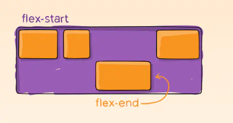
- 摆放顺序
- 盒子宽度和高度
- 水平和垂直方向的对齐
- 是否允许折行
A
B
C
<div class="container">
<div class="a">A</div>
<div class="b">B</div>
<div class="c">C</div>
</div>
<style>
.container {
display: flex;|
border: 2px solid #966;
}
.a, .b, .c {
text-align: center;
padding: 1em;
}
.a {
background: #fcc;
}
.b {
background: #cfc;
}
.c {
background: #ccf;
}
flex-direction
/* The direction text is laid out in a line */
flex-direction: row;

/* Like <row>, but reversed */
flex-direction: row-reverse;

/* The direction in which lines of text are stacked */
flex-direction: column;

/* Like <column>, but reversed */
flex-direction: column-reverse;
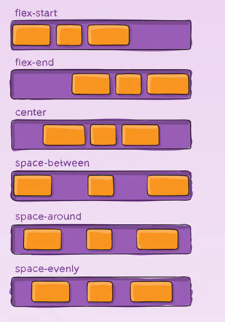
justify-content
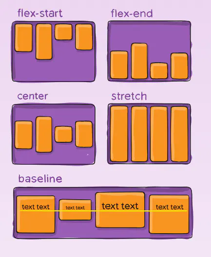
align-items
align-self
order
Flexibility
- 可以设置子项的弹性:当容器有剩余空间时,会伸展;容器空间不够时,会收缩。
- flex-grow 有剩余空间时的伸展能力
- flex-shrink 容器空间不足时收缩的能力 默认 1 可被压缩
- flex-basis 没有伸展或收缩时的基础长度
A
B
C
<div class="container">
  <div class="a">A</div>
  <div class="b">B</div>
  <div class="c">C</div>
</div>
<style>
  .container {
    display: flex;
  }
  .a,
  .b,
  .c {
    width: 100px;
  }
  .a {
    flex-grow: 2;
  }
  .b {
    flex-grow: 1;
  }
</style>
flex
| 简写 | 含义 |
|---|---|
| flex: 1 | flex-grow: 1 |
| flex: 100px | flex- basis: 100px |
| flex: 2 1 | flex-grow: 2; flex-shrink: 1 |
| flex: 1 100px | flex- grow: 1; flex-basis: 100px |
| flex: 2 0 100px | flex-grow: 2; flex-shrink: 0; flex-basis: 100px |
| flex: auto | flex: 1 1 auto |
| flex: none | flex: 0 0 auto |
Grid 布局
- display: grid 使元素生成一个块级的 Grid 容器
- 使用 grid-template 相关属性将容器划分为网格
- auto 可占用所有
- 1fr 剩余的分份
grid-line 网格线
grid-area: auto / auto / auto / auto;
grid-area 网格区域:grid-row-start 会被设为第一个值,grid-column-start 为第二个值, grid-row-end 为第三个值,grid-column-end 为第四个值
float 浮动
float:left/right;
position 位置
| 值 | 含义 |
|---|---|
| static | 默认值,非定位元素 |
| relative | 相对自身原本位置偏移,不脱离文档流 在常规流里面布局 相对于自己本应该在的位置进行偏移 使用 top、left、 bottom、 right 设置偏移长度 流内其它元素当它没有偏移样布局 |
| absolute | 绝对定位,相对非 static 祖先元素定位 脱离常规流 相对于最近的非 static 祖先定位 不会对流内元素布局造成影响 |
| fixed | 相对于视口绝对定位 |

 浙公网安备 33010602011771号