

matplotlib绘图学习
最近频繁用到matplotlib绘图,梳理了下官网的tutorial,记录下学习笔记。主要是对下面链接的翻译和个人理解整理。
https://matplotlib.org/3.5.0/tutorials/introductory/usage.html
1. 基础知识
matplotlib绘图中包括两个概念:figure, axes. 其中figure表示一张图,axes对应一个绘图区域,一个figure中可以包括多个axes, 如下代码:
fig = plt.figure()  # an empty figure with no Axes
fig, ax = plt.subplots()  # a figure with a single Axes
fig, axs = plt.subplots(2, 2)  # a figure with a 2x2 grid of Axes
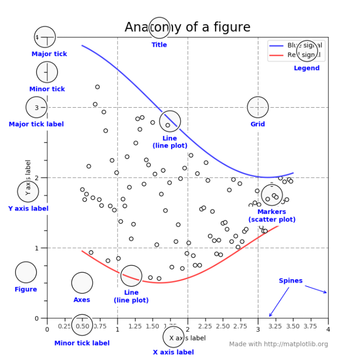
一个figure可以包含的组成成分如下:
注意:matplotlib绘制图片时,接受的数据最好是numpy格式(list和pandas等array-like数据,可能会出现异常情况)
1.1 面向对象接口和pyplot接口
matplotlib提供了两种形式的接口供调用:
- 面向对象接口(object-oriented interface): 显示的创建figure对象和axes对象,调用figure和axes对象的方法
- pyplot接口(pyplot interface):依靠pyplot来创建和管理figure和axes对象,调用pyplot函数
面向对象接口风格代码如下:
x = np.linspace(0, 2, 100)  # Sample data.

# Note that even in the OO-style, we use `.pyplot.figure` to create the figure.
fig, ax = plt.subplots()  # Create a figure and an axes.
ax.plot(x, x, label='linear')  # Plot some data on the axes.
ax.plot(x, x**2, label='quadratic')  # Plot more data on the axes...
ax.plot(x, x**3, label='cubic')  # ... and some more.
ax.set_xlabel('x label')  # Add an x-label to the axes.
ax.set_ylabel('y label')  # Add a y-label to the axes.
ax.set_title("Simple Plot")  # Add a title to the axes.
ax.legend()  # Add a legend.
pyplot接口风格代码:
x = np.linspace(0, 2, 100)  # Sample data.

plt.plot(x, x, label='linear')  # Plot some data on the (implicit) axes.
plt.plot(x, x**2, label='quadratic')  # etc.
plt.plot(x, x**3, label='cubic')
plt.xlabel('x label')
plt.ylabel('y label')
plt.title("Simple Plot")
plt.legend()
2. pyplot接口
matplotlib.pyplot 是一个使matplotlib像MATLAB一样工作的绘图接口(很多函数的集合),pyplot会自动追踪当前figure和axes, 其调用函数也是作用于当前axes。
示例一
import matplotlib.pyplot as plt
import numpy as np
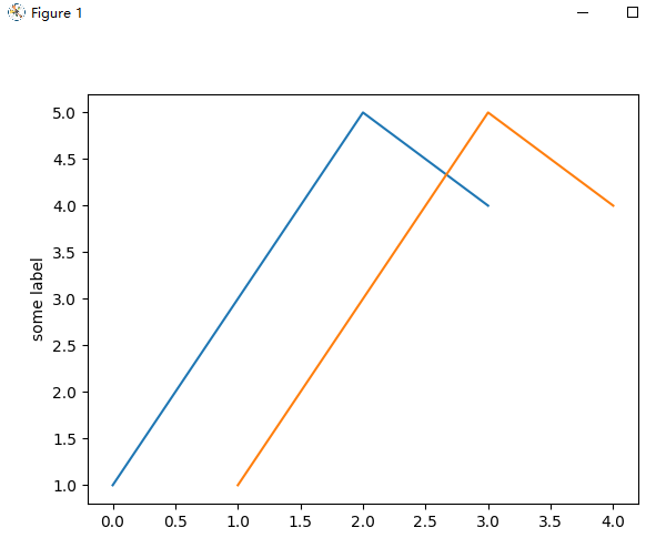
# 1. 定义一个图形窗口
plt.figure()
# 2. 绘制图形
plt.plot([1, 3, 5, 4]) # [1, 3, 5, 4]会被当作y,x会被自动设置成[0, 1, 2,3],(x从0开始递增)
plt.ylabel('some label')
plt.plot([1, 2, 3, 4], [1, 3, 5, 4]) #x=[1, 2, 3, 4], y=[1, 3, 5, 4]
# 3. 显示绘制图形
plt.show()
2.1 控制plot曲线的格式(style)
对于每一组x,y, plot函数接受一个字符串参数fmt,设置绘制曲线的格式,其中fmt格式如下:
fmt = '[marker][line][color]'
或者fmt = '[color][marker][line]'
fmt默认设置:'b-
marker:
| character | description |
|---|---|
'.' |
point marker |
',' |
pixel marker |
'o' |
circle marker |
'v' |
triangle_down marker |
line:
| character | description |
|---|---|
'-' |
solid line style |
'--' |
dashed line style |
'-.' |
dash-dot line style |
':' |
dotted line style |
color:
| character | color |
|---|---|
'b' |
blue |
'g' |
green |
'r' |
red |
所有marker, line, color参考如下链接:https://matplotlib.org/3.5.0/api/_as_gen/matplotlib.pyplot.plot.html#matplotlib.pyplot.plot
常用fmt示例:
'b'    # blue markers with default shape
'or'   # red circles
'-g'   # green solid line
'--'   # dashed line with default color
'^k:'  # black triangle_up markers connected by a dotted line
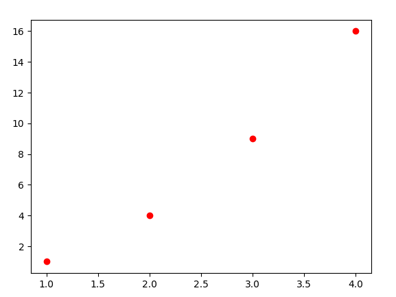
示例一
import matplotlib.pyplot as plt

plt.figure()
# 绘制红色的圆圈
plt.plot([1, 2, 3, 4], [1, 4, 9, 16], 'ro')
plt.show()
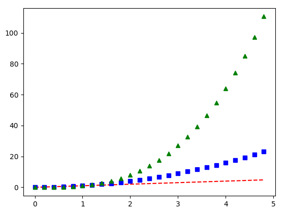
示例二
import matplotlib.pyplot as plt
import numpy as np

plt.figure()
t = np.arange(0., 5., 0.2)
# 'r--'红色虚线; 'bs':蓝色的方框('s':square marker); 'g^':绿色上三角形('^': 上三角形marker)
plt.plot(t, t, 'r--', t, t**2, 'bs', t, t**3, 'g^')

plt.show()
2.3 plot接受字典和字符串形式输入
示例一
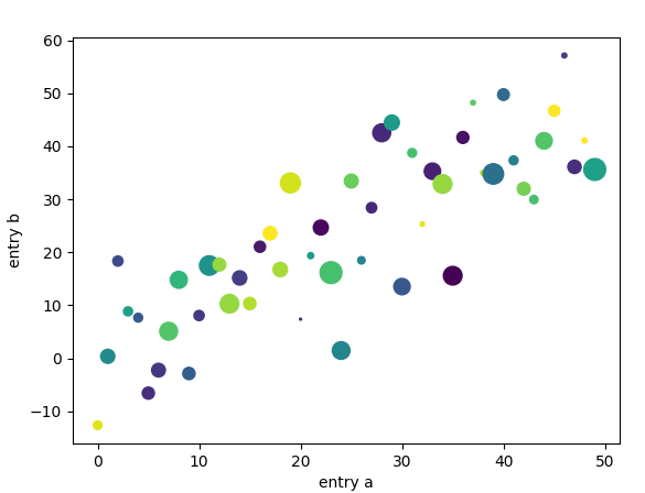
plt.scatter()函数参数data,可以接受一个字典输入,根据字典的key来索引字典中的数据,如下代码:
import matplotlib.pyplot as plt
import numpy as np

plt.figure()
data = {'a': np.arange(50),
        'c': np.random.randint(0, 50, 50),
        'd': np.random.randn(50),
}
data['b'] = data['a']+10*np.random.randn(50)
data['d'] = np.abs(data['d'])*100
# 采用data['a'],data['b']表示每个点的x,y
# c='c', 表示采用data['c']的值设置每个点的颜色
# s='d', 表示采用data['d']的值设置每个点的大小
plt.scatter('a', 'b', c='c', s='d', data=data)
plt.xlabel('entry a')
plt.ylabel('entry b')
plt.show()
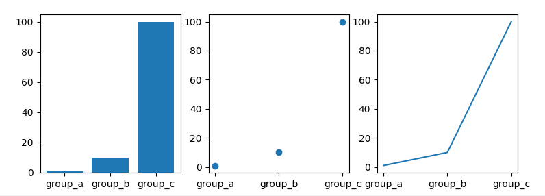
示例二
plt.plot()的横坐标可以接收字符串形式的输入,如下:
import matplotlib.pyplot as plt
import numpy as np

names = ['group_a', 'group_b', 'group_c']
values = [1, 10, 100]
plt.figure(figsize=(9, 3))

# 131: 表示有1行3列,共3个子图,在3个子图的第一个子图中绘制
plt.subplot(131)
plt.bar(names, values)

plt.subplot(132)
plt.scatter(names, values)

plt.subplot(133)
plt.plot(names, values)

plt.show()
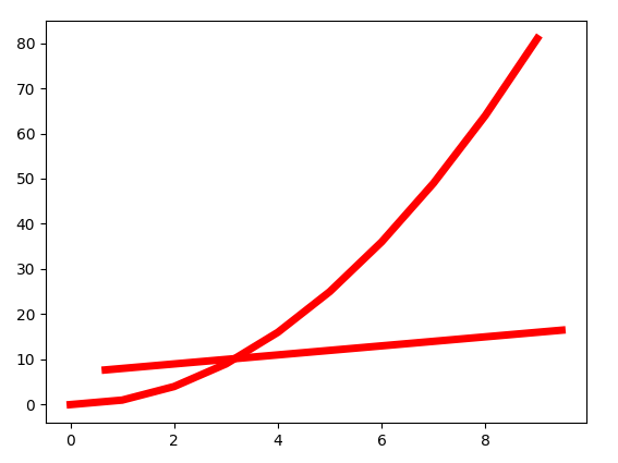
2.4 设置line的属性
直线有很多属性可以设置,线的宽度,颜色,风格等,有下面三种设置方式,如下面代码:
import matplotlib.pyplot as plt
import numpy as np
plt.figure()

x1 = np.arange(10)
x2 = np.arange(10)+np.random.rand(10)
y1 = x1**2
y2 = x2+np.random.randint(3, 10)
# 方式一:通过关键字参数设置
# plt.plot(x1, y1, linewidth=5.0)

# 方式二:通过返回的line2D对象设置  (返回包含line2D对象的列表,有两条直线,所以列表里有两个对象)
# line1, line2 = plt.plot(x1, y1, '-', x2, y2)
# line1.set_antialiased(False)  # turn off antialiasing

lines = plt.plot(x1, y1, x2, y2)
# 方式三:通过plt.setp设置
plt.setp(lines, color='r', linewidth=5.0)
plt.setp(lines)  # plt.setp(lines):查看所有可以设置的属性名称
plt.show()
2.5 多个figure和多个axes
pyplot中有figure和axes的概念,可以有多个figure,每个figure可以有多个axes,pyplot.gca()返回当前的axes对象( matplotlib.axes.Axes ), pyplot.gcf()返回当前的figure对象( matplotlib.figure.Figure ),pyplot总是绘制在当前axes。
下面代码中利用plot.subplot()创建多个axes,其参数含义如下:
plot.subplot(numrows, numcols, plot_number):
- subplot(211): 等同于subplot(2, 1, 1), 表示创建2行1列,共2个axes, 在其中的第一个axes进行绘制
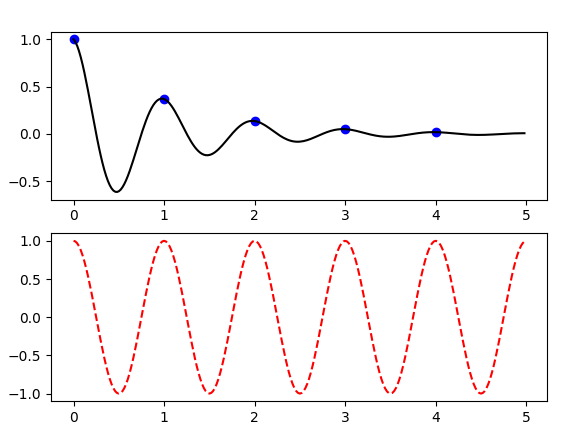
示例1
import matplotlib.pyplot as plt
import numpy as np

def func(t):
    return np.exp(-t)*np.cos(2*np.pi*t)

t1 = np.arange(0.0, 5.0, 1.0)
t2 = np.arange(0.0, 5.0, 0.02)
plt.figure()
plt.subplot(211)   # 相当于plt.subplot(2, 1, 1), 第一个axes
plt.plot(t1, func(t1), 'bo', t2, func(t2), 'k')

plt.subplot(212)  # 相当于plt.subplot(2, 1, 2),第二个axes
plt.plot(t2, np.cos(2*np.pi*t2), 'r--')

plt.show()
示例2
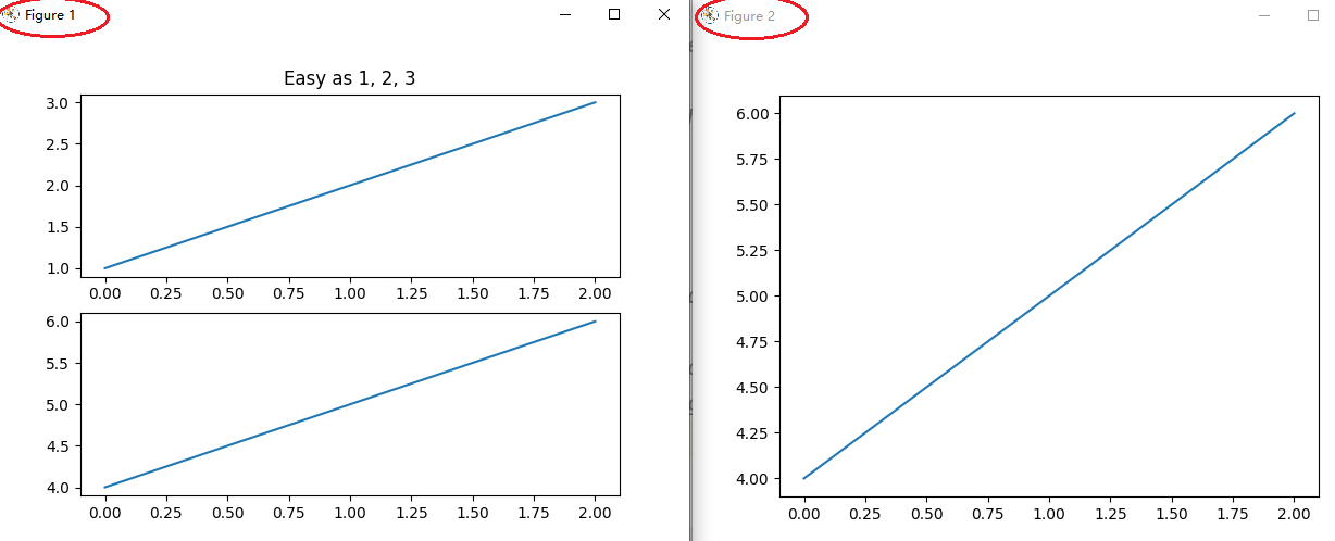
下面示例代码中,绘制了两个figure, 每个figure中有自己的多个axes:
import matplotlib.pyplot as plt
import numpy as np

plt.figure(1)                # the first figure
plt.subplot(211)             # the first subplot in the first figure
plt.plot([1, 2, 3])
plt.subplot(212)             # the second subplot in the first figure
plt.plot([4, 5, 6])

plt.figure(2)                # a second figure
plt.plot([4, 5, 6])          # creates a subplot() by default

plt.figure(1)                # figure 1 current; subplot(212) still current
plt.subplot(211)             # make subplot(211) in figure1 current
plt.title('Easy as 1, 2, 3') # subplot 211 title

plt.show()
plt.clf() 清理当前figure中内容
plt.cla() # 清理当前axes中内容
plt.close(2) # 关闭figure2
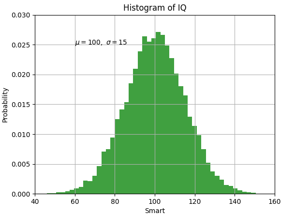
2.6 pyplot中text
pyplot中可以通过如下函数添加文本:
plt.xlabel('Smarts'): x坐标轴名称plt.ylabel('Probability'): y坐标轴名称plt.title('Histogram of IQ'): axes标题plt.text(60, .025, r'$\mu=100,\ \sigma=15$'): 在坐标(60, 0.025)处添加文本 ($$ 表示markdown文本格式)
上面的四个text中都支持markdown格式,来设置数学表达式,如:
plt.title(r'$\sigma_i=15$')
示例1
import matplotlib.pyplot as plt
import numpy as np
plt.figure()
mu, sigma = 100, 15
x = mu + sigma*np.random.randn(10000)
n, bins, patches = plt.hist(x, 50, density=1, facecolor='g', alpha=0.75)
plt.xlabel('Smart')
plt.ylabel('Probability')
plt.title('Histogram of IQ')
plt.text(60,  0.025, r'$\mu=100,\ \sigma=15$')
plt.axis([40, 160, 0, 0.03])   # [xmin, xmax, ymin, ymax]
plt.grid(True)  # 设置网格
plt.show()
和之前介绍的line属性设置一样,也可以通过关键字,或者pyplot.setp()来设置文本的属性,如下:
t1 = plt.xlabel('my data', fontsize=14, color='red')
# plt.setp(t1)  # 打印t1可以设置的属性
t2 = plt.text(60,  0.025, r'$\mu=100,\ \sigma=15$', color='green')
# plt.setp(t2)   # 打印t2可以设置的属性
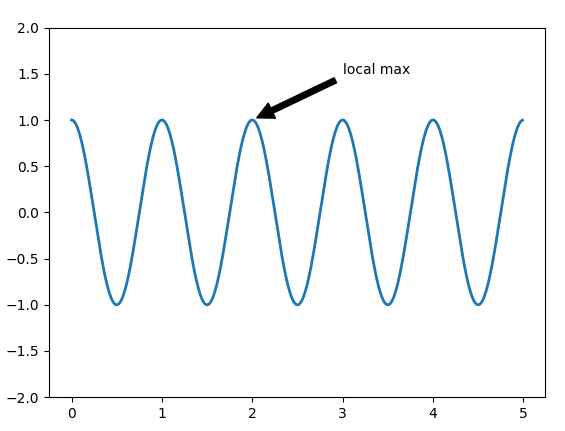
示例2
plt.annotate(text='local max', xy=(2, 1), xytext=(3, 1.5),):可以设置文本及其指向的位置
- text: 文本字符串
- xy: 文本指向的坐标
- xytext:文本的坐标位置
annotate详细文档:https://matplotlib.org/3.5.0/tutorials/text/annotations.html#annotations-tutorial
plt.figure()
ax =plt.subplot()
t = np.arange(0, 5.0, 0.01)
s = np.cos(2*np.pi*t)
line, = plt.plot(t, s, lw=2)
plt.annotate('local max', xy=(2, 1), xytext=(3, 1.5),
             arrowprops=dict(facecolor='black', shrink=0.05),
             )

plt.ylim(-2, 2)
plt.show()
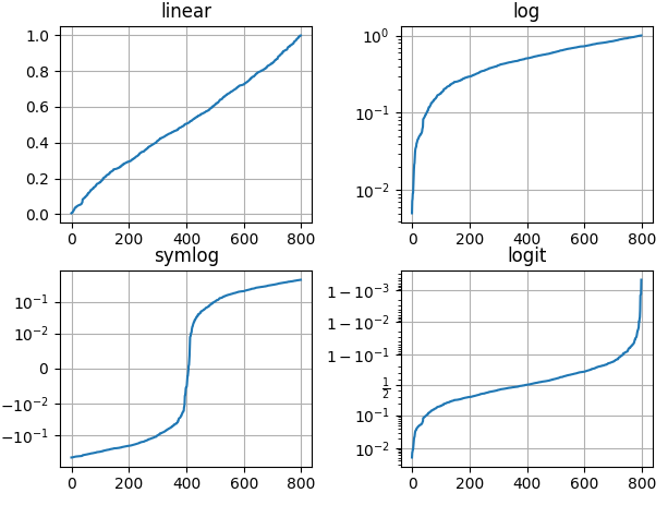
2.7 Logarithmic scale
pyplot的坐标轴除了支持linear scale,还支持log scale, symmetric log scale, logit scale:
关于scale文档:https://matplotlib.org/3.5.0/api/scale_api.html#module-matplotlib.scale
-
log scale: 即
matplotlib.scale.LogScale, log坐标轴,注意其只绘制正数,会忽略负数 -
symmentric log scale: 即
matplotlib.scale.SymmetricalLogScale, 对称log坐标轴, 支持正负数 -
logit scale: 即
matplotlib.scale.LogitScale, logit坐标轴,[0,1]范围内,会将log数据映射[0, 1]范围内。( logit = 1/(1+log(-x)) )
示例代码如下:
np.random.seed(19680801)
y = np.random.normal(loc=0.5, scale=0.4, size=1000)  # shape(1000,)
y = y[(y > 0) & (y < 1)]  # shape(799, ), 值在[0, 1]范围内
y.sort()
x = np.arange(len(y))

plt.figure()
# 线性坐标轴
plt.subplot(221)
plt.plot(x, y)
plt.yscale('linear')
plt.title('linear')
plt.grid(True)

# y轴为log坐标轴
plt.subplot(222)
plt.plot(x, y)
plt.yscale('log')
plt.title('log')
plt.grid(True)

# y轴为symlog坐标轴
plt.subplot(223)
plt.plot(x,  y - y.mean())  # y可以为正数和负数,均值变成0
plt.yscale('symlog', linthresh=0.01)  # x趋近于0时,log(x)会趋近于负无穷,linthresh=0.01设置(-0.01, 0.01)范围内为线性值
plt.title('symlog')
plt.grid(True)

# y轴为logit坐标轴
plt.subplot(224)
plt.plot(x, y)
plt.yscale('logit')
plt.title('logit')
plt.grid(True)

# 调整subplot之间的格式
plt.subplots_adjust(top=0.92, bottom=0.08, left=0.10, right=0.95, hspace=0.25,
                    wspace=0.35)
plt.show()
2. 8 综合案例
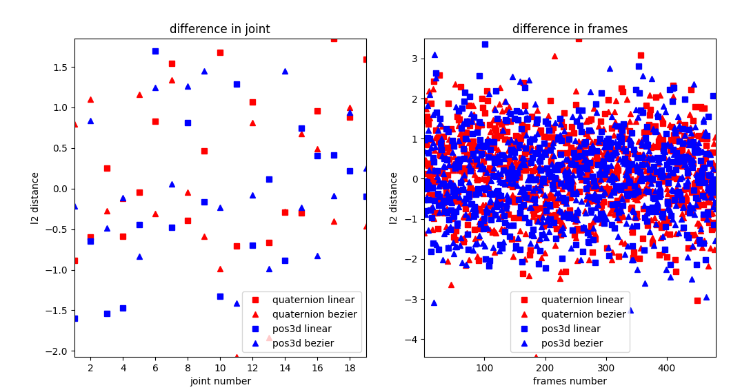
下面时工作中我绘制的一段代码截图,数据采用随机数进行了代替,包括了坐标轴的标题,图例显示,坐标轴刻度范围等。
import numpy as np
import matplotlib.pyplot as plt

plt.figure(figsize=(12, 6))  # 设置fig的大小,width=12, height=6

# quaternion linear曲线插值
quater_linear_joint_y = np.random.randn(19)+0.2   # shape(19, )
quater_linear_sequence_y = np.random.randn(481)+0.2  # shape(481, )

# quaternion bezier曲线插值
quater_bezier_joint_y = np.random.randn(19)    # shape(19, )
quater_bezier_sequence_y = np.random.randn(481)   # shape(481, )

quater_linear_joint_x = np.arange(quater_linear_joint_y.shape[0]) + 1    # shape(19, )
quater_bezier_joint_x = np.arange(quater_bezier_joint_y.shape[0]) + 1     # shape(19, )
quater_linear_sequence_x = np.arange(quater_linear_sequence_y.shape[0]) + 1    # shape(481, )
quater_bezier_sequence_x = np.arange(quater_bezier_sequence_y.shape[0]) + 1   # shape(481, )

# 线性插值
pos3d_linear_joint_y = np.random.randn(19)+0.1   # shape(19, )
pos3d_linear_sequence_y = np.random.randn(481)+0.1  # shape(481, )

# bezier曲线插值
pos3d_bezier_joint_y = np.random.randn(19)    # shape(19, )
pos3d_bezier_sequence_y = np.random.randn(481)   # shape(481, )

pos3d_linear_joint_x = np.arange(pos3d_linear_joint_y.shape[0]) + 1   # shape(19, )
pos3d_bezier_joint_x = np.arange(pos3d_bezier_joint_y.shape[0]) + 1   # shape(19, )
pos3d_linear_sequence_x = np.arange(pos3d_linear_sequence_y.shape[0]) + 1  # shape(481, )
pos3d_bezier_sequence_x = np.arange(pos3d_bezier_sequence_y.shape[0]) + 1  # shape(481, )

# 绘制joint
plt.subplot(121)
plt.title(f"difference in joint")  # 设置subplot标题
plt.xlabel("joint number")    # 设置y轴标题
plt.ylabel("l2 distance")   # 设置x轴标题
ymin = min(np.min(quater_linear_joint_y), np.min(quater_bezier_joint_y),
           np.min(pos3d_linear_joint_y), np.min(pos3d_bezier_joint_y))
ymax = max(np.max(quater_linear_joint_y), np.max(quater_bezier_joint_y),
           np.max(pos3d_linear_joint_y), np.max(pos3d_bezier_joint_y))
plt.ylim((ymin, ymax))   # 设置y轴坐标轴刻度范围
plt.xlim((1, 19))       # 设置x轴坐标轴刻度范围
plt.plot(quater_linear_joint_x, quater_linear_joint_y, 'rs', label='quaternion linear')   #'rs'表示红色方框,label方便legend显示
plt.plot(quater_bezier_joint_x, quater_bezier_joint_y, 'r^', label='quaternion bezier')   #'r^'表示红色三角形,label方便legend显示

plt.plot(pos3d_linear_joint_x, pos3d_linear_joint_y, 'bs', label='pos3d linear')   #'bs'表示蓝方框,label方便legend显示
plt.plot(pos3d_bezier_joint_x, pos3d_bezier_joint_y, 'b^', label='pos3d bezier')   #'b^'表示蓝色三角形,label方便legend显示
plt.legend()  # 显示图例,根据plot时设置的label区分

# 绘制sequence
plt.subplot(122)
plt.title(f"difference in frames")
plt.xlabel("frames number")
plt.ylabel("l2 distance")
ymin = min(np.min(quater_linear_sequence_y), np.min(quater_bezier_sequence_y),
           np.min(pos3d_linear_sequence_y), np.min(pos3d_bezier_sequence_y))
ymax = max(np.max(quater_linear_sequence_y), np.max(quater_bezier_sequence_y),
           np.max(pos3d_linear_sequence_y), np.max(pos3d_bezier_sequence_y))
plt.ylim((ymin, ymax))   # 设置y轴坐标轴刻度范围
plt.xlim((1, 481))
plt.plot(quater_linear_sequence_x, quater_linear_sequence_y, 'rs', label='quaternion linear')
plt.plot(quater_bezier_sequence_x, quater_bezier_sequence_y, 'r^', label='quaternion bezier')

plt.plot(pos3d_linear_sequence_x, pos3d_linear_sequence_y, 'bs', label='pos3d linear')
plt.plot(pos3d_bezier_sequence_x, pos3d_bezier_sequence_y, 'b^', label='pos3d bezier')
plt.legend()
# plt.savefig(f'./plot.png')  # 保存绘制图片
plt.show()
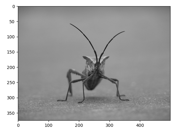
3. 图片显示
matplotlib.image可以用来读取图片为numpy数据(底层依赖Pillow),其读取的图片numpy格式为RGB, 通过plt.imshow能显示图片numpy数据。
注意:matplolib读取图片后,会将其缩放到[0, 1]范围内,并且转换为float32格式, 对应RGB图片matplotlib支持float32和uint8类型数据, 但对于灰度图,matplotlib只支持float32格式
(若采用opencv读取,需要将BGR其转换为RGB,并将其转换为float32类型,缩放到[0,1]范围)
示例代码如下:
import matplotlib.pyplot as plt
import matplotlib.image as mping

img_path = r"./stinkbug.png"
img = mping.imread(img_path)
print(img.shape, img.dtype)
imgplot = plt.imshow(img)
plt.show()
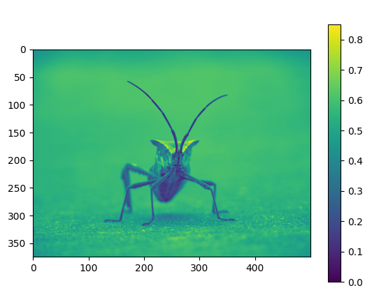
3.1 伪彩色机制
对于灰度图图片,matplotlib可以通过伪彩色机制显示,能够分辨出图片中亮暗区域。如下代码所示:
import matplotlib.pyplot as plt
import matplotlib.image as mping

img_path = r"./stinkbug.png"
img = mping.imread(img_path)
print(img.shape, img.dtype)

# example 2
gray_img = img[:, :, 0]
plt.imshow(gray_img)   # 默认采用viridis伪彩色展示灰度图
plt.colorbar()  # 显示颜色条
plt.show()
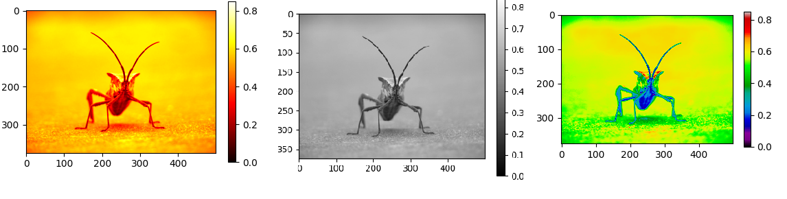
默认采用viridis伪彩色展示灰度图,可以设置伪彩色的机制, 如下所示:
import matplotlib.pyplot as plt
import matplotlib.image as mping

img_path = r"./stinkbug.png"
img = mping.imread(img_path)
print(img.shape, img.dtype)

gray_img = img[:, :, 0]
plt.imshow(gray_img, cmap='hot')   # 采用hot伪彩色展示灰度图

# plt.imshow(gray_img, cmap='gray')   # 展示原始灰度图

# imgplot = plt.imshow(gray_img)
# imgplot.set_cmap('nipy_spectral') # 采用nipy_spectral伪彩色展示灰度图

plt.colorbar()  # 显示颜色条
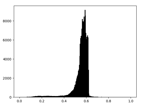
3.2 直方图统计和截取
plt.hist能绘制直方图,统计每个像素出现的次数,plt.imshow函数中的clim参数能设置显示的像素区间, 如下面代码:
plt.hist(lum_img.ravel(), bins=256, range=(0.0, 1.0), fc='k', ec='k')  # 绘制单通道灰度图直方图,256个区间
imgplot = plt.imshow(lum_img, clim=(0.0, 0.7))  # 图像像素范围在[0, 1]区间,只显[0, 0.7]区间像素
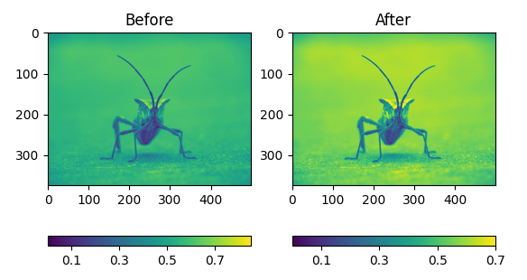
示例1
下面代码中,截取了原图像素(0, 0.7)的区间。(根据统计直方图可知,超过0.7范围内的像素很少, 相当于增加对比度?)
import matplotlib.pyplot as plt
import matplotlib.image as mping

img_path = r"./stinkbug.png"
img = mping.imread(img_path)
gray_img = img[:, :, 0]

fig = plt.figure()
ax = fig.add_subplot(1, 2, 1)
imgplot = plt.imshow(gray_img)
ax.set_title('Before')
plt.colorbar(ticks=[0.1, 0.3, 0.5, 0.7], orientation='horizontal')

ax2 = fig.add_subplot(1, 2, 2)
imgplot2 = plt.imshow(gray_img, clim=(0.0, 0.7))
ax2.set_title('After')
plt.colorbar(ticks=[0.1, 0.3, 0.5, 0.7], orientation='horizontal')

plt.show()
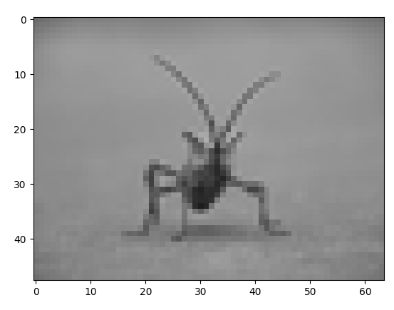
3.3 插值
plt.imshow显示图片时,若图片尺寸发生变化,可以设置插值的方式, 示例代码如下:
import matplotlib.pyplot as plt
from PIL import Image

img_path = r"./stinkbug.png"
img = Image.open(img_path)
print(img.size)  # shape(500, 375)
img.thumbnail((64, 64), Image.ANTIALIAS)   # 保持长宽比缩放: shape(64, 48)
print(img.size)
# plt.imshow(img)   # 默认采用bilinear 插值
plt.imshow(img, interpolation='nearest')   # 采用nearest插值
# plt.imshow(img, interpolation='bicubic')  # 采用bicubic插值

plt.show()


【推荐】国内首个AI IDE,深度理解中文开发场景,立即下载体验Trae
【推荐】编程新体验,更懂你的AI,立即体验豆包MarsCode编程助手
【推荐】抖音旗下AI助手豆包,你的智能百科全书,全免费不限次数
【推荐】轻量又高性能的 SSH 工具 IShell:AI 加持,快人一步
· 阿里最新开源QwQ-32B,效果媲美deepseek-r1满血版,部署成本又又又降低了!
· 开源Multi-agent AI智能体框架aevatar.ai,欢迎大家贡献代码
· Manus重磅发布:全球首款通用AI代理技术深度解析与实战指南
· 被坑几百块钱后,我竟然真的恢复了删除的微信聊天记录!
· 没有Manus邀请码?试试免邀请码的MGX或者开源的OpenManus吧