rem
规范中明确写道:
Equal to the computed value of ‘
font-size’ on the root element.
rem是指根元素(root element,html)的字体大小,从 IE6 到Chrome,根元素都默认的 font-size 都是 16px。
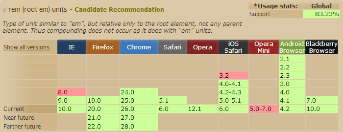
下面来看看rem的兼容性:
我们知道 em 的计算是基于父级元素的,在实际使用中给我们的计算带来了很大的不便。所以 rem 让我们不用担心父级元素的 font-size ,因为它始终是基于根元素(html) 的。
比如默认的 html font-size=16px,那么我想设置12px 的文字就是:12÷16=0.75(rem)
html{

font-size:62.5%; /* 10÷16=62.5% */

}

body{

font-size:12px;

font-size:1.2rem ; /* 12÷10=1.2 */

}

p{

font-size:14px;

font-size:1.4rem;

}
需要注意的是,为了兼容不支持 rem 的浏览器,我们需要在 rem 前面写上对应的 px 值,这样不支持的浏览器可以优雅降级。
当然,我们也可以使用js来为html设定font-size:
document.getElementsByTagName("html").style.fontSize=20+"px";

 浙公网安备 33010602011771号