学习前端相关
HTML常用标签
<strong>需要加粗的文字<strong>
<br>换行
<hr>分割线
<!-- 我是 HTML 注释 -->
<h1>一级标题</h1>
<h2>二级标题</h2>
<h3>三级标题</h3>
<h4>四级标题</h4>
<h5>五级标题</h5>
<h6>六级标题</h6>
<p>段落标签</p>
<em>倾斜标签</em>
<ins>下划线</ins>
<del>删除线</del>
<!-- <img src="图片的 URL" alt="图片无法加载的描述" title="图片的描述" width="宽度" height="高度"> -->
<img src="图片的 URL" alt="图片无法加载的描述" title="图片的描述" width="100" height="100" />
<!--<a href="https://www.baidu.com" target="属性设置为_blank新窗口打开">跳转到百度</a> -->
<a href="https://www.baidu.com" target="_blank">跳转到百度</a>
<!-- src= 音频的url,controls="控制台" loop="循环播放" autoplay = 自动播放 -->
<audio src="音频的 URL" controls="controls" loop="loop" autoplay></audio>
<!-- src= 视频的 URL,controls="控制台" loop="循环播放" autoplay = 自动播放 muted=静音播放 -->
<video src="视频的 URL" muted></video>
<ul>
<li>无序列表</li>
<li>第一项</li>
<li>第二项</li>
<li>第三项</li>
</ul>
<ol>
<li>有序列表</li>
<li>第一项</li>
<li>第二项</li>
<li>第三项</li>
</ol>
<dl>
<dt>列表标题</dt>
<dd>列表描述 / 详情</dd>
</dl>
<!-- 跨行合并,保留最上单元格,添加属性 rowspan
跨列合并保留最左单元格,添加属性 colspan -->
<table border="1">
<tr>
<th>姓名</th>
<th>语文</th>
<th>数学</th>
<th>总分</th>
</tr>
<tr>
<td>张三</td>
<td>99</td>
<td rowspan="2">100</td>
<td>199</td>
</tr>
<tr>
<td>李四</td>
<td>98</td>
<!-- <td>100</td> -->
<td>198</td>
</tr>
<tr>
<td>总结</td>
<td>全市第一</td>
<td>全市第一</td>
<td>全市第一</td>
</tr>
</table>
<form action="提交地址" method="post">
<!-- 经验:用 label 标签绑定文字和表单控件的关系,增大表单控件的点击范围。 -->
<label for="用户名">用户名:</label>
<!-- placeholder="提示信息" checked="默认选中" disabled="禁用" readonly="只读" -->
<input type="text" id="用户名" name="用户名" placeholder="请输入用户名" /><br>
<label for="密码">密码:</label>
<input type="password" id="密码" name="密码" placeholder="请输入密码" /><br>
<label for="用户名">邮箱:</label>
<input type="email" id="邮箱" name="邮箱" placeholder="请输入邮箱" /><br>
<input type="radio" name="性别" id="1" checked="checked">男
<input type="radio" name="性别" id="0">女<br>
<input type="checkbox" name="爱好" id="1">篮球
<input type="checkbox" name="爱好" id="2">足球
<input type="checkbox" name="爱好" id="3">羽毛球<br>
<input type="file" name="文件" id=""><br>
<!-- 实际开发中,使用 CSS 设置 文本域的尺寸
实际开发中,一般禁用右下角的拖拽功能 -->
<textarea>默认提示文字</textarea>
<select>
<option>北京</option>
<option>上海</option>
<option>广州</option>
<option>深圳</option>
<!-- 默认显示第一项,selected 属性实现默认选中功能。 -->
<option selected>武汉</option>
</select><br>
<button type="submit">提交</button>
<button type="reset">重置</button>
<button type="button">普通按钮</button>
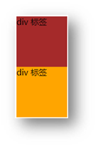
<div>div 标签,独占一行</div>
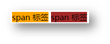
<span>span 标签,不换行</span>
<!-- 布局标签 -->
<nav>导航标签</nav>
<footer>底部导航栏</footer>
<aside>侧边栏</aside>
<section>网页区块/内容</section>
<article>网页文章</article>
</form>
CSS
外部引入CSS文件/内部使用
<link rel="stylesheet" href="./my.css">
<style> </style>
css选择器
<style>
		/* 标签选择器:使用标签名作为选择器 → 选中同名标签设置相同的样式。*/
        p {
            color: red;
        }

        /* 定义类选择器 */
        /* <div class="red">这是 div 标签</div> */
        .red {
            color: red;
        }

        /* 定义 id 选择器 */
        /* <div id="red">这是 div 标签</div> */
        #red {
            color: red;
        }
        /* 查找页面所有标签,设置相同样式。
        通配符选择器: *,不需要调用,浏览器自动查找页面所有标签,设置相同的样式 */
        * {
            /* 通配符选择器可以用于**清除标签的默认样式**,例如:标签默认的外边距、内边距。 */
            margin: 0;
            padding: 0;
            background-color: #3a3434;
            width: 100%;
            height: 100%;
        }
		/* 超链接伪类 */
        /*
        a标签在选中时生效
        */
        a:hover {
            color: green;
        }
</style>
css文字可用属性格式
| 文字尺寸 | font-size: 30px; | PC 端网页最常用的单位 px |
| 文字默认的效果 | font-style:normal; | normal无效果italic倾斜 |
| 文字行高 | line-height: 30px; | PC 端网页最常用的单位 px |
| 背景色 | background-color: skyblue; | #3a3434 |
| 文本缩进 | text-indent: 2em; | 1em = 当前标签的字号大小 |
| 控制内容水平对齐方式 | text-align: center; | center居中对齐,left左对齐,right右对齐 |
| 文本修饰线 | text-decoration:none; | none无修饰线,underline下划线,line-through删除线 |
| 宽度 | width: 100%; | px或者百分号 |
| 高度 | height: 100%; | px或者百分号 |
css背景可用格式
| 背景图 | background-image: url(./images/1.png); | 路径 |
| 背景色 | background-color: #3a3434; | #3a3434 |
| 背景图片的重复方式 | background-repeat: no-repeat; | repeat=不重复,repeat-x 水平方向不重复,repeat-y 垂直方向不重复,repeat 重复 |
| 背景图位置 | background-position: center bottom; | 单词,px |
| 背景图缩放 | background-size: cover; | cover:等比例缩放背景图片以完全覆盖背景区,可能背景图片部分看不见,contain:等比例缩放背景图片以完全装入背景区,可能背景区部分空白 |
| 背景图固定 | background-attachment: fixed; |
设置浮动
| 设置浮动 | display:block | block块级沾满一行,inline-block行内块模式 |
块级元素
特点:
- 独占一行
- 宽度默认是父级的100%
- 添加宽高属性生效
行内元素
特点:
- 一行可以显示多个
- 设置宽高属性不生效
- 宽高尺寸由内容撑开
行内块元素
特点:
- 一行可以显示多个
- 设置宽高属性生效
- 宽高尺寸也可以由内容撑开
盒子模型
盒子模型-组成
- 内容区域 – width & height
- 内边距 – padding(出现在内容与盒子边缘之间)
- 边框线 – border
- 外边距 – margin(出现在盒子外面)
div {
  margin: 50px;
  border: 5px solid brown;
  padding: 20px;
  width: 200px;
  height: 200px;
  background-color: pink;
}
边框线
四个方向
属性名:border(bd)
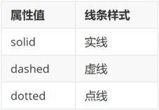
属性值:边框线粗细 线条样式 颜色(不区分顺序)
单方向边框线
属性名:border-方位名词(bd+方位名词首字母,例如,bdl)
属性值:边框线粗细 线条样式 颜色(不区分顺序)
div {
  border-top: 2px solid red;
  border-right: 3px dashed green;
  border-bottom: 4px dotted blue;
  border-left: 5px solid orange;
  width: 200px;
  height: 200px;
  background-color: pink;
}
内边距
作用:设置 内容 与 盒子边缘 之间的距离。
- 属性名:padding / padding-方位名词
div {
  /* 四个方向 内边距相同 */
  padding: 30px;
  /* 单独设置一个方向内边距 */
  padding-top: 10px;
  padding-right: 20px;
  padding-bottom: 40px;
  padding-left: 80px;
  width: 200px;
  height: 200px;
  background-color: pink;
}
提示:添加 padding 会撑大盒子。
- padding 多值写法
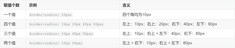
技巧:从上开始顺时针赋值,当前方向没有数值则与对面取值相同。
标准流,浮动,Flex布局
使用浮动布局
<style>
        #d1{
            background-color: #c64646;
            width: 200px;
            height: 200px;
            float: left;
        }
        #d2{
            background-color: antiquewhite;
            width: 200px;
            height: 200px;
           float: left;
        }
    </style>
<body>
    <div id="d1"></div>
    <div id="d2"></div>
</body>
浮动后的盒子会脱离标准流,要么一起浮动,要么都别浮动,不然会盒子覆盖
浮动设置后盒子有顶对齐,脱标,具备行内块的特点,也可以使用display: inline-block达到同样效果
浮动带来的错乱问题与解决方法
<style>
        *{
            margin: 0;
            padding: 0;
        }
        .top{
            /* height: 300px; */
            width: 1200px;
            margin: 10px auto;
            background-color: aqua;
        }
        .bottom{
            height: 100px;
            background-color: rgb(243, 40, 5);
        }
        .left{
            float: left;
            width: 300px;
            height: 300px;
            background-color: #080707;
        }
        .right{
            float: right;
            width: 900px;
            height: 300px;
            background-color: rgb(3, 10, 225);
        }
        /* .fix{
            clear: both;
        } */
        .clearfix::before,
        .clearfix::after{
            content: "";
            display: table;
        }
        .clearfix::after{
            clear: both;
        }
    </style>
<body>
    <!-- 因为top没有设置高度,两个子集虽然有设置了高度。
        但是子集(left,right)使用了浮动,在浏览器中,已经脱标了。
        所以子集无法撑开父级(top)
        导致了bottom与left,right在同一行显示
        解决方式有四种
        1.在后面加个空标签,给属性clear: both;(不常用)
        2.使用双位元素法在父级上加伪标签.clearfix::before,.clearfix::after
    -->
    <div class="top clearfix">
        <div class="left"></div>
        <div class="right"></div>
        <div class="fix"></div>
    </div>
    <div class="bottom"></div>
 </body>
flex布局
<style>
        *{
            margin: 0;
            padding: 0;
        }
        .box{
            margin: 10px auto;
            width: 400px;
            display: flex;
            justify-content: space-between;
            height: 300px;
            border: 1px solid #000;
        }
        .dd{
            /* float: left; */
            height: 100px;
            width: 100px;
            background-color: aqua;
        }
    </style>
<body>
    <div class="box">
        <div class="dd">1</div>
        <div class="dd">2</div>
        <div class="dd">3</div>
    </div>
</body>
dd是div标签,块级,会占用一行,如果想要让三个div左对齐占在同一行,原本使用方式可以用float: left;但是如果父级没有高度,会出现脱标情况
如果使用flex布局display: flex;justify-content: space-between;,此时子集能够撑开父级,不会产生脱标情况。
flex组成部分
设置方式:父元素设置为 display: flex;如果父级的宽度或者高度不够子集显示,子集也会自动的挤压与拉伸,不会被挤下去
- 弹性容器
- 弹性盒子
- 主轴:默认是水平方向(后续可以通过CSS更改方向)
- 侧轴/交叉轴:默认在垂直方向
| 创建flex容器 | display: flex; | |
| 主轴对其方式 | justify-content: space-between; | flex-start左对齐,flex-end右对齐,center居中对齐,space-between左右无边距中间留空,space-around侧面相等,space-evenly所有距离都相等 |
| 侧轴对其方式 | align-items: center; | stretch拉伸,center居中对齐 |
| 某个弹性盒子侧轴对其方式 | ||
| 修改主轴方向 | ||
| 弹性伸缩比 | ||
| 弹性盒子换行 | ||
| 行对齐方式 |
主轴对其方式
/* 左对齐 */
/* justify-content: flex-start; */

/* 右对齐 */
/* justify-content: flex-end; */

/* 水平居中 */
/* justify-content: center; */

/* 两侧对齐父级剩余的空间均分间距,间距相等 */
/* justify-content: space-between; */

/* 间距出现在弹性盒子的两侧 */
/* 视觉效果:弹性盒子与盒子之间的距离是两侧距离的两倍 */
/* justify-content: space-around; */


/* 间距出现在弹性盒子的两侧,且盒子之间的距离相等 */
/* 视觉效果:弹性盒子与盒子之间的距离与边距离相等 */
/* justify-content: space-evenly; */
设置侧轴对齐方式
/* 设置侧轴对齐方式 */
/* 默认,如果盒子没有设置高度,默认拉伸到容器高度
如果盒子设置了高度,就按照盒子设置的高度来显示不变
*/
/* align-items: stretch; */

/* 垂直居中对齐,如果盒子没有设置高度,且没有内容填充。则盒子没有高度。
如果盒子设置了高度,则垂直两侧的距离是高度剩下的距离
*/
/* align-items: center; */

 浙公网安备 33010602011771号