
margin塌陷问题
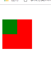
magin塌陷现象:在垂直方向,父子关系两个盒子中margin大的覆盖margin小的,导致两个盒子有同一个margin.
<style>
.div1{
width: 100px;
height: 100px;
background-color: red;
margin-top: 50px;
}
.div2{
width: 50px;
height: 50px;
background-color: green;
margin-top:70px;
}
</style>
<body>
<div class="div1">
<div class="div2"></div>
</div>
</body>
正常情况下,父级元素应该相对浏览器进行定位,子级相对父级定位.
但由于margin的塌陷,父级相对浏览器定位.而子级没有相对父级定位,子级相对父级,就像坍塌了一样.
结果:本应该是子元素的margin-top=70px(子元素的margin是相对于父元素的),父元素的等于50px,但最后结果子元素和父元素的margin-top都为70px.
解决办法:
1.父元素加border,注意加border时一定要有solid(不管写不写颜色),没写solid仅仅有个border:1px,浏览器实际上是没渲染border的。(不建议使用)
2.父元素加padding(不建议使用)
3.改变bfc(块级格式上下文)
改变父级的渲染规则有以下四种方法,给父级盒子添加
(1)position:absolute/fixed
(2)display:inline-block;
(3)float:left/right
(4)overflow:hidden
这四种方法都能触发bfc,但是使用的时候都会带来不同的麻烦,具体使用中还需根据具体情况选择没有影响的来解决margin塌陷
bfc:
浮动元素和绝对定位元素,非块级盒子的块级容器(例如 inline-blocks, table-cells, 和 table-captions),以及overflow值不为“visiable”的块级盒子,
都会为他们的内容创建新的BFC(块级格式上下文)。
特殊情况:下面这种也形成了margin塌陷,父级是body,子级div2没有相对body定位,而是和body一起用一个margin.div1脱离了文档流,不会相对body定位,但div2得相对body定位。
出现这种情况的条件是body有一个div脱离了标准流。
<style>
.box1{
width: 50px;
height: 50px;
position: absolute;
/* float: left; */
background-color: black;
}
.box2{
width: 100px;
height: 100px;
background-color: gray;
margin-top: 100px;
}
</style>
<body>
<div class="box1"></div>
<div class="box2"></div>
</body>
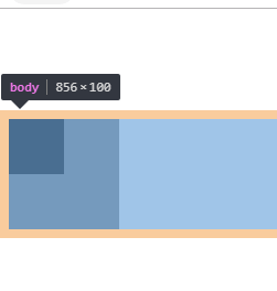
解决办法:和上面同理,只是父级变成了body
