css实现背景色圆弧效果
<div class="content"></div>
向上圆弧:
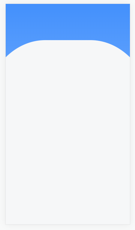
.content {
  width: 100%;
  height: 100%;
  position: relative;
  z-index: 0;
  background: linear-gradient(180deg, #4390fc 0%, #9ec8ff 100%);
}
.content::after {
  content: "";
  width: 140%;
  height: 100%;
  position: absolute;
  left: -20%;
  top: 110px;
  z-index: -1;
  border-radius: 37% 37% 0 0;
  background: #fff;
}
向下圆弧:
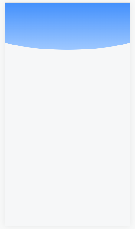
.content {
  width: 100%;
  height: 100%;
  position: relative;
  z-index: 0;
}
.content::after {
  content: '';
  width: 140%;
  height: 140px;
  position: absolute;
  left: -20%;
  top: 0;
  z-index: -1;
  border-radius: 0 0 50% 50%;
  background: linear-gradient(180deg, #4390fc 0%, #9ec8ff 100%);
}