30-seconds-of-css
你可以再30秒或者更短的时间内读懂的有用的CSS代码片段的精选.
github地址 不过代码不在github上面
官网地址 上面有详细的介绍和演示
下面是我读到的一些个人认为比较实用的片段
1. 等宽高比
给定一个可变宽度的元素, 它确保其高度以响应的方式与宽度保持成比例, 即宽度与高度的比例保持一致.
<div class="constant-width-to-height-ratio"></div>
CSS代码
.constant-width-to-height-ratio {
  background: #333;
  width: 50%;
}
.constant-width-to-height-ratio::before {
  content: '';
  padding-top: 100%;
  float: left;
}
.constant-width-to-height-ratio::after {
  content: '';
  display: block;
  clear: both;
}
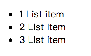
2. 计数器
计数器本质上是由CSS维护的变量, 其值可以通过CSS规则递增以跟踪它们的使用次数
<ul>
  <li>List item</li>
  <li>List item</li>
  <li>List item</li>
</ul>
CSS代码
ul {
  counter-reset: counter;
}
li::before {
  counter-increment: counter;
  content: counters(counter, '.') ' ';
}
效果
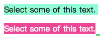
3. 自定义文本选择
更改文本选择的样式
<p>Sleect some of this text</p>
<p class="custom-text-selection">Select some of this text.</p>
CSS代码
::selection {
  background: aquamarine;
  color: black;
}
.custom-text-selection::selection {
  background: deeppink;
  color: white;
}
效果
4. 自定义变量
CSS变量, 其中包含要在整个文档中重用的值.
<p class="custom-variables">CSS is awesome!</p>
CSS代码
:root {
  --some-color: #da7800;
  --some-keyword: italic;
  --some-size: 1.25em;
  --some-complex-value: 1px 1px 2px whitesmoke, 0 0 1em slategray, 0 0 0.2em slategray;
}
.custom-variables {
  color: var(--some-color);
  font-size: var(--some-size);
  font-style: var(--some-keyword);
  text-shadow: var(--some-complex-value);
}
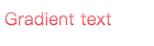
5. 渐变文本
为文本提供渐变(IE无效)
<p class="gradient-text">Gradient text</p>
CSS代码
.gradient-text {
  background: -webkit-linear-gradient(pink, red);
  -webkit-text-fill-color: transparent;
  -webkit-background-clip: text;
}
6. 溢出滚动渐变
向溢出元素添加渐变以更好的提示用户有更多内容需要滚动
<div class="overflow-scroll-gradient">
  <div class="overflow-scroll-gradient__scroller">
    Content to be scrolled
  </div>
</div>
CSS代码
.overflow-scroll-gradient {
  position: relative;
}
.overflow-scroll-gradient::after {
  content: '';
  position: absolute;
  bottom: 0;
  width: 240px;
  height: 25px;
  background: linear-gradient(
    rgba(255, 255, 255, 0.001),
    white
  ); /* transparent keyword is broken in Safari */
  pointer-events: none;
}
.overflow-scroll-gradient__scroller {
  overflow-y: scroll;
  background: white;
  width: 240px;
  height: 200px;
  padding: 15px 0;
  line-height: 1.2;
  text-align: center;
}
7. 环形旋转器
用CSS动画创建一个正在加载的动画
<div class="donut"></div>
CSS代码
@keyframes donut-spin {
  0% {
    transform: rotate(0deg);
  }
  100% {
    transform: rotate(360deg);
  }
}
.donut {
  display: inline-block;
  border: 4px solid rgba(0, 0, 0, 0.1);
  border-left-color: #7983ff;
  border-radius: 50%;
  width: 30px;
  height: 30px;
  animation: donut-spin 1.2s linear infinite;
}
其实有很多加载动画都可以用css3去书写, 如果不考虑IE9以下的流浪器


 浙公网安备 33010602011771号