
05. Matplotlib 1 |图表基本元素| 样式参数| 刻度 注释| 子图
1.Matplotlib简介
Matplotlib是一个Python 2D绘图库,它可以在各种平台上以各种硬拷贝格式和交互式环境生成出具有 出版品质的图形。 Matplotlib可用于Python脚本,Python和IPython shell,Jupyter笔记本,Web应用 程序服务
器和四个图形用户界面工具包。 Matplotlib试图让简单的事情变得更简单,让无法实现的事情变得可能实现。 只需几行代码即可生成绘 图,直方图,功率谱,条形图,错误图,散点图等。 为了简单绘图,pyplot
模块提供了类似于MATLAB的界面,特别是与IPython结合使用时。 对于高级用 户,您可以通过面向对象的界面或MATLAB用户熟悉的一组函数完全控制线条样式,字体属性,轴属性 等。
Matplotlib → 一个python版的matlab绘图接口,以2D为主,支持python、numpy、pandas基本数据结构,运营高效且有较丰富的图表库
https://matplotlib.org/api/pyplot_api.html
可视化是在整个数据挖掘的关键辅助工具,可以清晰的理解数据,从而调整我们的分析方法。
- 能将数据进行可视化,更直观的呈现
- 使数据更加客观、更具说服力
常见图形种类和意义
折线图:以折线的上升或下降来表示统计数量的增减变化的统计图。特点:能够显示数据的变化趋势,反映事物的变化情况。(变化)
散点图:用两组数据构成多个坐标点,考察坐标点的分布,判断两变量之间是否存在某种关联或总 结坐标点的分布模式。 特点:判断变量之间是否存在数量关联趋势,展示离群点(分布规律)
柱状图:排列在工作表的列或行中的数据可以绘制到柱状图中。特点:绘制连离散的数据,能够一眼看出各个数据的大小,比较数据之间的差别。(统计/对比)
直方图:由一系列高度不等的纵向条纹或线段表示数据分布的情况。 一般用横轴表示数据范围,纵轴表示分布情况。特点:绘制连续性的数据展示一组或者多组数据的分布状况(统计)
饼图:用于表示不同分类的占比情况,通过弧度大小来对比各种分类。特点:分类数据的占比情况(占比)
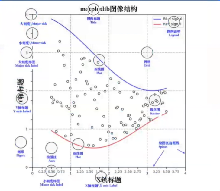
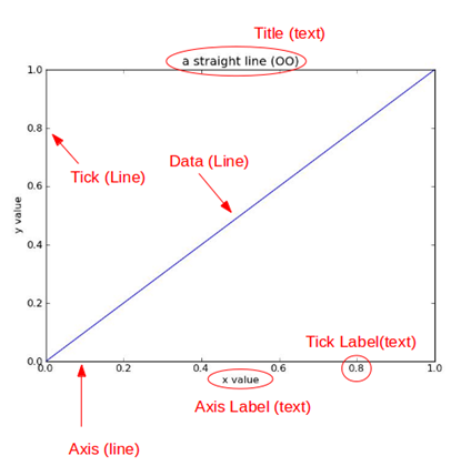
title为图像标题,Axis为坐标轴, Label为坐标轴标注,Tick为刻度线,Tick Label为刻度注释。
plt.plot( 数组 ) --> 图表窗口 plt.show( ) 、
% matplotlib inline 嵌入图表;    ---> plt.scatter(x, y)
% matplotlib notebook 可交互窗口;--->s.plot(style = 'k--o',figsize=(10,5))
% matplotlib qt5可交互性控制台; --->>df.hist(figsize=(12,5),color='g',alpha=0.8)
import numpy as np
import pandas as pd
import matplotlib.pyplot as plt

# 图表窗口1 → plt.show()

plt.plot(np.random.rand(10))
plt.show()
# 直接生成图表
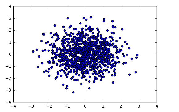
# 图表窗口2 → 魔法函数,嵌入图表

% matplotlib inline
x = np.random.randn(1000)
y = np.random.randn(1000)
plt.scatter(x,y)
# 直接嵌入图表,不用plt.show()
# <matplotlib.collections.PathCollection at ...> 代表该图表对象
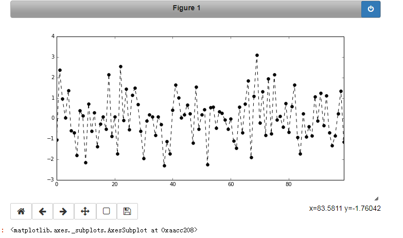
# 图表窗口3 → 魔法函数,弹出可交互的matplotlib窗口
% matplotlib notebook
s = pd.Series(np.random.randn(100))
s.plot(style='k--o', figsize=(10, 5))
# 可交互的matplotlib窗口,不用plt.show()
# 可做一定调整
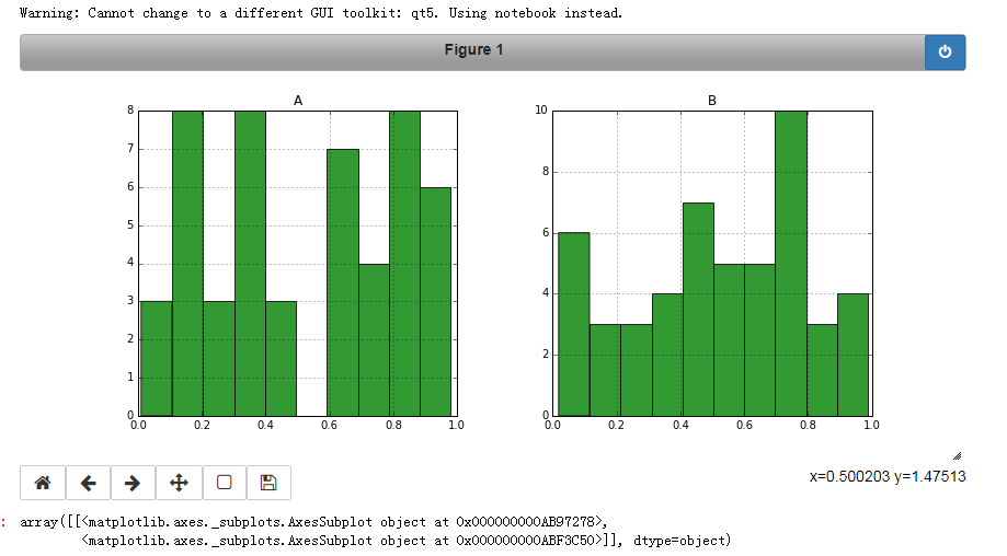
# 图表窗口4 → 魔法函数,弹出matplotlib控制台
% matplotlib qt5
df = pd.DataFrame(np.random.rand(50, 2),columns=['A', 'B'])
df.hist(figsize=(12, 5), color='g', alpha=0.8)

# 可交互性控制台
# 如果已经设置了显示方式(比如notebook),需要重启然后再运行魔法函数
# 网页嵌入的交互性窗口 和 控制台,只能显示一个

#plt.close()
# 关闭窗口

#plt.gcf().clear()
# 每次清空图表内内容
2.图表的基本元素
图名,图例,轴标签,轴边界,轴刻度,轴刻度标签等
plt.title(' ') #图名 、plt.xlabel('') #x轴标签、 plt.ylabel('') #y轴标签 、plt.legend(loc='upper right') #就是图例的位置 右上
plt.xlim([0, 12])x轴边界 、plt.ylim([0, 1.5]) y轴边界 、plt.xticks(range(10))设置x刻度 、plt.yticks([0, 0.2, 0.4, 0.6, 0.8, 1.0, 1.2])设置y刻度
fig.set_xticklabels("%.1f" %i for i in range(10))x轴刻度标签 ,使得其显示1位小数;
fig.set_yticklabels("%.2f" %i for i in [0, 0.2, 0.4, 0.6, 0.8, 1.0, 1.2])
xlim范围只是限制图表长度,xticks则是决定显示的标尺,刻度标签set_xticklabels决定显示的小数位数;
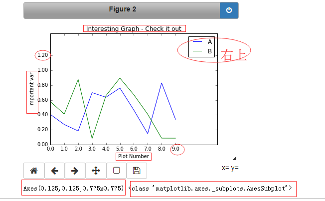
# 图名,图例,轴标签,轴边界,轴刻度,轴刻度标签等
df = pd.DataFrame(np.random.rand(10, 2), columns=['A', 'B'])
fig = df.plot(figsize=(6, 4)) # figsize:创建图表窗口,设置窗口大小; # 创建图表对象,并赋值与fig
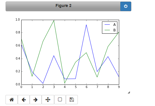
# 图名,图例,轴标签,轴边界,轴刻度,轴刻度标签等
df = pd.DataFrame(np.random.rand(10, 2), columns=['A', 'B'])
fig = df.plot(figsize=(6, 4)) # figsize:创建图表窗口,设置窗口大小;  #创建图表对象,并赋值与fig

plt.title('Interesting Graph - Check it out') #图名
plt.xlabel('Plot Number') #x轴标签
plt.ylabel('Important var') #y轴标签
plt.legend(loc='upper right') #就是图例的位置 右上


# 图例的几种显示方式,loc表示位置,分别表示位置。
# 'best'         : 0, (only implemented for axes legends)(自适应方式)
# 'upper right'  : 1,
# 'upper left'   : 2,
# 'lower left'   : 3,
# 'lower right'  : 4,
# 'right'        : 5,
# 'center left'  : 6,
# 'center right' : 7,
# 'lower center' : 8,
# 'upper center' : 9,
# 'center'       : 10,
plt.xlim([0, 12]) # x轴边界
plt.ylim([0, 1.5]) # y轴边界
plt.xticks(range(10)) # 设置x刻度
plt.yticks([0, 0.2, 0.4, 0.6, 0.8, 1.0, 1.2]) # 设置y刻度
fig.set_xticklabels("%.1f" %i for i in range(10)) # x轴刻度标签 ,使得其显示1位小数; 小数的显示方式变成字符串的形式显示了。
fig.set_yticklabels("%.2f" %i for i in [0, 0.2, 0.4, 0.6, 0.8, 1.0, 1.2]) # y轴刻度标签,使得y轴显示后边再加一位小数,之设置前有一位
# 范围只限定图表的长度,刻度则是决定显示的标尺 → 这里x轴范围是0-12,但刻度只是0-9,刻度标签使得其显示1位小数
# 轴标签则是显示刻度的标签
print(fig, type(fig))
其他元素可视化
弧度制、角度值,正弦/余弦函数
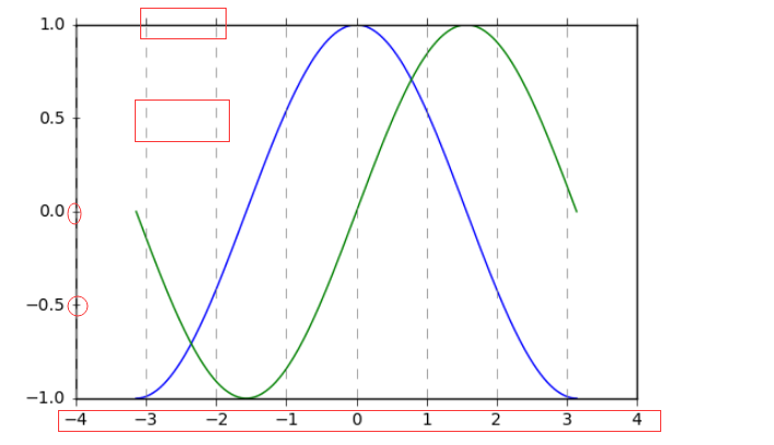
plt.grid(True, linestyle="--", color="gray", linewidth="0.5", axis='x')显示网格
plt.tick_params(bottom='on',top='off',left='on',right='off')就是4个坐标轴的刻度线是往里凸呢还是凹呢;刻度线的方向matplotlib.rcParams['xtick.direction'] = 'out'
frame.axes.get_xaxis().set_visible(False) x轴上的东西都隐藏了呗
plt.axis('off') # 关闭坐标轴
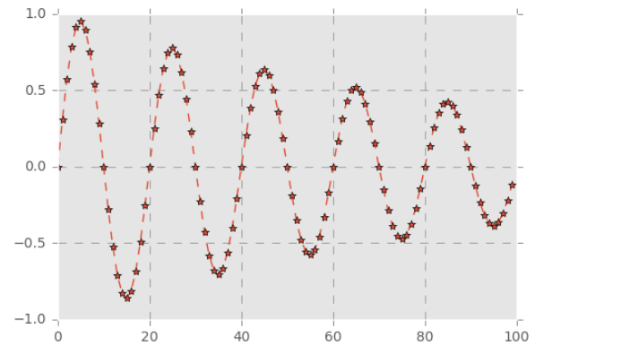
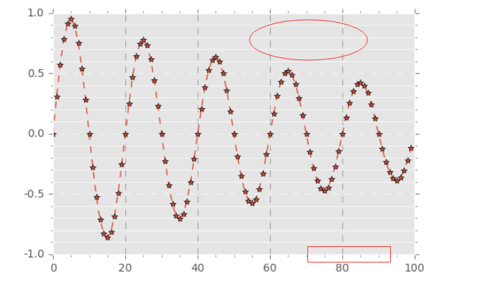
x = np.linspace(-np.pi,np.pi,256,endpoint = True) #pi值的是圆周率 π math.pi
c, s = np.cos(x), np.sin(x)  #这里用的是弧度制表示。
plt.plot(x, c)
plt.plot(x, s)
# plt.grid(True, linestyle="--", color="gray", linewidth="0.5", axis='x') # .grid是创建格网
# 通过ndarry创建图表

# 显示网格
# linestyle:线型
# color:颜色
# linewidth:宽度
# axis:x,y,both,显示x/y/两者的格网
plt.tick_params(bottom='on',top='off',left='on',right='off') #就是四个轴有刻度凸显出来,关掉网格线就看出来了
# 刻度显示
import matplotlib  # 这里需要导入matploltib,而不仅仅导入matplotlib.pyplot
matplotlib.rcParams['xtick.direction'] = 'out' # 设置刻度的方向: 在里边是in,  显示在外边就是out,  在中间就是inout
matplotlib.rcParams['ytick.direction'] = 'inout'
frame = plt.gca()
frame.axes.get_xaxis().set_visible(False)  # False是x/y 轴上的标签都不显示出来,
frame.axes.get_yaxis().set_visible(False)
# plt.axis('off') # 关闭坐标轴
3.图表的样式参数
linestyle、style、color、marker
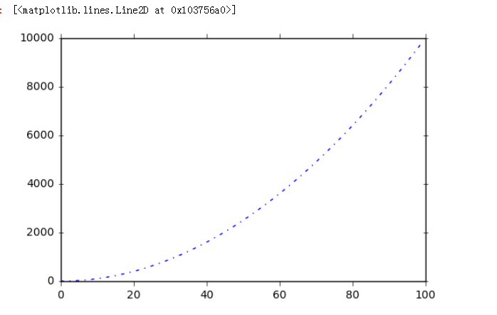
plt.plot([i**2 for i in range(100)],linestyle = '-.' )
linestyle参数 线型
plt.plot([i**2 for i in range(100)],
        linestyle = '-.')
# '-'       solid line style
# '--'      dashed line style
# '-.'      dash-dot line style
# ':'       dotted line style
marker参数 线上的点
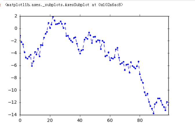
s.plot(linestyle = '--',marker = '.') 线上的点的形状呗
s = pd.Series(np.random.randn(100).cumsum()) #.cumsum()是累计求和
s.plot(linestyle = '--',
      marker = '.')
# '.'       point marker
# ','       pixel marker
# 'o'       circle marker
# 'v'       triangle_down marker
# '^'       triangle_up marker
# '<'       triangle_left marker
# '>'       triangle_right marker
# '1'       tri_down marker
# '2'       tri_up marker
# '3'       tri_left marker
# '4'       tri_right marker
# 's'       square marker
# 'p'       pentagon marker
# '*'       star marker
# 'h'       hexagon1 marker
# 'H'       hexagon2 marker
# '+'       plus marker
# 'x'       x marker
# 'D'       diamond marker
# 'd'       thin_diamond marker
# '|'       vline marker
# '_'       hline marker
color参数颜色
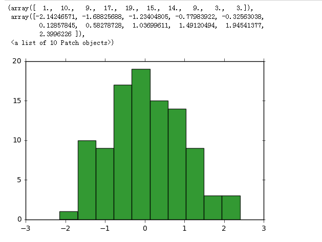
plt.hist(np.random.randn(100),color = 'g',alpha = 0.8) 常用颜色简写:red-r, green-g, black-k, blue-b, yellow-y
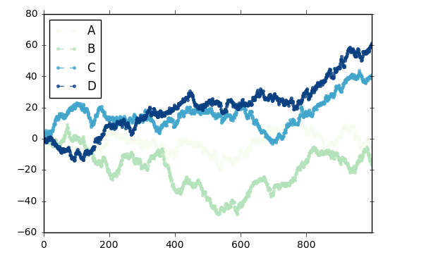
df.plot(style = '--.', alpha = 0.8, colormap = 'GnBu') colormap颜色板
plt.hist(np.random.randn(100),
        color = 'g',alpha = 0.8)# alpha:0-1,透明度
df = pd.DataFrame(np.random.randn(1000, 4), columns=list('ABCD'))
df = df.cumsum()
df.plot(style = '--.', alpha = 0.8, colormap = 'GnBu')
# colormap:颜色板,包括:
# Accent, Accent_r, Blues, Blues_r, BrBG, BrBG_r, BuGn, BuGn_r, BuPu, BuPu_r, CMRmap, CMRmap_r, Dark2, Dark2_r, GnBu, GnBu_r, Greens, Greens_r,
# Greys, Greys_r, OrRd, OrRd_r, Oranges, Oranges_r, PRGn, PRGn_r, Paired, Paired_r, Pastel1, Pastel1_r, Pastel2, Pastel2_r, PiYG, PiYG_r,
# PuBu, PuBuGn, PuBuGn_r, PuBu_r, PuOr, PuOr_r, PuRd, PuRd_r, Purples, Purples_r, RdBu, RdBu_r, RdGy, RdGy_r, RdPu, RdPu_r, RdYlBu, RdYlBu_r,
# RdYlGn, RdYlGn_r, Reds, Reds_r, Set1, Set1_r, Set2, Set2_r, Set3, Set3_r, Spectral, Spectral_r, Wistia, Wistia_r, YlGn, YlGnBu, YlGnBu_r,
# YlGn_r, YlOrBr, YlOrBr_r, YlOrRd, YlOrRd_r, afmhot, afmhot_r, autumn, autumn_r, binary, binary_r, bone, bone_r, brg, brg_r, bwr, bwr_r,
# cool, cool_r, coolwarm, coolwarm_r, copper, copper_r, cubehelix, cubehelix_r, flag, flag_r, gist_earth, gist_earth_r, gist_gray, gist_gray_r,
# gist_heat, gist_heat_r, gist_ncar, gist_ncar_r, gist_rainbow, gist_rainbow_r, gist_stern, gist_stern_r, gist_yarg, gist_yarg_r, gnuplot,
# gnuplot2, gnuplot2_r, gnuplot_r, gray, gray_r, hot, hot_r, hsv, hsv_r, inferno, inferno_r, jet, jet_r, magma, magma_r, nipy_spectral,
# nipy_spectral_r, ocean, ocean_r, pink, pink_r, plasma, plasma_r, prism, prism_r, rainbow, rainbow_r, seismic, seismic_r, spectral,
# spectral_r ,spring, spring_r, summer, summer_r, terrain, terrain_r, viridis, viridis_r, winter, winter_r

# 其他参数见“颜色参数.docx”
style参数,可以包含linestyle,marker,color
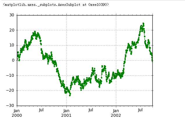
ts.plot(style = '--g.',grid=True) linestyle(-)线性,marker(.),color(g)颜色,grid=True是显示网格线
ts = pd.Series(np.random.randn(1000).cumsum(), index=pd.date_range('1/1/2000', periods=1000))
ts.plot(style = '--g.',grid=True)
# style → 风格字符串,这里包括了linestyle(-)线性,marker(.),color(g)颜色
# plot()内也有grid参数
整体风格样式
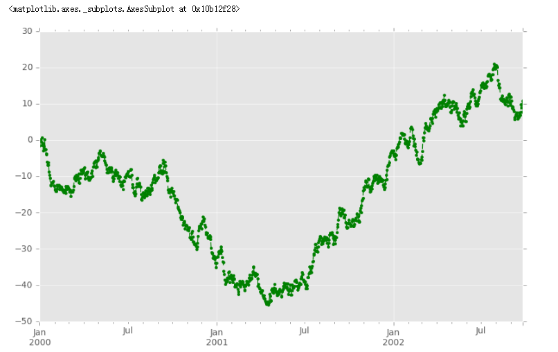
psl.use('ggplot')
import matplotlib.style as psl
print(plt.style.available) # 查看样式列表
psl.use('ggplot')
ts = pd.Series(np.random.randn(1000).cumsum(), index=pd.date_range('1/1/2000', periods=1000))
ts.plot(style = '--g.',grid = True,figsize=(10,6))  #一旦选用样式后,所有图表都会有样式,重启后才能关掉
所有的样式列表--->
['seaborn-bright', 'seaborn-notebook', 'seaborn-darkgrid', 'seaborn-ticks', 'seaborn-poster', 'seaborn-dark', 'grayscale', 'fivethirtyeight',
 'seaborn-paper', 'seaborn-whitegrid', 'seaborn-deep', 'ggplot', 'classic', 'bmh', 'dark_background', 'seaborn-colorblind', 'seaborn-white',
 'seaborn-muted', 'seaborn-dark-palette', 'seaborn-talk', 'seaborn-pastel']
4.刻度、注解、图表输出
主刻度、次刻度
刻度
subplot(2,2,1) 前面俩参数指定的是一个画板被分割成的行和列,后面一个参数则指的是当前正在绘制的编号!
ax.xaxis.set_major_locator(xmajorLocator)设置x轴主刻度、 xmajorLocator = MultipleLocator(20) 将x主刻度标签设置为20的倍数
ax.xaxis.set_major_formatter(xmajorFormatter)设置x轴标签文本格式 、 xmajorFormatter = FormatStrFormatter('%.0f')设置x轴标签文本的格式
ax.xaxis.set_minor_locator(xminorLocator)设置x轴次刻度、 xminorLocator   = MultipleLocator(5) # 将x轴次刻度标签设置为5的倍数
ax.xaxis.grid(True, which='majpr') #x坐标轴的网格使用(就是纵横交错的网格线)主刻度 both、minor(只显示次刻度)、majpr(只显示主刻度)
ax.xaxis.set_major_formatter(plt.NullFormatter()) 删除x坐标轴的刻度显示
from matplotlib.ticker import MultipleLocator, FormatStrFormatter

t = np.arange(0.0, 100.0, 1)
s = np.sin(0.1*np.pi*t)*np.exp(-t*0.01)
ax = plt.subplot(111) #注意:一般都在ax中设置,不再plot中设置
plt.plot(t,s,'--*')
plt.grid(True, linestyle = "--",color = "gray", linewidth = "0.5",axis = 'both')
# 网格
#plt.legend()  # 图例
xmajorLocator = MultipleLocator(20) # 将x主刻度标签设置为10的倍数
xmajorFormatter = FormatStrFormatter('%.0f') # 设置x轴标签文本的格式
xminorLocator   = MultipleLocator(5) # 将x轴次刻度标签设置为5的倍数
ymajorLocator = MultipleLocator(0.5) # 将y轴主刻度标签设置为0.5的倍数
ymajorFormatter = FormatStrFormatter('%.1f') # 设置y轴标签文本的格式
yminorLocator   = MultipleLocator(0.1) # 将此y轴次刻度标签设置为0.1的倍数

ax.xaxis.set_major_locator(xmajorLocator)  # 设置x轴主刻度
ax.xaxis.set_major_formatter(xmajorFormatter)  # 设置x轴标签文本格式
ax.xaxis.set_minor_locator(xminorLocator)  # 设置x轴次刻度
ax.yaxis.set_major_locator(ymajorLocator)  # 设置y轴主刻度
ax.yaxis.set_major_formatter(ymajorFormatter)  # 设置y轴标签文本格式
ax.yaxis.set_minor_locator(yminorLocator)  # 设置y轴次刻度ax.xaxis.grid(True, which='majpr') #x坐标轴的网格使用(就是纵横交错的网格线)主刻度 both、minor(只显示次刻度)、majpr(只显示主刻度)
ax.yaxis.grid(True, which='minor') #y坐标轴的网格使用次刻度

# which:格网显示

#删除坐标轴的刻度显示
#ax.yaxis.set_major_locator(plt.NullLocator())
# ax.xaxis.set_major_formatter(plt.NullFormatter())
注解
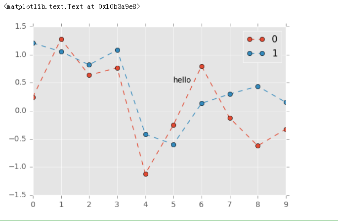
plt.text(5,0.5,'hello',fontsize=10) 参数是注释在坐标系中的位置和大小:(5,0.5)
df = pd.DataFrame(np.random.randn(10,2))
df.plot(style = '--o')
plt.text(5,0.5,'hello',fontsize=10)
# 注解 → 横坐标,纵坐标,注解字符串
图表输出
plt.savefig('C:/Users/Administrator/Desktop/pic.png',
            dpi=400,  #分表率;
            bbox_inches = 'tight', #剪出周围的空白
            facecolor = 'g', #图像的背景色
            edgecolor = 'b') #图片的edgecolor
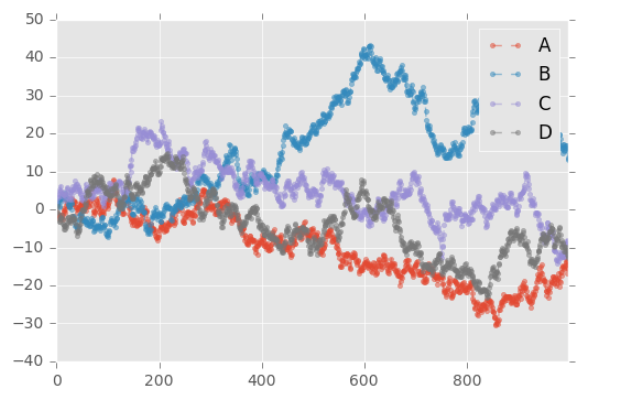
df = pd.DataFrame(np.random.randn(1000, 4), columns=list('ABCD'))
df = df.cumsum()
df.plot(style = '--.',alpha = 0.5)
plt.legend(loc = 'upper right')
plt.savefig('C:/Users/Administrator/Desktop/pic.png',
            dpi=400,
            bbox_inches = 'tight',
            facecolor = 'g',
            edgecolor = 'b')
# 可支持png,pdf,svg,ps,eps…等,以后缀名来指定
# dpi是分辨率
# bbox_inches:图表需要保存的部分。如果设置为‘tight’,则尝试剪除图表周围的空白部分。
# facecolor,edgecolor: 图像的背景色,默认为‘w’(白色)
5.子图
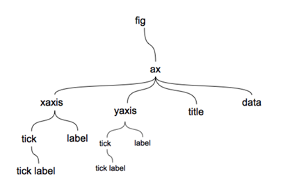
在matplotlib中,整个图像为一个Figure对象
在Figure对象中可以包含一个或者多个Axes对象
每个Axes(ax)对象都是一个拥有自己坐标系统的绘图区域
plt.figure, plt.subplot
# plt.figure() 绘图对象
# plt.figure(num=None, figsize=None, dpi=None, facecolor=None, edgecolor=None,
# frameon=True, FigureClass=<class 'matplotlib.figure.Figure'>, **kwargs)
fig1 = plt.figure(num=1,figsize=(4,2))
plt.plot(np.random.rand(50).cumsum(),'k--')
fig2 = plt.figure(num=2,figsize=(4,2))
plt.plot(50-np.random.rand(50).cumsum(),'k--')
# num:图表序号,如果他们两个的序号一样,曲线就会显示在一张图片里边;如果把num都去掉,则跟num=1和num=2是一样的效果。
# figsize:图表大小

# 当我们调用plot时,如果设置plt.figure(),则会自动调用figure()生成一个figure, 严格的讲,是生成subplots(111)
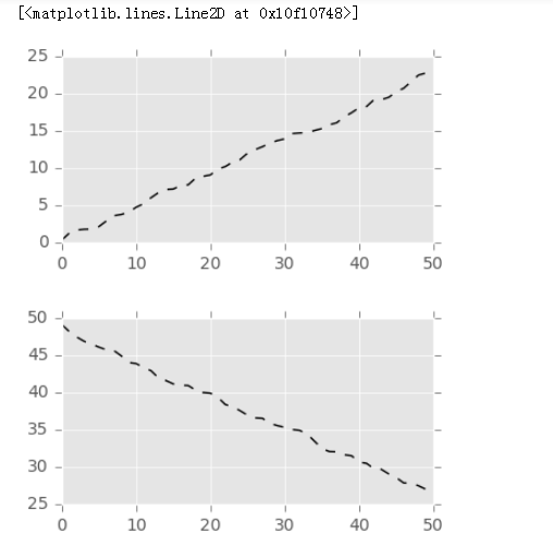
fig.add_subplot(2,2,1)生成创建好的图表figure() 2*2的矩阵表格,第1个个位置 、 plt.plot(np.random.rand(50).cumsum(),'k--')往上边画线,填图
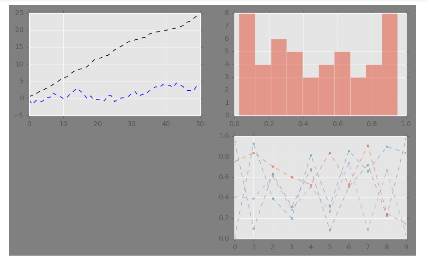
# 子图创建1 - 先建立子图然后填充图表

fig = plt.figure(figsize=(10,6),facecolor = 'gray')

ax1 = fig.add_subplot(2,2,1)  # 第一行的左图
plt.plot(np.random.rand(50).cumsum(),'k--')
plt.plot(np.random.randn(50).cumsum(),'b--')
# 先创建图表figure,然后生成子图,(2,2,1)代表创建2*2的矩阵表格,然后选择第一个,顺序是从左到右从上到下
# 创建子图后绘制图表,会绘制到最后一个子图

ax2 = fig.add_subplot(2,2,2)  # 第一行的右图
ax2.hist(np.random.rand(50),alpha=0.5)

ax4 = fig.add_subplot(2,2,4)  # 第二行的右图
df2 = pd.DataFrame(np.random.rand(10, 4), columns=['a', 'b', 'c', 'd'])
ax4.plot(df2,alpha=0.5,linestyle='--',marker='.')
# 也可以直接在子图后用图表创建函数直接生成图表
---->
[<matplotlib.lines.Line2D at 0x13bbb240>,
 <matplotlib.lines.Line2D at 0x13bbb390>,
 <matplotlib.lines.Line2D at 0x13bbb5f8>,
 <matplotlib.lines.Line2D at 0x13bbb780>]
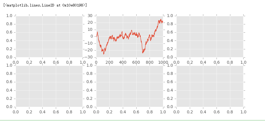
fig, axes = plt.subplots(2,3,figsize=(10,4)) 创建2*3个fig图,2*3个数组。--->> ax1 = axes[0,1] ---> ax1.plot(ts) 在[0,1]的图中绘线
# 子图创建2 - 创建一个新的figure,并返回一个subplot对象的numpy数组 → plt.subplot

fig,axes = plt.subplots(2,3,figsize=(10,4))
ts = pd.Series(np.random.randn(1000).cumsum())
print(axes, axes.shape, type(axes))  # 生成图表对象的数组,2行3列的数组
print(fig,type(fig)---->>>  Figure(720x288)   <class 'matplotlib.figure.Figure'>
ax1 = axes[0,1] #表示在第一行第二个图片绘制图线。
ax1.plot(ts)
---------------->>>>>>>>>>
[[<matplotlib.axes._subplots.AxesSubplot object at 0x000000000BB5A4A8>
  <matplotlib.axes._subplots.AxesSubplot object at 0x000000000C08B240>
  <matplotlib.axes._subplots.AxesSubplot object at 0x000000000C0D6550>]
 [<matplotlib.axes._subplots.AxesSubplot object at 0x000000000C10CDD8>
  <matplotlib.axes._subplots.AxesSubplot object at 0x000000000C15B160>
  <matplotlib.axes._subplots.AxesSubplot object at 0x000000000C190DA0>]] (2, 3) <class 'numpy.ndarray'>
plt.subplots( ),参数调整,是否共享坐标轴
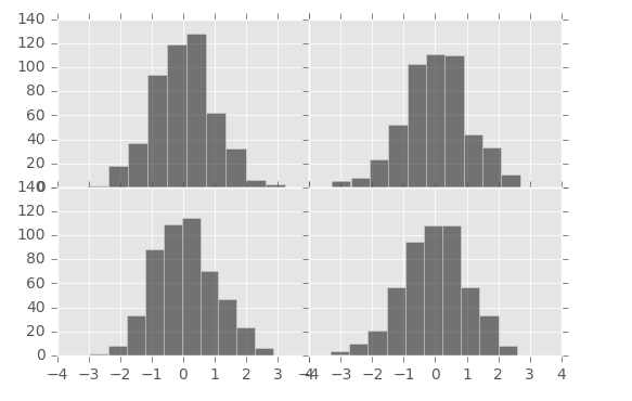
fig, axes = plt.subplots(2, 2, sharex=True, sharey=True)# sharex,sharey:是否共享x,y刻度
fig, axes = plt.subplots(2, 2, sharex=True, sharey=True)# sharex,sharey:是否共享x,y刻度
for i in range(2):
    for j in range(2):
        axes[i, j].hist(np.random.randn(500), color='k', alpha=0.5)
plt.subplots_adjust(wspace=0,hspace=0)
# wspace,hspace:用于控制宽度和高度的百分比,比如subplot之间的间距
df.plot(style = '--.', alpha=0.4, grid=True, figsize = (8, 8),
       subplots = True, #为False时是绘制到了一张图上面
       layout = (2,3),# 2*3的矩阵填充图
       sharex = False) #不共享x轴
plt.subplots_adjust(wspace=0,hspace=0.2) ##wspace是子图之间的横向间距,hspace是子图之间的竖直间距。
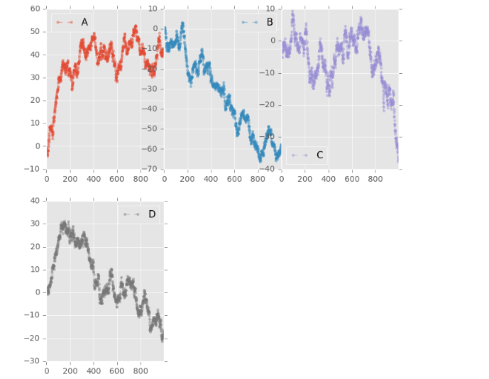
# 子图创建3 - 多系列图,分别绘制
df = pd.DataFrame(np.random.randn(1000, 4), index=ts.index, columns = list('ABCD'))
df = df.cumsum()
df.plot(style = '--.', alpha=0.4, grid=True, figsize = (8, 8),
       subplots = True, #为False时是绘制到了一张图上面
       layout = (2,3),
       sharex = False)
plt.subplots_adjust(wspace=0,hspace=0.2) ##wspace是子图之间的横向间距,hspace是子图之间的竖直间距。
# plt.plot()基本图表绘制函数 → subplots,是否分别绘制系列(子图)
# layout:绘制子图矩阵,按顺序填充

 浙公网安备 33010602011771号