element-ui dialog对话框组件的具体使用
element-ui dialog对话框组件的具体使用
对话框的格式:
<el-dialog>
</el-dialog>
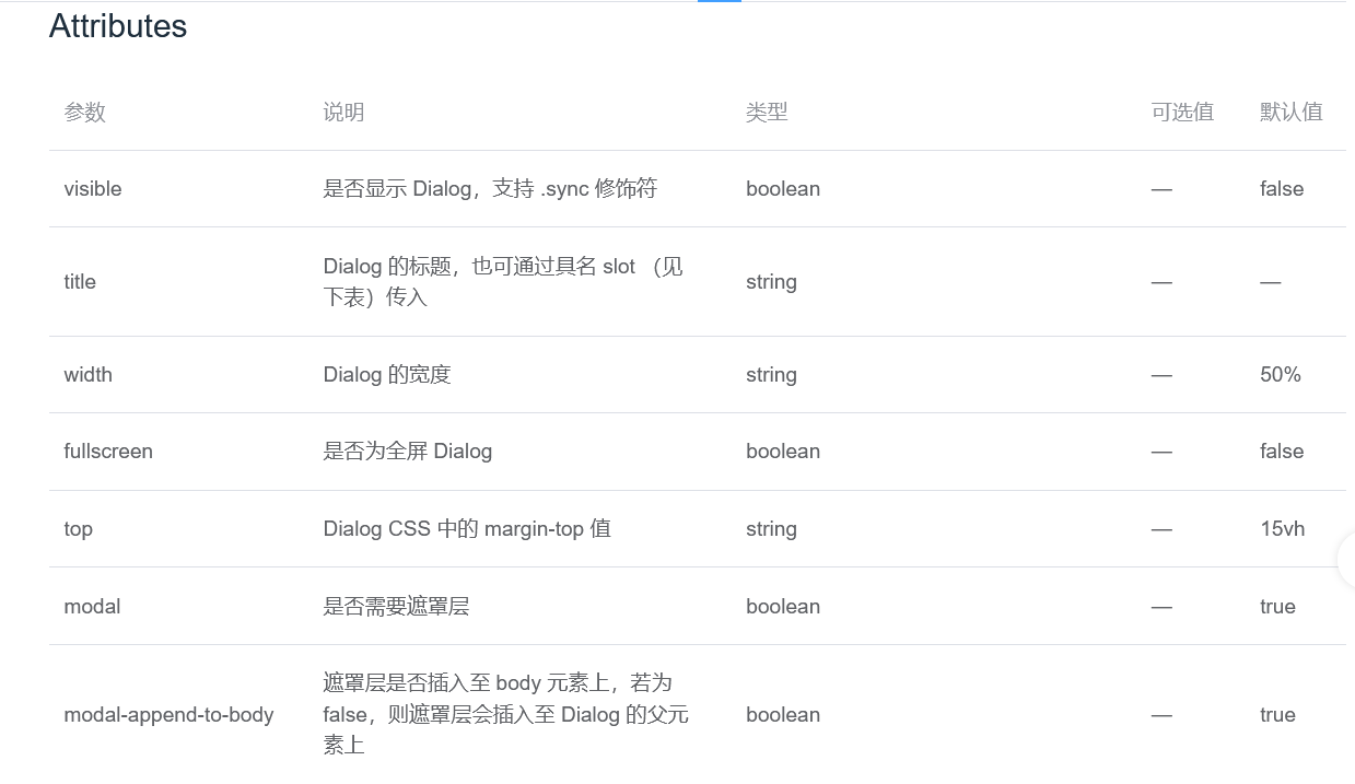
dialog的属性

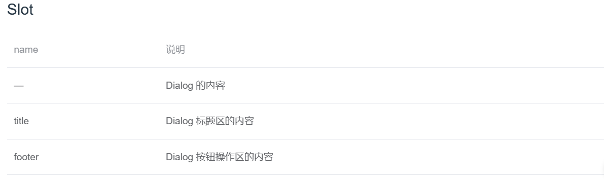
dialog的插槽
插槽比较常用
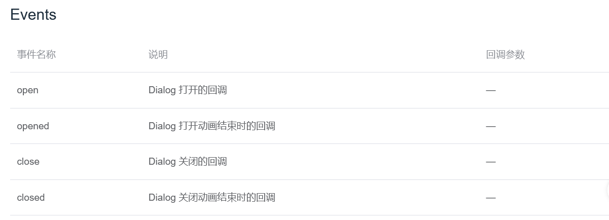
dialog的事件
常用属性与事件的说明
属性
:visible.sync="dialogVisible"   是否显示对话框,.sync修饰符实时更新数据
				参数为boolean类型,为true时显示对话框,为false不显示对话框
:titel="title"			对话框的标题,参数为string类型
width="30%"			对话框的宽度
:append-to-body="true"		对话框自身是否插入到body元素中,(嵌套的对话框该属性必须为true,默认为false)
:before-close="function()"      关闭前的回调,会暂停对话框的关闭,是处理对话框中关闭按钮的事件
事件
@close="function()"		对话框关闭的回调,一般用于清空弹窗中的数据
实例
父组件
<template>
  <div class="app-container">
    <div class="the-container">
      <div>
        <el-button type="primary" @click="openDialog">打开对话框</el-button>
      </div>
    </div>
    <Dialog ref="dialog" />
  </div>
</template>

<script>
import Dialog from './dialog'
export default {
  name: 'Index',
  components: {
    Dialog
  },
  data() {
    return {
    }
  },
  methods: {
    openDialog() {
      this.$refs.dialog.show()
    }
  }
}
</script>

<style lang="scss" scoped>
  .app-container{
    height: 100%;
    background-color: #f1f1f1;
  }
  .the-container{
    height: 100%;
    background-color: #fff;
    padding: 20px;
    display: flex;
    justify-content: center;
  }
</style>
子组件
<template>
  <el-dialog
    title="提示"
    :visible="dialogVisible"
    width="30%"
    :append-to-body="true"
    @close="handleClose"
  >
    <span>这一个对话框测试</span>
    <span slot="footer" class="dialog-footer">
      <el-button @click="dialogVisible = false">取 消</el-button>
      <el-button type="primary" @click="dialogVisible = false">确 定</el-button>
    </span>
  </el-dialog>

</template>

<script>
export default {
  name: 'Dialog',
  data() {
    return {
      dialogVisible: false
    }
  },
  methods: {
    show() {
      this.dialogVisible = true
    },
    handleClose() {
      this.dialogVisible = false
      console.log('close')
    }
  }
}
</script>

<style scoped>

</style>

 浙公网安备 33010602011771号