今天被微信启动页刷屏了。
一直还以为启动页背景显示的月球的 。今天才了解到这么有含义。
我也蹭一下微信的热度,做一个HTML+CSS版本的。
用CSS画地球太困难了 ,来个简单点的,天王星版。
主要使用到css3的渐变,阴影,圆角等属性
演示地址:
http://suohb.com/work/weixin.html
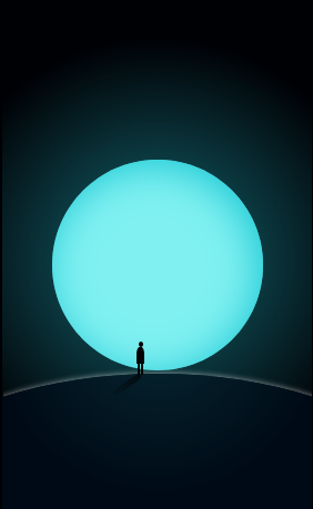
效果图如下:
源码:
  1 <!doctype html>
  2 <html>
  3 <head>
  4 <meta http-equiv="Pragma" content="no-cache" />
  5 <meta http-equiv="Cache-Control" content="no-cache" />
  6 <meta http-equiv="Expires" content="0" />
  7 <meta http-equiv="Content-Type" content="text/html;charset=utf-8" />
  8 <meta name="viewport" content="width=device-width,initial-scale=1.0,user-scalable=no" />
  9 <style type="text/css">
 10 #box2{
 11     position:relative;
 12     margin:0 auto;
 13     width:279px;
 14     height:497px;
 15     background:radial-gradient(circle,#10535b 15%,#000105 70%);
 16     overflow:hidden;
 17 }
 18 .earth {
 19     position: absolute;
 20     left: 45px;
 21     top: 158px;
 22     width: 190px;
 23     height: 190px;
 24     border-radius: 50%;
 25     background: #80f0f1;
 26     box-shadow:inset -5px 5px 75px #1dc9d5;
 27 }
 28 .moon {
 29     position: absolute;
 30     left: 50%;
 31     transform: translateX(-50%);
 32     top: 351px;
 33     width: 631px;
 34     height: 403px;
 35     border-radius: 50%;
 36     background: #000b17;
 37     box-shadow: 0 0px 5px rgba(255,255,255,.6);
 38     overflow:hidden;
 39 }
 40 .moon > div{
 41     position:absolute;
 42     left: 50%;
 43     transform: translateX(-50%);
 44     top: -60%;
 45     width: 631px;
 46     height: 403px;
 47     background:radial-gradient(circle,#10535b 1%,#000b17 40%);
 48     opacity:.4;
 49 }
 50 .man {
 51     position: absolute;
 52     left: 125px;
 53     top: 322px;
 54 }
 55 .man > div:nth-child(1){
 56     position:absolute;
 57     left:-0.5px;
 58     transform:translateX(-50%);
 59     width:4px;
 60     height:5px;
 61     border-radius:50%;
 62     background:#030305;
 63 }
 64 .man > div:nth-child(2){
 65     position:absolute;
 66     left:-1px;
 67     top:5px;
 68     transform:translateX(-50%);
 69     width:7px;
 70     height:15px;
 71     border-top-left-radius:40%;
 72     border-top-right-radius:40%;
 73     border-bottom-left-radius:30;
 74     background:#030305;
 75 }
 76 .man > div:nth-child(3){
 77     position:absolute;
 78     left:-1px;
 79     top:19px;
 80     transform:translateX(-50%);
 81     width:1px;
 82     height:11px;
 83     border-left:2px solid #030305;
 84     border-right:2px solid #030305;
 85 }
 86 .man > div:nth-child(4){
 87     position:absolute;
 88     left:0;
 89     top:30px;
 90     transform-origin:center 0%;
 91     transform:translateX(-48%) rotate(55deg);
 92     width:6px;
 93     height:30px;
 94     background:linear-gradient(rgba(3,3,3,.7),rgba(3,3,3,.1));
 95     border-radius:40%;
 96 }
 97 </style>
 98 </head>
 99 <body bgcolor="#000105">
100 <div id="box2">
101     <div class="moon"><div></div></div>
102     <div class="earth"></div>
103     <div class="man">
104         <div></div>
105         <div></div>
106         <div></div>
107         <div></div>
108     </div>
109 </div>
110 <script>
111 </script>
112 </body>
113 </html>
更多特效请关注我的公众号 :