

二次封装 Vue-Treeselect 组件
场景
开发中多个地方都需要用到 vue-treeselect组件,于是想二次封装成 SelectTree 组件便于使用。
需求1:自定义选项样式
插槽 option-label
SelectTree组件预留插槽 `diy-option`
      <label
        slot="option-label"
        slot-scope="{ node, shouldShowCount, labelClassName, countClassName }"
        :class="labelClassName"
      >
        <!-- 可自定义选项内容 -->
        <slot name="diy-option" v-bind="{ node, shouldShowCount, countClassName }">
          {{ node.label }}
          <span v-if="shouldShowCount" :class="countClassName">({{ node.children.length }})</span>
        </slot>
      </label>
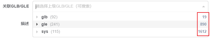
样式一:展示选项的附加信息
使用SelectTree组件
                <template v-slot:diy-option="{ node, shouldShowCount, countClassName }" v-if="item.showAttachInfo">
                  <div class="option-left">
                    {{ node.label }}
                    <span v-if="shouldShowCount" :class="countClassName">({{ node.children.length }})</span>
                  </div>
                  <div class="option-right">{{ node.raw[item.attachField] }}</div>
                </template>
注意
这里暴露的 node 指的是 normalizer 中的数据,即包含 id, label, children 属性的对象。
如果要使用 options 中的其他数据 xxx,则要用 node.raw.xxx 来表示。
页面效果:
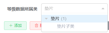
样式二:某些选项置灰
绑定动态类名 `gray`
                <template v-slot:diy-option="{ node, shouldShowCount, countClassName }">
                  <span :class="{ gray: !node.raw.releRankFlag }">{{ node.label }}</span>
                  <span v-if="shouldShowCount" :class="countClassName">({{ node.children.length }})</span>
                </template>
页面效果
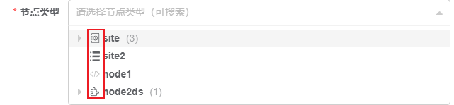
样式三:给选项添加前置图标
使用 `SvgIcon` 组件
                <template v-slot:diy-option="{ node, shouldShowCount, countClassName }">
                  <svg-icon :icon-class="node.raw['icon']" />
                  {{ node.label }}
                  <span v-if="shouldShowCount" :class="countClassName">({{ node.children.length }})</span>
                </template>
页面效果
需求2:自定义输入框的值
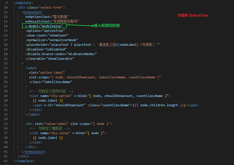
插槽 value-label
SelectTree组件预留插槽 `diy-value`
      <div slot="value-label" slot-scope="{ node }">
        <!-- 可自定义值标签 -->
        <slot name="diy-value" v-bind="{ node }">
          {{ node.label }}
        </slot>
      </div>
样式:给输入框添加前置图标
使用SelectTree组件
                <!-- 给输入框文本加上前缀图标 -->
                <template v-slot:diy-value="{ node }">
                  <svg-icon :icon-class="node.raw.icon" />
                  {{ node.raw.name  }}
                </template>
页面效果
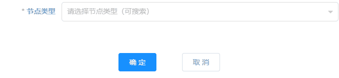
需求3:是否可选择有子项的节点 :disable-branch-nodes="disBranchNodes"
需求4:是否显示子项的数量 :show-count="showCount"
需求5:是否禁用 :disabled="isDisabled"
需求6:是否显示可清空按钮 :clearable="showClearable"
需求7:设置默认文本
noOptionsText="暂无数据"
noResultsText="未搜索到匹配项"
:placeholder="placeText ? placeText : 请选择上级${this.nodeLabel}(可搜索)"
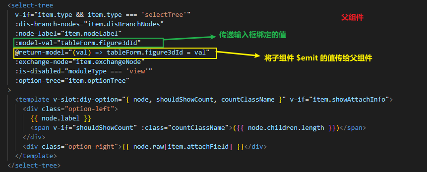
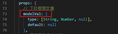
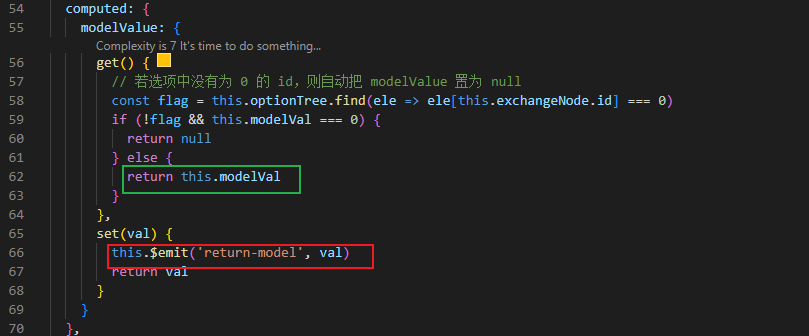
问题:父组件给 SelectTree传递输入框要绑定的值 val,SelectTree把 val用 v-model 双向绑定给 treeselect。选择值后 val 会改变。报错:不允许直接更改父组件通过 prop 传递的数据。
原因:Vue 单向数据流,父组件传递给子组件的数据,子组件不能直接更改。
解决办法:子组件可以设置计算属性返回传递的 prop 数据。
注意:在这里选择值后需要把新值传递给父组件,因此计算属性要设置 setter。
本文来自博客园,作者:shayloyuki,转载请注明原文链接:https://www.cnblogs.com/shayloyuki/p/16856713.html
posted on 2022-11-04 10:38 shayloyuki 阅读(966) 评论(0) 编辑 收藏 举报

