
python 用 matplotlib 绘制 复合条饼图 实例详解
软件版本:
0、import
import numpy as np
import matplotlib as mpl
import matplotlib.pyplot as plt
from matplotlib import cm
from matplotlib.patches import ConnectionPatch
1、绘图
# 使图表元素中正常显示中文
mpl.rcParams['font.sans-serif'] = 'SimHei'
# 使坐标轴刻度标签正常显示负号
mpl.rcParams['axes.unicode_minus'] = False
# -------------------------------- 创建画布,划分子区 --------------------------------
fig = plt.figure(figsize=(12, 8),
facecolor='cornsilk'
)
ax1, ax2 = fig.subplots(nrows=1,
ncols=2
)
# ------------------------------------- 绘制饼图 -------------------------------------
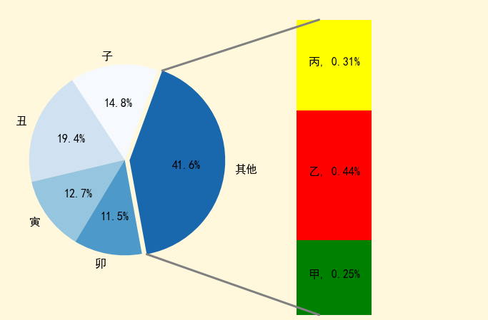
sales = [138, 181, 118, 107, 387]
labels = ['子', '丑', '寅', '卯', '其他']
#
ax1.pie(x=sales, # 数据
autopct='%1.1f%%', # 锲形块的数据标签格式
startangle=70, # 锲形块开始角度
labels=labels,
colors=cm.Blues(range(1, 300, 50)),
explode=[0, 0, 0, 0, 0.05], # 分裂距离
textprops={'color': 'k',
'fontsize': 16},
)
# ------------------------------------- 绘制条形图 -------------------------------------
sales = [98, 170, 119]
labels = ['甲', '乙', '丙']
colors = ['green', 'red', 'yellow']
xpos = 0
bottom = 0
for j, _ in enumerate(sales):
ration = sales[j]/sum(sales)
ax2.bar(x=xpos,
height=ration,
width=0.5,
bottom=bottom,
color=colors[j]
)
ypos = bottom + ax2.patches[j].get_height() / 2
bottom += ration # 通过自增,实现堆积柱形的效果
# 添加数据标签
ax2.text(x=xpos, # 标签文本的横轴坐标
y=ypos, # 竖轴坐标
s='%s, %3.2f%%' % (labels[j], ax2.patches[j].get_height()), # 标签的文本内容
fontsize=16,
ha='center', # horizontal alignment
)
ax2.axis('off') # 关闭坐标轴
# 设置刻度范围
ax2.set_xlim(xmin=-0.6,
xmax=1
)
# ------------------------------------- 绘制连接线 -------------------------------------
# 获取锲形块的数据
theta1, theta2 = ax1.patches[-1].theta1, ax1.patches[-1].theta2
center, r = ax1.patches[-1].center, ax1.patches[-1].r
bar_height = sum([item.get_height() for item in ax2.patches])
# 上连接线
x = r * np.cos(np.pi / 180 * theta2) + center[0]
y = np.sin(np.pi / 180 * theta2) + center[1]
con1 = ConnectionPatch(xyA=(-width / 2, bar_height),
coordsA=ax2.transData,
xyB=(x, y),
coordsB=ax1.transData
)
# 下连接线
x = r * np.cos(np.pi / 180 * theta1) + center[0]
y = np.sin(np.pi / 180 * theta1) + center[1]
con2 = ConnectionPatch(xyA=(-width / 2, 0),
coordsA=ax2.transData,
xyB=(x, y),
coordsB=ax1.transData
)
# 添加连接线
for con in [con1, con2]:
con.set_color('gray')
ax2.add_artist(con)
con.set_linewidth(3)
# 调整子区布局
fig.subplots_adjust(wspace=0)
# 显示图形
plt.show()
图形:
非学无以广才,非志无以成学。

 浙公网安备 33010602011771号