格式与布局
2018-01-11 16:07 看看乖哦 阅读(139) 评论(0) 编辑 收藏 举报2018.1.11
格式与布局
1,position:fixed
锁定位置:相对于浏览器位置(如浏览器右下角)
<head>
<meta http-equiv="Content-Type" content="text/html; charset=utf-8" />
<title>无标题文档</title>

<style type="text/css">
    #a
        {
             border:5px solid blue;
             width:100px;
             height:100px;
             margin:10px;
             background-color:#0f3;
             left:30px;
             bottom:20px;
             position:fixed;

            }
</style>

</head>
<body>
    <div id="a">
    </div>

</body>
</html>
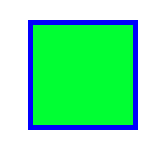 试图效果
试图效果
2,position:absolute
a,外层没有position:absolute(或relative);那么div相对于浏览器定位,如下图a。
b,外层有position:absolute(或relative);那么div相对于外层边框定位,如下图中aa
<head>
<meta http-equiv="Content-Type" content="text/html; charset=utf-8" />
<title>无标题文档</title>

<style type="text/css">
    .a
        {
             border:5px solid blue;
             width:100px;
             height:100px;
             margin:10px;
             background-color:#0f3;
             right:50px;
             bottom:20px;
             position:absolute;

            }
    .b
        {
            border:2px solid red;
            width:400px;
            height:200px;

            }
    .c
        {
            border:2px solid  red;
            width:400px;
            height:200px;
            position:absolute;

            }
</style>

</head>
<body>
    <div class="b">b
        <div class="a">a
        </div>
    </div>
    <div class="c">c
        <div class="a">aa

        </div>
    </div>

</body>
</html>
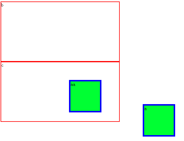 视觉效果
视觉效果
3,position:relative
相对与默认位置的移动。如下图,a在用relative移动位置,aa为用relative移动位置后,aa距原位置上部间距50px,左部间距50px。
<style type="text/css">
    #a
        {
             border:5px solid blue;
             width:100px;
             height:100px;
             margin:10px;
             background-color:#0f3;
             position:fixed;

            }
    #aa
        {
            border:5px solid blue;
            width:100px;
            height:100px;
            marfin:10px;
            background-color:#0f3;
            left:20px;
            top:50px;
            position:relative;

            }

</style>

</head>
<body>
    <div id="a">a

    </div>
    <div id="aa">aa

    </div>

</body>
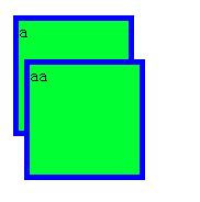 视觉效果
视觉效果
4,分层(z-index)
在z轴方向分层,可理解成分成一叠纸,层数越高越靠上。
在上面relative的事例中,我们看到aa盖住了a,只是因为后写的代码会覆盖前面的,那么在不改变代码顺序的情况下如何让a盖住aa
<style type="text/css">
    #a
        {
             border:5px solid blue;
             width:100px;
             height:100px;
             margin:10px;
             background-color:#0f3;
             position:fixed;
             z-index:2;
            }
    #aa
        {
            border:5px solid blue;
            width:100px;
            height:100px;
            marfin:10px;
            background-color:#0f3;
            left:20px;
            top:50px;
            position:relative;

            }

</style>

</head>
<body>
    <div id="a">a

    </div>
    <div id="aa">aa

    </div>

</body>
 视觉效果
视觉效果
5,float:left,right
overflow:hidden;超出部分隐藏;scroll显示出滚动条;
<div style="clear:both"></div>截断流
6,半透明效果
<style type="text/css">


</style>

</head>
<body>
        <div style="width:200px; height:200px; background-color:#0C0; clear:both; display:block;border-radius:40px; box-shadow:30px 30px 200px #CC0000;"></div>

</body>
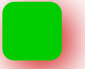 视觉效果
视觉效果
7,鼠标移动到上面的形成特效
cursor :pointer
