react native layout
官方文档:https://reactnative.dev/docs/flexbox/#absolute--relative-layout
另外一片文档:https://medium.com/wix-engineering/the-full-react-native-layout-cheat-sheet-a4147802405c
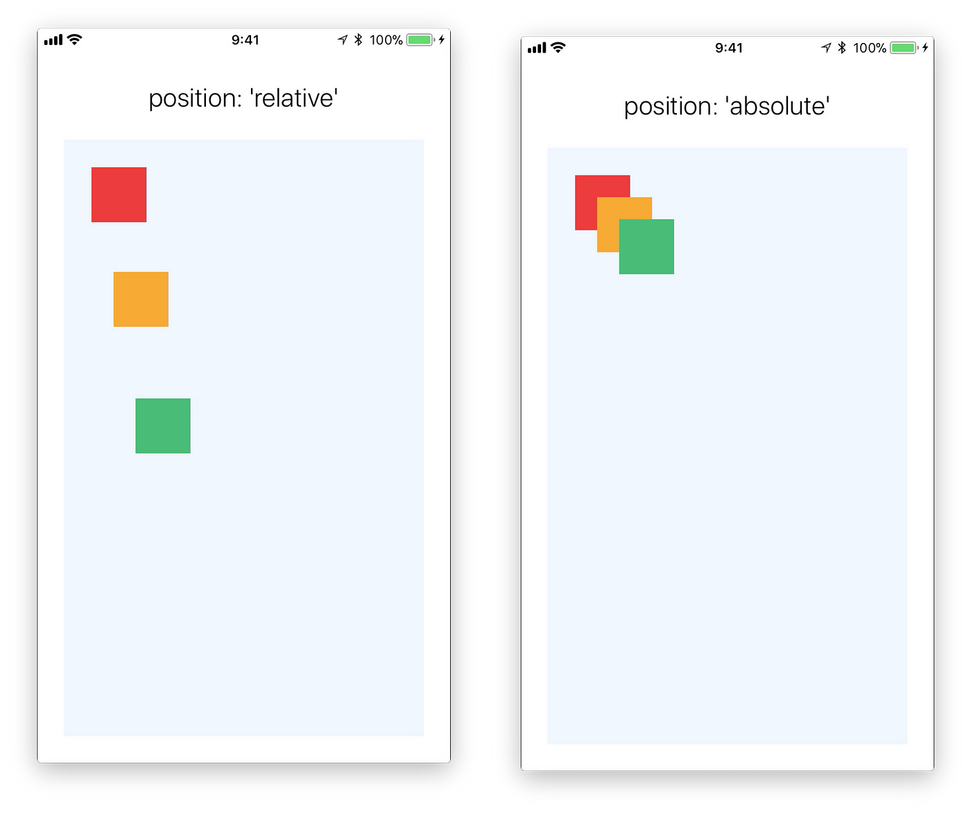
需要注意的是position的relative的含义:它是先计算没有设定position的时候的位置,然后基于这个位置再加上top, bottom, left, right的值得到的结果,不是简单的根据sibling计算的。
-----------------------------------------------------------------------------------------
As a newbie in React Native I found myself time after time going back to React Native layout docs, struggling to understand and master the difference between all the different props. justify vs align, relative vs absolute, items vs content, It was all very confusing… 😟
So I prepared this visual guide with all of the important props, including some playgrounds where you can play around with them. I hope that it will help you during the learning process or just as a cheat sheet when you will want to refresh your memory.
flexDirection
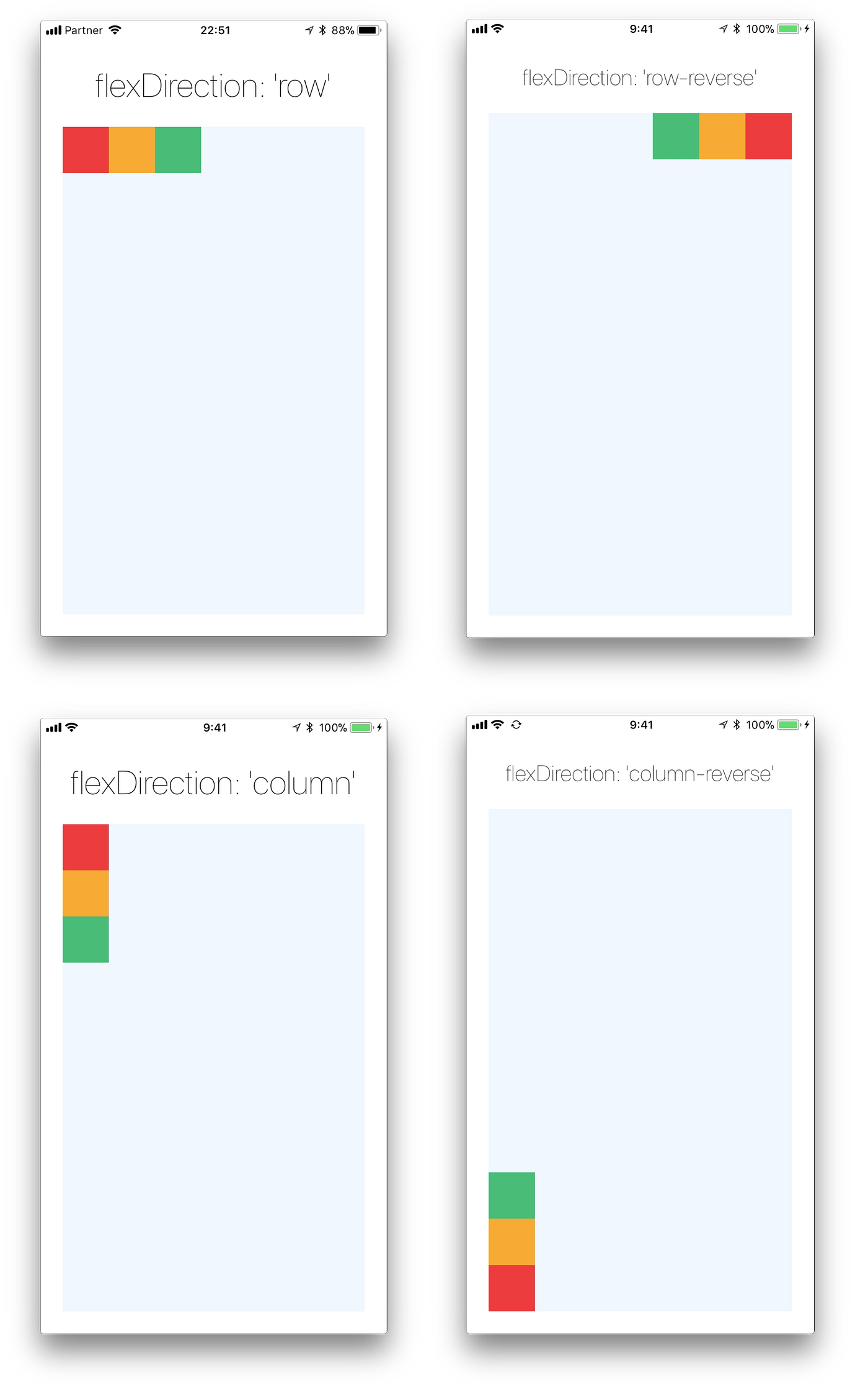
‘column’/’column-reverse’/’row’/’row-reverse’
Defines the direction of the main axis. Opposite to the web, React Native default flexDirection is column which makes sense, most mobile apps much more vertically oriented.
flex
flex will define how your items are going to “fight” over the available space along your primary axis. Most of the time you will want your app container to be flex:1 to take all of the screen height. Space will be divided according to each element flex property. In the following example the red, yellow and the green views are all children in the container view that got flex:1. The red view got flex:1 , the yellow view got flex:2 and the green view got flex:3 . 1+2+3=6 which means that red view will get 1/6 of the space, the yellow 2/6 of the space and the red 3/6 of the space. I think you got it…

justifyContent
‘flex-start’/’flex-end’/’center’/’space-between’/’space-around’
Determines the distribution of children along the primary axis. The term “justify” actually comes from the print world. The lines in a newspaper article fill the space evenly and form a straight edge at the margins which gives the article a more organize layout and help the reader to move more smoothly between the lines of text. It was actually very hard to do that back in the days where we didn’t have any computers.

- The default value is
flex-start
alignItems
‘flex-start’, ‘flex-end’, ‘center’, ‘stretch’
Align items along the cross axis. So in a default view, it will control the horizontal alignment of items.
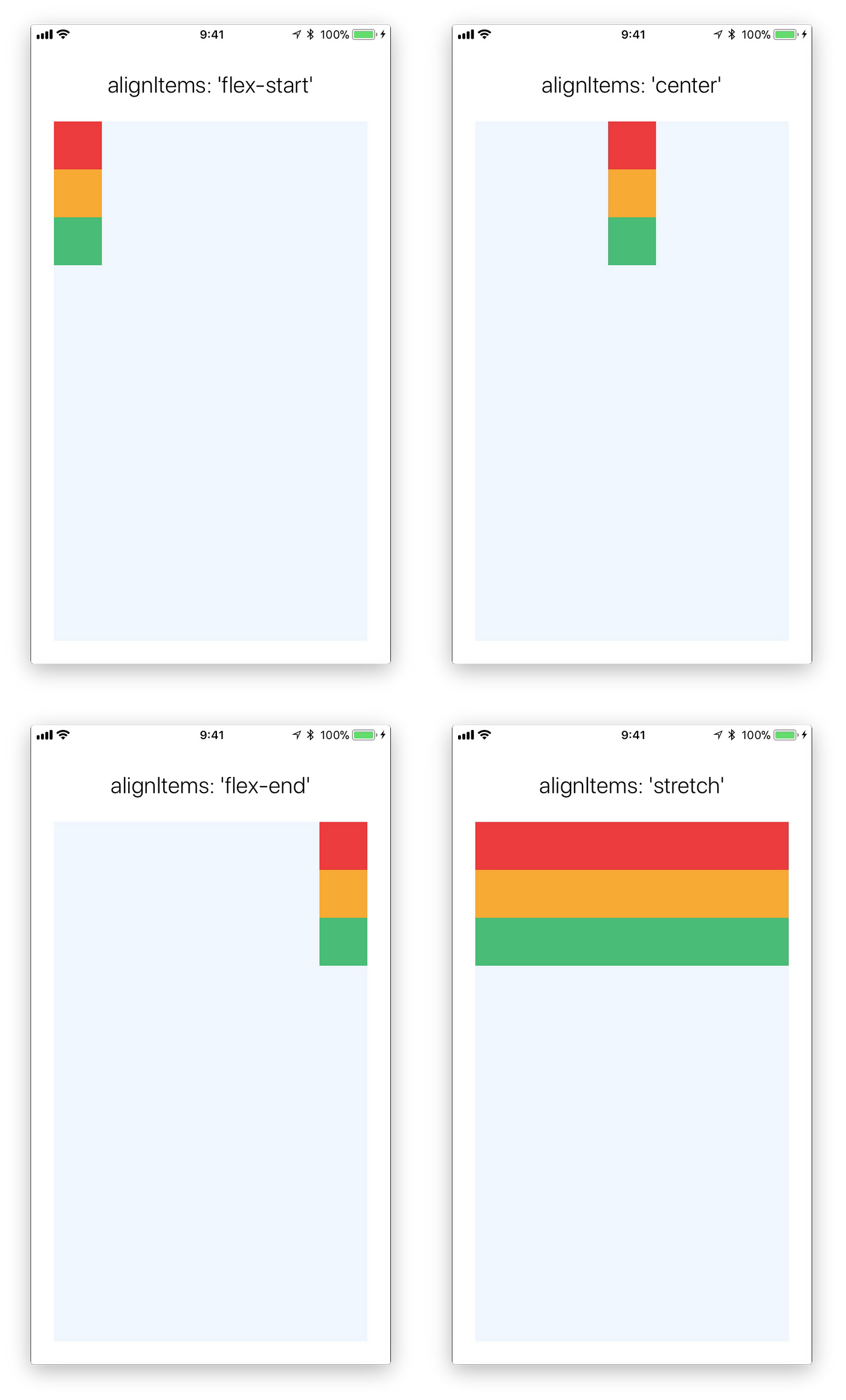
stretchwouldn’t work if you have a specificwidth- If you don’t have a specific
widthflex-startandflex-endwouldn’t understand what to do…
alignSelf
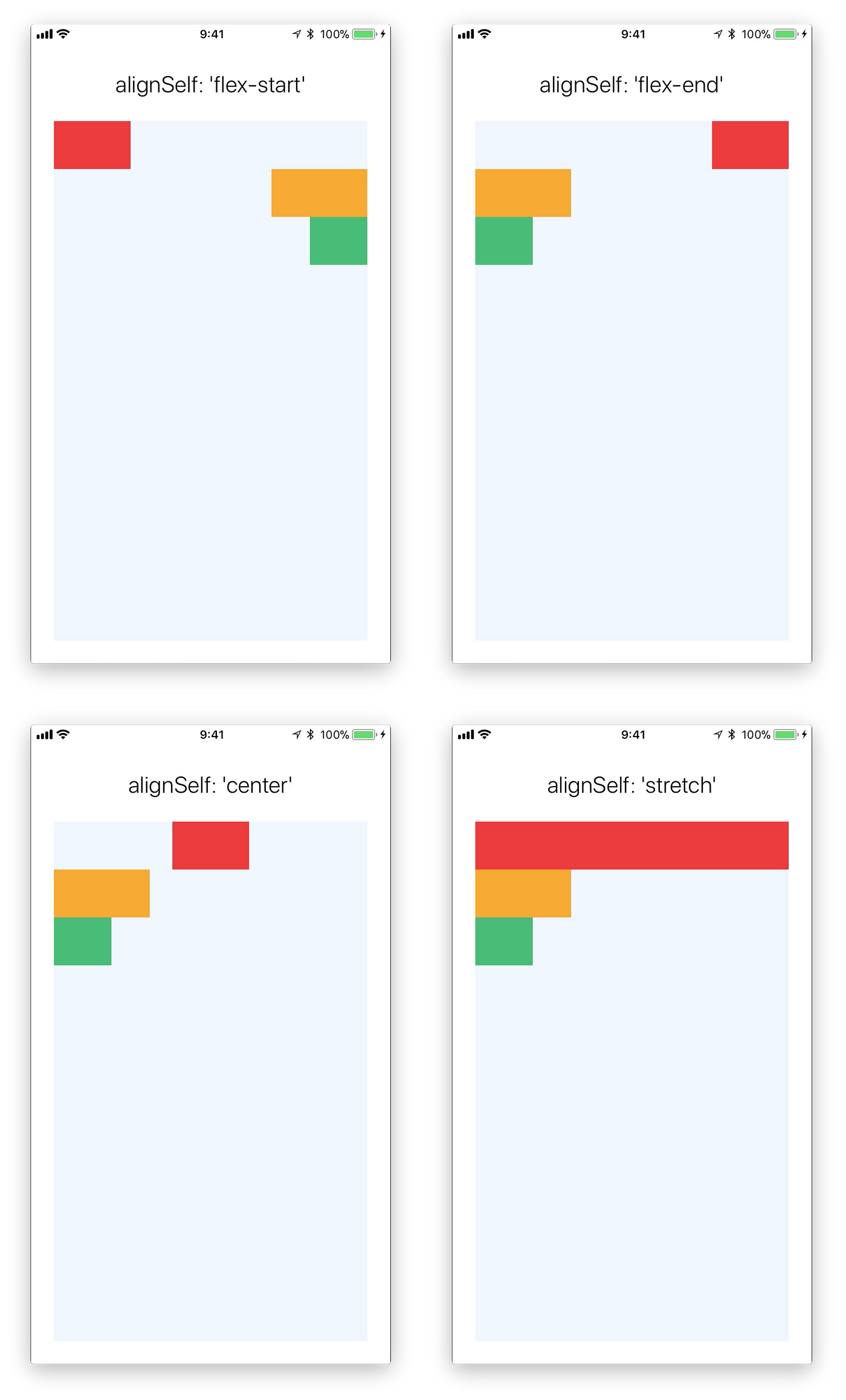
‘flex-start’, ‘flex-end’, ‘center’, ‘stretch’
align an item along the cross axis overwriting his parent alignItem property
flexWrap
‘wrap’, ‘nowrap’
Controls whether flex items are forced on a single line or can be wrapped on multiple lines.

- The default value is
nowrap
alignContent
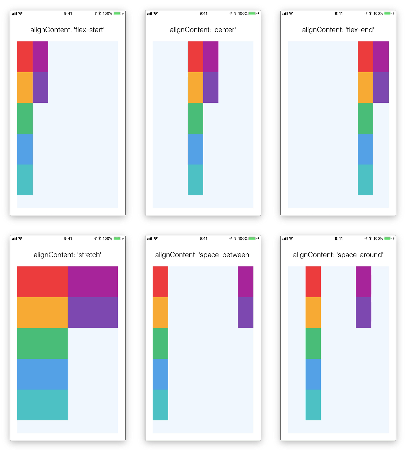
‘flex-start’/’center’/’flex-end’/’stretch’/’space-between’/’space-around’
So if you went with flexWrap:'wrap' you have multiple lines of items, this property will help you align the lines on the cross-axis.
position
‘relative’/’absolute’
Think of your container as a line of people. And you are telling each person to stand 5 meters behind the person in front of him (marginTop: 5). If this person is set to relative he will respect the line and will position himself relatively to the person in front of him. If this person is set to absolute he will ignore all of the people in the line and will position himself as if the line was empty, 5 meters from where the line (his parent container) starts.
- The default value is
relative
zIndex
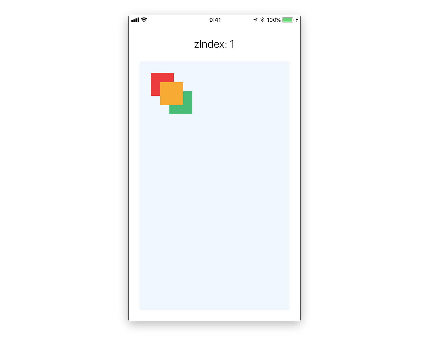
You can control which components display on top of others. In the following example the zIndex of the yellow square to 1.
React Native is still lagging behind the capabilities that we have on the web. But mixing and matching all of the properties above will give you almost any layout you want. so go wild.


 浙公网安备 33010602011771号